
Leveraging Unique Design Motifs to Reflect Brand Personality

Crafting Your Unique Identity Through Design
In the realm of design and aesthetics, the use of unique motifs plays a crucial role in conveying a brand's personality. This involves integrating distinctive elements—such as shapes, patterns, and symbols—into the pitch deck that resonate with the essence of the brand. These motifs not only enhance the visual appeal but also serve as an immediate connection point for the audience, creating a memorable impression that lingers long after the presentation. When a pitch deck effectively reflects a brand’s personality, it can significantly influence how potential investors perceive the value and uniqueness of the business.
The History and Importance of Design Motifs
Historically, design motifs have been pivotal in branding across various industries. From ancient symbols representing tribal identities to modern logos that encapsulate corporate ethos, motifs have always been integral to visual storytelling. Today, brands are increasingly leveraging these motifs to tell their unique stories and establish emotional connections with their audience. A well-designed pitch deck that incorporates specific motifs can communicate the brand's values and mission more effectively than text alone. By understanding the psychological impact of these designs, brands can craft a narrative that is not only compelling but also resonates with their target audience.
Real-World Applications and Trends
Many successful pitch decks exemplify the effective use of unique design motifs. For instance, the Airbnb pitch deck creatively used motifs that reflected the company’s core values of belonging and community, integrating their signature design elements throughout. Similarly, the Dropbox pitch deck incorporated clean, minimalistic motifs that underscored their brand identity as a straightforward, user-friendly solution for file storage. Current trends suggest that incorporating motifs from cultural references or aligning with sustainability themes can also set a brand apart in today’s competitive landscape through creative innovation. This strategy not only enhances aesthetic appeal but also fosters a deeper connection with the audience.
Supporting Evidence and Key Statistics
Research indicates that creating visually stunning and appealing design can increase viewer retention by up to 400% compared to text-heavy slides. According to a survey by Canva, 67% of marketers believe that using visually stunning and engaging content is crucial for brand building. Furthermore, a report by HubSpot revealed that using cohesive design elements in presentations can enhance perceived professionalism, making brands appear more credible. By leveraging unique design motifs in pitch decks, businesses can effectively communicate their brand personality and foster stronger relationships with potential investors
The Role of Color Psychology in Influencing Investor Feelings

Understanding Color Psychology in Design
Color psychology is a powerful tool in design, particularly when it comes to creating an impactful pitch deck. Colors evoke emotions and can significantly influence perceptions, making them crucial for shaping the investor's feelings during a presentation. For instance, blue often conveys trust and dependability, while red can evoke excitement and urgency. By carefully selecting colors that align with the brand’s personality and the emotions it wishes to evoke, a successful pitch deck, can effectively communicate key messages and engage potential investors on a deeper level.
Historical Context and Significance of Colors
The significance of color in communication is not a modern concept; it has deep historical roots. For centuries, cultures have associated specific colors with particular meanings—think of green symbolizing growth and renewal in many cultures or black representing sophistication and elegance. In the business context, research shows that colors can affect decision-making. A study published in the journal "Color Research and Application" found that colors can influence consumer behavior, making it vital for brands to consider how their color choices impact investor perceptions. In pitch decks, the right color palette can reinforce the intended message and create an atmosphere that aligns with the desired investor experience.
Practical Applications in Pitch Decks
Successful pitch decks utilize color psychology to great effect. For instance, the Slack pitch deck used a palette of soft blues and greens, promoting a feeling of calm and collaboration, which resonated well with potential investors. Another example is the Trello pitch deck, which featured vibrant colors to reflect energy and creativity, aligning perfectly with its brand identity as a dynamic productivity tool. Current trends indicate that companies are now focusing on creating color schemes that reflect their unique value propositions, enhancing the storytelling aspect of their pitch decks. By integrating color psychology into their designs, brands can create a lasting impression that captivates their audience.
Supporting Research and Statistics
A study by Color Marketing Group indicates that 90% of snap judgments made about products can be based on color alone, highlighting its critical role in design. Additionally, according to HuffPost, 85% of consumers make purchase decisions based on color, showcasing its impact on investor feelings during pitch presentations. Furthermore, Xerox found that using color in marketing materials can improve reader attention by 80%, underscoring the importance of effective color choices in pitch decks. By leveraging color psychology, brands can not only enhance their visual storytelling but also influence investor sentiment positively.
How to Choose Fonts That Enhance Readability and Aesthetic Appeal
The Importance of Font Choice in Pitch Decks
Font choice plays a pivotal role in the overall effectiveness of a pitch deck, influencing both readability and aesthetic appeal. The right font can convey professionalism, creativity, or urgency, making it essential for reflecting the brand's identity. In a pitch deck, where information must be presented clearly and persuasively, selecting fonts that enhance readability ensures that potential investors can easily absorb the content. Fonts that are too ornate or complex may distract from the message, while clean, sans-serif fonts like Arial or Helvetica tend to be more legible, especially in a digital format.
Historical Context and Font Development
The evolution of typography has significantly shaped how we communicate visually. The transition from traditional print to digital media has introduced a myriad of font choices, ranging from serif to sans-serif and everything in between. Historically, serif fonts were deemed more trustworthy and formal, often used in print for books and newspapers. In contrast, sans-serif fonts emerged in the 20th century as modern and clean alternatives, gaining popularity in digital media. Understanding these historical nuances helps in making informed decisions about font selection, ensuring that the chosen fonts align with the intended tone of the pitch deck and resonate with the target audience.
Case Studies of Effective Font Use
Successful pitch decks exemplify the effective use of typography to enhance visual storytelling. For example, the Airbnb pitch deck effectively used a combination of sans-serif fonts for headings and clean serif fonts for body text, striking a balance between modernity and readability. Another notable example is the Buffer pitch deck, which incorporated bold typography to emphasize key points and ensure that crucial information stood out. The trend today leans towards minimalistic font choices that complement the overall design without overwhelming the viewer. By choosing fonts that align with their branding while maintaining legibility, companies can create a more engaging and effective pitch deck.
Supporting Research and Best Practices
Research from the Journal of Business Research indicates that fonts significantly impact how messages are perceived, with specific font choices affecting trustworthiness and professionalism. According to a study by Type Network, 94% of consumers cite font as a primary reason for why they might mistrust or dismiss a brand. Additionally, best practices suggest limiting font combinations to two or three types to maintain visual coherence. Tools like Google Fonts and Adobe Typekit offer extensive libraries to help pitch deck designers find the perfect font that balances readability and aesthetic appeal. By prioritizing font selection, companies can ensure their pitch decks are not only visually appealing but also effectively communicate their key messages.
Using Layout Creatively to Guide the Viewer’s Journey Through the Deck
The Role of Layout in Pitch Deck Design
Layout is more than just arranging text and images; it's about crafting a narrative that guides the viewer through the pitch deck. An effective layout serves as a roadmap, directing attention to key information and ensuring that the flow of ideas is logical and engaging. In a pitch deck, where the goal is to persuade potential investors, a well-thought-out layout helps maintain the audience's focus and interest. By utilizing visual hierarchies, spacing, and alignment, designers can create a seamless journey that enhances understanding and retention of information, ultimately leading to a more compelling presentation.
Understanding Layout Principles and Best Practices
The principles of layout design encompass several fundamental concepts that should be considered when creating a pitch deck. These include balance, contrast, alignment, repetition, and proximity. Balance ensures that the visual weight of elements is evenly distributed, while contrast draws attention to critical areas. Alignment creates a cohesive look, and repetition reinforces brand identity through consistent use of colors and fonts. Proximity helps in grouping related information together, making it easier for viewers to digest content. By understanding and applying these principles, designers can create layouts that not only look appealing but also serve their functional purpose in guiding the viewer's experience.
Real-World Examples of Effective Layout Use
One standout example of effective layout use is the Trello pitch deck, which employed a grid-based layout to organize content systematically. Each slide was designed to lead naturally to the next, with clear visual cues and consistent spacing that created a smooth flow. Another example is the Canva pitch deck, which used strategic layouts to emphasize its product features while allowing for creative freedom. The use of infographics and data visualization not only enhanced comprehension but also made the pitch deck examples visually stimulating. These examples illustrate how innovative layouts can captivate viewers, maintain their interest, and ultimately contribute to the pitch's success.
Evidence and Recommendations
Research conducted by Nielsen Norman Group reveals that users tend to skim content, making the layout even more crucial in presentations. Their studies found that 70% of users prefer clean layouts that highlight key information and allow for easy navigation. Additionally, a report from Forbes states that well-structured presentations can increase retention rates by 40%. For designers, tools like Canva and Adobe InDesign provide templates that follow best practices for layout design, enabling the creation of visually appealing and functional pitch decks. By leveraging layout effectively, companies can significantly enhance the viewer’s journey and reinforce their message.
Importance of High-Quality Images and How to Source Them

The Impact of High-Quality Imagery on Presentations
In today’s visually-driven world, high-quality images are essential in the pitch deck design process. They serve as powerful tools for communication, helping to convey messages more effectively than text alone. High-resolution images can enhance the aesthetic appeal of a presentation and create a professional impression, crucial for attracting and retaining potential investors' attention. The right images can evoke emotions, support key points, and reinforce brand identity. Therefore, incorporating high-quality visuals is not merely an option but a necessity for creating a compelling pitch deck that stands out.
Understanding Image Quality and Its Effects
High-quality images are characterized by clarity, appropriate resolution, and relevance to the pitch deck content. A blurred or pixelated image can distract from the message and lead to a negative perception of the brand or business. The ideal resolution for images in pitch decks should be at least 300 DPI (dots per inch) for print or 72 DPI for digital displays. Furthermore, using relevant images that align with the presentation's content can significantly enhance the viewer’s understanding and retention. In contrast, low-quality images can undermine the credibility of the whole pitch deck service, making it imperative for designers to prioritize image quality in their presentations.
Sourcing High-Quality Images: Best Practices
Sourcing high-quality images can be achieved through various methods, including stock photo websites, hiring professional photographers, or utilizing custom illustrations. Websites like Unsplash, Pexels, and Shutterstock provide a plethora of high-resolution images suitable for various contexts, even pitch deck agency while platforms like Adobe Stock offer curated collections ideal for professional use. Additionally, custom illustrations can add a unique touch to the pitch deck, setting it apart from competitors. Brands like Dropbox have successfully employed original imagery to strengthen their storytelling, thereby enhancing audience engagement and impact.
Resources and Recommendations
According to a study by Visual Capitalist, presentations that incorporate high-quality images can increase audience engagement by 94%, demonstrating the importance of visual content persuasive presentations. Furthermore, the Content Marketing Institute suggests that using visuals in presentations can improve information retention rates by 65%. To ensure a seamless experience, it’s advisable to use tools like Canva for sourcing images and designing layouts simultaneously. This way, designers can maintain visual consistency while adhering to best practices in image selection market size and placement, ultimately crafting an impressive pitch deck that effectively communicates the desired message.
Custom Illustrations vs. Stock Images: Choosing What’s Best for Your Deck
The Choice Between Custom Illustrations and Stock Images
When it comes to enhancing the visual appeal of your pitch deck, one of the critical decisions is whether to use custom illustrations or stock images. Both options offer distinct advantages and drawbacks that can significantly affect the overall quality and perception of your presentation. Custom illustrations can provide a unique and tailored visual representation of your brand and message, while stock images can offer convenience and affordability. Understanding the strengths of each approach is crucial in determining which best fits your own pitch deck design needs.
An In-Depth Look at Custom Illustrations
Custom illustrations are specifically designed to represent a brand's identity and messaging. They allow for a level of creativity and personalization that stock images cannot provide. For instance carefully researched pitch decks, brands can use illustrations to depict their unique value proposition or convey complex ideas in a simplified manner. The Airbnb pitch deck is a prime example of effective use of custom illustrations, as they encapsulate the brand's compelling story, and values in a visually engaging way. However, producing custom illustrations can be time-consuming and often requires the expertise of skilled designers, which can impact project timelines and budgets.
The Benefits and Limitations of Stock Images
On the other hand, stock images are readily available and can be a cost-effective solution for startups and entrepreneurs who may be working with limited budgets. Platforms like iStock and Adobe Stock offer vast libraries of high-quality images that can fit various themes and concepts. However, one potential downside is that stock images may lack uniqueness, which could result in a presentation that feels generic or similar to others. Brands like Slack have effectively used stock images by carefully selecting visuals that align with their brand voice and message, demonstrating that a well-curated selection of stock images can still convey a strong narrative.
Key Insights and Recommendations
When choosing between custom illustrations and stock images, it’s important to consider your target audience and the overall message you want to communicate. A report from HubSpot suggests that content featuring custom illustrations is 30% more memorable than those using standard stock images, highlighting the effectiveness of personalized visuals. For best results, consider using a combination of both—leveraging stock images for generic concepts while integrating custom illustrations for unique aspects of your pitch deck. Tools like Canva can facilitate this process by providing access to both custom design options and stock images, allowing you to create a visually compelling presentation that resonates with potential investors.
Design Tips to Make Your Pitch Deck Memorable
Crafting a Memorable Pitch Deck
Creating a memorable pitch deck is essential for leaving a lasting impression on potential investors and stakeholders. The right design can help convey your brand’s identity, articulate your value proposition, and ultimately persuade your audience to take action. A well-designed pitch deck doesn’t just look good; it enhances understanding and retention of information. With the right design tips, you can transform your pitch deck into a powerful storytelling tool that captures attention and makes your message resonate.
Understanding the Fundamentals of Memorable Design
Memorability in design often stems from a few key principles: simplicity, consistency, and emotional resonance. Simplicity ensures that your message isn’t lost in unnecessary clutter. Consistency in color schemes, fonts, and layouts helps reinforce your brand identity. Emotional resonance can be achieved through storytelling elements, compelling visuals, and relatable anecdotes. Research by The Design Council shows that design-driven companies outperform their competitors by 200% over a decade, highlighting the significant role of effective design in business success. Thus, integrating these principles can set your pitch deck apart from the competition.
Real-World Examples of Memorable Pitch Decks
Many successful startups have effectively used design to make their pitch decks memorable. For example, Dropbox's pitch deck used a minimalistic design with clear visuals and concise text to communicate its unique value proposition. This clarity made it easy for investors to grasp the concept quickly. Another notable example is LinkedIn, which utilized engaging visuals and a straightforward narrative to effectively convey its business model and growth potential. These examples demonstrate how thoughtful design choices can elevate a pitch deck and make it more engaging for the audience.
Validating Design Effectiveness with Data
According to a report from Forbes, 80% of investors believe that a well-designed presentation in investor pitch decks significantly increases a startup's chances of securing funding. Moreover, a study by Nielsen Norman Group found that users can remember information presented visually in investor pitch decks at a rate of 65% compared to 10% for text alone. These statistics reinforce the importance of investing in high-quality design elements within your pitch deck. By combining effective storytelling with visually appealing design, you can create a pitch deck that not only communicates your business idea clearly but also leaves a memorable impact on your audience.
Avoiding Common Design Mistakes That Could Undermine Your Message

Recognizing Design Pitfalls
Design plays a pivotal role in conveying your message effectively, especially in a pitch deck. However, many entrepreneurs unknowingly fall into common design traps that can diminish their presentation’s impact. Mistakes such as cluttered slides, inconsistent formatting, and poor font choices can distract the audience and obscure key points. A well-structured pitch deck should communicate information clearly and compellingly, making it crucial to be aware of potential pitfalls that could undermine your message.
Exploring the Most Common Design Mistakes
Some of the most prevalent design mistakes include overcrowded slides filled with text, using low-quality images, and choosing colors that clash or are hard to read. According to Canva, 70% of viewers reported that they find presentations with too much text overwhelming. Similarly, a lack of visual hierarchy can confuse viewers about the importance of different elements on a slide. Poorly chosen fonts may affect readability and professional perception, further detracting from your core message. Recognizing these mistakes is the first step toward creating a polished and effective pitch deck.
Learning from Design Errors
Many successful companies have publicly shared their design mistakes and the lessons learned. For instance, Snapchat initially struggled with a cluttered pitch deck that confused investors about its business model. After re-evaluating their approach and streamlining their design, they were able to communicate their value proposition clearly. Another example is Yelp, which faced challenges with poor-quality images in their early presentations. By investing in high-resolution visuals and adhering to consistent branding guidelines, they improved their pitch deck significantly. These examples illustrate how learning from design errors can lead to better presentations and improved investor confidence.
Supporting Data and Statistics
Data from Piktochart reveals that 90% of information transmitted to the brain is visual, underscoring the importance of design in communication. Furthermore, a study by Prezi found that 56% of presenters believe that poor design significantly affects the audience's perception of their competence. By avoiding common design mistakes and focusing on creating a cohesive, visually appealing pitch deck, you can enhance your credibility and ensure that your message is effectively conveyed. Investing time in refining your design approach is crucial for standing out and making your final presentation have a memorable impact on potential investors.
How Simplicity in Design Can Convey Sophistication
Embracing Minimalism
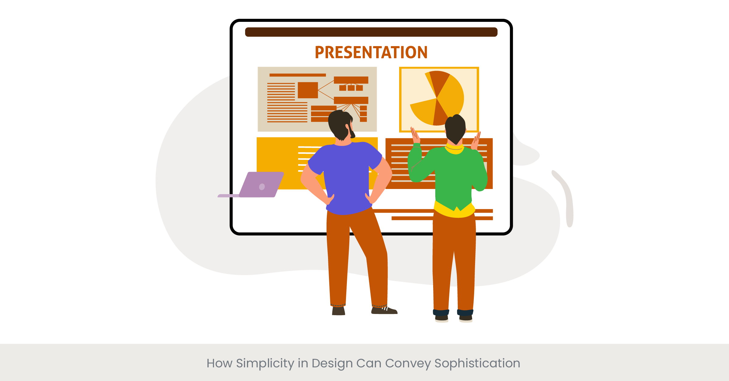
Simplicity in design is a powerful tool that can convey sophistication and professionalism, particularly in a pitch deck. A minimalist approach focuses on the essential elements of your message, removing unnecessary distractions and clutter. By utilizing clean lines, ample white space, and limited color palettes, you can create a visual hierarchy that guides the audience's attention to your key points. This strategy not only enhances readability but also conveys confidence and clarity, qualities that resonate well with potential investors.
The Philosophy of "Less is More"
The philosophy of "less is more" has been embraced by many successful brands, highlighting the elegance of simplicity. The concept emphasizes that a straightforward design can often be more effective than one filled with excessive visuals or text. Renowned designer Dieter Rams, known for his work with Braun, famously stated, "Good design is as little design as possible." This principle is crucial when crafting your pitch deck, where every slide should serve a specific purpose. Simplifying your content helps ensure that your audience retains the core messages without being overwhelmed by information.
Real-World Examples of Effective Simplicity
Several well-known brands have successfully implemented simplicity in their pitch decks. Airbnb, for instance, utilized a minimalist design that focused on high-quality images and succinct text to convey their value proposition. Their pitch deck was so effective that it has been cited as one of the best pitch decks in history. Another great example is the Facebook pitch deck, which presented its business model clearly and concisely, showcasing key metrics and the company's vision without unnecessary embellishments. These examples demonstrate how simplicity can effectively communicate complex ideas, ultimately engaging potential investors.
Supporting Evidence and Statistics
Research from Adobe shows that presentations with a simple design are 75% more effective in retaining audience attention. Additionally, a study by HubSpot found that simplicity in visual communication increases message retention by as much as 65%. These statistics highlight the importance of adopting a minimalist approach in your pitch deck design. By focusing on simplicity, you not only enhance your message's clarity but also create a more sophisticated and appealing presentation that is likely to leave a lasting impression on your audience.
Evaluating Design Effectiveness Through A/B Testing with Audiences

Understanding A/B Testing in Design
A/B testing, also known as split testing, is a powerful technique used to evaluate the effectiveness of different design elements within a pitch deck. By presenting two variations of a design—Version A and Version B—to different audience segments, you can gather data on which design resonates more effectively with viewers. This method allows pitch deck designers to make informed decisions based on real-world feedback rather than relying solely on assumptions. In the competitive landscape of startup presentations, leveraging A/B testing can mean the difference between securing funding and missing out on valuable investment opportunities.
The Importance of Data-Driven Decisions
Data-driven decisions in design are critical for optimizing pitch decks to ensure maximum impact. According to Nielsen Norman Group, usability testing can increase user satisfaction and engagement by up to 50%. When it comes to pitch decks, A/B testing can reveal valuable insights about audience preferences regarding visuals, layout, and messaging. For instance, you might discover that a particular color scheme or font style significantly enhances audience engagement. These insights can guide you in refining your design approach, leading to more compelling presentations that effectively communicate your value proposition to potential investors.
Real-World Applications of A/B Testing
Many successful companies have utilized A/B testing to enhance their pitch decks. Dropbox is a prime example; their original pitch deck was put to the test against a more simplified version. The A/B testing revealed that the simpler version resulted in higher conversion rates, prompting the company to adopt a cleaner design in their future presentations. Similarly, LinkedIn has employed A/B testing for its promotional materials, discovering that changes in imagery and layout led to significantly improved user engagement. These case studies illustrate the value of A/B testing in creating effective pitch decks that resonate with audiences.
Validating Insights with Research
Research from InVision shows that 70% of design professionals believe A/B testing is crucial for refining their projects. Additionally, Optimizely reports that companies utilizing A/B testing find pitch deck examples experience a 10-30% increase in conversion rates. These statistics underscore the importance of evaluating pitch deck design agencies effectiveness through A/B testing, providing a reliable method to ensure that your pitch deck stands out from the competition. By systematically assessing different design elements, you can create a more impactful pitch deck that effectively communicates your business model and attracts potential investors.
Frequently Asked Questions (FAQs)
1. How much does it cost to a leading pitch design agency to build a pitch deck?
The cost of building a pitch deck can vary widely depending on several factors, such as the complexity of the design, the expertise of the designer, and the specific needs of your project. On average, hiring a professional pitch deck design agency can range from $1,500 to $10,000. However, freelance designers or template options can lower pitch deck development costs significantly.
2. What does a pitch deck designer do?
A pitch deck designer specializes in creating visually appealing and effective presentations for startups and businesses looking to secure, raise funding, or convey their ideas. They focus on layout, design, graphics, and storytelling to ensure the pitch deck is engaging and communicates the business plans core message clearly.
3. Do consultants make pitch decks?
Yes, many business consultants offer pitch deck design services as part of their consulting packages. They not only create the visual components of the pitch deck but also help craft the content to the slide decks; pitch deck services ensure it aligns with business goals and effectively communicates the value proposition to potential investors.
4. Who prepares a pitch deck?
Typically, the pitch deck is prepared by the startup stand founding team or marketing professionals within the startup. However, many choose to collaborate with pitch deck design agencies or pitch deck consultants, who can provide expertise in creating a visually impactful presentation that meets industry standards.
5. What program is best to create a pitch deck?
Several programs are popular for creating pitch decks, including Microsoft PowerPoint, Google Slides, and Keynote for Mac users. For more advanced graphic design projects, tools like Canva and Adobe InDesign can also be utilized to make sales decks and create professional-looking presentations.
6. What is the best platform to share a pitch deck?
The best platforms to share a pitch deck include SlideShare for public sharing, Google Drive for collaborative access, and PDF format for professional distribution. Each option allows for easy sharing while maintaining the design integrity of the pitch deck.
7. Do consultants make pitch decks?
Yes, many consultants offer specialized services in creating custom pitch decks. They can provide insights on market trends, investor expectations, competitive advantage, and effective communication strategies, ensuring the pitch deck stands out and effectively conveys the intended message.
8. What is a company pitch deck?
A company pitch deck is a presentation used to provide potential investors or partners in venture capital, with a concise overview of a company's business plan, value proposition, and growth strategy. It typically includes sections on the problem, solution, target market, opportunity, and financial projections.


%20(1).jpg)
%20(1).jpg)

