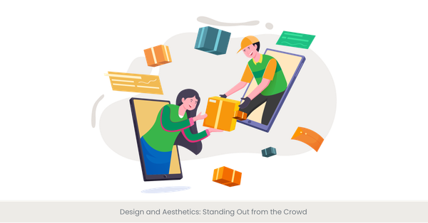
Principles of Effective Pitch Deck Design
Unleashing the Power of Visual Storytelling: Our Success Stories.

Dec 18, 2024
15 min read
%20(1).jpg)
Creating an effective pitch deck is crucial for securing investment and communicating your company's vision. A well-designed pitch deck not only captures the attention of potential investors but also clearly conveys your business's mission, value proposition, and growth potential.
One exemplary format is the sequoia capital pitch deck, known for its curated and effective structure designed to communicate company missions succinctly and successfully.
Understanding Pitch Decks
What is a Pitch Deck?
A pitch deck is a visual presentation that entrepreneurs and startups use to showcase their business idea, product, or service to potential investors, partners, or customers. It is a crucial tool for securing funding, partnerships, and growth opportunities. Typically consisting of 10-20 slides, a pitch deck should be designed to be visually appealing, concise, and easy to understand. The goal is to communicate the essence of the business idea effectively, capturing the interest and imagination of the audience. A well-crafted pitch deck can make the difference between securing investment and missing out on crucial opportunities.
Understanding Color Psychology and Its Impact on Investor Pitch Deck Perception
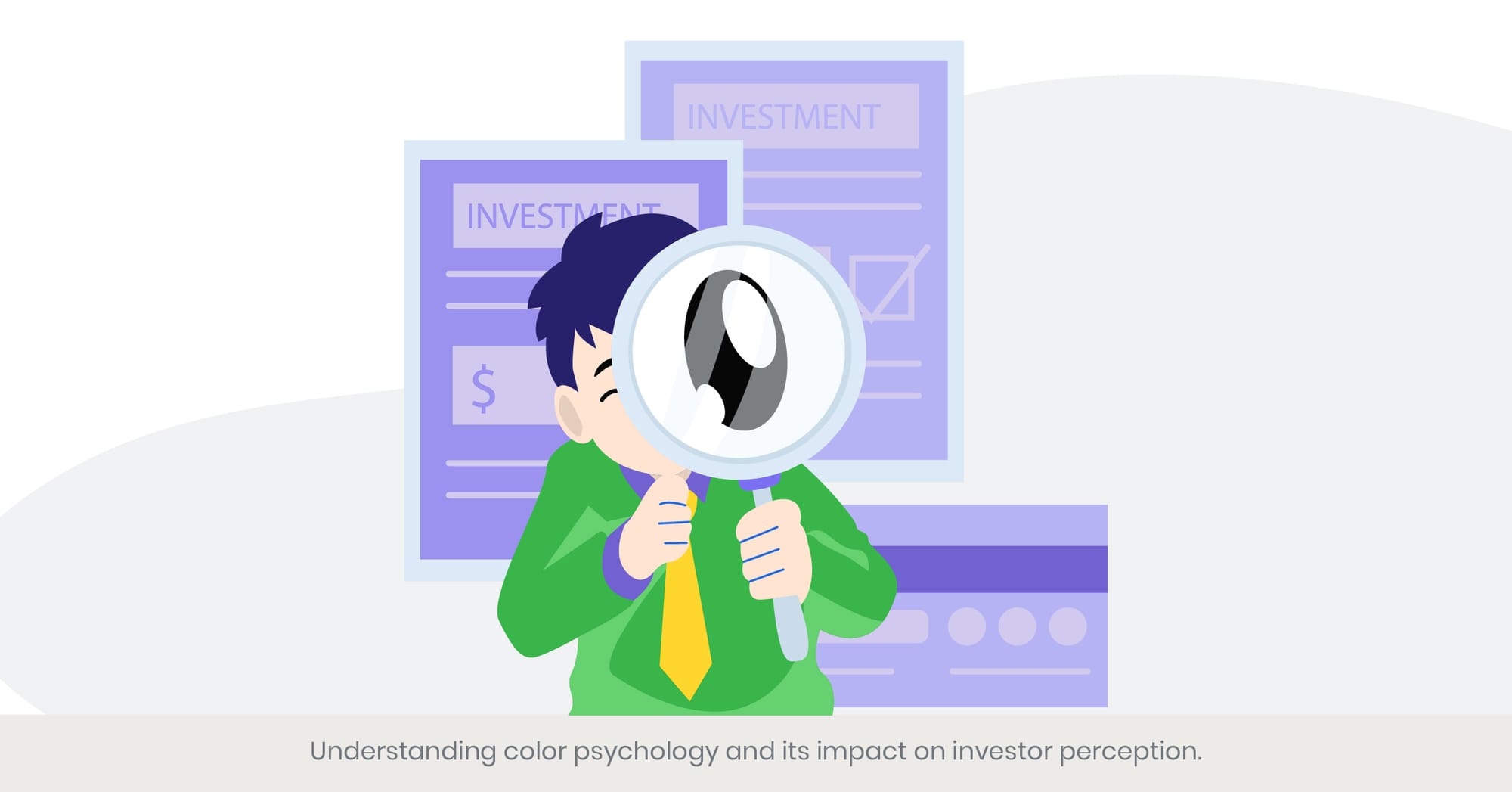
Introduction: Unveiling the Spectrum of Influence
Color psychology plays a pivotal role in the realm of pitch and investor deck and design, subtly swaying investor perception and engagement. Colors are not merely aesthetic choices; they are powerful tools that convey emotions and messages, sometimes more eloquently than words. This section explores how strategic color choices in pitch decks can significantly influence investor reactions and decisions.
Background: The Science of Colors in Marketing
Colors have been studied extensively in marketing and psychology for their impact on human behavior. Each color can trigger specific emotional and cognitive responses. For instance, blue often instills a sense of trust and security, while red can evoke feelings of urgency and excitement. Understanding these psychological effects is crucial for graphic designers and entrepreneurs who wish to tailor their pitch decks to elicit the right responses from potential investors.
Real-World Applications: Case Studies and Trends
Major brands and startups alike leverage color psychology to enhance their pitch deck presentations. A notable example is the use of green by eco-friendly startups to highlight sustainability, tapping into the color’s associations with nature and growth. Similarly, technology companies often use blue to reinforce a theme of reliability and professionalism. The uber pitch deck template is a prime example of a visually appealing presentation design that addresses industry pain points and provides clear solutions. Analyzing these applications helps in crafting finished pitch deck decks that not only look appealing but are also strategically aligned with the brand’s message and audience expectations.
References and Further Reading
To deepen your understanding of how colors affect investor perception, consider these resources:
- "The Psychology of Color in Marketing and Branding" – This guide provides insights into how different colors can affect customer perception and behavior.
- "Color Influence on Consumer Behavior" – A comprehensive study that offers statistics on how colors influence purchasing decisions, which can be extrapolated to investor decisions in pitch decks.
Choosing the Right Typography to Enhance Readability and Influence

Introduction: The Art of Typography in Pitch Decks
Typography is a critical element of design that goes beyond mere font selection; it is an essential tool for communication in pitch decks. The right typography can enhance readability, influence perception, and underscore the key messages intended for potential investors. This section delves into how selecting appropriate fonts and typography styles can significantly impact the effectiveness of a pitch deck.
Background: Typography Fundamentals
At its core, typography involves the art and technique of arranging type to make the text not only readable but also visually appealing and emotionally resonant. It includes the choice of font, size, spacing, and color. Each typographic element plays a specific role: serif fonts, for example, are often perceived as formal and traditional, whereas sans-serif fonts are seen as modern and approachable. Understanding these nuances is crucial for creating pitch decks that communicate effectively and resonate with the intended audience.
Real-World Applications: Successful Typography in Action
Successful pitch decks often utilize typography that aligns with the brand's identity and the presentation's tone. For instance, a startup or pitch deck presentation might use clean, minimalist fonts like Helvetica or Arial to convey simplicity and innovation, especially in tech-related fields. Case studies from successful investor pitch deck presentations demonstrate how tailored typography can enhance comprehension and retention of the presented material, thereby increasing the chances of securing investor interest and funding.
References and Further Reading
For those interested in exploring the impact of typography on reader engagement and decision-making, the following resources are invaluable:
- "Typography and Readability in Business Presentations" – A study that discusses how different typefaces affect readability and audience engagement.
- "Type Matters: The Artistry and Impact of Fonts" – This book provides a deeper understanding of how typography shapes our perception and how it can be harnessed in business communications, including pitch decks.
Effective Use of Whitespace to Guide Viewer Focus

Introduction: Mastering the Canvas of Creativity
Whitespace, often referred to as negative space, is a powerful design element in pitch decks that goes beyond mere aesthetic. It is the space left unmarked: between graphics, margins, and distinct elements of content. Proper use of whitespace can dramatically enhance the readability and impact of a presentation, guiding the viewer’s focus to the most critical information and providing a visual breathing room that makes content more digestible.
Background: The Principles of Whitespace
Whitespace is not simply 'empty' space—it's an active element in design that helps create a hierarchy of information. When used effectively, it can help emphasize key points, improve comprehension, and make the presentation appear more professional. It’s about balancing act between content and space, which can significantly influence how information is perceived and processed by the viewer.
Real-World Applications: Whitespace in Practice
Top companies and seasoned designers utilize whitespace to create a focus and highlight important data without overwhelming the viewer. For example, Apple’s pitch decks and advertising materials are renowned for their minimalistic design approach, using ample whitespace to create a clean, premium feel that aligns with their brand identity. This strategy not only draws attention to key messages and products but also enhances the overall aesthetic and readability of the presentation.
References and Further Reading
To further explore the strategic use of whitespace in design, consider these resources:
- "The Power of Whitespace in Design" – An article that explores various case studies on how effective whitespace has been used to guide viewer focus and decision-making.
- "Whitespace: The Silent Salesman" – This book discusses the psychological impact of whitespace and provides practical tips on how to apply it in business communications, including pitch decks.
Incorporating Data Visualization for Complex Financial Data
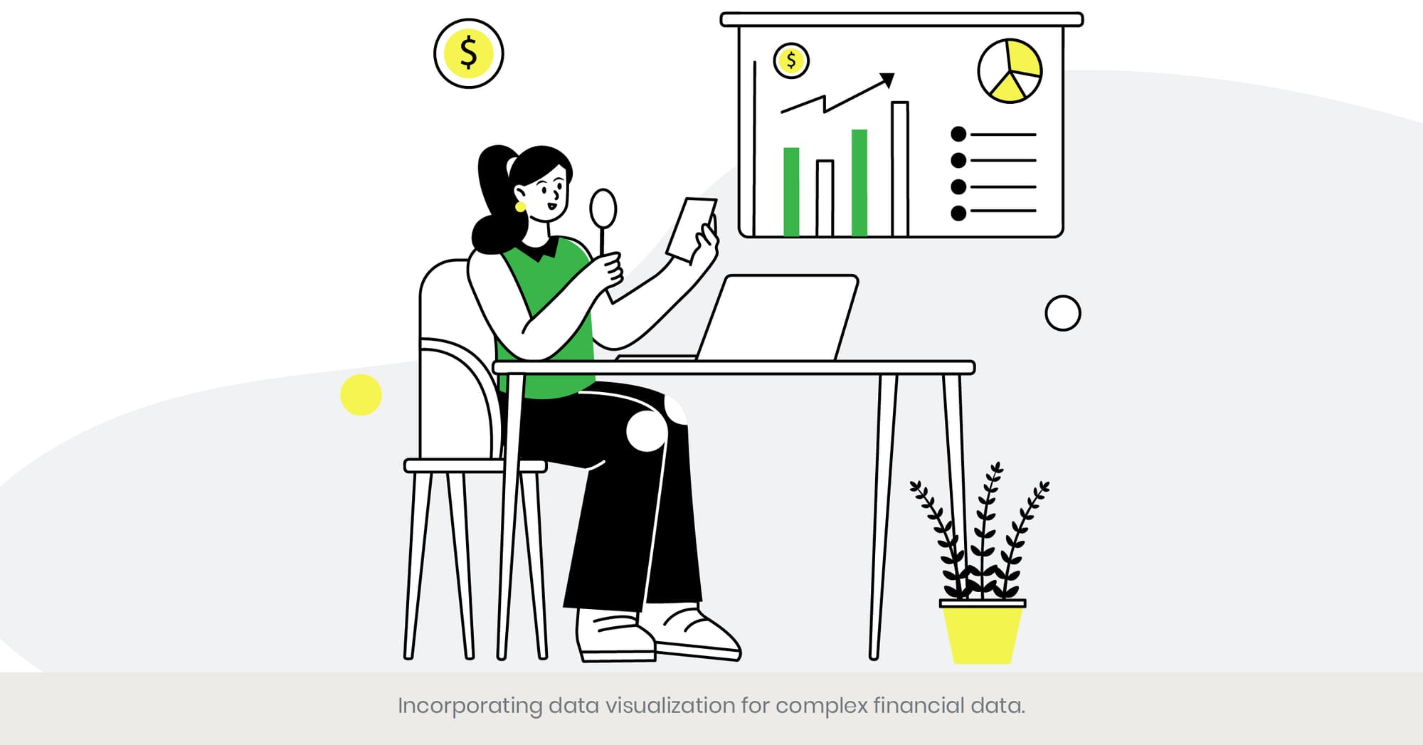
Introduction: Clarity Through Visualization
In the world of pitch decks, data visualization is an indispensable tool for presenting complex financial data in an understandable and engaging manner. Graphs, charts, and infographics transform dense and potentially overwhelming data into clear, digestible and engaging visuals that can convey key messages at a glance. This section explores the critical role of effective data visualization in enhancing comprehension and persuading investors.
Background: The Essentials of Data Visualization
Effective data visualization involves more than just presenting numbers; it's about telling a story that resonates with the audience. It requires a deep understanding of the information being presented and the best graphical means to represent it. Whether it’s a bar graph, line chart, or a custom infographic, each format has the potential to highlight different aspects of the data, making it essential for entrepreneurs to choose the right type of visualization to match their data and narrative.
Real-World Applications: Visuals that Speak Volumes
Successful startups often utilize innovative data visualizations to demonstrate growth metrics, financial projections, and market analysis in their pitch decks. For instance, Airbnb’s initial pitch deck included clear, concise visualizations of key metrics regarding their market penetration and user engagement, which were pivotal in their successful fundraising efforts. These visuals allowed potential investors to quickly grasp the magnitude and potential of Airbnb's business model, facilitating easier decision-making.
References and Further Reading
For further insights into crafting effective data visualizations for pitch decks, these resources can be invaluable:
- "Data Visualisation: A Handbook for Data Driven Design" – This book offers comprehensive guidelines on choosing and designing the most effective visualizations for various types of data.
- "Visualize This: The FlowingData Guide to Design, Visualization, and Statistics" – A guide that provides practical advice on turning complex quantitative data into accessible and appealing visual stories.
Aligning Design Elements with Brand Identity
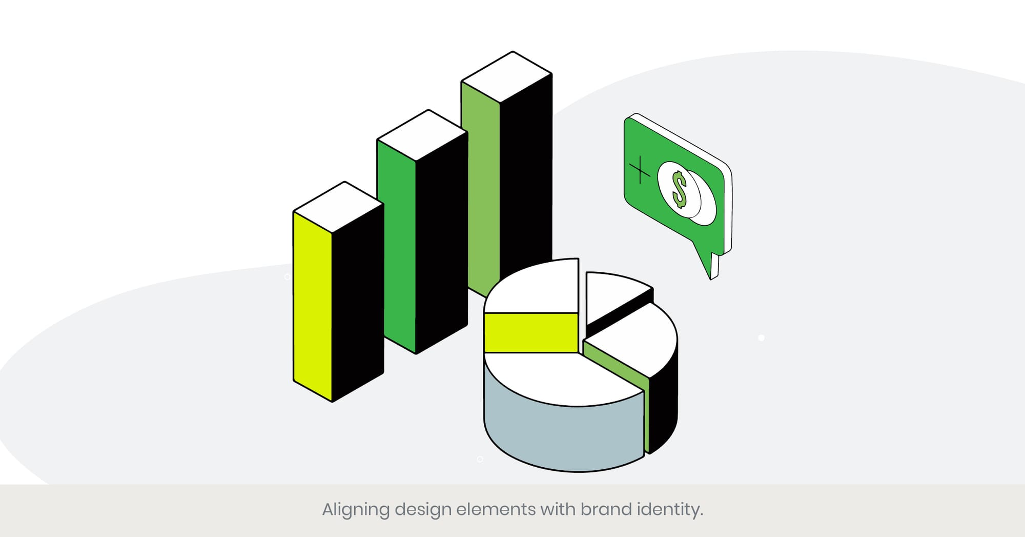
Introduction: Harmonizing Design with Brand Essence
The alignment of design elements with brand identity in a pitch deck is crucial for creating a cohesive and impactful investor presentation. This integration ensures that every aspect of the pitch—from color schemes and typography to imagery and layout—resonates with the brand’s core values and market positioning. This section explores how effectively aligning design elements with brand identity can enhance credibility and emotional connection with investors.
Background: Understanding Brand Identity in Design
Brand identity is the visual and thematic representation of a company's ethos, values, and objectives. It encompasses everything from the logo and color palette to the messaging and overall aesthetic. For pitch decks, ensuring that all the slides and design elements consistently reflect the brand identity is essential not only for aesthetic harmony but also for building trust and recognition with potential investors.
Real-World Applications: Consistency Meets Creativity
Examples of successful brand identity alignment can be seen in companies like Tesla and Google. Tesla’s pitch decks, for example, feature clean, innovative designs with bold imagery that reflect its commitment to cutting-edge technology and sustainability. Similarly, Google uses simple, colorful designs that mirror its dynamic and user-friendly brand persona. These companies demonstrate how pitch decks that align closely with brand identity can effectively communicate the brand’s promise and persuade investors.
References and Further Reading
To delve deeper into aligning design elements with brand identity, consider these resources:
- "Brand Identity Essentials: 100 Principles for Designing Logos and Building Brands" – This book lays out key principles for integrating brand identity into design, providing a useful guide for anyone preparing a pitch deck.
- "Designing Brand Identity: An Essential Guide for the Whole Branding Team" – A comprehensive exploration of how visual design can be used to reinforce brand identity across various media, including pitch decks.
Balancing Creativity with Professionalism in Design

Introduction: The Creative-Professional Spectrum
In the context of pitch deck design, striking the right balance between creativity and professionalism is paramount. This balance ensures that the presentation is both engaging and credible, capturing the attention of potential investors while conveying a sense of trustworthiness and business acumen. This section delves into how designers and entrepreneurs can achieve this equilibrium to maximize their impact during presentations.
Background: The Dynamics of Design Balance
Creativity in design allows for innovation and uniqueness, helping a pitch stand out in a sea of standard presentations. Professionalism, on the other hand, reassures investors of the seriousness and viability of the the business plan. The challenge lies in integrating creative elements such as unique layouts, dynamic visuals, and unconventional color schemes without compromising the professional quality of the pitch presentation itself.
Real-World Applications: Case Studies of Successful Pitch Decks
Examples of this balance are evident in the pitch decks of startups that have successfully secured seed round of funding by showcasing their individuality while maintaining a polished appearance. For instance, Dropbox’s initial pitch deck cleverly used simple but imaginative visuals that clearly explained their product’s functionality and benefits in a few clicks, all while maintaining a sleek, professional layout that appealed to serious investors.
References and Further Reading
For more insights into balancing creativity with professionalism, the following resources are recommended:
- "Creative Confidence: Unleashing the Creative Potential Within Us All" – This book explores how to blend creativity with professional constraints to foster innovation in business settings.
- "The Art of Innovation: Lessons in Creativity from IDEO, America's Leading Design Firm" – Offers practical advice on how to nurture creativity in organizations while adhering to professional standards and goals.
The Role of Consistency in Slide Layout and Design
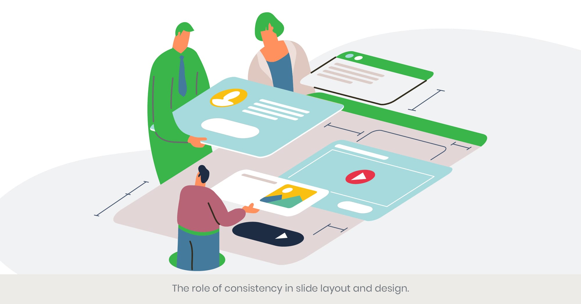
Introduction: The Power of Consistency
Consistency in your slide deck layout and design is more than just a stylistic choice; it's a strategic tool that enhances communication in pitch decks. Consistent elements help create a cohesive story, making it easier for investors to follow along and absorb information. This section explores how maintaining consistency across slides can improve viewer understanding and engagement.
Background: Fundamentals of Consistent Design
Consistency involves the repeated use of similar elements throughout a presentation, such as consistent color schemes, font styles, and layout structures. This repetition helps to establish a visual identity, which can reinforce the brand’s message and make the presentation more memorable. Consistency also aids in the logical flow of information, which is crucial for maintaining the audience’s focus and interest throughout the pitch.
Real-World Applications: Effective Consistency in Action
Successful applications of consistency are evident in pitch decks from established companies like LinkedIn and Uber. These companies use standardized pitch deck templates that feature consistent elements across all slides. This approach not only reinforces their brand but also makes complex information more accessible and easier to understand, significantly enhancing the overall impact of their presentations.
References and Further Reading
To deepen your understanding of the importance of consistency in design, consider these resources:
- "Slide:ology: The Art and Science of Creating Great Presentations" – This book offers detailed insights into how effective design consistency can transform presentations.
- "The Non-Designer's Design Book" – Provides practical tips on how to apply principles of design, including consistency, to create more effective visual communications.
Utilizing High-Quality Images to Communicate Vision
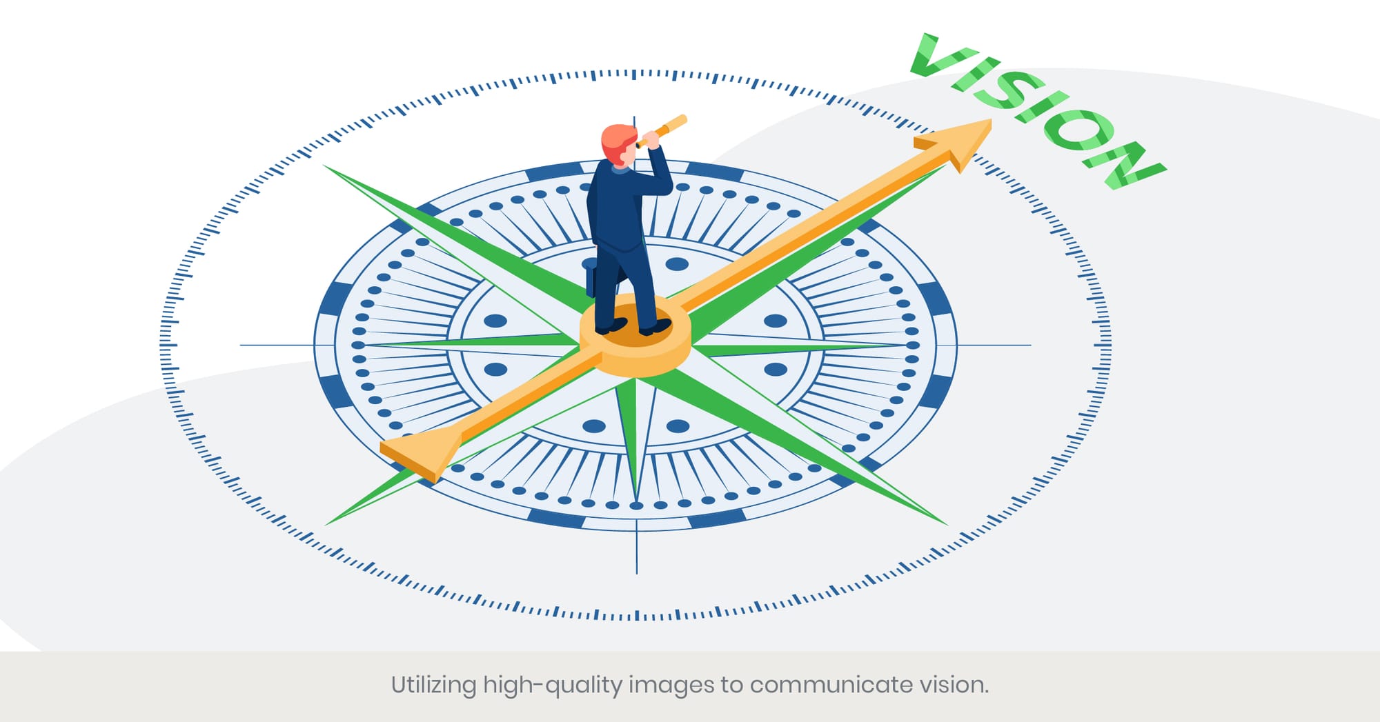
Introduction: Visual Storytelling in Pitch Decks
High-quality images are essential in pitch decks, not just for aesthetic appeal but for effectively communicating the vision and mission of a company. They serve as powerful storytelling tools that can capture attention, evoke emotions, and illustrate complex business ideas more succinctly. This section delves into how the strategic use of images enhances the overall impact of a pitch deck.
Background: The Importance of Image Quality
The clarity and quality of images used in a pitch deck can significantly influence the perception of professionalism and credibility. High-resolution images ensure that the presentation looks polished and well-prepared, avoiding the pitfalls of pixelation or distortion that can detract from the message. Moreover, the choice of images should align with the brand's identity and the message being conveyed to ensure a harmonious visual experience.
Real-World Applications: Images in Action
Successful startups often utilize compelling imagery that resonates with their target audience and reinforces their value proposition. For example, a tech startup might include high-definition images of their product in use, showcasing its functionality and user-friendliness. These images help potential investors visualize the product in a real-world setting, making the business concept more tangible and relatable.
References and Further Reading
For those interested in exploring the effective use of images in pitch decks, these resources are invaluable:
- "Understanding Visual Communication in Digital Age" – Offers insights into how visual elements can be used to enhance communication and storytelling.
- "The Power of Visual Storytelling: How to Use Visuals, Videos, and Social Media to Market Your Brand" – This book provides strategies for integrating impactful visuals into marketing and business presentations, including pitch decks.
The Impact of Slide Transitions and Animations on Viewer Engagement
Introduction: Enhancing Presentations with Dynamic Elements
Slide transitions and animations, when used judiciously, can significantly enhance the engagement and dynamism of a a pitch deck presentation. These elements can help maintain interest, clarify relationships between ideas, and provide a smooth flow of information. This section explores how effectively integrating transitions and animations traction slide show can elevate a pitch deck presentation from static to captivating.
Background: The Art of Motion in Presentation
Transitions and animations are more than just decorative features; they play a functional role in guiding the audience’s attention and enhancing understanding. Effective transitions can help underscore key points or shift focus from one idea to another seamlessly, while animations can be used to highlight important data or illustrate processes in a step-by-step manner. However, overuse or inappropriate use can distract from the core message, so balance and relevance are crucial.
Real-World Applications: Strategic Use in High-Stakes Settings
Consider the pitch decks of companies that have successfully secured funding. These often utilize subtle transitions that reflect the pace and tone of the narrative, enhancing storytelling without overshadowing the content. For example, next pitch deck for a funding round for a financial services startup might use smooth fade transitions to reflect its professional and polished ethos, while a creative agency might opt for more dynamic animations to showcase its creativity and innovative approach.
References and Further Citing
For a deeper dive into the use of transitions and animations in pitch decks, consider consulting:
- "Presentation Zen: Simple Ideas on Presentation Design and Delivery" – This book discusses how to use design and technological enhancements, including animations, to improve presentation effectiveness.
- "Animator’s Survival Kit" – Provides a comprehensive guide to animation techniques that can be adapted for dynamic and engaging presentations.
Design Tips for Ensuring Accessibility and Inclusivity
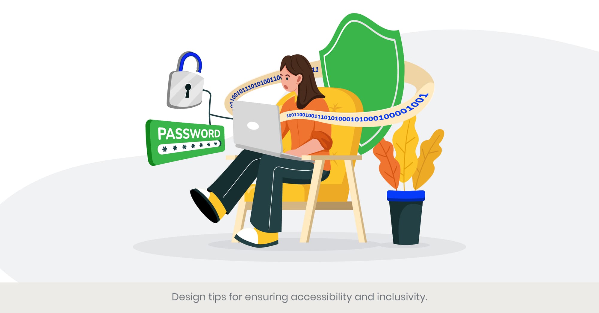
Introduction: Creating Inclusive Design
In the world of pitch decks, ensuring accessibility and inclusivity in design is not just a legal obligation but a strategic competitive advantage. It allows your message to reach and resonate with a broader audience, including those with disabilities. This section highlights key design practices that enhance accessibility and inclusivity best pitch decks, ensuring that everyone can engage with your presentation.
Background: Principles of Accessible Design
Accessible design in startup pitch deck template for decks involves the implementation of principles that accommodate viewers with disabilities, such as those with visual, auditory, or cognitive impairments. This includes using high-contrast color schemes for viewers with vision impairments, selecting readable fonts, and providing alternative text for images. By incorporating these elements, designers can create a full pitch deck template that is both visually appealing and universally accessible.
Real-World Applications: Case Studies of Inclusive Design
Companies that prioritize accessibility often see increased engagement and positive responses. For example, a tech company may demonstrate its commitment to inclusivity by using accessible design features in its pitch deck, such as closed captions for videos and clear, descriptive headings for those using screen readers. These practices not only enhance the company's reputation but also expand its potential investor base.
References and Further Reading
To further understand and implement accessible design in your own own pitch deck design or decks, the following resources are recommended:
- "Design for Accessibility: A Comprehensive Guide for Designers" – This guide offers detailed strategies on creating accessible digital content, including pitch decks.
- "Inclusive Design Patterns" – This book breaks down the best practices in accessibility across various digital platforms, providing practical tips that can be applied to presentation design.
Designing a Pitch Deck
Using a Pitch Deck Template
Using a pitch deck template can be an effective way to create a professional-looking presentation quickly and efficiently. A good pitch deck template should include essential elements such as a clear and concise message, a compelling value proposition, and a well-structured narrative. It should also be visually appealing, with a focus on conveying key information and messages. There are many pitch deck templates available online, including those inspired by successful startups such as Uber and Facebook. These templates provide a solid foundation, allowing you to customize the content to fit your unique business idea while ensuring that the overall design remains polished and professional.
Creating a Compelling Pitch Deck
Crafting a Clear and Concise Message
Crafting a clear and concise message is essential for creating a compelling pitch deck. The message should be focused on the key benefits and value proposition of the business and should be communicated in a way that is easy to understand. The use of visuals, such as charts and graphs, can be effective in highlighting and emphasizing key information. Icons can also be used to inject personality into the pitch deck and convey information quickly and without words. A good pitch deck should be designed to be easy to read and understand, with clear headings and concise language. By ensuring that each slide serves a clear purpose and contributes to the overall narrative, you can create a pitch deck that captures the attention of potential investors and effectively communicates your business model.
Frequently Asked Questions: Pitch Deck Template
1. What is a design pitch deck?
A design pitch deck is a visual presentation used primarily by startups and entrepreneurs to convey their own business strategy, model, products, or services to potential investors or clients. It emphasizes visual design elements to make the information more engaging and easier to understand.
2. How to design an It effective pitch deck?
To design an effective, pitch deck template, focus on clarity, simplicity, and storytelling. Use high-quality visuals, consistent branding elements, and clear data visualizations. Ensure that each slide serves a clear purpose and contributes to the overall narrative of team slide in your pitch deck example presentation.
3. How do you structure a good pitch deck?
A great example well-structured pitch deck typically starts with an introduction to the business, followed by the problem statement, solution, target market, size, business model, competitive analysis, team overview, financials, and ends last slide, with a strong call to action.
4. How to make a design pitch?
Making a design pitch involves clearly presenting your design concept in a way that is both compelling and visually appealing. Use a mix of sketches, prototypes, and digital renderxings to demonstrate your design ideas and how they solve specific user problems.
5. What is a great pitch deck or graphic design?
Pitch. facebook pitch deck graphic design refers to the aesthetic design of a pitch deck, including the use of color schemes, typography, images, and layout that reflect the brand's identity and enhance the investor deck presentation's effectiveness.
6. How to pitch as a graphic designer?
As a graphic designer, pitch your skills and market opportunity by showcasing your portfolio and highlighting specific projects that align with team expertise and the potential client's needs. Emphasize your creative process, your ability to solve problems through design, and your proficiency in various design tools.
7. How to make a design pitch deck?
To make a design pitch deck, incorporate visual storytelling, maintain a clear and logical flow, use professional fonts and colors, and include visuals like charts and infographics to illustrate key points. Make sure to tailor the design pitch deck examples and slide deck examples to your audience's preferences and expectations.
8. What does a pitch mean in graphic design?
In graphic context, a pitch refers to presenting a design idea or concept to a potential client or employer. It involves explaining the creative vision or business idea, the rationale behind design choices, and how the design will benefit the client or sales team.
%20(1).jpg)