
Integrating Compelling Storytelling to Illustrate Executive Challenges

Introduction
Integrating compelling storytelling to illustrate executive challenges is an essential element in CXO presentations. Storytelling is a powerful tool that can turn complex business scenarios into engaging narratives, making them easier to understand and more relatable. By weaving a story around data and strategic insights, presenters can capture the attention of their audience and drive home the key messages more effectively. This sub-topic explores the importance of storytelling in executive presentations and provides insights into how it can be effectively used to highlight executive challenges.
Background Information
The use of storytelling in presentations has a rich historical background, rooted in ancient traditions of oral storytelling. In modern business contexts, storytelling has evolved to become a strategic tool used to convey complex information in a compelling way. Storytelling in CXO presentations involves creating a clear narrative structure that includes a beginning, middle, and end. The above story structure should highlight the challenges faced by the organization, the strategies employed to overcome these challenges, and the outcomes achieved. This approach not only makes the presentation more engaging but also helps in creating a memorable and impactful message that resonates with the audience.
Real-World Examples
A prime example of effective storytelling in executive presentations is the annual shareholder meetings of companies like Amazon and Apple. Jeff Bezos, the founder of Amazon, often uses storytelling to explain the company’s strategic decisions and future plans. He narrates stories that illustrate the challenges faced by Amazon and how the company’s innovative solutions have addressed these challenges. Similarly, Apple’s product launch events, led by executives like Tim Cook, are structured around compelling narratives that highlight the challenges of product development and the remarkable solutions created by Apple’s team. These examples show how storytelling can make executive presentations more engaging and effective by providing context and meaning to data and strategic insights.
Highlighting Key Business Metrics that Support Strategic Decisions

Introduction
Highlighting key business metrics that support strategic decisions is a critical aspect of executive presentations. These metrics provide the quantitative foundation for decision-making, offering a clear picture of the organization’s performance and strategic direction. Effective presentation of these metrics can help executives make informed decisions, justify strategies, and communicate the rationale behind those decisions to stakeholders. This sub-topic explores the importance of business metrics in executive presentations and the best practices for showcasing them effectively.
Background Information
The role of business metrics in strategic decision-making has long been established in the corporate world. Key business metrics include financial performance indicators, market share, customer satisfaction scores, and operational efficiency metrics. Historically, these metrics have been used to measure the success of business strategies and to identify areas for improvement. In the context of CXO presentations, these metrics must be presented clearly and concisely, often through data visualizations such as charts, graphs, and dashboards. Effective presentation of these metrics involves not only displaying the numbers but also providing context and analysis to explain their significance. This approach helps in transforming raw data into actionable insights that can guide strategic decisions.
Real-World Examples
Leading companies such as Google and Microsoft excel in presenting key business metrics in their executive presentations. Google’s quarterly earnings calls are a prime example, where the company’s executives present financial performance data, user engagement metrics, and market growth figures in a clear and engaging manner. These presentations use high-quality visuals to highlight trends and insights, making complex data accessible to stakeholders. Similarly, Microsoft’s annual reports and investor presentations effectively showcase key business metrics, providing a comprehensive overview of the company’s strategic achievements and future goals. These examples illustrate how highlighting key business metrics can support strategic decisions and enhance the impact of executive presentations.
Structuring Content to Facilitate Quick Understanding and Retention

Introduction
Structuring content to facilitate quick understanding and retention is crucial in executive presentations. High-level executives often have limited time, making it essential to present information in a clear, concise, and easily digestible format. The organization of content can significantly impact the audience's ability to grasp and remember key points. This sub-topic explores effective strategies for structuring presentation content to enhance comprehension and retention among executive audiences.
Background Information
The science of information processing and memory retention underscores the importance of content structure in presentations. Historically, effective presentations follow a logical sequence, breaking down complex information into manageable sections. Techniques such as the use of an executive summary, clear headings, bullet points, and concise text help in organizing content. Additionally, incorporating visual aids and interactive elements can aid in better retention. Understanding cognitive load theory, which suggests that people can only process a limited amount of information at a time, is crucial for designing presentations that do not overwhelm the audience but rather facilitate understanding and retention.
Real-World Examples
Successful structuring of presentation content can be seen in the practices of companies like IBM and General Electric. IBM’s executive presentations often begin with an executive summary that outlines the main points, followed by detailed sections that delve into each topic. This structure helps executives quickly grasp the key messages and understand the context. General Electric employs a similar approach, with presentations structured to highlight key metrics and strategic initiatives first, followed by detailed analysis. These presentations use clear headings, bullet points, and visuals to make complex information accessible and memorable. These examples highlight the importance of structuring content effectively to facilitate quick understanding and retention.
Personalizing Content to Reflect the Unique Style of the Executive

Introduction
Personalizing content to reflect the unique style of the executive is a key element in creating impactful presentations. Each executive has their own communication style, preferences, and brand identity, which should be reflected in the presentation to make it more authentic and engaging. Tailoring the content to resonate with the executive’s style helps in establishing a stronger connection with the audience and reinforces the executive’s leadership presence. This sub-topic explores strategies for personalizing presentation content to align with the unique style of the executive.
Background Information
The importance of personalizing presentation content stems from the need to maintain authenticity and enhance the executive's credibility. Historically, successful leaders have used presentations that align with their personal brand and communication style, whether it is formal, conversational, or dynamic. Key elements of personalization include the tone of the language, the choice of visuals, and the overall design aesthetic. Understanding the executive’s preferences and incorporating them into the presentation design ensures that the content feels genuine and relatable. This approach not only enhances the delivery but also helps in building trust and rapport with the audience.
Real-World Examples
Real-world examples of personalized presentations can be found in the styles of executives like Elon Musk and Mary Barra. Elon Musk’s presentations are known for their futuristic and visionary tone, reflecting his innovative personality. His slides often feature bold visuals and minimal text, allowing his dynamic speaking style to take center stage. On the other hand, Mary Barra, CEO of General Motors, delivers presentations that are structured, clear, and data-driven, aligning with her pragmatic and strategic approach. These presentations are personalized with a focus on detailed charts, comprehensive data, and clear strategic goals. These examples demonstrate how personalizing content to reflect the executive’s unique style can enhance the effectiveness of a presentation.
Ensuring All Design Elements Are Consistent with Corporate Branding

Introduction
Ensuring all design elements are consistent with corporate branding is essential for maintaining a unified and professional image in CXO presentations. Consistent branding reinforces the company's identity and values, helping to build trust and recognition among stakeholders. This sub-topic explores the importance of aligning presentation design with corporate branding guidelines and provides strategies for achieving visual and thematic coherence across all presentation materials.
Background Information
Corporate branding involves the use of specific colors, fonts, logos, and messaging that collectively represent the company's identity. Historically, companies with strong brand consistency across all communication channels, including presentations, have seen enhanced brand recognition and trust. Key components of maintaining consistency include adhering to brand guidelines, using approved templates, and ensuring that all visual elements, such as logos and color schemes, are correctly applied. Consistency in branding not only strengthens the corporate image but also ensures that presentations are instantly recognizable and convey a sense of professionalism and reliability. Understanding and implementing these principles is crucial for creating effective CXO presentations that align with the company's overall branding strategy.
Real-World Examples
Companies like Coca-Cola and IBM are exemplary in maintaining brand consistency across their presentations. Coca-Cola’s presentations are characterized by their iconic red and white color scheme, the use of their signature font, and the incorporation of the Coca-Cola logo on every slide. This consistency reinforces the brand’s identity and ensures that every presentation is instantly recognizable. IBM, on the other hand, employs a sleek, professional design in its presentations, with consistent use of its blue color palette and modern typography, reflecting the company’s emphasis on innovation and professionalism. These real-world examples highlight how maintaining consistency with corporate branding can enhance the impact and coherence of CXO presentations.
Utilizing High-Quality Visuals to Support Complex Business Narratives

Introduction
Utilizing high-quality visuals to support complex business narratives is crucial in CXO presentations. Visuals can simplify complicated information, making it more accessible and engaging for the audience. High-quality images, infographics, and data visualizations help convey key messages effectively, ensuring that the audience can quickly grasp and retain important information. This sub-topic explores the strategies for incorporating high-quality visuals into presentations to enhance understanding and impact.
Background Information
The use of visuals in presentations has a long history, with early presentations relying heavily on text. However, research has shown that people process visual information faster and retain it longer than text. This has led to a shift towards more visual-centric presentations, especially in high-stakes environments like CXO meetings. Key types of visuals include charts, graphs, infographics, and photographs. High-quality visuals are those that are clear, relevant, and professionally designed. They should complement the spoken narrative, not overwhelm it, and should be used to highlight key points and data. Understanding the principles of effective visual communication is essential for creating presentations that support complex business narratives.
Real-World Examples
Leading companies like Tesla and Netflix excel in using high-quality visuals in their presentations. Tesla’s product launch presentations, led by CEO Elon Musk, often feature detailed infographics and striking images of their vehicles, making complex technical details accessible to a broad audience. Similarly, Netflix’s quarterly earnings presentations use clear, professional charts and graphs to illustrate subscriber growth, revenue streams, and market expansion. These visuals not only support the narrative but also enhance the overall impact of the presentation, making the information memorable and engaging. These examples illustrate how high-quality visuals can effectively support complex business narratives, making them more comprehensible and impactful.
Emphasizing Critical Points through Strategic Use of Color and Layout
Introduction
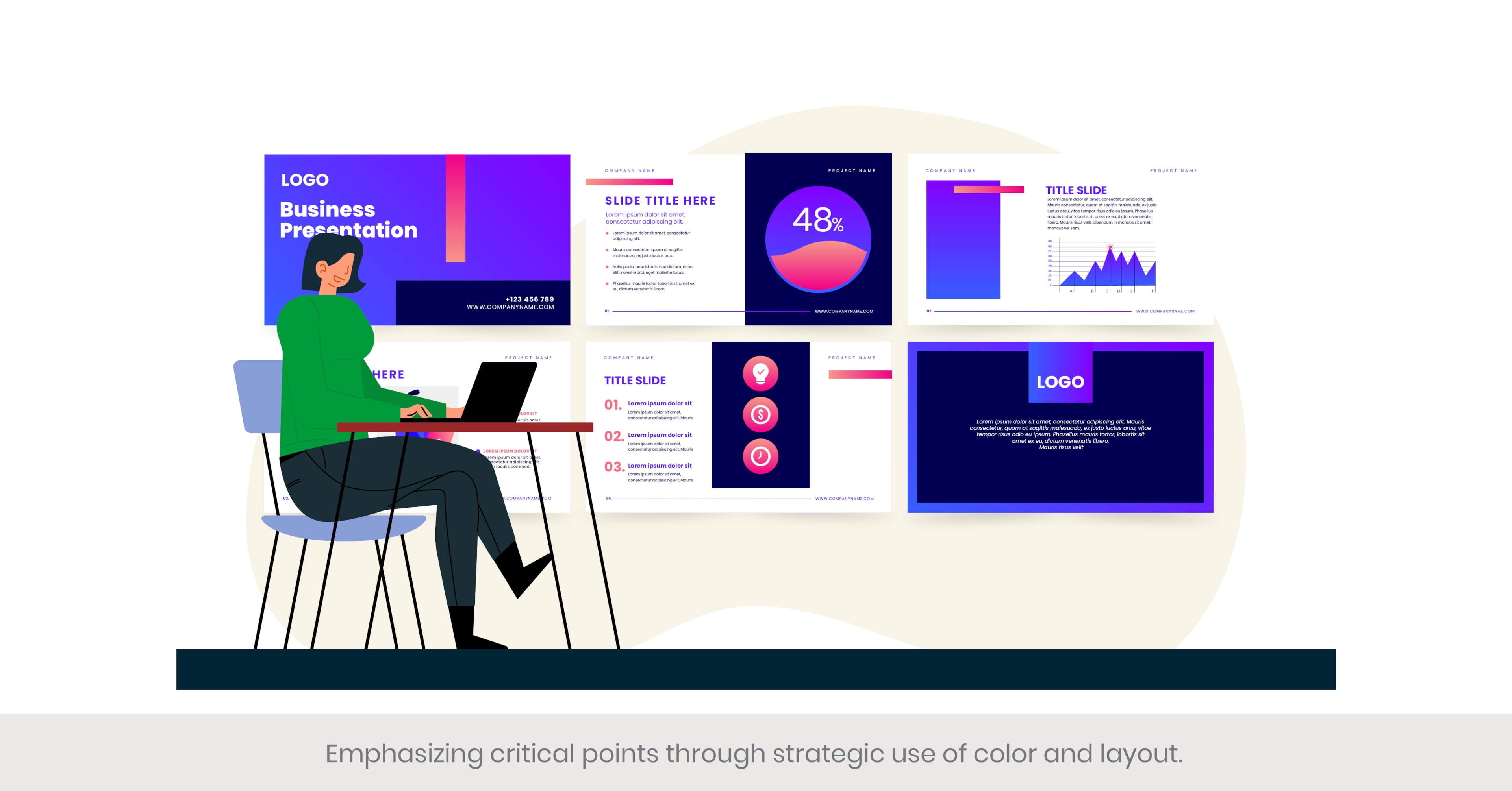
Emphasizing critical points through the strategic use of color and layout is an essential technique in CXO presentation design. Color and layout can significantly influence the audience's perception and understanding of the presented information. By carefully selecting colors and arranging content, presenters can highlight important information, guide the audience’s attention, and enhance the overall effectiveness of the presentation. This sub-topic explores how to use color and layout strategically to emphasize critical points and improve communication in executive presentations.
Background Information
The psychology of color and the principles of layout design have long been studied in various fields, including marketing, graphic design, and psychology. Colors can evoke emotions, convey messages, and attract attention, making them powerful tools in presentation design. Layout, on the other hand, refers to the arrangement of elements on a slide, which can affect the flow and readability of the information. Key principles include the use of contrasting colors to highlight key points, maintaining a balanced layout to avoid clutter, and using whitespace effectively to separate sections and enhance readability. Understanding these principles helps in designing presentations that are visually appealing and effective in communicating critical information.
Real-World Examples
Several leading companies effectively use color and layout to emphasize critical points in their presentations. For example, IBM uses a consistent blue color scheme to convey trust and professionalism, while highlighting important metrics and insights with contrasting colors like yellow or red. This approach helps in drawing attention to critical data points while maintaining a cohesive visual identity. Similarly, Apple’s presentations are known for their minimalist layout, which uses ample whitespace and strategic placement of visuals and text to emphasize key messages. These examples demonstrate how strategic use of color and layout can enhance the clarity and impact of executive presentations.
Creating Dedicated Sections for Q&A to Engage with the Audience

Introduction
Creating dedicated sections for Q&A to engage with the audience is a crucial element of successful CXO presentations. A well-structured Q&A session allows executives to address the audience’s concerns, clarify ambiguities, and provide deeper insights into the presentation content. It also fosters interaction, making the audience feel valued and engaged. This sub-topic explores the strategies for effectively incorporating Q&A sections in executive presentations, ensuring they contribute to the overall impact and effectiveness.
Background Information
The practice of including Q&A sessions in presentations has a long history, rooted in the principles of interactive communication. Q&A sections serve as a platform for real-time feedback and dialogue, helping presenters gauge audience understanding and interest. Structuring these sessions effectively involves setting aside specific time slots, preparing for potential questions, and creating a comfortable environment for audience participation. Techniques such as using clear signals to transition into the Q&A, repeating questions for clarity, and providing concise, thoughtful responses are key to successful Q&A sessions. Understanding these principles is essential for creating interactive and engaging presentations that resonate with executive audiences.
Real-World Examples
Companies like Salesforce and Google have mastered the art of incorporating Q&A sessions into their executive presentations. During Salesforce’s annual Dreamforce conference, CEO Marc Benioff dedicates substantial time to Q&A sessions, allowing stakeholders to ask questions about the company’s strategies and future plans. These sessions are structured to ensure that key questions are addressed comprehensively. Similarly, Google’s town hall meetings, known as TGIF, feature extensive Q&A sections where employees and stakeholders can pose questions to executives like Sundar Pichai. These examples illustrate how dedicated Q&A sections can enhance audience engagement and provide valuable insights, making the presentations more interactive and impactful.
Preparing Backup Content for Deeper Dives During Discussions

Introduction
Preparing backup content for deeper dives during discussions is an essential strategy in CXO presentation design. High-level executive presentations often require flexibility to address in-depth questions or explore specific topics in greater detail. Having well-prepared backup content ensures that presenters can provide comprehensive answers and delve into complex areas without disrupting the flow of the presentation. This sub-topic explores the importance of backup content and offers strategies for effectively preparing and utilizing it.
Background Information
The concept of backup content in presentations is rooted in the need for thorough preparation and adaptability. Historically, presenters relied on extensive notes and supplementary materials to handle unexpected questions or requests for more information. Modern presentation tools like PowerPoint and Google Slides allow for the integration of hidden slides or sections that can be quickly accessed if needed. Key elements of effective backup content include detailed data points, expanded explanations, and additional visual aids. Preparing this content involves anticipating potential questions and areas of interest, ensuring that the presenter is equipped to provide deeper insights without hesitation. Understanding these principles is crucial for creating dynamic and responsive presentations.
Real-World Examples
Successful examples of using backup content can be seen in the presentations of companies like Johnson & Johnson and SAP. During earnings calls, Johnson & Johnson executives often have detailed financial breakdowns and market analysis slides ready to address specific questions from analysts. Similarly, SAP’s presentations at industry conferences include additional slides with technical specifications and case studies that can be brought up if the audience seeks more detailed information. These examples highlight how having backup content prepared allows presenters to handle in-depth discussions confidently and effectively, enhancing the credibility and depth of the presentation.
Ensuring Smooth Transitions Between Topics to Maintain Flow

Introduction
Ensuring smooth transitions between topics to maintain flow is a critical element in CXO presentation design. Transitions are the bridges that connect different sections of a presentation, helping to guide the audience seamlessly from one topic to the next. Effective transitions enhance the coherence and fluidity of the presentation, making it easier for the audience to follow and understand the narrative. This sub-topic explores strategies for creating smooth transitions that maintain the flow and momentum of executive presentations.
Background Information
The importance of smooth transitions in presentations is well-documented in communication and presentation theory. Historically, presentations that lacked clear transitions often left audiences confused and disengaged. Key techniques for achieving smooth transitions include the use of signposting language (e.g., "Now that we've covered... let's move on to..."), visual cues (e.g., consistent slide designs or transition animations), and thematic connections that link one topic to the next logically. By preparing these transitions in advance, presenters can ensure that their narrative flows naturally and that each section builds on the previous one, maintaining the audience’s interest and comprehension throughout.
Real-World Examples
Companies like Amazon and McKinsey & Company exemplify the use of smooth transitions in their executive presentations. Amazon’s product launch events, for instance, are known for their seamless flow, with each new product or feature introduced with a brief recap of the previous section and a clear segue into the next. This keeps the audience engaged and ensures that the narrative remains coherent. Similarly, McKinsey’s consulting presentations often use clear, structured transitions to move between different strategic recommendations and analyses, helping clients to follow the logical progression of their arguments. These examples highlight the importance of planning and executing smooth transitions to maintain the flow of a presentation.
Frequently Asked Questions (FAQs)
1. How to create an executive-level presentation?
Creating an executive-level presentation involves understanding the audience’s needs and expectations. Start with a clear objective and outline the key points you want to cover. Use a minimalist design with high-quality visuals and concise text to enhance clarity. Incorporate data visualizations to support your points and ensure all data is accurate. Practice delivering the presentation to refine your delivery and anticipate questions. Tools like PowerPoint and Google Slides can be used to create professional presentations, ensuring they are compatible across different platforms.
2. What is the McKinsey style of presentation?
The McKinsey style of presentation is known for its clarity, structure, and emphasis on data-driven insights. Key elements include a clear storyline, well-defined sections, and concise text supported by high-quality graphics and data visualizations. The presentations are typically designed to facilitate decision-making, with each slide contributing to the overall narrative. The McKinsey style also emphasizes consistency in design and format, ensuring that the audience can easily follow the argument and focus on the critical information.
3. What is a C-Suite presentation?
A C-Suite presentation is designed specifically for senior executives, such as CEOs, CFOs, and other high-ranking officials in an organization. These presentations focus on strategic issues, financial performance, and high-level decision-making. Key characteristics include a clear and concise executive summary, detailed data analysis, and strategic recommendations. The design should be professional, with a focus on clarity and simplicity, using visuals to support the key messages without overwhelming the audience with unnecessary details.
4. How do you structure your presentation?
Structuring a presentation involves creating a clear outline that guides the audience through your content. Start with an engaging introduction that outlines the presentation’s objectives. Follow with the main body, divided into clear sections that cover each key point in detail. Use data and examples to support your arguments and maintain the audience's interest. Conclude with a summary of the main points and a call to action or next steps. Ensure each section flows logically into the next, using transitions to maintain coherence.
5. What are the key elements of a successful presentation?
Key elements of a successful presentation include a clear objective, engaging content, and a well-organized structure. Use a professional design with high-quality visuals and data visualizations to enhance understanding. Practice your delivery to ensure clarity and confidence, and anticipate questions from the audience. Tailor the content to the audience's needs and interests, focusing on delivering a clear, concise, and impactful message.
6. How can I make my presentation more engaging?
To make your presentation more engaging, use storytelling techniques to connect with your audience emotionally. Incorporate high-quality visuals, such as images, charts, and videos, to illustrate your points. Use interactive elements, like polls or Q&A sessions, to involve the audience. Keep the content concise and focused, and vary your delivery by changing your tone and pace. Practicing your delivery can also help you appear more confident and engaging.
7. What are some best practices for data visualization in presentations?
Best practices for data visualization in presentations include using the appropriate chart types for your data, such as bar charts for comparisons and line charts for trends. Keep the design simple and avoid clutter by focusing on key data points. Use contrasting colors to highlight important information and ensure that labels and legends are clear and readable. Providing context for the data and explaining its relevance to the audience can also enhance understanding.
8. How important is rehearsal for a successful presentation?
Rehearsal is crucial for a successful presentation. Practicing helps you become familiar with the content, refine your delivery, and identify any potential issues. Rehearsing in front of a mirror or a small audience can provide valuable feedback and boost your confidence. It also allows you to time your presentation, ensuring it fits within the allocated time. Rehearsal helps you anticipate questions and prepare responses, making you more effective during the actual presentation.
9. What tools can I use to create professional presentations?
Several tools can help you create professional presentations, including Microsoft PowerPoint, Google Slides, and Apple Keynote. These tools offer a range of templates, design options, and collaboration features. For advanced design and animation, you can use tools like Adobe Illustrator and Prezi. Additionally, online platforms like Canva and Visme provide easy-to-use interfaces with a variety of templates and graphics to enhance your presentation.
10. How can I ensure my presentation is accessible to all audiences?
To ensure your presentation is accessible to all audiences, use clear and simple language, and avoid jargon. Provide text alternatives for images and videos, services such as captions and transcripts. Use high-contrast colors and readable fonts to enhance visibility. Ensure that the presentation is compatible with screen readers and other assistive technologies. Providing a downloadable version of the presentation in accessible formats, such as PDF, can also help reach a wider audience.


%20(1).jpg)
%20(1).jpg)
