
Highlighting the Importance of Operational Data Visualization
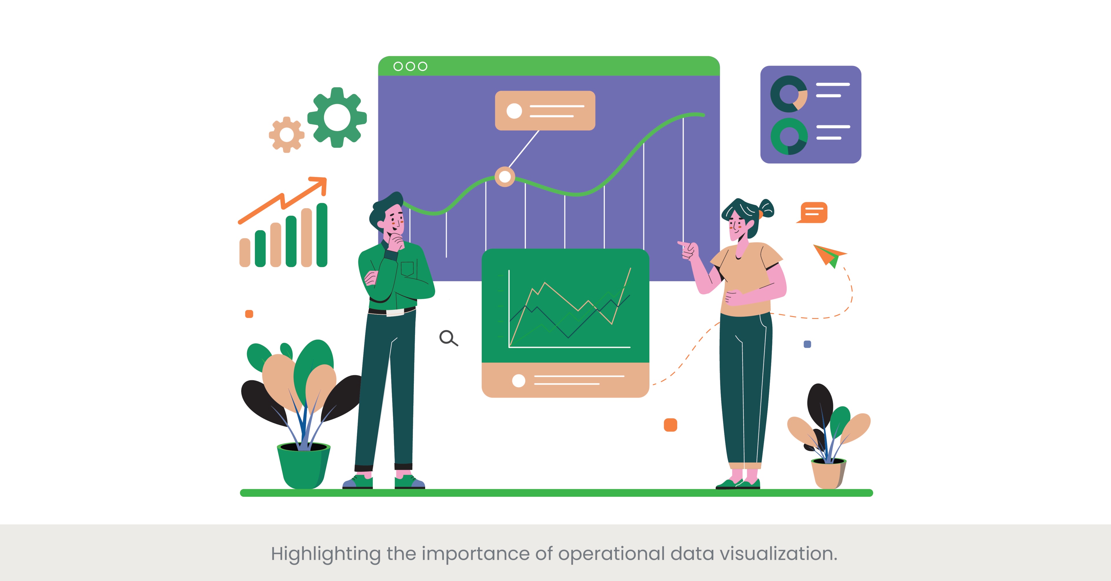
The Power of Visualizing Operational Data
Operational data visualization is crucial in COO presentation design, enabling chief operating officers to communicate complex data effectively and make informed decisions. By transforming raw data into visual formats like charts, graphs, and dashboards, COOs can highlight key metrics and trends, making it easier for stakeholders to grasp important insights quickly. This approach not only enhances clarity but also aids in strategic planning and operational efficiency. A well-designed visual representation of data can bridge the gap between data complexity and audience understanding, ensuring that key messages are effectively conveyed.
Deep Dive into Data Visualization Techniques
Data visualization techniques have evolved significantly, offering various tools and methods to present operational data effectively. Common techniques include bar charts, line graphs, pie charts, and heat maps, each serving different purposes depending on the data's nature and the message to be conveyed. Presentation design agencies often employ advanced data visualization software like Tableau or Power BI to create interactive and dynamic dashboards. These tools allow for real-time data updates and offer various customization options to align with the organization's brand guidelines and operational strategies. The choice of visualization technique depends on the type of data and the intended audience, ensuring that the presentation remains clear and impactful.
Practical Applications and Real-World Examples
In practice, many top companies utilize operational data visualization in their COO presentations to drive organizational success. For instance, a leading tech company might use interactive dashboards to showcase real-time performance metrics, helping the chief operating officer identify areas needing improvement and make quick decisions. Another example is a manufacturing firm that visualizes its production data through flowcharts and graphs, highlighting efficiency metrics and bottlenecks in the production process. These real-world applications demonstrate how effective data visualization can lead to better decision-making and operational efficiency.
References and Supporting Evidence
Research supports the importance of data visualization in enhancing operational presentations. According to a study by the Harvard Business Review, visual data representations can improve comprehension and retention by up to 400%. Another report by McKinsey & Company highlights that companies using advanced data visualization tools are twice as likely to be in the top quartile of financial performance within their industries. These findings validate the need for incorporating robust data visualization techniques in COO presentation design, emphasizing the role of presentation design agencies in crafting these visual tools.
By highlighting the importance of operational data visualization, COOs can ensure their presentations to teams are not only informative but also engaging and actionable, driving better decision-making and operational success.
Discussing the Integration of Real-Time Performance Metrics

The Value of Real-Time Performance Metrics in COO Presentations
Integrating real-time performance metrics into COO presentations is essential for providing up-to-date insights and facilitating timely decision-making. Real-time data allows chief operating officers to monitor operational performance continuously, identify trends, and address issues as they arise. A COO Presentation Design that incorporates real-time metrics ensures that the information presented is current and relevant, enhancing the credibility and impact of the presentation. This approach is particularly useful in fast-paced industries where conditions can change rapidly, requiring quick and informed responses.
Deep Dive into Real-Time Data Integration
Integrating real-time performance metrics into presentations involves using advanced data management systems and visualization tools. Technologies such as Internet of Things (IoT) sensors, big data analytics, and cloud computing enable the collection and analysis of real-time data across various operational areas. Presentation design agencies often utilize platforms like Power BI, Tableau, and Google Data Studio to create dynamic dashboards that update in real-time. These tools allow COOs to display live data feeds, interactive charts, and automated reports, ensuring that the presentation reflects the latest operational performance. This integration not only enhances the presentation's accuracy but also enables COOs to provide a more detailed and comprehensive overview of current operations.
Practical Applications and Industry Examples
Real-world applications of real-time performance metrics can be seen in various industries. For instance, in the logistics sector, companies like FedEx use real-time tracking systems to monitor shipment statuses and delivery times, integrating this data into COO presentations to optimize logistics operations. In the manufacturing industry, real-time metrics on production rates, equipment efficiency, and downtime are crucial for maintaining optimal performance and identifying issues promptly. A notable example is Tesla, which uses real-time data analytics to monitor its manufacturing processes and vehicle performance, providing detailed insights during operational reviews and strategy meetings.
References and Supporting Evidence
The effectiveness of integrating real-time performance metrics is well-supported by research. According to a study by Gartner, organizations that leverage real-time data analytics are 2.5 times more likely to achieve superior business performance. Another report by Deloitte emphasizes that real-time data integration can lead to a 20-30% improvement in operational efficiency by enabling more responsive and informed decision-making. These findings highlight the importance of real-time metrics in COO presentation design and the role of presentation design agencies in implementing these technologies effectively.
By integrating real-time performance metrics into their presentations, COOs can provide clients with a more accurate, timely, and actionable overview of operational performance, thereby enhancing decision-making and driving organizational success.
Designing Slides to Illustrate Complex Operational Processes Clearly
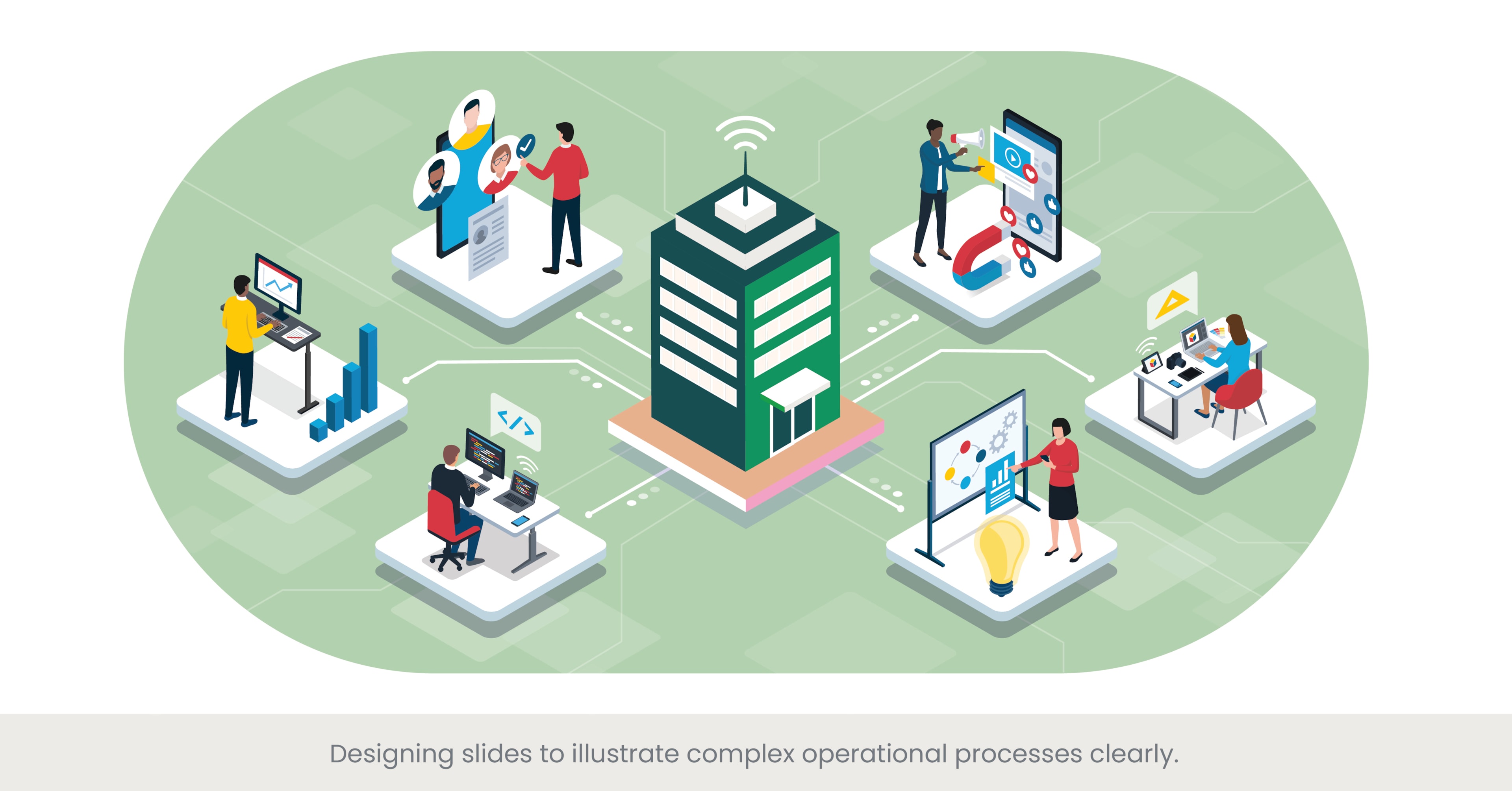
Clarity in Illustrating Complex Operational Processes
Designing slides that clearly illustrate complex operational processes is a critical aspect of effective COO Presentation Design. Chief operating officers often need to present intricate processes that involve multiple steps, departments, and variables. Using clear and well-structured slides helps in breaking down these complexities, making them understandable for all stakeholders. This approach not only enhances comprehension but also aids in strategic planning and decision-making, ensuring that key messages are conveyed effectively.
Deep Dive into Slide Design Techniques
Creating slides to illustrate complex operational processes involves several design techniques. One effective method is the use of flowcharts and process diagrams, which visually map out the steps and interconnections within a process. Presentation design agencies often recommend using clean, simple graphics and avoiding clutter to maintain clarity. Another technique is the use of color coding and labeling to differentiate between different stages or components of the process. This helps in highlighting key points and making the slides more visually appealing. Additionally, animation can be used to gradually reveal information, guiding the audience through the process step by step.
Practical Applications and Real-World Examples
Real-world examples of clear slide design for complex processes can be found across various industries. For instance, in the healthcare sector, hospital administrators might use detailed flowcharts to illustrate patient care pathways, highlighting each step from admission to discharge. In the manufacturing industry, companies like Toyota use visual management tools such as Kanban boards and process maps to explain their lean manufacturing processes. These tools help in visualizing workflow, identifying bottlenecks, and improving efficiency. Another example is Amazon, where COO presentations often include process diagrams to showcase the intricate logistics and supply chain operations, ensuring that stakeholders understand the entire workflow.
References and Supporting Evidence
Research supports the effectiveness of using visual aids to explain complex processes. According to a study by the University of Minnesota, presentations that incorporate visual elements are 43% more effective in persuading audiences. Additionally, a report by the Nielsen Norman Group highlights that well-designed visuals create presentations can improve comprehension by up to 89%. These findings underscore the importance of clear and effective slide design in COO presentations, validating the use of professional presentation design services to achieve this clarity.
By designing slides that clearly illustrate complex operational processes, COOs can ensure that their presentations are informative, engaging, and easy to understand, thereby enhancing communication and facilitating better decision-making.
Utilizing Diagrams and Flowcharts to Explain Systems and Infrastructures
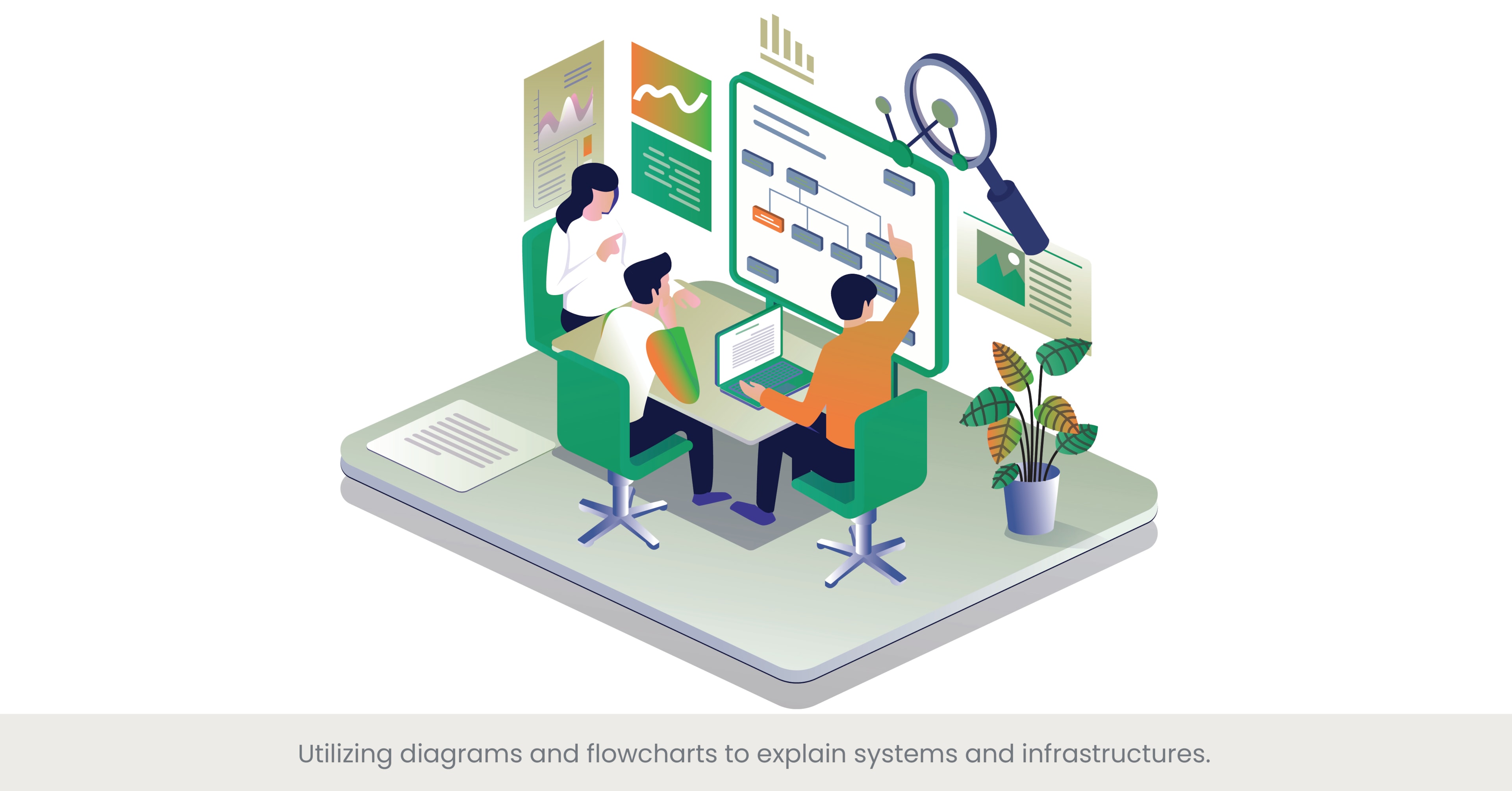
The Power of Diagrams and Flowcharts in COO Presentations
Utilizing diagrams and flowcharts in COO and design presentations is an effective way to explain complex systems and infrastructures. These visual tools help simplify intricate processes, making them easier to understand and follow. A COO Presentation Design expert leverages diagrams and flowcharts to break down large amounts of information into digestible parts, providing a clear and concise overview of operational systems. This approach enhances communication, allowing key stakeholders to grasp the nuances of the organization's processes quickly and efficiently.
Deep Dive into Diagram and Flowchart Techniques
Diagrams and flowcharts serve different purposes in visualizing systems and infrastructures. Flowcharts are ideal for illustrating step-by-step processes, showing how different stages are interconnected. They can be used to map out workflows, decision trees, and operational sequences. Diagrams, on the other hand, are versatile tools that can represent various structures, such as organizational hierarchies, network topologies, and system architectures. Presentation design agencies often employ these tools to create visually appealing and informative slides. Key techniques include using standardized symbols, maintaining consistency in design, and incorporating color codes to highlight different components or stages.
Practical Applications and Real-World Examples
Real-world applications of diagrams and flowcharts in COO presentations are abundant. For example, a chief operating officer at a tech company might use network diagrams to illustrate the infrastructure of their IT systems, showcasing how different servers and databases interact. In the logistics industry, flowcharts can map out the supply chain process, from procurement to delivery, highlighting each step and identifying potential bottlenecks. Another example is in healthcare, where process diagrams can explain patient flow through different departments, ensuring clarity in operational procedures. Companies like IBM and Siemens frequently use these visual tools in their presentations to communicate complex information effectively.
References and Supporting Evidence
The effectiveness of using presentation skills with diagrams and flowcharts is supported by various studies and expert insights. According to a report by the Project Management Institute, visual project management tools like flowcharts can improve project success rates by 28%. Additionally, a study by the University of Toronto found that visual aids enhance learning and retention by up to 29%. These findings validate the importance of using diagrams and flowcharts in COO presentation design, emphasizing the role of professional and presentation design agency and services in creating these visuals.
By incorporating diagrams and flowcharts into their presentations, COOs can explain complex systems and infrastructures more clearly, ensuring that their audience can follow along and understand the operational details.
Customizing Visual Elements to Align with Operational Strategies
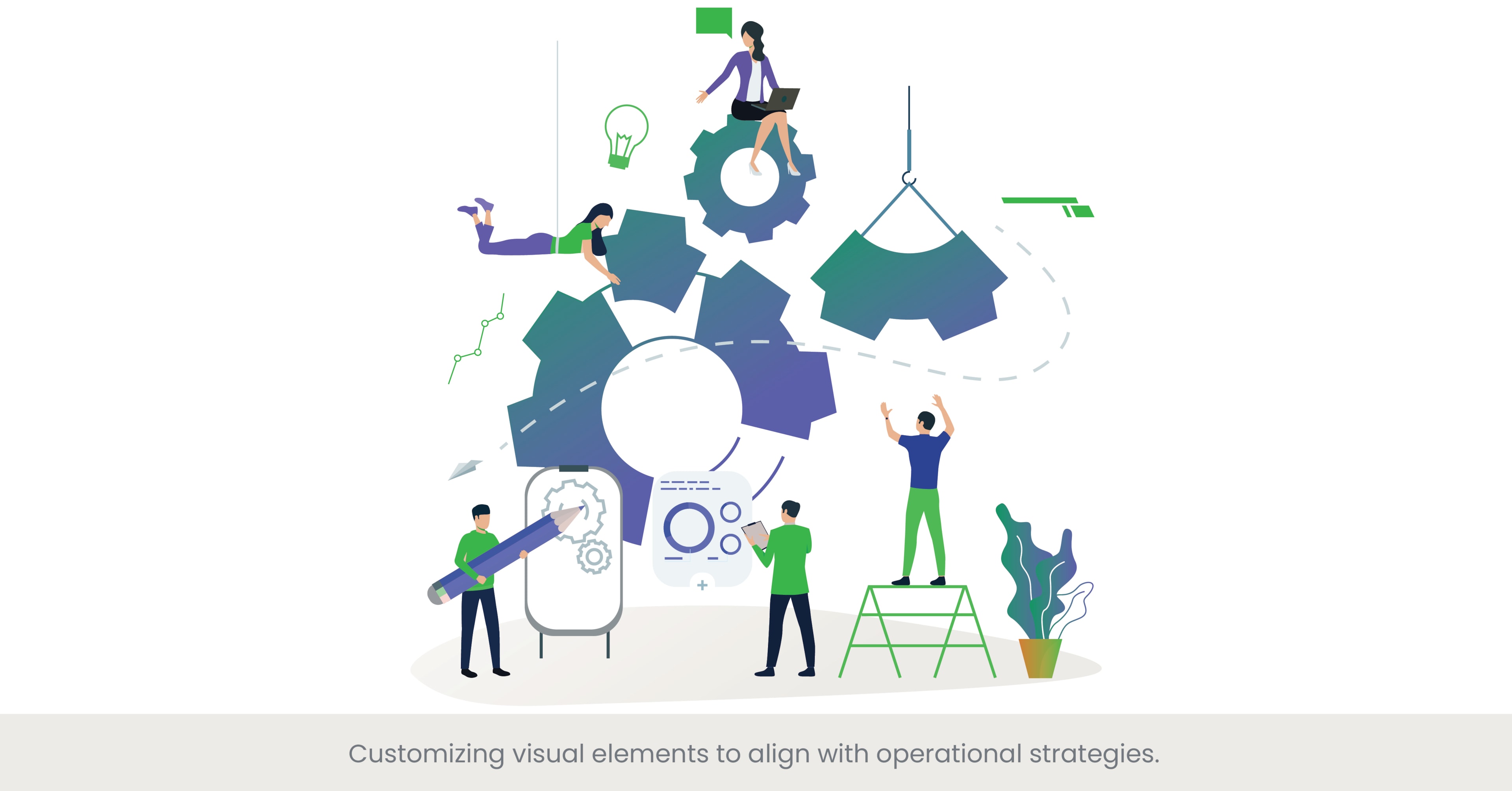
Tailoring Visual Elements to Operational Strategies
Customizing visual elements to align with operational strategies is essential for creating effective COO presentations. By tailoring visuals such as graphs, charts, and icons to reflect specific operational goals and strategies, chief operating officers can ensure that their presentations are not only visually appealing but also strategically aligned. This approach helps to reinforce key messages, making it easier for stakeholders to understand and support the organization’s operational plans. A COO Presentation Design expert focuses on creating visuals that resonate with the audience while highlighting the strategic priorities of the organization.
Deep Dive into Customization Techniques
Customizing visual elements involves several techniques to ensure they align with operational strategies. One key technique is using color schemes that match the company’s branding and highlight different operational areas. Another is incorporating company-specific icons and imagery that reflect the organization’s culture and strategic initiatives. Presentation design agencies often recommend using consistent visual themes across all slides to maintain a cohesive, consistent look, and feel. Additionally, customizing data visualizations to highlight specific KPIs and operational metrics helps to focus the audience’s attention on critical areas of performance.
Practical Applications and Real-World Examples
In practice, many organizations customize their presentation visuals to align with their operational strategies. For example, a manufacturing company might use customized Gantt charts to showcase their production schedules and highlight key milestones. In the financial sector, COOs might employ tailored financial dashboards that reflect the company’s specific financial strategies and goals. A notable example is General Electric (GE), where presentations often include customized visuals that align with their operational excellence strategies, such as process improvement and efficiency metrics. These tailored visuals help to communicate complex strategies clearly and effectively to stakeholders.
References and Supporting Evidence
Research supports the effectiveness of customizing visual elements in presentations. According to a study by the Corporate Executive Board, presentations that are visually aligned with strategic goals are 30% more likely to persuade stakeholders to take desired actions. Another report by the Visual Teaching Alliance highlights that visual aids improve learning and comprehension by up to 400%. These findings validate the importance of customizing visuals in COO presentation design, emphasizing the role of presentation design agencies in creating strategically aligned visuals.
By customizing visual elements to align with operational strategies, COOs can enhance the effectiveness of their presentations, ensuring that they communicate strategic priorities clearly and engage their own team and audience effectively.
Emphasizing Clarity and Precision in Presenting Operational Updates

The Necessity of Clarity and Precision in COO Presentations
Clarity and precision are paramount in COO presentation design, right course, particularly when presenting operational updates. Chief operating officers must convey complex information succinctly and accurately to ensure that stakeholders understand the current status, challenges, and progress of operations. Clear and precise presentations help in building trust, facilitating informed decision-making, and driving organizational success. A COO Presentation Design Agency focuses on your presentation skills creating presentations that highlight essential data and insights without overwhelming the audience.
Deep Dive into Techniques for Clarity and Precision
Achieving clarity and precision involves several key techniques. Firstly, simplifying complex data through visual aids such as charts, graphs, and infographics can make the information more accessible. Secondly, using straightforward language and avoiding jargon ensures that the message is easily understood by all audience members, regardless of their technical background. Another technique is to structure the presentation logically, with a clear introduction, body, and conclusion, and to use bullet points and headings to break down the information into manageable sections. Additionally, providing summaries and key takeaways at the end of each section can reinforce the main points.
Practical Applications and Real-World Examples
Real-world examples of clear and precise operational presentations can be found in various industries. For instance, in the technology sector, companies like Microsoft and Google often present operational updates using clear and concise slides that highlight key performance indicators (KPIs) and milestones. These presentations use a combination of data visualization and straightforward language to convey their messages effectively. In the automotive industry, companies like Toyota use clear process maps and dashboards to update stakeholders on production and quality metrics, ensuring that all relevant information is presented in an easily digestible format. These examples demonstrate how clarity and precision can enhance the effectiveness of COO presentations.
References and Supporting Evidence
Research underscores the importance of clarity and precision in presentations. According to a study by the McKinsey Global Institute, clear communication of operational updates can improve organizational performance by up to 25%. Another report by the Harvard Business Review highlights that presentations emphasizing clarity and precision are more likely to lead to successful outcomes, such as securing stakeholder buy-in and driving strategic initiatives. These findings validate the need for clear and precise presentation design, reinforcing the value of professional presentation services in achieving this clarity.
By emphasizing clarity and precision in presenting operational updates, COOs can ensure their presentations are informative, engaging, and effective, ultimately supporting better decision-making and organizational success.
Using Color Codes to Distinguish Between Different Operational Areas

The Role of Color Coding in COO Presentations
Using color codes to distinguish between different operational areas is a powerful technique in COO Presentation Design. This method enhances the visual appeal of presentations and helps in organizing information, making it easier for the audience to follow and understand. Chief operating officers can use color coding to highlight various departments, processes, or performance metrics, ensuring that key information stands out. This approach not only improves clarity but also aids in quick comprehension, which is crucial during high-level presentations where time and attention span may be limited.
Deep Dive into Color Coding Techniques
Color coding involves assigning specific colors to different elements within a presentation to create a visual distinction. For example, one might use green to indicate areas performing well, yellow for areas needing attention, and red for critical issues. Presentation design agencies often employ tools and templates that facilitate the consistent use of color schemes aligned with the company’s brand guidelines. Additionally, color coding can be applied to charts, graphs, and tables to distinguish between various data sets, making it easier for stakeholders to compare and analyze information. It's essential to use colors thoughtfully to avoid overwhelming the audience and to ensure that the colors chosen are accessible to all viewers, including those with color vision deficiencies.
Practical Applications and Real-World Examples
Practical applications of color coding can be seen in various successful presentations. For instance, a tech company like IBM might use color-coded dashboards in their COO presentations to differentiate between project statuses, resource allocation, and performance metrics. In the healthcare industry, hospital administrators might use color-coded flowcharts to illustrate patient care pathways, with different colors representing different stages of patient treatment. Another example is in financial services, where firms like JP Morgan use color-coded financial reports to indicate market performance, investment returns, and risk levels. These real-world applications demonstrate how color coding can enhance the clarity and effectiveness of operational presentations.
References and Supporting Evidence
The effectiveness of color coding is supported by research and best practices. According to a study by the International Journal of Human-Computer Studies, color-coded information improves comprehension and retention by up to 78%. Another report by the Nielsen Norman Group highlights that color coding can reduce cognitive load, making it easier for audiences to process complex information quickly. These findings validate the importance of using color codes in COO presentation design, emphasizing the role of presentation design agencies in implementing these techniques effectively.
By using color codes to distinguish between different operational areas, COOs can enhance the clarity and impact of their presentations, ensuring that key information is communicated effectively and efficiently to leadership team.
Implementing Dynamic Elements to Reflect Changes in Operational Status
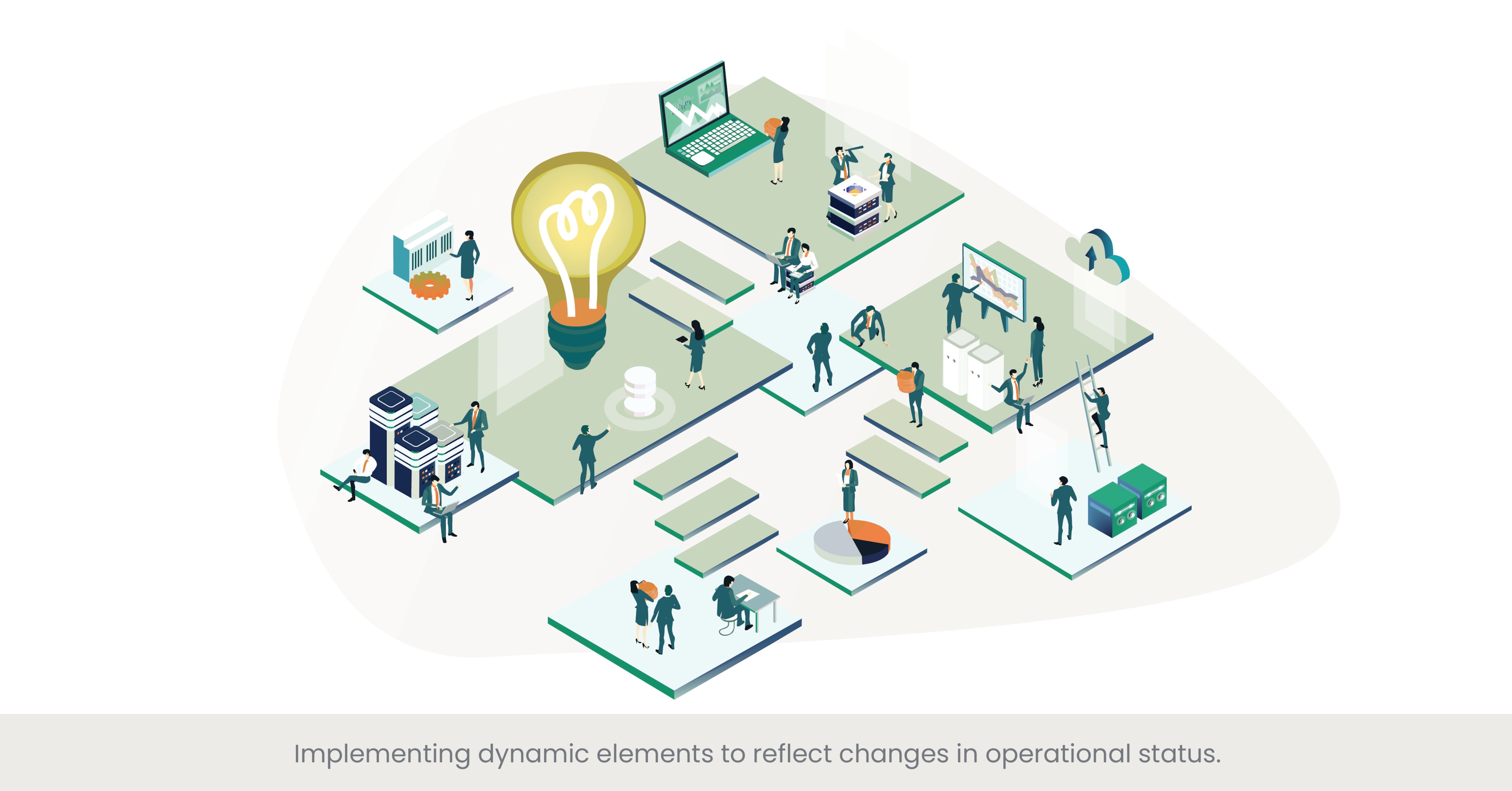
The Importance of Dynamic Elements in COO Presentations
Implementing dynamic elements in COO presentations is essential for reflecting real-time changes in operational status. These elements can include live data feeds, animations, and interactive components that update automatically as new data becomes available. This approach ensures that the information presented is always current, providing a more accurate and engaging representation of the operational landscape. A COO Presentation Design expert incorporates these dynamic features to enhance the presentation's relevance and interactivity, keeping the audience informed and engaged.
Deep Dive into Dynamic Presentation Techniques
Dynamic elements in presentations can take various forms, from live data dashboards to animated charts and graphs. Live data integration allows presentations to pull information directly from databases or real-time monitoring systems, ensuring that the data displayed is up-to-date. Animations can be used to highlight changes over time, such as trends in performance metrics or shifts in resource allocation. Interactive elements, like clickable charts and drill-down capabilities, enable the audience to explore data in more detail during the presentation. Presentation design agencies often use advanced software tools such as Power BI, Tableau, and Google Data Studio to create these dynamic elements, ensuring a seamless integration with existing data systems.
Practical Applications and Real-World Examples
Real-world examples of dynamic elements in COO presentations are prevalent in industries that rely heavily on real-time data. For instance, in the retail sector, companies like Walmart use live sales data dashboards in their presentations to monitor inventory levels, sales performance, and customer trends. In the manufacturing industry, firms like Siemens employ animated process maps and real-time production metrics to showcase operational efficiency and identify bottlenecks. Another example is in the financial services industry, where dynamic financial models and live market data feeds are used to update stakeholders on current market conditions and investment performance. These examples illustrate how dynamic elements can make presentations more informative and responsive to real-time changes.
References and Supporting Evidence
The benefits of using dynamic elements in presentations are well-documented. According to a report by McKinsey & Company, organizations that use real-time data in their decision-making processes can improve operational efficiency by up to 20%. A study by the Aberdeen Group found that companies leveraging dynamic data visualization tools are 28% more likely to find the information they need quickly and make informed decisions. These findings highlight the importance of integrating dynamic elements in COO presentation design, validating the practices of presentation design agencies that specialize in this area.
By implementing dynamic elements to reflect changes in the business model and operational status, COOs can create more engaging and accurate presentations that provide real-time insights, enhancing decision-making and operational agility.
Providing Examples of Effective COO Presentation Layouts

The Significance of Effective Presentation Layouts
An effective presentation layout is critical for COO presentations as it helps in organizing content logically and enhancing the visual appeal. A well-structured layout ensures that the audience can easily follow the presentation, understand the key messages, and stay engaged throughout. COO Presentation Design focuses on creating layouts that facilitate clear communication, making complex information accessible and visually appealing. By employing strategic layouts, COOs can deliver their messages more effectively, ensuring that operational updates are conveyed in an impactful manner.
Deep Dive into Layout Design Principles
Designing an effective presentation layout involves several key principles. One of the most important is the use of a clear hierarchy, which guides the audience's attention through the content in a logical order. This can be achieved by varying font sizes, using headings and subheadings, and organizing content into sections. Consistency is another crucial principle, ensuring that fonts, colors, and design elements are uniform across all slides. Presentation design agencies often employ grid-based layouts to align text and visuals neatly, enhancing readability and aesthetic appeal. Additionally, incorporating white space strategically helps to avoid clutter and makes the presentation look clean and professional.
Practical Applications and Real-World Examples
Examples of effective COO presentation layouts can be found in various high-profile companies. For instance, Tesla's quarterly operational updates often feature clean, grid-based layouts with clear headings, ample white space, and high-quality visuals. These layouts help to highlight key performance metrics and strategic updates clearly. Another example is General Electric (GE), which uses structured layouts in their presentations to display complex operational data through well-organized charts, tables, and infographics. These layouts facilitate quick comprehension and ensure that important information stands out. These real-world applications demonstrate how thoughtful layout design can enhance the effectiveness of COO presentations.
References and Supporting Evidence
The importance of effective presentation layouts is supported by research and industry standards. According to a study by the Presentation Guild, presentations with well-designed layouts are perceived as more credible and professional, significantly enhancing audience engagement. A report by Nielsen Norman Group highlights that clear and consistent layouts improve information retention by up to 40%. These findings validate the emphasis on layout design in COO presentation design, underscoring the role and core responsibilities of presentation design agencies in crafting impactful layouts.
By providing examples of effective COO presentation layouts, COOs can gain insights into best practices and tips for organizing and presenting their content, ensuring that their presentations are both informative and visually appealing.
Discussing the Balance Between Detail and Overview in Operational Presentations

Finding the Right Balance in COO Presentations
Balancing detail and overview in operational presentations is crucial for ensuring that key messages are communicated effectively without overwhelming the audience. Chief operating officers must present comprehensive information while maintaining a clear and concise narrative that highlights the most critical aspects. This balance is essential in COO Presentation Design, as it allows stakeholders to grasp the big picture while also understanding the finer details that drive operational success. Achieving this balance ensures that presentations are both informative and engaging, providing the necessary depth without losing focus.
Deep Dive into Balancing Techniques
Achieving the right balance between detail and overview involves several techniques. One effective method is to start with an executive summary that provides a high-level overview of the presentation's key points. This can be followed by more detailed sections that delve into specific areas, such as performance metrics, operational challenges, and strategic initiatives. Presentation templates can be designed to facilitate this structure, ensuring a logical flow from overview to detail. Additionally, using visual aids such as infographics and summary charts can help condense complex information into digestible formats. It's also important to prioritize content, focusing on the most critical data and insights that align with the presentation's objectives.
Practical Applications and Real-World Examples
Real-world examples of balancing detail and overview in COO presentations can be found in various industries. For instance, at Amazon's annual operational reviews, presentations typically begin with a broad overview of the company's performance, followed by detailed analyses of specific business units and operational metrics. This approach ensures that stakeholders get a comprehensive understanding of overall performance before diving into the specifics. Similarly, in the automotive industry, companies like Ford use structured presentations that start with an overview of market conditions and strategic goals, followed by detailed breakdowns of production data, financial performance, and innovation initiatives. These examples demonstrate how to effectively balance detail and overview in operational presentations.
References and Supporting Evidence
Research supports the importance of balancing detail and overview in presentations. According to a study by the Harvard Business Review, presentations that effectively balance high-level overviews with detailed information are more likely to keep the audience engaged and facilitate better decision-making. Another report by McKinsey & Company highlights that providing an executive summary at the beginning of a presentation can improve audience comprehension and retention of key messages by up to 30%. These findings underscore the importance of this balance in COO presentation design, emphasizing the role of professional presentation services in achieving it.
By discussing the balance of effort between detail and overview, COOs can ensure their presentations are well-structured and effective, providing their team and stakeholders with both a comprehensive understanding and the necessary detailed insights to drive future organizational success.
Frequently Asked Questions (FAQs)
1. How to start a presentation on leadership?
Starting a presentation on leadership involves capturing the the speaker and audience's attention and setting the tone for the discussion. Begin with a powerful quote or anecdote related to leadership, then provide a brief overview of what the presentation will cover. Highlight the importance of leadership in achieving organizational success and outline the key topics to be discussed. This approach sets a clear agenda and engages the audience right from the very start up.
2. Are SlidesGo free?
SlidesGo offers both free and premium image templates for presentations. While many templates are available for free, offering a wide range of designs and styles, premium templates require a subscription for access. Free templates can be a great resource for creating visually appealing presentations without any cost.
3. How to get fancy Google Slides?
To create fancy Google Slides, start by choosing a professional and visually appealing template from Google Slides' template gallery or third-party websites like SlidesGo or SlidesCarnival. Customize and edit the template with your brand colors, fonts, and images. Use high-quality visuals, infographics, and animations to enhance the presentation. Additionally, incorporate multimedia elements like videos, video, and interactive charts to make your slides more engaging.
4. Where can I download PPT templates for free?
You can download free PPT templates from various online resources. Some popular websites offering free PowerPoint templates include:
- SlidesGo (www.slidesgo.com)
- SlidesCarnival (www.slidescarnival.com)
- PowerPoint Styles (www.powerpointstyles.com)
- Presentation Magazine (www.presentationmagazine.com)
These sites offer designers a wide range of templates suitable for different types of presentations, from business to educational purposes.
5. How to effectively visualize operational data in presentations?
To effectively visualize operational data, use clear and concise charts, graphs, and dashboards. Ensure that the visual elements are easy to understand and highlight key metrics. Tools like Power BI and Tableau can help create interactive and dynamic visualizations. Consistently use color codes and labels to differentiate data points, and avoid clutter by focusing on the most relevant information.
6. What are the benefits of using real-time performance metrics in presentations?
Using real-time performance metrics in presentations ensures that the information is current and relevant. It allows for immediate insights and quick decision-making. Real-time data can highlight trends, identify issues, and provide a dynamic view of operational performance. This approach enhances the credibility and impact of the presentation by providing the most up-to-date information.
7. How can diagrams and flowcharts improve understanding of complex processes?
Diagrams and flowcharts simplify complex processes by breaking them down into visual steps. They help in organizing information logically and making connections between different parts of a process. This visual representation of complex ideas makes it easier for the audience to follow and understand complex systems, ensuring that key points and ideas in new processes are conveyed effectively.
8. Why is customizing visual elements important in operational presentations?
Customizing visual elements of keynote presentation to align with operational and marketing strategies ensures that the presentation is not only visually appealing but also strategically aligned. It reinforces key messages and makes the presentation more relevant to the audience. Customization includes using company-specific colors, icons, and images, which helps in maintaining brand consistency and enhancing the overall impact of the presentation.
9. What techniques can enhance clarity and precision in COO presentations?
To enhance clarity and precision, use simple and direct language, avoid jargon, and focus on key messages. Use visual aids like charts and graphs to illustrate data clearly. Structure the talk, course, or presentation logically with a clear introduction, body, and conclusion. Summarize key points at the end of each section and provide takeaways to reinforce the talk or main messages.
10. How does balancing detail and overview benefit operational presentations?
Balancing detail and overview ensures that the presentation is comprehensive yet concise. It allows the audience to grasp the big picture while understanding important specifics. This balance helps in maintaining engagement, preventing information overload, and ensuring that key messages are communicated effectively. Starting with an overview and then delving into details provides a structured approach that enhances understanding and retention.


%20(1).jpg)
%20(1).jpg)


