Utilizing Augmented Reality in Posters
Introduction: Revolutionizing Poster Design with Augmented Reality
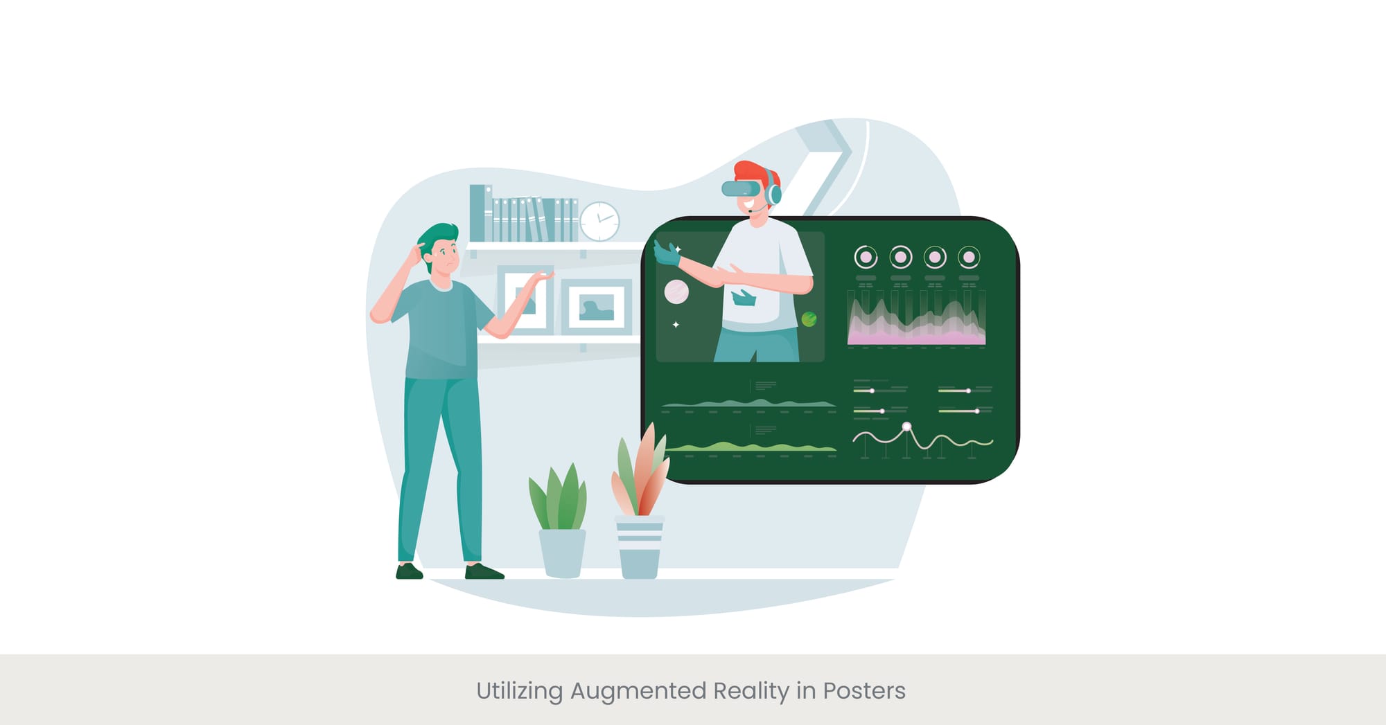
Augmented Reality (AR) is transforming poster display and design by adding an interactive dimension that enhances viewer engagement and comprehension. By superimposing digital information onto the physical world, AR in posters can turn static displays into dynamic experiences.
Background: The Emergence of AR in Visual Communication
Augmented reality has steadily gained traction in various fields, including advertising, education, and art, due to its ability to blend digital and real-world elements seamlessly. In the context of print and poster design, AR introduces a new layer of interaction, allowing viewers to access multimedia content simply by scanning the poster with a smart device. This has made poster presentation tools equipped with AR an essential part of cutting-edge design for enhancing the visual appeal of posters.
Real-World Applications and Case Studies
For example, at an international tech expo event, a series of posters equipped with AR capabilities allowed attendees to view 3D models of new gadgets by pointing their smartphones at the images. This not only increased the dwell time but also enhanced the attendees' understanding and recall of the product features. In fact, AR is fast becoming an indispensable tool for professional poster design, especially for conferences where networking strategies are often integrated into the design to improve engagement.
Expert Opinions and Research Insights
Experts suggest that AR can significantly enhance the educational and promotional value of posters by making the information more accessible and engaging. According to a study published in "Journal of Interactive Marketing," posters with AR elements achieve higher engagement rates and better information retention among viewers. Designers are encouraged to integrate AR thoughtfully to ensure that it adds value without overshadowing the content itself. As visual aid design for posters becomes more sophisticated, experts advocate for using AR to support the overall poster design, improving both content delivery and interactivity.
Animation and Motion Graphics for Dynamic Posters
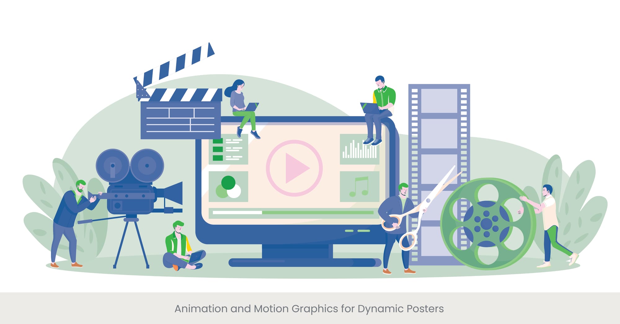
Introduction: Bringing Posters to Life with Animation
Animation and motion graphics offer a vibrant way to captivate and engage an audience, transforming traditional posters into dynamic visual narratives. These technologies enable designers to incorporate movement and storytelling elements that attract attention and convey messages effectively, much like poster presentation tools that enhance how information is displayed.
Background: The Evolution of Animated Design
Historically, animation has been used primarily in film and television, but advances in software and digital technology have made it accessible for broader applications, including educational and promotional posters. Motion graphics blend graphic design with animation to create the illusion of motion, adding a layer of depth and interaction to static images, thus transforming basic poster designs into professional poster designs that are both eye-catching and functional.
Real-World Examples of Animation in Posters
At a recent digital art exhibition, animated posters were used to showcase artists' works, with subtle animations that highlighted different elements of the art over time. This approach not only drew the viewer’s eye but also provided a unique, immersive experience that static posters could not achieve. This is an example of how visual aid design for posters can elevate the overall experience, incorporating animation to give deeper insight into the subject matter.
Expert Insights and Practical Applications
Experts in digital design recommend using animation sparingly to enhance the message without overwhelming the viewer. For instance, "Dynamic Design Techniques" suggests that animations should be purposeful, enhancing the understanding of the poster’s content rather than merely serving as decoration. Tools like Adobe After Effects and Blender can be used to create sophisticated animations that are both informative and visually appealing, making them indispensable poster presentation tools for those looking to make a lasting impact.
3D Elements in Poster Design
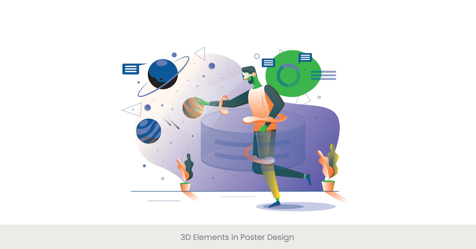
Introduction: Enhancing Depth with 3D Design
Incorporating 3D elements into poster design can dramatically enhance the poster session visual impact and viewer engagement. This technique adds depth and realism, making the content more immersive and interactive. Professional poster design often includes 3D elements to draw attention and convey complex concepts clearly.
Background: The Rise of 3D in Graphic Design
The integration of 3D design elements has become increasingly popular in graphic design due to advancements in software and rendering technologies. This trend allows designers to create visuals that are not only eye-catching but also more representative of complex data or concepts, providing a richer experience to the audience. Poster presentation tools that utilize 3D elements are particularly useful in educational and tech-related poster design, where visualizing complex concepts or systems is essential.
Real-World Examples of 3D Poster Innovations
At a scientific conference, a research team used 3D elements to depict complex molecular structures on their poster. This approach allowed conference attendees to better visualize the spatial relationships and dynamics within the molecule, significantly enhancing their understanding of the research project and findings. This is a prime example of how visual aid design for posters can transform the communication of scientific information by making it more accessible and interactive.
Expert Insights and Technological Advancements
Experts in visual communication advocate for the strategic use of 3D elements to ensure they serve the poster’s educational or promotional objectives effectively. "Innovations in Visual Design," a well-regarded publication, suggests using 3D modeling software like Autodesk Maya or Blender to create detailed and accurate representations. Additionally, it's important to consider the balance and integration of 3D elements within the poster to maintain clarity and focus on the main message. Using poster presentation tools that allow for 3D integration can help designers craft visually dynamic and effective presentations.
Experimental Typography in Posters
Introduction: Pushing Boundaries with Typography
Experimental typography is an innovative design technique that explores unique font treatments, innovative layouts, and text arrangements to elevate the aesthetic and communicative power of posters. This approach not only attracts attention but also adds depth to the message being conveyed, much like professional poster design that aims to engage the viewer through creative visual strategies.
Background: The Evolution of Typographic Design
Typography in design has evolved from merely functional to an expressive art form. Designers have begun to experiment with fonts, varying typefaces, sizes, orientations, and compositions to break from conventional layouts and engage audiences in new ways. This experimentation can turn text into a visual tool that complements the graphical elements of a poster, enhancing visual aid design for posters.
Real-World Examples of Experimental Typography
At a design exposition, one standout poster featured distorted text that flowed around other visual elements, simulating water movement. This creative use of typography not only captured the theme of fluid dynamics but also made the poster stand out, drawing viewers in for a closer look. By integrating such techniques, posters become more than just a display of information; they become a visual aid design for posters that tells a story.
Expert Insights and Best Practices
Experts in graphic design stress the importance of maintaining readability and purpose when experimenting with typography. "Creative Typography in Modern Design," a leading resource, recommends balancing innovative type treatments with clear communication goals. Tools like Adobe Illustrator and InDesign offer extensive features and templates that allow designers to explore creative typography without sacrificing the poster’s overall clarity and impact.
Keep Up with the Latest Design Trends! Encourage readers to stay informed by subscribing to INK PPT’s blog.
Sustainable Materials and Practices in Poster Creation
Introduction: Embracing Eco-Friendly Design
Incorporating sustainable materials and practices into poster creation reflects a growing commitment to environmental responsibility in the design community. By choosing eco-friendly options, designers not only minimize ecological impact but also set a standard for sustainability in visual communications.
Background: The Shift Toward Sustainability in Design
The design industry has seen a significant shift towards sustainability, driven by an increased awareness of environmental issues and consumer demand for greener products. This trend involves using recycled materials, employing energy-efficient processes, and designing for reuse and recyclability.
Real-World Examples of Sustainable Poster Design
An innovative example was seen at an environmental conference where all posters were printed on 100% recycled paper using soy-based inks. Additionally, digital displays were powered by solar energy, significantly reducing the carbon footprint of the event’s visual presentations.
Expert Insights and Future Directions
Experts in sustainable design advocate for a holistic approach that considers the entire lifecycle of design products. "Green Graphic Design" suggests that designers should not only focus on materials and production but also on the longevity and disposal of their creations. Resources like the Sustainable Green Printing Partnership provide guidelines and certifications that can help designers make informed choices about materials and methods that align with sustainability goals.
Interactive Infographics for Enhanced Engagement
Introduction: The Powerpoint of Interaction in Infographics
Interactive infographics have transformed the way information is presented in posters, turning static data and charts into engaging, dynamic experiences. By allowing audiences to interact directly with the data, these infographics can significantly increase understanding and retention.
Background: Evolution of Infographics in Digital Communication
Originally simple visual representations of data, infographics have evolved into complex interactive tools thanks to advancements in digital technology. This evolution has enabled designers to incorporate elements like clickable areas, hover effects, and real-time data updates, which make infographics more than just visually appealing—they become a practical tool for exploration and discovery.
Real-World Applications and Success Stories
For example, at a recent public health symposium, a research project with an interactive infographic poster detailing the spread of a virus allowed viewers to select different regions and time frames. This feature provided personalized insights into specific data points, enhancing the educational value of research poster and the information presented.
Expert Insights and Practical Recommendations
Experts recommend that when designing interactive infographics, clarity should remain a top priority. Overloading an infographic with too much interaction or complex data can overwhelm the viewer. Tools like Tableau Public and Adobe Animate are praised for their usability and effectiveness in creating sophisticated interactive elements without compromising on user-friendliness. Designers are encouraged to keep the user journey in mind, ensuring that the interactions are intuitive and informative.
Blending Art and Science in Poster Design
Introduction: Fusing Creativity with Accuracy
The integration of artistic elements with scientific data in research poster design can significantly enhance the visual appeal and communicative effectiveness of many scientific poster presentations. This approach not only attracts a wider audience but also facilitates a deeper understanding of complex scientific concepts through visual storytelling.
Background: The Intersection of Art and Science
Historically, art and science have been viewed as distinct disciplines, but their convergence in modern design practices has proven highly effective for educational and communicative purposes. Utilizing artistic techniques to illustrate scientific data, such as through detailed illustrations or creative data visualizations, can make abstract concepts more tangible and relatable.
Real-World Examples of Successful Integration
A notable example can be seen in a poster presentation at an environmental science conference, where the presenter used watercolor effects to depict chemical processes in the atmosphere. This artistic representation not only captured the audience's attention but also helped convey the fluid dynamics involved in a more intuitive and engaging manner.
Expert Insights and Design Recommendations
Experts in scientific communication advocate for a balanced approach where artistic elements do not overshadow the scientific content present. "Art in Science Communication," a publication by a leading expert in the field, recommends employing design principles that enhance the clarity and precision of scientific data while incorporating artistic flair to capture interest and evoke emotional responses. Tools like Adobe Illustrator and Corel Painter are often recommended for their capabilities to blend artistic styles with technical precision.
Want to See Real-World Impact with INK PPT?
Custom Illustrations as a Tool for Storytelling
Introduction: Visualizing Stories Through Custom Illustrations
Custom illustrations offer a powerful means of storytelling within posters, enabling presenters and researchers to convey complex narratives or data through unique, engaging visuals. This artistic approach research posters not only captures the audience’s attention but also aids in deeper understanding and retention of information.
Background: The Role of Illustration in Communication
Illustrations have been used historically to explain and entertain, serving as a bridge between the communicator and the audience. In the context of poster design, custom illustrations can personalize and elevate the presentation, making abstract or dense information more accessible and memorable.
Real-World Applications and Impact
For instance, a conservation organization used custom illustrations to depict the impact of climate change on various ecosystems in their educational posters. These illustrations provided scientific posters with a vivid portrayal that text descriptions and graphs alone could not achieve, making the urgent message more impactful and emotionally resonant with the audience.
Expert Insights and Practical Tips
Experts in visual communication emphasize the importance of aligning illustrations with the overall message and tone of the presentation. "Visual Narratives in Education," a well-cited resource, suggests working closely with graphic artists to develop illustrations that are not only visually appealing but also accurate and informative. Techniques such as thematic consistency, color symbolism, and narrative flow are crucial for effective storytelling through illustrations.
Need Help Crafting Custom Illustrations?
Utilizing Modular Design for Flexible Presentations
Introduction: The Versatility of Modular Design
Modular design in poster boards for presentations offers flexibility and adaptability, allowing presenters to customize their displays based on audience, setting, or specific goals. This design strategy involves creating components that can be easily rearranged or repurposed, enhancing the utility and reach of the presentation.
Background: The Concept of Modular Design
Modular design has its roots in architecture and product design, where adaptability and scalability are crucial. Applied to poster design, this approach allows for the assembly of different elements based on the context, making it highly effective for varied presentation environments and audiences.
Real-World Examples of Modular Design Implementation
An example of modular design's effectiveness was demonstrated at a multi-disciplinary academic conference. A research team prepared academic poster as a series of interconnected modules that could be rearranged to emphasize different aspects of their research depending on the interests of the session's attendees. This not only engaged diverse audiences more effectively but also maximized the poster’s utility across different sessions and conferences.
Expert Insights and Recommendations
Design experts recommend modular design for its cost-effectiveness and its ability to cater to diverse audience needs without the need for multiple distinct presentations. "Flexibility in Visual Design," a leading publication, advises on maintaining a consistent style and branding across modules to ensure cohesive communication. Tools such as grid systems and magnetic mounting can facilitate the physical assembly and rearrangement of modular components.
Ready to Innovate Your Poster Design?
Cutting-edge Software and Tools for Design
Introduction: Innovating with Advanced Design Tools
The use of cutting-edge software and tools in poster design not only streamlines the creation process but also unlocks new possibilities for innovation and creativity research poster templates. Modern design tools offer a range of features that can significantly enhance the visual impact and functionality of posters.
Background: Evolution of Design Technology
The digital revolution has transformed the landscape of graphic design, with advanced software providing capabilities that were once unimaginable. From complex image editing to 3D modeling and interactive elements, these tools have expanded the horizons of what designers can achieve.
Real-World Applications and Impact
For example, a designer at a tech startup used Adobe Illustrator combined with After Effects to create an animated poster template that illustrated the company’s growth trajectory. The dynamic elements of the poster template design captured the audience's attention more effectively than static images could, leading to increased engagement at a trade show.
Expert Insights and Recommendations
Experts in graphic design emphasize the importance of staying updated with the latest software developments to maintain a competitive edge. "Digital Design Mastery," a free resource for professionals, suggests experimenting with various free and tools to find those that best suit the project’s needs. Popular software like Adobe Creative Suite, Sketch, and Figma are highly recommended for their versatility and wide range of features that support both traditional and innovative design approaches.
Ready to Transform Your Poster Design?
Frequently Asked Questions
1. What is the meaning of innovative design?
Innovative design refers to creating novel solutions that improve functionality, enhance aesthetic appeal, or introduce new ways of interacting with products and environments. It often involves integrating the latest technologies or unconventional methods to solve design challenges.
2. What is an example of an innovative design?
An example of innovative design is the use of augmented reality in educational posters, allowing users to interact with the content in a dynamic and immersive way that deepens understanding and engagement.
3. What is an effective layout?
An effective layout organizes content in a clear and functional manner, guiding the viewer’s eye across the page naturally. It balances elements such as text, images, and white space to ensure the important information is easily accessible and aesthetically pleasing.
4. What are the 4 basic principles of layout design?
The four basic principles of layout design are contrast, repetition, alignment, and proximity. These principles help create a visually cohesive and organized design that communicates more effectively.
5. What are examples of design concepts?
Design concepts can include ideas such as minimalism, where simplicity and functionality are prioritized; or sustainability, which focuses on eco-friendly practices and materials. Each concept serves as a guiding philosophy that influences the aesthetics and functionality of the design.
6. What are the five design concepts?
The five design concepts often include balance, rhythm, proportion, emphasis, and unity. These concepts work together to create designs that are visually appealing and effectively communicate the intended message.
7. What are the basic design concept?
Basic design concepts refer to fundamental ideas that underpin the structure and execution of a design project. These include line, shape, form, texture, and color, which are the building blocks of all visual designs.
8. What are the components of the design concept?
Components of a design concept include the core idea, visual and drop graphic elements, color schemes, typography, and materials that will be used. These elements are combined based on the design principles to achieve the desired outcome.
9. What is the use of animation?
Animation is used to bring visuals to life, enhance storytelling, illustrate complex processes, and attract and maintain viewer attention. It can make explanations more understandable and engaging, especially in educational or promotional content.
10. How to use animation step by step?
To use animation effectively:
- Start by defining the purpose of the animation in your design.
- Sketch the storyboard to outline key frames and actions.
- Choose the right tools and software, such as Adobe After Effects or Blender.
- Animate elements step-by-step, ensuring timing and transitions are smooth.
- Test the animation on different devices to ensure compatibility and effectiveness.
- Gather feedback and refine as necessary.


%20(1).jpg)
%20(1).jpg)
