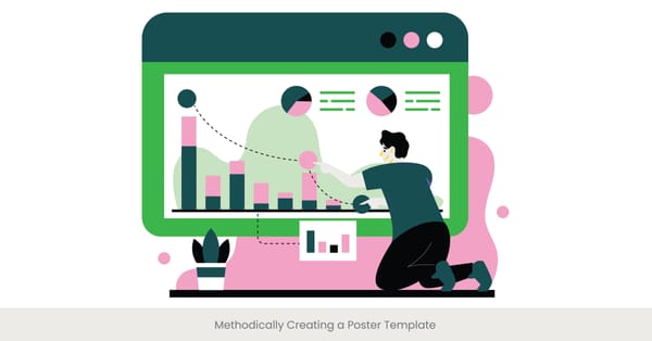
Proactively Avoiding Common Design Mistakes
Unleashing the Power of Visual Storytelling: Our Success Stories.

May 15, 2024
14 min read
%20(1).jpg)
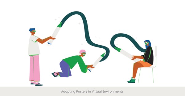
Overloading Information on Your Poster
Introduction: The Pitfalls of Too Much Information
In the realm of scientific poster design, particularly in academic and professional settings, the temptation to include as much information as possible can be overwhelming. However, overloading a poster with data, text, and images often leads to reduced engagement and comprehension by the audience. When considering poster presentation services, it's essential to avoid the common mistake of overloading the design with excessive content.
Background: Understanding Information Overload
Historically, as academic and business presentations have become more data-driven, the challenge of presenting this information effectively has grown. Cognitive load theory suggests that too much information can overwhelm the viewer’s ability to process and retain the material, leading to a phenomenon known as 'information fatigue', which significantly detracts from the communication's effectiveness. For those opting for poster content creation services, it’s vital to strike a balance between information density and clarity.
Real-World Implications and Examples
Consider a case study from a recent scientific conference, where a poster loaded with dense text and complex graphs was notably less frequented by attendees compared to more visually streamlined posters. Feedback indicated that the overwhelming amount of data made it difficult to quickly grasp the key messages, leading to disengagement. When considering custom graphics for presentations, the focus should be on simplifying complex ideas and enhancing visual appeal without overwhelming the audience.
Expert Recommendations and Research Insights
Research in the field of visual communication strongly advises against overloading viewers with information. Studies suggest utilizing hierarchical structures in design that guide the viewer through the information in stages rather than all at once. Effective use of space and minimalistic design can help focus the audience’s attention on key points. Sources like "Journal of Academic Design" recommend no more than 20% text coverage on a poster, emphasizing visuals and white space to enhance readability and viewer retention.
Poor Choice of Colors and Fonts
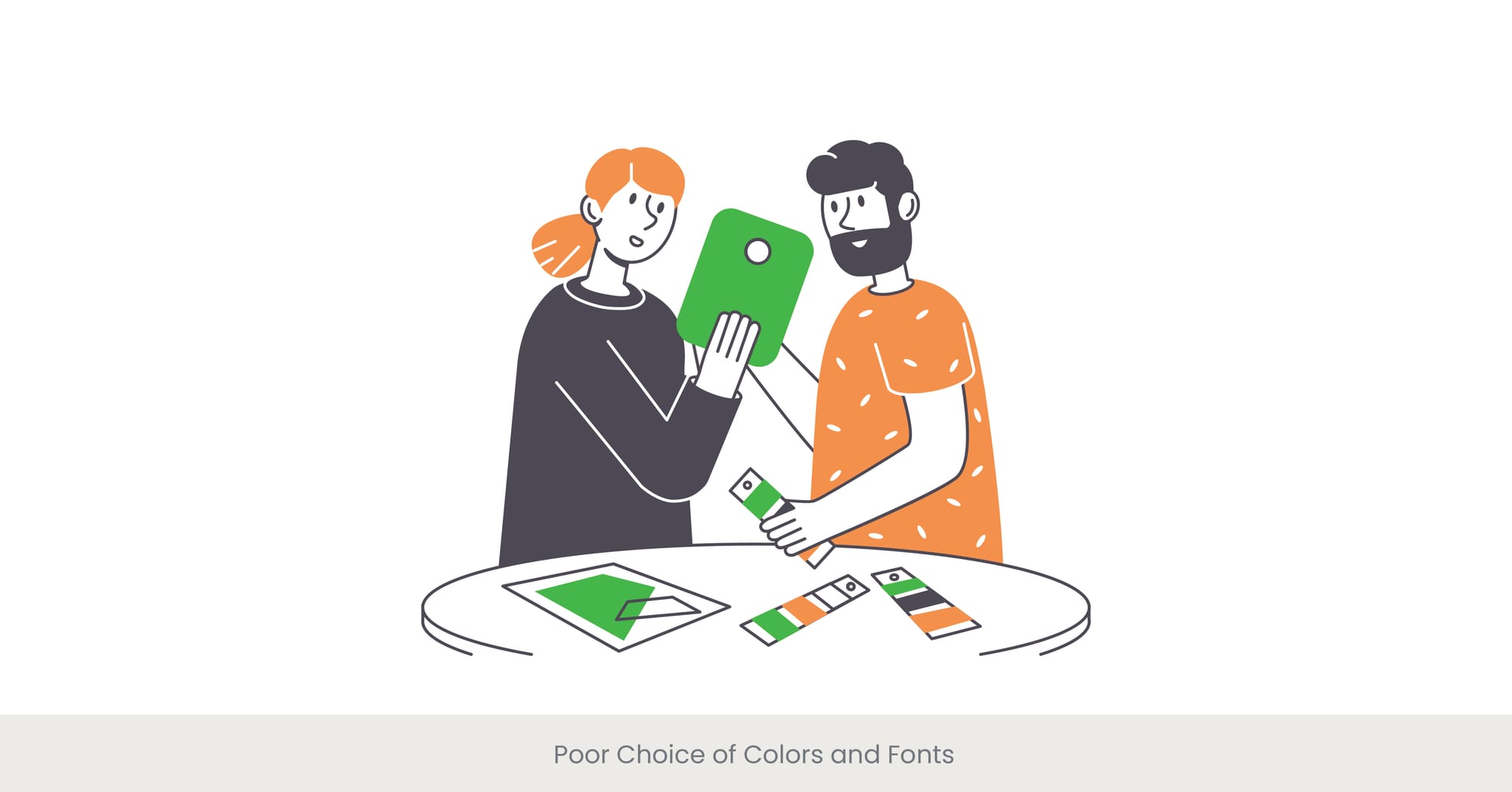
Introduction: Visual Aesthetics in Poster Design
The choice of colors and fonts plays a crucial role in the effectiveness of the graphics on a poster. These elements not only contribute to the aesthetic appeal but also significantly impact readability and the viewer's emotional response. Poor choices in these areas can undermine the communication goals of the poster. Poster presentation services often focus on how color and font choices can improve overall impact.
Background: The Science of Color and Typography
Color psychology and typography have been studied extensively in the context of marketing and design. Colors evoke specific emotions and associations, while fonts can affect the readability and perception of information. Historical studies show that certain colors and font types can either enhance understanding and retention or detract from it, depending on how they are used.
Case Studies of Design Missteps
A notable example involves a marketing poster for a health campaign that used bright reds and yellows with a highly stylized font. While intended to create and to grab the audience's attention, the color scheme inadvertently evoked feelings of anxiety and stress, and the font choice made the detailed information difficult to read, resulting in poor audience engagement and backlash. For those creating custom graphics for presentations, it’s crucial to select colors and fonts that align with the message, ensuring readability and audience retention.
Expert Analysis and Guidelines
Design experts often emphasize the importance of choosing colors and fonts that align with the message of the poster. For instance, calm blues and greens are suitable for scientific topics to convey trust and stability, while clear, easy-to-read fonts like Arial or Helvetica are recommended for their universal legibility. "The Designer’s Guide to Color Combinations," recommends using no more than three complementary colors and sticking to one or two font types to avoid visual confusion and ensure the poster’s message is clear.
Failing to Highlight Key Takeaways

Introduction: The Essence of Clarity in Poster Design
In poster design, especially within academic and professional settings, clearly highlighting key takeaways is crucial for effective communication. Posters that fail to emphasize these central points often lose their impact, leaving audiences confused about the main message. When considering poster content creation, it's important to strategically highlight the most relevant details for the audience.
Background: Importance of Focus in Communication
Effective communication hinges on the ability to distill complex information into clear, digestible points. Historically, successful academic and marketing materials are those that have clearly defined takeaways that are easily memorable. The science of attention economy teaches us that with limited free time to capture interest, focusing on key messages is imperative. Experts suggest using design techniques like public speaking for posters, where the poster acts as a visual tool for verbal storytelling, helping to engage the audience.
Real-World Examples of Missed Opportunities
Consider a technical poster from a recent engineering conference that presented groundbreaking research but cluttered the layout with too many secondary details. The critical findings were lost amidst the overload, leading to minimal audience engagement and recall. Feedback suggested that attendees struggled to discern the research's primary implications, which significantly diminished the poster's effectiveness. When presenting at poster sessions, it's vital to focus on the key takeaways to ensure maximum engagement.
Scholarly Advice and Practical Tips
Experts in visual communication recommend using bullet points, bold text, and strategic placement of icons and graphics to make key takeaways stand out. Publications such as "Design Principles for Visual Communication" suggest that these elements guide the viewer’s eye to the most important information, enhancing comprehension and retention. Additionally, including a succinct conclusion or summary statement can reinforce the main messages, ensuring they resonate with the audience.
Neglecting the Importance of White Space

Introduction: The Strategic Use of White Space
In poster design, white space, or the area of a printed poster left unmarked, is not merely empty space but a crucial element of design. Its proper use can greatly enhance the effectiveness of printing a poster by improving readability and focusing the viewer's attention on the most important design elements within. Maximizing poster session impact relies on giving viewers visual space to absorb information without feeling overwhelmed.
Background: Psychological and Visual Impact of White Space
White space is a fundamental component of graphic design that influences how content is perceived. Studies in visual perception show that ample white space enhances user interaction by reducing cognitive overload. Historically, designs that effectively utilize white space are often seen as more professional and trustworthy.
Case Studies Demonstrating the Effects of White Space
An example can be drawn from a health awareness campaign poster that used ample white space to emphasize critical health warnings and advice. The use of white space around these messages made them stand out starkly against the background, resulting in higher comprehension and recall rates among the audience, as evidenced by post-campaign surveys. When considering poster content creation, experts recommend a balance between design elements and white space to prevent information overload.
Expert Recommendations and Guidelines
Design experts often emphasize the idea that white space should be considered an active element rather than a passive background. "The Art of Clean Design," a publication by a renowned graphic designer, advocates for the strategic placement of white space to create a visual flow that guides the viewer to navigate through the content naturally. Recommendations include balancing text and images with white space to prevent the design from appearing overcrowded, which can detract from the poster's message.
Inconsistent or Confusing Layout
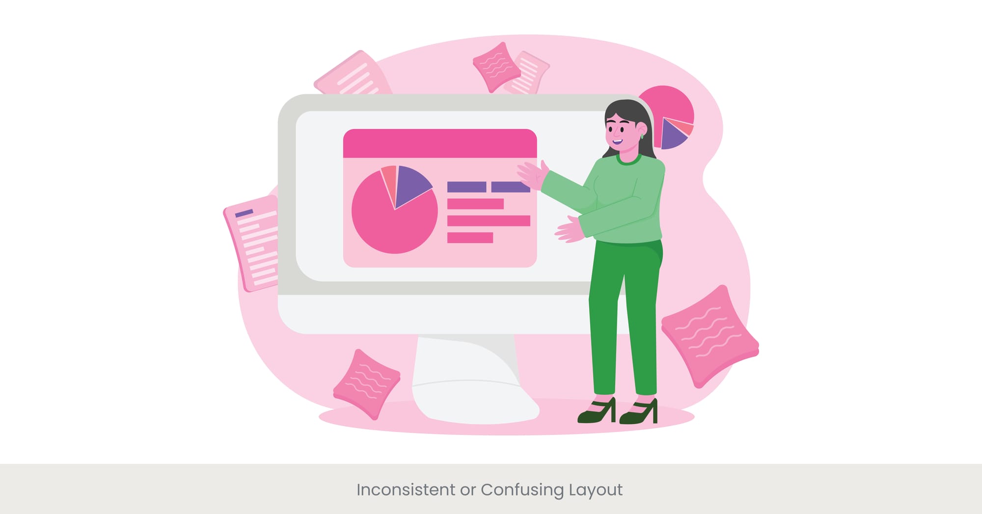
Introduction: The Importance of Coherent Design
A well-organized and consistent layout is essential for effective poster presentations. It not only guides the viewer to navigate logically through the information but also enhances the presentation and overall impact by making the content easier to digest. In contrast, an inconsistent or confusing layout can significantly hinder comprehension and engagement.
Background: Design Principles for Effective Layouts
Historically, principles of design such as balance, alignment, and hierarchy have guided the creation of visually appealing and effective layouts. These principles ensure that elements are arranged in a way that is both aesthetically pleasing and functionally practical, facilitating a smoother free flow of information. Poster presentation services typically apply these principles to enhance clarity and coherence in poster design.
Examples of Layout Challenges
At a recent educational technology conference, a poster featuring innovative teaching tools suffered due to its chaotic layout. Key elements like the title, main findings, and graphical data were scattered randomly across the space, making it difficult for viewers to follow the intended narrative. Feedback from attendees highlighted a sense of confusion and a lack of focus in absorbing the intended messages.
Expert Insights and Recommendations
Experts in graphic design stress the importance of a logical page layout that respects visual hierarchy and the natural reading patterns of the audience. Publications like "Effective Poster Design for Academic Conferences" recommend using grid systems and consistent margins to create structured spaces for columns and tables that enhance readability. The guide also suggests prioritizing information flow from top to bottom in columns and left to right, mirroring the natural scanning habits of most cultures, to ensure the audience easily understands and retains the presented information.
Underestimating the Importance of a Good Title

Introduction: The First Impression Matters
In the poster template design, the title is not just a label but a crucial component of poster templates that captures the essence of the presentation. It serves as the initial point of engagement that can attract or deter audience interest in new product. Underestimating the importance of a compelling title in poster templates can diminish the impact of even the most well-researched posters. Underestimating the importance of a compelling title in poster templates can diminish the impact of even the most well-researched posters.
Background: The Role of Titles in Academic and Professional Fields
Titles and poster templates have historically played a pivotal role in academic and professional communications, acting as the abstract's gateway. A well-crafted title and poster template should be concise, informative, and intriguing, encapsulating the central theme of the poster while inviting the audience to learn more.
Real-World Importance and Missteps
For example, a a poster template titled "Analysis of Water Quality Parameters" might sound straightforward but fails to engage interest as effectively as a poster template "Unveiling the Secrets of Aquatic Health: A Dive into Water Quality Analysis." The latter not only informs the audience of the topic but also adds an element of curiosity and relevance, increasing the likelihood of engagement.
Expert Advice on Crafting Effective Titles
Experts in communication and design recommend that titles should be thought-provoking and reflective of the content. According to guidelines published in "The Journal of Effective Communication," a title should ideally be no longer than 10-12 words, incorporating key terms that enhance discoverability and create relevance to readers. Utilizing active verbs, posing questions, or including unexpected twists can make titles more compelling and memorable.
Ignoring Audience Accessibility Needs
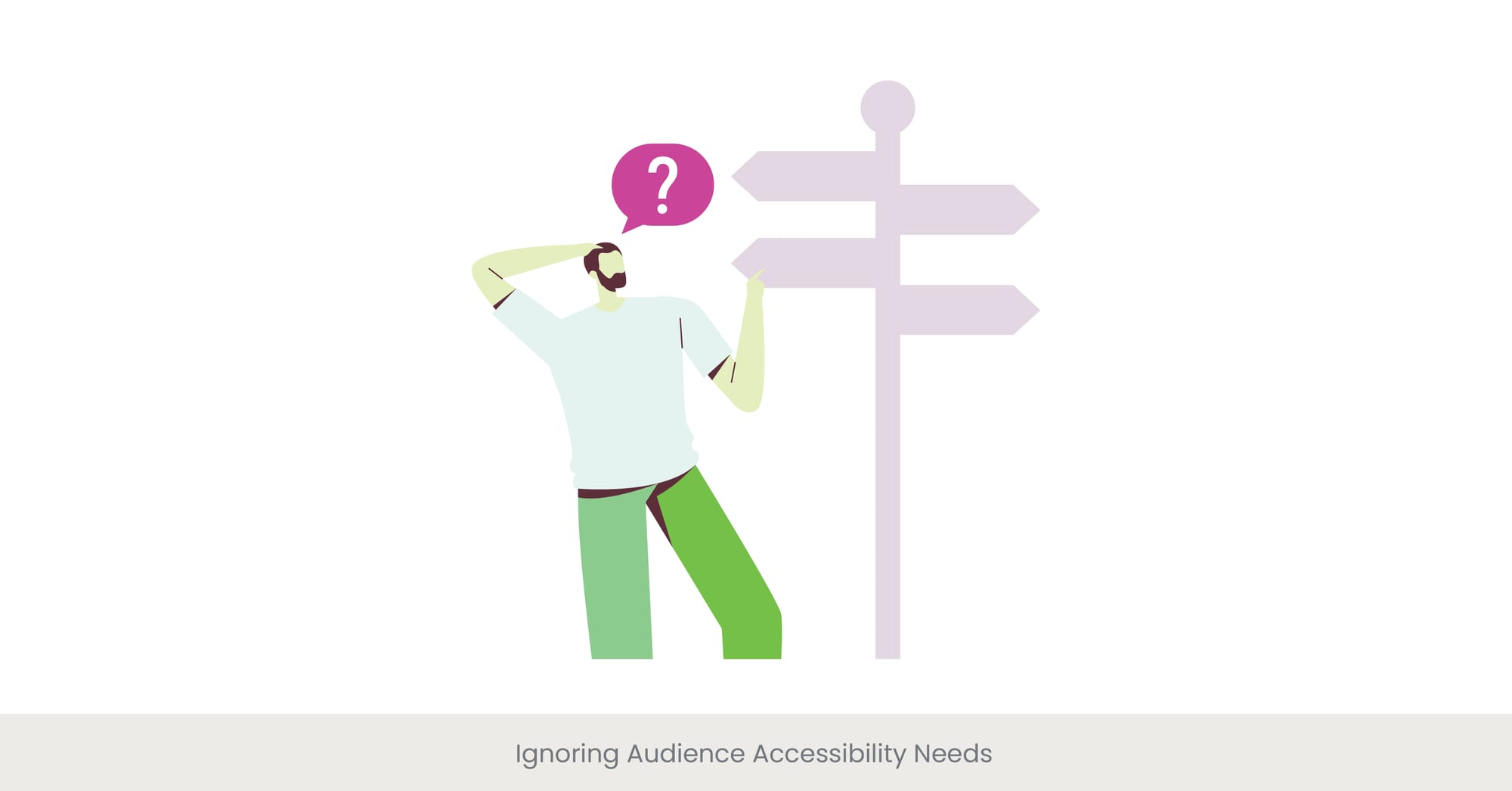
Introduction: Essential Inclusivity in Design
Accessibility in poster design is not just about compliance with regulations; it's about inclusively communicating to all audience members, including those with disabilities. Ignoring these needs can alienate parts of your audience and significantly impact the effectiveness of your communication.
Background: The Importance of Accessible Design
Accessibility considerations in web design have gained prominence over the years, emphasizing the need to cater to diverse audience needs, including visual impairments, color blindness, and hearing disabilities. Integrating accessibility features not only broadens the audience but also demonstrates a commitment to inclusivity and ethical communication practices.
Examples of Accessibility Oversights
A notable instance occurred during a national science fair where a highly informative research poster had used color combinations that were indistinguishable to colorblind viewers, rendering critical data invisible to them. This oversight not only reduced the scientific research poster’s effectiveness but also highlighted the need for designers to consider color accessibility in their presentations.
Expert Recommendations and Guidelines
Experts in accessible design recommend using high-contrast color schemes and large, legible fonts to enhance readability for visually impaired individuals. Publications like "Accessible Design for All" suggest including audio descriptions or QR codes linking to detailed oral presentations to accommodate those with visual or auditory impairments. Additionally, providing materials in multiple formats, such as Braille or digital accessible formats, can significantly improve accessibility.
Looking for more presentation tips?
Overreliance on Text Over Visuals
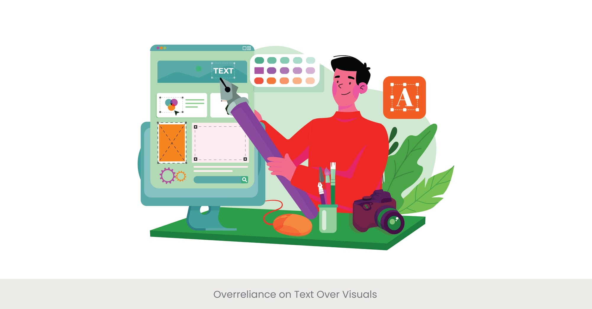
Introduction: Balancing Text and Imagery
In the world of poster presentations, the balance between text and visuals is crucial. Relying too heavily on text can overwhelm the audience and detract from the engagement and understanding that visuals can offer. A well-balanced poster utilizes both elements to communicate effectively.
Background: The Impact of Visual Learning
Visual learning is a fundamental aspect of human cognition. Studies have shown that individuals tend to retain information better when it is presented visually rather than as text alone. Historically, the most impactful posters are those that skillfully integrate text with relevant, informative visuals to enhance comprehension and retention.
Case Examples of Text-Heavy Designs
An example of the pitfalls of text overreliance can be seen in a health conference poster detailing new dietary guidelines. The poster, densely packed with paragraphs of text, saw limited engagement compared to another poster that used infographics and icons to illustrate the same guidelines succinctly and vividly.
Expert Insights and Practical Advice
Design experts often advise that the text-to-image ratio should support the poster’s main message without overwhelming the audience. "The Guide to Visual Presentations" recommends using bullet points for text and supporting these with charts, graphs, or images that can visually represent the data. This approach not only captures the attention of readers more effectively but also aids in quicker and deeper understanding. Additionally, tools like infographics can convey complex information in a digestible and visually appealing manner.
Not Testing the Design in Different Formats
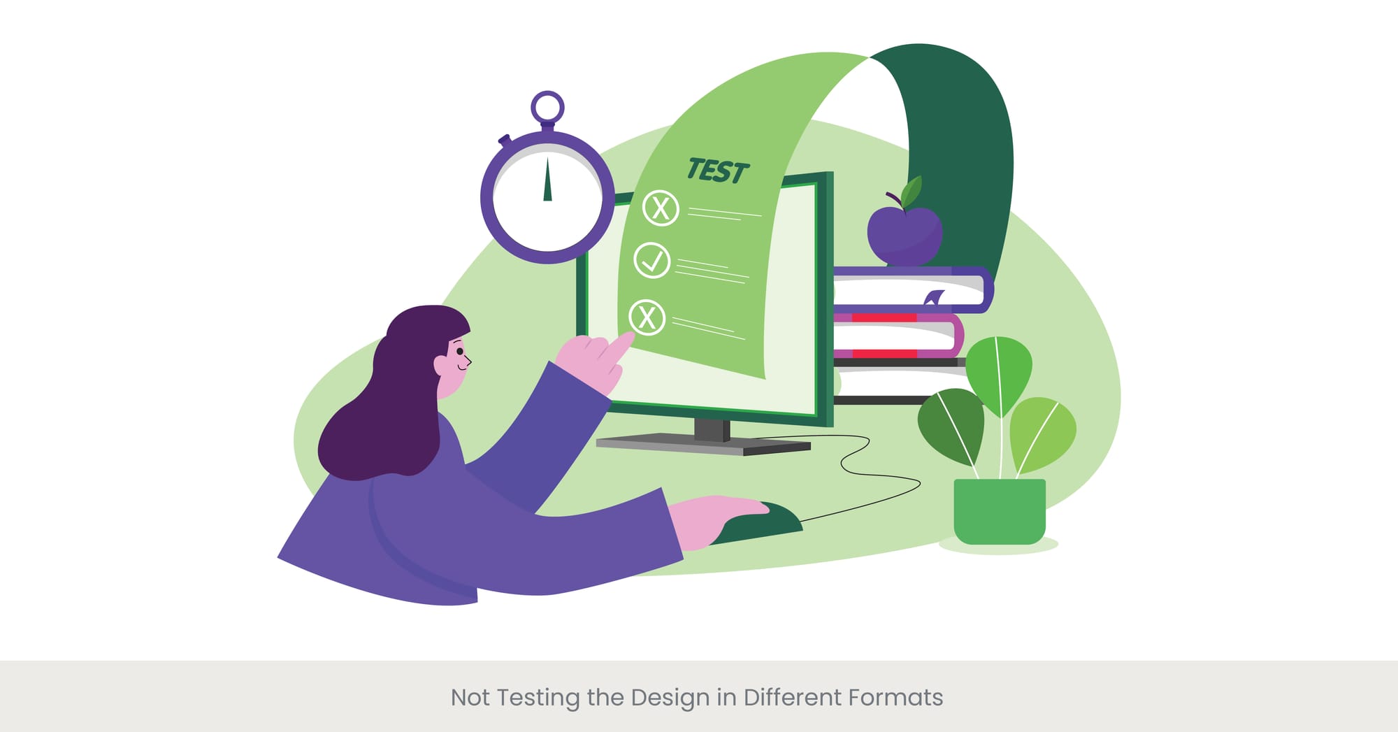
Introduction: The Importance of Versatility in Design
Testing a poster’s design across different formats is crucial to ensure that it communicates effectively in various contexts, whether displayed on a digital screen, printed on large format, or shared online. Failing to test these formats can lead to issues with readability, color accuracy, and overall impact.
Background: Adaptability in Modern Presentation
The adaptability of design to different dimensions and formats has become increasingly important with the diversification of presentation mediums. Historically, posters and logos were primarily designed for print and displayed in a standard size at conferences. However, today’s digital age requires designs to be flexible enough to maintain effectiveness across a range of dimensions of digital and physical mediums.
Case Studies Highlighting Format Failures
An illustrative case involved printing a poster designed for an international biology conference that looked excellent in digital previews but lost significant detail and vibrancy when printed. The colors chosen did not translate well to print, and the small text became illegible, leading to a poor reception and limited engagement at the conference.
Expert Recommendations and Testing Strategies
Experts in print and graphic design stress the importance of using color profiles that are compatible with both digital and print formats and recommend conducting thorough tests on different screens and print sizes before finalizing the design. "The Designer’s Handbook on Format Testing" suggests creating mock setups to simulate various viewing conditions and gather feedback. This ensures that the logo, insert or poster achieves its intended effect regardless of how or where it is viewed.
Need help with your presentation? Contact us today for personalized advice!
Forgetting to Include Contact Information and Calls to Action

Introduction: Essential Elements for Continued Engagement
Contact information and calls to action (CTAs) are critical components of a successful poster design, facilitating further engagement and follow-up from the audience. Neglecting to include these elements can result in missed opportunities for collaboration, feedback, and impact.
Background: The Role of CTAs and Contact Details
In the history of academic and professional communications, providing a way for the audience to engage beyond the initial presentation of scientific research poster has always been pivotal. Effective posters not only convey information but also invite further interaction, whether through questions, further research inquiries, ideas, or professional connections. This is where having clear contact information and calls to action becomes crucial, as they directly influence the success of a poster in fostering long-term engagement.
Want your poster to stand out?
Real-World Consequences of Omission
A case in point occurred at a recent tech innovation showcase event where a presenter failed to include any contact details or clear CTAs on their poster. Despite the event generating significant interest, the lack of follow-up mechanisms led to decreased practical engagement and missed partnership opportunities, as interested parties present had no clear avenue to express their interest or reach out post-event.
Expert Advice and Best Practices
Experts in communication design recommend prominently placing contact details and actionable CTAs on posters. "Communication Strategies for Professionals" suggests that calls to action be specific, such as inviting viewers to sign up for a newsletter, download further resources, or join a discussion forum. Including QR codes that link directly to contact forms or project websites can also effectively bridge the interaction gap. These practices ensure that the poster serves not just as an informational tool but as a gateway to deeper engagement, turning a passive display into an active communication platform.
As highlighted by top design professionals, using clear contact information paired with specific calls to action ensures your audience knows exactly how to proceed after seeing your work. It's not just about sharing information—it's about sparking further interest, leading to tangible outcomes like inquiries, collaborations, or even further sharing of your content.
Incorporating contact details and relevant CTAs into your design increases the chances of audience interaction and allows your poster to function beyond the initial display. Whether it’s a QR code for easy access to more details or a clear invitation to follow up for discussions, these elements transform a static poster into a dynamic tool for engagement.
By embracing the importance of contact information and calls to action, designers can ensure that their work achieves its ultimate goal—not just to inform but to inspire continued interaction and connection. Whether it’s asking for feedback, setting up future meetings, or prompting a digital response, these elements are key in driving further communication and extending the impact of your poster presentation.
Want to create a winning presentation?
Frequently Asked Questions
1. What are the 3 effects of overcrowding?
Overcrowding can lead to decreased readability, reduced viewer engagement, and diminished comprehension of the key messages in a poster. It can overwhelm the audience and detract from the essential points intended to be communicated.
2. What are the problems with overcrowding?
The main problems with overcrowding include creating visual clutter that confuses the viewer, an overwhelming amount of information that can lead to disinterest, and the inability to highlight the most important data or points effectively.
3. How do you explain overcrowding?
Overcrowding occurs when too much information, whether text, images, graphics, or data, is crammed into a limited space, making it difficult for viewers to focus on or extract the most relevant information. This can lead to a lack of clear visual hierarchy and reduced communication effectiveness.
4. How does overcrowding affect society?
In the context of design, overcrowding can diminish the effectiveness of communications materials such as posters and presentations, leading to less effective transmission of important messages and information.
5. What is clutter in design?
In design, clutter refers to an excessive amount of elements within a layout, which can include text, images, or graphical elements that are not organized in a coherent, visually pleasing manner. Clutter can significantly decrease the effectiveness of a design by reducing its aesthetic appeal and clarity.
6. What is the Cluttercore trend?
Cluttercore is a design trend that embraces an abundance of elements and eclectic aesthetics, a style most often seen in interior design and personal spaces. While it celebrates pop and maximalism, it is a style typically not recommended for educational or professional poster designs due to its potential to confuse and overwhelm the viewer.
7. What is the 12-12-12 challenge?
The 12-12-12 challenge is a decluttering exercise where individuals find 12 items to throw away, 12 items to donate, free and 12 items to be returned to their proper place. It’s a concept from organizational behavior that can metaphorically apply to cleaning up a design by reducing unnecessary elements.
8. What is an example of visual clutter?
An example of visual clutter could be a poster where multiple colors, text styles, and images are used without a clear structure or hierarchy, making it hard for the audience to quickly identify the key message or focus points of own poster.
9. What happens when you don't have a target audience?
Not having a clearly defined target audience can lead to designs that are too generic or not effectively tailored, which may fail to engage any specific group deeply. This often results in communications that are less impactful and less successful at achieving their intended goals.
10. What are the needs of the audience?
The needs of the audience in the context of poster design include clear communication, easily digestible information, visual engagement, and relevance to their interests or problems. Understanding and addressing these needs are crucial for effective poster design.
%20(1).jpg)