
Understanding the Fundamentals of Design Theory
Introduction to Design Theory
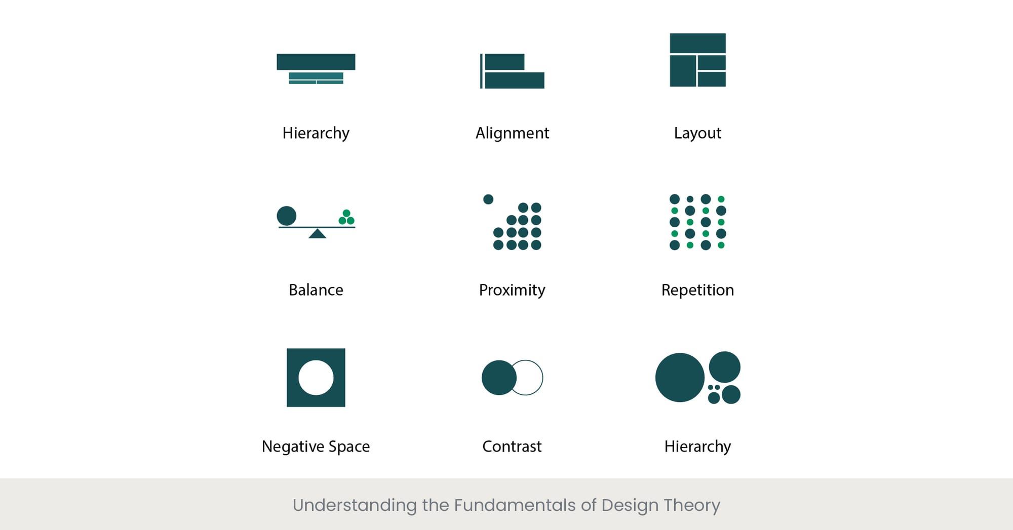
Understanding the fundamentals of design theory is essential for creating effective presentations. Design theory provides a framework for making aesthetic decisions that enhance the communication and impact of your presentation, ensuring that your message is not only seen but also remembered.
Background on Design Principles
Design theory encompasses principles such as balance, alignment, contrast, and repetition, which help structure the visual components of a presentation for maximum impact. These principles guide the placement and styling of elements to achieve a cohesive and visually appealing result.
Real-World Applications and Examples
For example, the principle of contrast can be used to draw attention to key points in a presentation by using distinct colors for text and background. Similarly, alignment helps create a clean and orderly layout that guides the viewer's eye through the content, making the information easier to digest and retain.
References and External Validation
Research in visual communication suggests that well-designed presentations significantly enhance audience engagement and retention of information. A study published in the Journal of Visual Literacy found that presentations adhering to basic design principles were 50% more effective in conveying the intended message than those that did not.
Applying Principles of Visual Hierarchy and Composition
Introduction to Visual Hierarchy
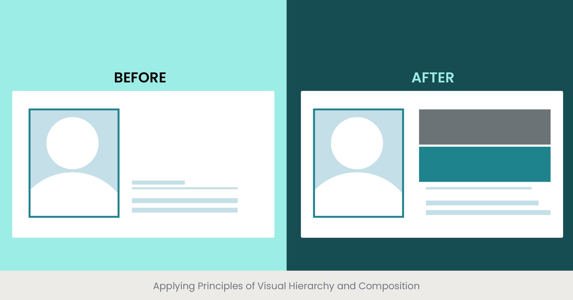
Visual hierarchy is a key design principle that organizes elements in a presentation to guide the audience’s attention to what is most important. By applying visual hierarchy effectively, you can control the sequence in which information is observed and processed.
Background on Composition Techniques
Composition in design refers to how elements like text, images, and shapes are arranged on a slide. Effective composition uses techniques such as the 'Rule of Thirds' or 'Golden Ratio' to create a balanced, engaging layout. Visual hierarchy is often achieved through variations in size, color, and contrast, which signal to the viewer the relative importance of each element.
Real-World Applications and Examples
For instance, in a business presentation, key statistics might be made larger and bolder than surrounding text to catch attention quickly. Strategic placement of images can also guide the viewer’s eye through a logical flow from problem, through analysis, to solution. This structured delivery helps maintain audience engagement and ensures the message is clearly understood.
References and External Validation
Studies have demonstrated the effectiveness of visual hierarchy in presentation design. According to research from the American Institute of Graphic Arts, presentations that employ strong visual hierarchy can improve content retention by up to 65%. This is because structured visual cues help prioritize information processing and recall.
Choosing Fonts, Colors, and Graphics That Enhance Readability

Introduction to Design Choices
The choice of fonts, colors, and graphics plays a critical role in enhancing the readability and effectiveness of presentations. These elements are not just decorative; they significantly affect how information is perceived and understood by the audience.
Background on Typography and Color Psychology
Typography involves selecting typefaces that are not only aesthetically pleasing but also easy to read at various distances. Color psychology can be leveraged to evoke specific emotions and reactions, or to highlight key points. Graphics should be used to support and clarify the message, rather than distract from the content.
Real-World Applications and Examples
For example, using a sans-serif font such as Arial or Helvetica can improve readability in digital presentations, while colors like blue and green are often seen as calming and reassuring, making them ideal for delivering complex information. Effective use of relevant graphics, such as charts or icons, can quickly convey key data or ideas without overwhelming the audience with text.
References and External Validation
Research in visual communications suggests that presentations designed with clear, readable fonts, appropriate color schemes, and supportive graphics are significantly more effective. A study in the Journal of Educational Psychology found that students understand material better and recall it more accurately when presentations are visually coherent and reader-friendly.
Creating Consistent Branding and Visual Identity

Introduction to Branding in Presentations
Creating a consistent branding and visual identity in presentations is essential for maintaining professional integrity and reinforcing the organization’s image. Consistency in design elements across all communication platforms strengthens brand recognition and trust among the audience.
Background on the Importance of Visual Identity
A strong visual identity helps to make your presentations instantly recognizable and associated with certain values and qualities that your brand embodies. This includes using consistent logos, color schemes, and font styles that align with the brand’s marketing and communication strategy.
Real-World Applications and Examples
For instance, a company that uses specific shades of blue and a clean, minimalist design in its marketing materials should incorporate these elements into its presentations. This consistency ensures that the presentation not only looks professional but also feels like an integrated part of the company’s overall messaging.
References and External Validation
Studies have shown that brand consistency can increase revenue by up to 23% due to increased familiarity and trust (source: Forbes). Moreover, a research paper published in the Journal of Brand Management highlights that consistent branding in presentations enhances audience engagement and retention of information, as it leverages the power of visual memory cues.
Balancing Text and Visual Elements for Impact

Introduction to Balancing Design Elements
Balancing text and visual elements in presentations is crucial for effective communication. The right balance ensures that your message is delivered clearly without overwhelming the audience with too much information at once, which can detract from the overall impact of your presentation.
Background on Visual Balance
Visual balance involves arranging text and visuals in a way that neither overwhelms the other. Effective presentations typically follow the principle that visuals should complement the text, not replace it or overshadow it. This balance helps to maintain the audience’s attention and aids in better understanding and retention of information.
Real-World Applications and Examples
For example, in a slide discussing market trends, instead of listing all the data in text, you might include a graph or chart that visually represents this information. The text could then be used to highlight key points or trends shown in the graph, providing a clear and direct narrative that supports the visual data.
References and External Validation
Research on multimedia learning, such as the Cognitive Theory of Multimedia Learning by Mayer, suggests that people learn better from words and pictures than from words alone. This is supported by a study in the Journal of Educational Psychology, which found that presentations that effectively balance text and visuals can enhance understanding by up to 89%, compared to text-heavy slides.
Incorporating White Space for Clarity and Focus

Introduction to White Space
Utilizing white space effectively in presentations is a critical design element that promotes clarity and focus. White space, or negative space, refers to the unoccupied areas in a slide that aren’t filled with text or graphics. It plays a crucial role in making content more digestible and visually appealing.
Background on the Importance of White Space
White space helps to prevent overcrowding of information, which can overwhelm viewers and dilute the message's impact. It aids in focusing the audience’s attention on the most important elements of the slide by creating visual breathing room around text and images.
Real-World Applications and Examples
For example, a slide designed to highlight a key performance indicator might feature the metric prominently in the center with ample white space around it. This design draws the audience’s eye directly to the data point, making the information stand out clearly and reducing visual competition from other elements.
References and External Validation
Studies in graphic design and usability demonstrate that white space can significantly improve comprehension and retention. According to research from the Nielsen Norman Group, designs with appropriate use of white space increase user attention by up to 20%, making information more accessible and easier to navigate.
Using Contrast and Emphasis to Guide Attention

Introduction to Contrast and Emphasis
Using contrast and emphasis effectively in presentations is essential for guiding the audience's attention to key information. These design principles help highlight important elements, making them stand out and ensuring they are noticed and remembered.
Background on Visual Contrast
Contrast involves differentiating elements within your presentation through variations in color, size, shape, or texture. Effective use of contrast makes your main points pop and directs the viewer’s eye to the most critical parts of your slide.
Real-World Applications and Examples
For instance, in a financial presentation, you might use a bold color like red to highlight areas that require immediate action, such as underperforming metrics, while less critical information is displayed in a more subdued color. Similarly, using a larger font for key figures or statements can make them more prominent compared to secondary information.
References and External Validation
Research on visual perception confirms that high contrast between elements significantly improves readability and viewer engagement. A study in the Journal of Vision found that presentations with strong contrast not only capture attention more effectively but also facilitate quicker understanding and longer retention of the information presented.
Incorporating Visual Storytelling Techniques

Introduction to Visual Storytelling
Incorporating visual storytelling techniques into presentations can transform a standard delivery into an engaging, memorable experience. Visual storytelling uses graphics, images, and other visual elements to weave a narrative that complements and enhances the spoken or written word.
Background on the Power of Storytelling
Visual storytelling taps into the human brain’s predisposition for narratives, making complex information more relatable and easier to understand. By connecting data and facts through a coherent story, presenters can captivate their audience and drive home key messages more effectively.
Real-World Applications and Examples
For example, a presentation on company growth could be enhanced with a timeline graphic showing major milestones, accompanied by images and anecdotes about key developments. This not only informs but also emotionally connects the audience with the company’s journey, making the presentation more impactful.
References and External Validation
Studies have shown that visual storytelling can significantly enhance communication effectiveness. Research published in the Journal of Business Research indicates that presentations incorporating storytelling elements are more persuasive and result in higher retention rates compared to those that are purely informational.
Avoiding Common Design Mistakes and Pitfalls
Introduction to Design Mistakes in Presentations
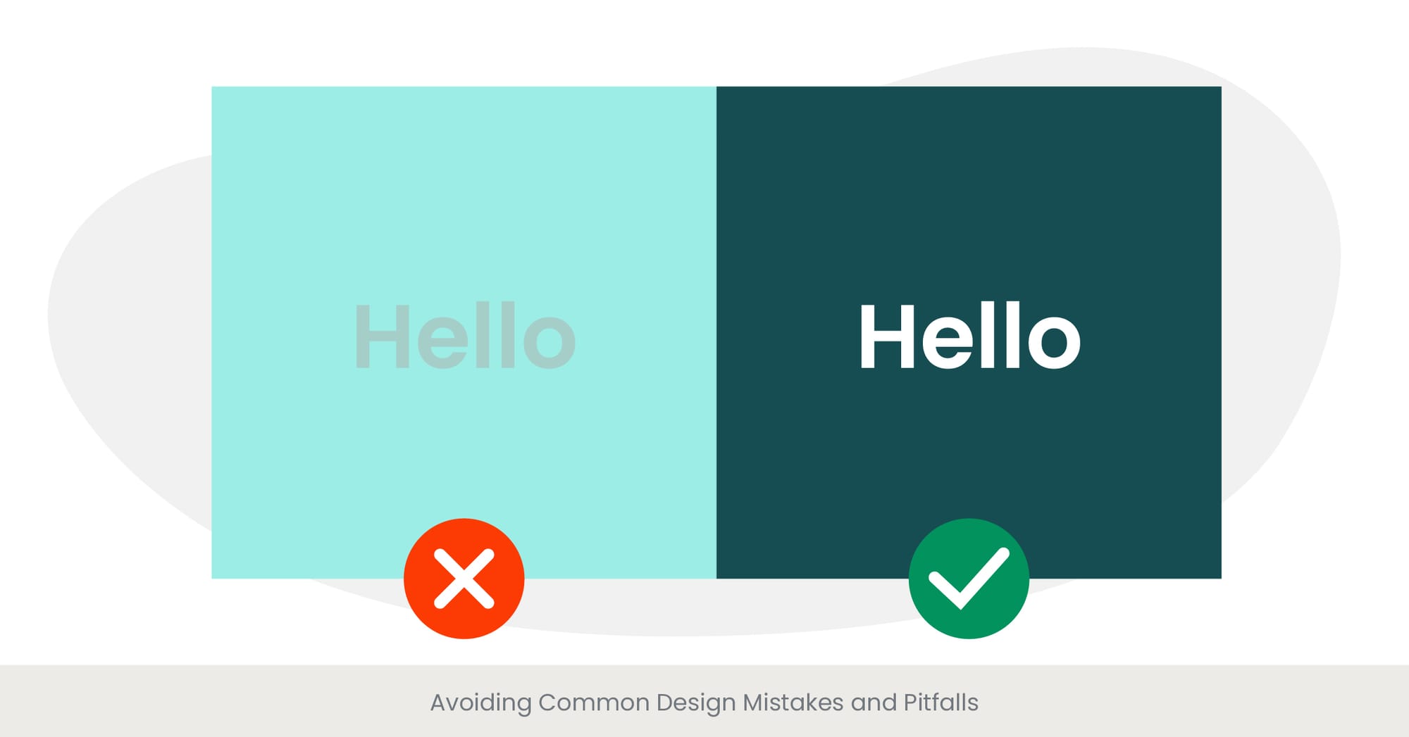
Avoiding common design mistakes is crucial for creating effective presentations. Certain pitfalls can detract from your message, confuse the audience, or even undermine your credibility as a presenter. Being aware of these can help you deliver a clearer and more professional presentation.
Background on Typical Design Errors
Common design mistakes include overcrowding slides with too much information, using inconsistent fonts and colors, poor choice of visuals that don’t support the text, and lack of alignment and balance between elements. These errors can make presentations hard to follow and visually unappealing.
Real-World Applications and Examples
For instance, a presentation slide that combines multiple complex charts with long bulleted lists is likely to overwhelm the audience, reducing their ability to retain key information. Simplifying the slide by focusing on one main idea at a time can significantly enhance understanding and engagement.
References and External Validation
Research in the field of educational psychology suggests that minimizing cognitive load by avoiding these common design mistakes can improve audience comprehension. Studies, such as those published in the Journal of Applied Psychology, have demonstrated that presentations with clean, focused designs are more effective in conveying information and maintaining audience attention.
Creating Accessible and Inclusive Designs for All Audiences

Introduction to Accessible Design
Creating accessible and inclusive designs for presentations ensures that all members of your audience, regardless of ability, can effectively receive and understand your message. This approach is not only a matter of ethical responsibility but also enhances the overall impact and reach of your communication.
Background on Accessibility in Design
Accessible design in presentations involves considerations like color contrast for visibility, text size for readability, and the inclusion of alternative text for images to support those with visual impairments. Additionally, providing materials in formats accessible to people with different disabilities (e.g., screen reader-friendly versions) is crucial.
Real-World Applications and Examples
For example, ensuring that all visual content has high contrast and is large enough to be seen from the back of a room can help those with visual impairments. Using clear, simple language benefits attendees for whom English is a second language or who have cognitive disabilities.
References and External Validation
Research supports the effectiveness of inclusive design practices. According to a study by the Global Initiative for Inclusive Information and Communication Technologies (G3ict), presentations designed with accessibility in mind can reach 15% more audience members than those that do not consider these factors. Moreover, these practices can improve clarity and retention for all audience members, not just those with disabilities.
Frequently Asked Questions
What are the basic PPT presentation skills?
Basic PPT presentation skills include designing clear and visually appealing slides, effectively using text and images, mastering slide transitions and animations, and presenting content in a structured, engaging manner. Key skills also involve understanding how to communicate ideas clearly and concisely while maintaining audience engagement.
What are the 5 P's of presentation skills?
The 5 P's of presentation skills are Plan, Prepare, Practice, Perform, and Post-Evaluate. Planning involves organizing your content; preparation is about creating your slides and script; practice means rehearsing your delivery; performing is the actual presentation; and post-evaluate is reviewing feedback to improve future presentations.
How to improve presentation skills in PPT?
To improve presentation skills in PowerPoint, focus on simplifying your slides, using high-quality graphics, and limiting the amount of text on each slide. Practice your delivery to ensure you are confident and clear. Also, make use of PowerPoint's features like animations and transitions judiciously to enhance, not distract from, your message.
What are the 7 P's of effective presentation?
The 7 P's of effective presentation are Purpose, Planning, Preparation, Practice, Presentation, Poise, and Post-Presentation Reflection. Each element contributes to the overall effectiveness of a presentation, from initial planning stages to the reflection after delivering it.
Where can I learn presentation?
Presentation skills can be learned through various online platforms such as Coursera, LinkedIn Learning, and Udemy, which offer courses ranging from basic to advanced levels. Additionally, many colleges and universities provide workshops and classes on effective presentation skills.
What is the purpose of presentation in class?
The purpose of a presentation in class is to communicate ideas, research, or knowledge to classmates and instructors in an engaging and informative way. It helps students develop their public speaking and communication skills, as well as their ability to synthesize and organize information.
What are the 5 types of presentation?
The five types of presentations are informative, instructional, persuasive, motivational, and decision-making. Each type serves a different purpose, from educating an audience about a particular topic to inspiring action or facilitating decision-making processes.
Which course is best for presentation skills?
The best course for presentation skills depends on your specific needs and skill level. Look for courses that offer comprehensive training on both the design and delivery aspects of presentations, such as those offered by Dale Carnegie Training, Toastmasters International, or specific online courses tailored to professional presentation skills.


%20(1).jpg)
%20(1).jpg)

