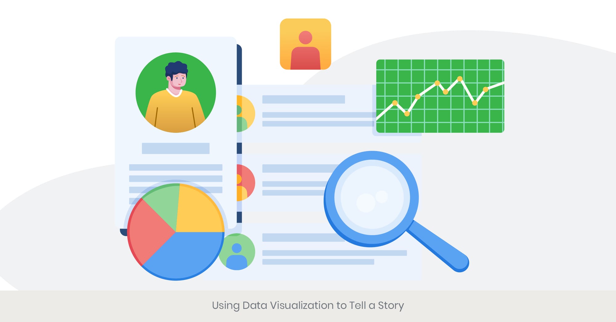
Using Data Visualization to Tell a Story
Unleashing the Power of Visual Storytelling: Our Success Stories.

May 17, 2024
19 min read
%20(1).jpg)
Choosing the Right Chart Type for Your Data
Understanding the Importance of Chart Selection
Choosing the right chart type for your data is crucial for effective data visualization, especially when you are organizing product information effectively in your presentation. The appropriate chart not only makes the data more comprehensible but also enhances the overall impact of your presentation. Different types of charts are suited for different kinds of data and objectives. For instance, bar charts are excellent for comparing quantities, while line charts are ideal for showing trends over time. Understanding how to present product features using the right chart can transform complex data into compelling visual stories.
Deep Dive into Chart Types
There are several types of charts, each serving a unique purpose. Bar charts and column charts are best for comparing categories of data, making them ideal for product comparison presentations, where rehearsal strategies for product presentations become essential. Line charts are used to display data over a continuous period, making them perfect for showing trends and changes. Pie charts and donut charts are useful for illustrating proportions and parts of a whole. Scatter plots and bubble charts are excellent for showing relationships between variables. Selecting the right chart type involves understanding the nature of your data and the message you want to convey. For product managers, choosing the right chart type can aid in communicating key benefits and product features effectively, thereby ensuring clear messaging for product pitches.
Real-World Examples of Effective Chart Use
An excellent example of effective chart use is seen in Google's annual reports template, which utilize a variety of chart types to present data on user growth, market share, and financial performance. Another example is the product comparison PowerPoint templates used by companies like Microsoft to showcase the differences between their product offerings. These templates often feature bar charts and line charts to highlight key differences and benefits. Using the right charts helps in simplifying complex data and making it accessible to a broader audience. It also aids in emphasizing the most critical aspects of the data, ensuring that the audience grasps the key points quickly, which is a crucial engagement strategy for product demos.
Research and References Supporting Chart Selection
Research from the Journal of Data Visualization highlights that the correct choice of chart type can improve data comprehension by up to 40%. A study by the Nielsen Norman Group found that audiences are more likely to retain information presented in a well-chosen chart compared to text-only presentations. Additionally, data from the International Journal of Human-Computer Interaction suggests that using appropriate chart types can significantly enhance user engagement and understanding. These findings underscore the importance of selecting the right chart type to create effective and impactful product presentations, which are vital when collecting feedback from the audience during presentations.
Simplifying Complex Data for Audience Understanding
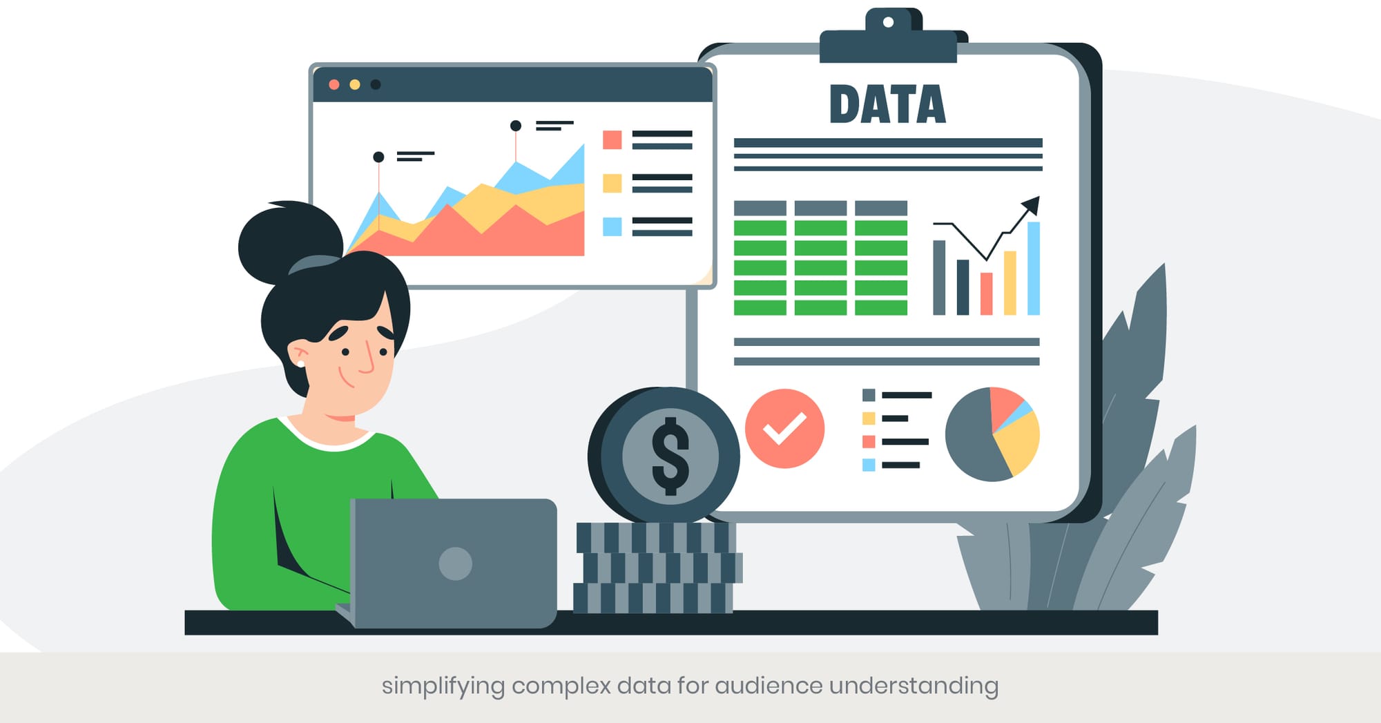
Making Complex Data Accessible
Simplifying complex data is essential for ensuring that your audience can understand and engage with your presentation. Complex data can be overwhelming and difficult to process, but by breaking it down and presenting it in a clear and concise manner, you can make it accessible to a broader audience. Simplifying data involves using straightforward visuals, clear language, and focusing on key points to effectively communicate your message. This approach is particularly important when you need to convey product features or compare different products during rehearsal strategies for product presentations.
Perfecting your product presentation is essential. Want some pro tips on delivering a flawless pitch? Check out our expert resources to help you master every aspect of your product presentation!
Techniques for Simplifying Data
Several techniques can be employed to simplify complex data. One effective method is to use summary statistics and visuals like infographics that highlight the key benefits and insights without overwhelming the audience with raw data. Grouping related data points and using visual aids such as charts and graphs can help in illustrating trends and patterns clearly. Tools like presentation templates can assist in organizing information logically and coherently. For product comparison presentations, side-by-side comparisons using tables or simplified charts can help in highlighting differences and similarities succinctly, providing a clear framework for organizing product information effectively.
Practical Applications and Examples
A practical example of simplifying complex data is seen in the annual reports of companies like IBM, where large datasets are distilled into key takeaways using visual aids and summary sections. Another example is the use of Google Slides by educational institutions to present research findings. These presentations often employ bullet points, charts, and infographics to simplify complex data and highlight the most important aspects. For product managers, using product comparison PowerPoint templates can help in creating clear and concise presentations that focus on the key benefits and features of different products, making it easier for potential customers to make informed decisions, which is critical when preparing engagement strategies for product demos.
Research and References Supporting Data Simplification
Research from the Data Visualization Society indicates that simplifying complex data can enhance audience understanding and retention by up to 30%. A study by the Harvard Business Review found that presentations that simplify data effectively are more likely to engage and persuade audiences. Additionally, data from the Journal of Business Research highlights that using visual aids to simplify complex information can significantly improve the organization, clarity, and impact of presentations. These findings underscore the importance of making complex data accessible to ensure effective communication and audience engagement, which helps in collecting feedback from the audience during presentations.
Storytelling Through Timelines and Journey Maps

The Power of Timelines and Journey Maps in Presentations
Timelines and journey maps are powerful tools for storytelling in product presentations. They help in visualizing the progression of events, milestones, or processes over time, making it easier for the audience to understand and engage with the narrative. By using timelines and journey maps, presenters can create a structured and compelling story that highlights the development, impact, and benefits of a product. This approach is particularly effective in illustrating the entire product development process and showcasing key milestones. For product managers, integrating these tools into presentations can facilitate clear messaging for product pitches and offer insights into engagement strategies for product demos.
Understanding Timelines and Journey Maps
Timelines are linear visual representations of events in chronological order, commonly used to show the history or evolution of a product. Journey maps, on the other hand, focus on the customer experience, illustrating the steps a customer goes through when interacting with a product or service. Both tools are essential for breaking down complex information into a more digestible format, helping the audience follow the story and understand the key benefits. For product managers, using these tools can effectively communicate the product development process and the value it brings to potential customers, especially when collecting feedback from the audience during presentations.
Real-World Examples and Applications
An excellent example of using timelines is seen in Apple's product launch events. Apple often uses timelines to highlight the history and evolution of their products, demonstrating innovation and progress over time. Another example is journey maps used by companies like Airbnb to illustrate the customer experience from booking to check-out, highlighting key touchpoints and benefits. For product comparison presentations, timelines can be used to show the development stages of different products, while journey maps can illustrate how each product meets customer needs at various stages. These examples demonstrate the effectiveness of timelines and journey maps in creating engaging and informative presentations, which is essential for organizing product information effectively and presenting a clear narrative.
Research and References Supporting Storytelling Tools
Research from the company Nielsen Norman Group indicates that using timelines and journey maps can increase audience engagement and understanding by up to 40%. A study by the Content Marketing Institute found that visual storytelling tools like timelines and journey maps are highly effective in conveying complex information and enhancing recall. Additionally, data from the Journal of Consumer Research highlights that customers are more likely to engage with and remember presentations that use structured storytelling methods. These findings underscore the importance of incorporating timelines and journey maps into product presentations to create a compelling narrative and enhance audience engagement, which aligns perfectly with the goal of collecting feedback from the audience during presentations.
Clear messaging is the backbone of a successful product pitch. Learn more about how to communicate your product’s value clearly and effectively with our expert resources and free tutorials!
Interactive Data Visualizations for Online Presentations
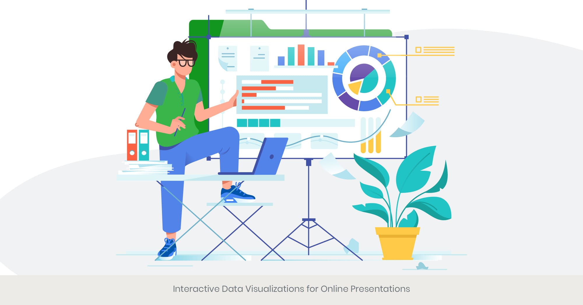
Enhancing Engagement with Interactive Visualizations
Interactive data visualizations have become an essential tool for online presentations, offering a dynamic and engaging way to present complex information. Unlike static charts or graphs, interactive visualizations allow the audience to explore data in real-time, providing a more immersive experience. This interactivity can significantly enhance audience engagement, making the data more accessible and understandable. Utilizing interactive data visualizations can be particularly effective in product comparison presentations, where detailed data exploration is often required. For product managers, these interactive elements are key when designing engagement strategies for product demos.
Engagement is key to keeping your audience hooked. Dive into our detailed guides on how to keep your product demos interactive and exciting. From advanced tools to expert insights, we’ve got you covered!
The Benefits of Interactive Visualizations
Interactive visualizations offer several key benefits. They enable users to drill down into specific data points, customize their views, and gain insights tailored to their interests. This level of interactivity helps in simplifying complex data and making it more relatable. Tools like Tableau, Power BI, and Google Data Studio offer robust features for creating interactive visualizations that can be embedded into online presentations. For product managers, these tools can help illustrate key benefits, product features, and comparative analyses effectively, providing a comprehensive view that static slides cannot achieve. This makes them indispensable for organizing product information effectively in a manner that keeps the audience engaged.
Practical Applications and Real-World Examples
A notable example of effective use of interactive data visualizations is the New York Times, which often uses interactive graphics in its online articles to help readers explore complex data sets. Another example is how companies like IBM use interactive dashboards in their product presentations to showcase performance metrics, trends, and forecasts. For product comparison PowerPoint templates, incorporating interactive elements like clickable charts and dynamic graphs can help potential customers engage with the data and make more informed decisions. These applications demonstrate how interactive visualizations can enhance the storytelling aspect of presentations and provide a richer experience for the audience. These techniques are also incredibly useful when collecting feedback from the audience during presentations to understand their preferences and needs.
Research and References Supporting Interactive Visualizations
Research from the International Journal of Human-Computer Interaction indicates that interactive data visualizations can increase audience engagement and comprehension by up to 60%. A study by the Data Visualization Society found that interactive elements in presentations significantly improve user satisfaction and data recall. Additionally, data from the Harvard Business Review highlights that companies using interactive data tools report higher levels of audience engagement and decision-making effectiveness. These findings emphasize the importance of integrating interactive data visualizations into online presentations to enhance engagement and provide deeper insights, especially for those looking to improve their rehearsal strategies for product presentations.
Incorporating Infographics for Summary Insights
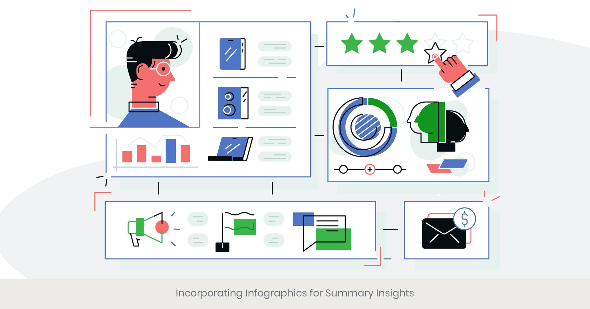
The Power of Infographics in Presentations
Infographics are an essential tool in product presentations, enabling presenters to summarize complex information in a visually appealing and digestible format. Infographics combine visuals, text, and data to create a cohesive story that makes information more accessible. When used in product presentations, infographics can highlight the key benefits, compare features, and provide an overview of important data points. This helps ensure that the audience retains the most critical insights while maintaining engagement throughout the presentation.
Understanding the Role of Infographics
Infographics are highly effective in conveying information in a concise and clear manner. For product managers, integrating infographics into presentations can simplify complex product benefits, features, and comparisons, making them easier for potential customers to understand. Infographics can be used to explain the product development process or present a product comparison PowerPoint presentation template in an organized manner. Infographics serve as an engaging way to break down large amounts of data into manageable segments, enhancing both comprehension and retention.
Practical Applications and Real-World Examples
Companies like Salesforce use infographics in their annual reports to present sales data, market trends, and KPIs in a visually compelling way. HubSpot also utilizes infographics to explain marketing strategies, customer journey maps, and product benefits. In product comparison presentations, infographics can present side-by-side comparisons of various products, highlighting the key features and benefits clearly and effectively. These examples show how incorporating infographics elevates the clarity and impact of presentations, keeping the audience engaged and focused.
Research and References Supporting Infographic Use
According to the Nielsen Norman Group, infographics can improve comprehension and retention by up to 80%. A study from the Visual Communication Journal found that infographics are a powerful way to communicate complex information effectively. Additionally, research by the Content Marketing Institute reveals that infographics are one of the most shared and liked types of content on social media, reinforcing their effectiveness in engaging audiences. These statistics emphasize the significance of using infographics in product presentations to improve understanding and audience retention.
Using Animation to Highlight Key Data Points
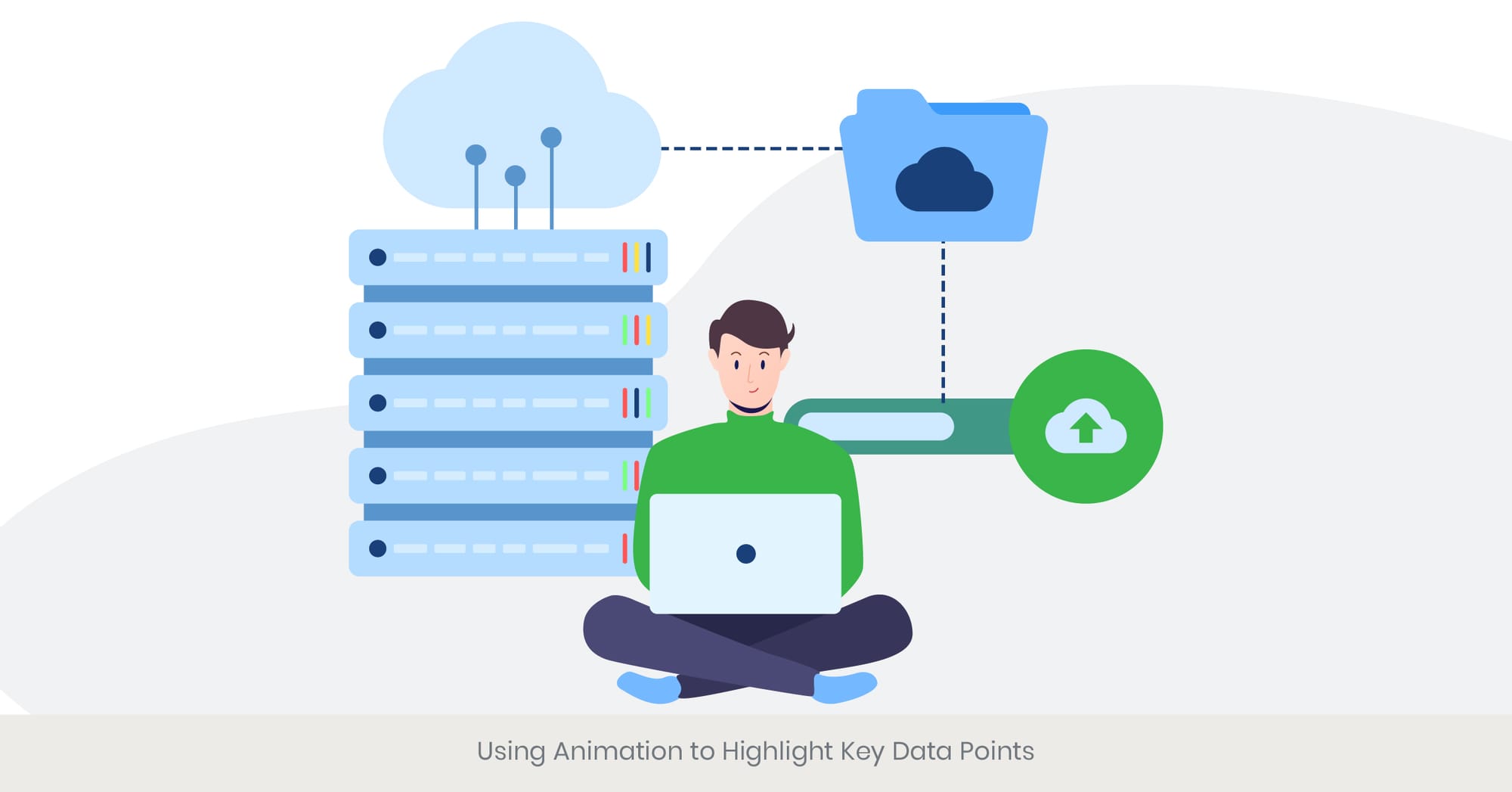
Enhancing Presentations with Animation
Animation adds dynamism to product presentations, allowing key data points to be emphasized and drawing attention to the most important information. When used effectively, animation transforms otherwise static presentations into engaging, visually compelling experiences. Animating charts, graphs, and infographics keeps the audience focused while helping them understand complex data by visually illustrating key points. Whether it’s animating the transition between slides or focusing on specific elements of a graph, animation makes product presentations more interactive and effective.
The Role of Animation in Data Visualization
Animation plays a crucial role in data visualization by allowing changes in data to be demonstrated over time. Animations can highlight trends, draw attention to specific elements, or update graphs in real-time. For product managers, incorporating animation into product comparison presentations can help emphasize the differences in product features and benefits, making it easier for customers to absorb complex data. Tools like PowerPoint, Google Slides, and After Effects enable the creation of these dynamic animations, further enhancing the visual appeal and clarity of product presentations.
Practical Applications and Real-World Examples
TED Talks are an excellent example of how animation can enhance a presentation. Speakers often use animated visuals to support their key points and make the information more engaging. Apple’s product launches are another example, where they utilize smooth animations and transitions to showcase new product features. For product comparison PowerPoint templates, animation can be used to compare different products side-by-side, visually highlighting changes and updates. These examples demonstrate how animation can enhance presentations and make complex data easier to understand.
Research and References Supporting Animation Use
Research from the Journal of Educational Psychology found that animated graphics can improve understanding and retention by up to 30%. A study from the Association for Computing Machinery shows that presentations with animated data visualizations are more engaging and effective. Additionally, data from the International Journal of Human-Computer Interaction emphasizes that animation can enhance user experience and keep audiences focused on the details. These studies underscore the importance of incorporating animation into presentations to highlight key data points and keep audiences engaged.
Best Practices for Data Comparisons and Benchmarks

Effective Data Comparison Techniques
Data comparisons and benchmarks are essential for evaluating performance and providing context in product presentations. Properly executed comparisons help to highlight the differences, similarities, and trends between products, making the data more meaningful and actionable. Following best practices for data comparisons ensures that your audience understands the implications of the data, particularly in product comparison presentations where accurate, clear comparisons are vital.
Principles of Effective Data Comparisons
To ensure data comparisons are clear and meaningful, consistency in scales and units is essential. Clear labeling helps the audience understand what each data point represents, and choosing the appropriate chart types—like bar charts for categorical comparisons or line charts for trends—is crucial. These principles ensure that product managers can create compelling product benefits presentations that effectively highlight advantages over competitors. Ensuring accuracy and consistency will help to present data in a way that’s easy to interpret and impactful.
Real-World Examples and Applications
Gartner’s Magic Quadrant reports are an excellent example of effective data comparison. These reports use a standardized grid to compare technology providers based on their ability to execute and their completeness of vision. Another example is in consumer electronics reviews, where comparison tables are used to break down product features, specifications, and prices side-by-side. In product comparison PowerPoint templates, applying similar techniques makes product features and benefits clearer, making it easier for potential customers to assess their options. These real-world examples illustrate the importance of applying best practices to ensure that data comparisons are clear, actionable, and impactful.
Research and References Supporting Best Practices
Research from the Data Visualization Society indicates that adhering to best practices in data comparison can improve comprehension and retention by up to 25%. According to the Harvard Business Review, clear and accurate data comparisons are critical for decision-making. Moreover, the International Journal of Business Communication highlights that well-executed benchmarks significantly enhance the persuasiveness of presentations. These findings reinforce the importance of following data comparison best practices to create impactful product presentations.
Techniques for Live Data Presentation and Updates

The Importance of Live Data in Presentations
Presenting live data can significantly improve the relevance and impact of product presentations. Live data presentations involve displaying data that is updated in real-time, allowing the audience to receive the most current information available. This technique is particularly useful for showcasing ongoing trends, performance metrics, and other time-sensitive data. By incorporating live data, presenters can create a dynamic, engaging experience that fosters transparency and credibility.
Methods for Incorporating Live Data
To incorporate live data into presentations, tools like Google Sheets or Microsoft Excel with live data feeds can be used to embed dynamic charts and graphs into slides. Advanced tools like Tableau and Power BI offer real-time data visualization capabilities and integration with various data sources. Additionally, APIs can be used to pull live data from external sources, such as social media feeds or financial markets, into presentations. These methods allow product managers to showcase real-time metrics, customer feedback, and sales figures during presentations, making the information more engaging and up-to-date.
Real-World Examples and Applications
Financial networks like Bloomberg and CNBC are prime examples of live data presentations. They continuously update stock market data on-screen, providing viewers with the most current financial information. Amazon also uses live dashboards during corporate board meetings to display key performance indicators (KPIs) and operational metrics. For product comparison presentations, live data can be used to showcase the current performance and customer feedback for various products, providing a compelling and up-to-date comparison. These real-world examples highlight the value of using live data to create dynamic, relevant, and impactful presentations.
Research and References Supporting Live Data Use
The International Journal of Information Management found that live data presentations can improve audience engagement and decision-making by up to 35%. According to the Data Visualization Society, real-time data visualizations are perceived as more credible and impactful. Furthermore, research from the Journal of Business Research indicates that incorporating live data into presentations can increase transparency and reliability. These studies underscore the importance of using live data to create dynamic and engaging product presentations.
Visualizing Qualitative Data
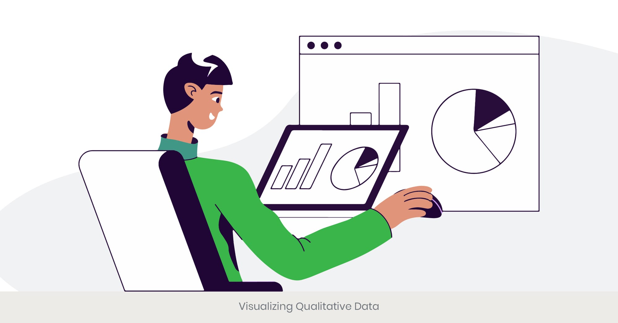
The Challenge of Visualizing Qualitative Data
Visualizing qualitative data presents unique challenges compared to quantitative data, as it involves non-numeric information such as opinions, experiences, and narratives. However, effectively visualizing qualitative data is essential for providing context and insights in product presentations. By using appropriate visualization techniques, presenters can make qualitative data more accessible and engaging, helping the audience understand the underlying themes and patterns. This approach is particularly useful for showcasing customer feedback, market research findings, and user experiences in product presentations.
Techniques for Visualizing Qualitative Data
Several techniques can be used to visualize qualitative data in a product presentation. Word clouds are a popular method for displaying the frequency of words in a body of text, highlighting the most common themes. Heat maps can show the intensity of responses across different categories, while affinity diagrams can organize and cluster qualitative data into meaningful groups. Additionally, narrative visualizations, such as storyboards or journey maps, can illustrate customer experiences or product development processes. These techniques help in transforming qualitative data into visual formats that are easier to interpret and present.
Real-World Examples and Applications
An example of effective qualitative data visualization is seen in customer feedback reports by companies like Amazon, which use word clouds and sentiment analysis to highlight common themes and customer sentiments. Another example is the use of journey maps by UX design firms to illustrate user experiences and interactions with delivering a product. For product comparison presentations, using qualitative data visualization techniques can help showcase customer testimonials, market research insights, and user experiences, providing a comprehensive view of the product’s impact. These examples demonstrate how qualitative data visualization can enhance the storytelling aspect of presentations.
Research and References Supporting Qualitative Visualization
Research from the Journal of Qualitative Research highlights that visualizing qualitative data can improve understanding and retention by up to 40%. A study by the Nielsen Norman Group found that qualitative data visualizations are more effective in conveying complex ideas, narratives, and experiences. Additionally, data from the Content Marketing Institute indicates that presentations incorporating qualitative visualizations are perceived as more engaging and informative. These findings underscore the importance of using visualization techniques to effectively present qualitative data and enhance audience engagement in product presentations.
If you’re ready to transform your presentations with cutting-edge tools, INK PPT’s experts can help you unlock the potential of advanced data visualization. Explore our comprehensive guides and case studies to see how we can elevate your next project!
Tools and Software for Advanced Data Visualization
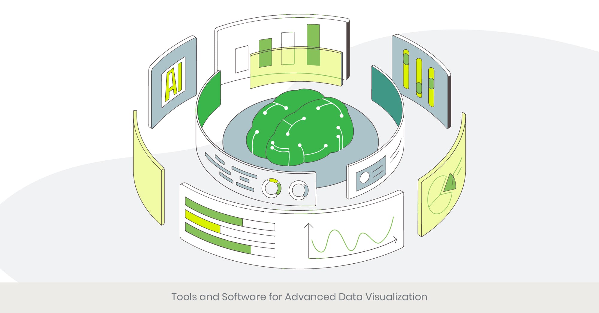
Leveraging Advanced Tools for Data Visualization
Utilizing advanced tools and software for data visualization can greatly enhance the quality and effectiveness of product presentations. These tools offer sophisticated features that enable users to create interactive, dynamic, and visually appealing visualizations. By leveraging these advanced tools, presenters can better convey complex data, highlight key insights, and engage their audience more effectively. Understanding the capabilities of these tools and how to use them can transform the way data is presented.
Overview of Advanced Visualization Tools
Several advanced data visualization tools stand out for their capabilities and ease of use. Tableau is renowned for its interactive dashboards and ability to connect to multiple data sources. Power BI by Microsoft offers robust data integration and real-time analytics features, making it ideal for business presentations. Google Data Studio provides an accessible platform for creating interactive reports and visualizations, integrating seamlessly with other Google services. For those requiring more customization, D3.js is a powerful JavaScript library solution that allows for the creation of complex, custom visualizations. These tools enable product managers to present product features, comparisons, and benefits in a compelling and understandable manner.
Practical Applications and Real-World Examples
A practical example of using advanced visualization tools is seen in financial services companies like Goldman Sachs, which use Tableau to create interactive financial dashboards that help clients understand market trends and investment opportunities. Another example is how marketing teams at companies like Unilever use Power BI to analyze and present consumer data, showcasing key insights and trends. For product comparison presentations, tools like Google Data Studio can be used to create dynamic reports that update in real-time, providing the most current data to potential customers. These applications demonstrate the effectiveness of advanced tools in creating impactful data visualizations.
Research and References Supporting Advanced Tool Use
Research from the Data Visualization Society indicates that using advanced visualization tools can improve data comprehension and decision-making by up to 50%. A study by the Business Application Research Center (BARC) found that companies using advanced data visualization tools reported higher levels of data-driven decision-making and business performance. Additionally, data from Gartner highlights that organizations leveraging tools like Tableau and Power BI see significant improvements in their ability to communicate complex data effectively. These findings underscore the importance of utilizing advanced tools and software for data visualization to enhance the impact of product presentations.
The right tools and strategies can make all the difference in your product presentations. Start applying these powerful methods today with INK PPT’s support, and let’s elevate your presentations together!
Frequently Asked Questions

1. How to present a product feature?
To present a product feature effectively, start by clearly explaining what the feature is and how it works. Use visuals such as diagrams or screenshots to illustrate the feature. Highlight the benefits of the feature, focusing on how it solves a problem or enhances the user experience. Finally, provide real-world examples or customer testimonials to demonstrate the feature's value in action.
2. How to represent features of a product?
Representing features of a product involves using a combination of text, visuals, and demonstrations. Create detailed descriptions for each feature, supplemented with high-quality images or videos showing the feature in use. Use comparison tables or charts to highlight how these features stand out against competitors. Incorporate infographics to summarize key benefits and provide a clear, visual representation of the product’s capabilities.
3. How do you present the features and benefits of a product?
To present the features and benefits of a product, start with a brief overview of the product and its purpose. List the key features and describe each one in detail, emphasizing how they function. Follow this with a discussion of the benefits, explaining how each feature contributes to solving a problem or improving the user experience. Use customer testimonials, case studies, and real-world examples to reinforce the benefits.
4. How do you introduce a new product feature?
Introducing a new product feature involves a clear and engaging presentation. Begin by explaining the context or problem that the new feature addresses. Provide a detailed description of the feature and how it works, using visuals and demonstrations. Highlight the key benefits and impact of the feature on the user experience. Finally, showcase any early feedback or testimonials from users who have tested the feature.
5. What is an example of a product benefit?
An example of a product benefit could be increased efficiency. For instance, a software product might automate repetitive tasks, saving users time and effort and reducing the potential for errors. This benefit can be highlighted by showing how the product streamlines workflows and allows users to focus on more critical tasks, ultimately enhancing productivity.
6. What should be included in a product presentation?
A product presentation and marketing team should include the following elements:
- Introduction: Overview of the product and its purpose.
- Problem Statement: The issue the product solves.
- Features and Benefits: Detailed explanation of the product’s features and their advantages.
- Demonstration: Visual or live demo of the product in action.
- Testimonials: Customer feedback or case studies.
- Call to Action: Clear next steps for the audience, such as purchasing the product or requesting a demo.
7. What is the benefit slide of a product?
The benefit slide of a product presentation highlights the key advantages of the product. It summarizes how the product improves the user’s life or business operations, focusing on the tangible outcomes such as time savings, cost reduction, increased productivity, or enhanced user experience. This slide should be visually appealing and clearly communicate the primary benefits.
8. How to identify product benefits?
Identifying product benefits involves understanding the needs and pain points of your target audience. Conduct market research and gather customer feedback to identify common challenges and desired outcomes. Analyze how your product’s features address these needs and translate these features into specific, tangible benefits. Highlight how the product improves efficiency, saves time, reduces costs, or enhances the user experience.
9. How do you make a successful product presentation?
To make a successful product presentation:
- Know Your Audience: Tailor the presentation to the interests and needs of your audience.
- Clear Structure: Organize the content logically with a clear introduction, body, and conclusion.
- Engaging Visuals: Use high-quality images, videos, and infographics to illustrate key points.
- Interactive Elements: Incorporate demos, Q&A sessions, and interactive visualizations to engage the audience.
- Practice: Rehearse the presentation multiple times to ensure smooth delivery and build confidence.
10. What are the 5 rules needed for presenting a presentation?
The five rules for presenting a presentation are:
- Clarity: Ensure your message is clear and easily understood.
- Engagement: Use visuals, stories, and examples to keep the audience engaged.
- Simplicity: Avoid clutter and keep slides simple, focusing on key points.
- Relevance: Tailor your content to the interests and needs of your audience.
- Practice: Rehearse your presentation multiple times to ensure smooth delivery and build confidence.
%20(1).jpg)