
Color Associations and Brand Identity
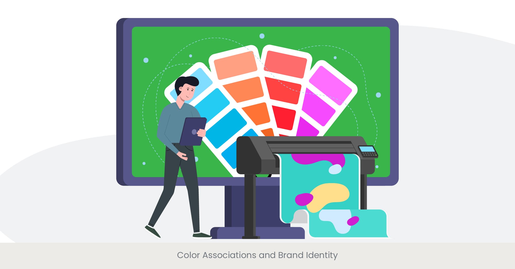
The Influence of Color on Brand Identity
Color plays a crucial role in establishing and reinforcing brand identity and enhancing audience interaction in presentations. Each color evokes different emotions and perceptions, making it a powerful tool for clear messaging for product pitches. Companies strategically choose colors that align with their compelling product narratives and target audience to create a memorable and distinctive identity. Understanding these color associations is essential for a successful product presentation process and enhances visual communication in product demos, as it helps convey the right message and build a strong brand image.
Deep Dive into Color Associations
Color associations refer to the psychological and cultural meanings attached to specific colors, influencing the best practices for product presentations. For example, blue often represents trust, professionalism, and calmness, which helps reinforce clear messaging for product pitches. Red evokes excitement, urgency, and passion, which is why it’s frequently used in compelling product narratives for sales presentations and marketing campaigns. Green, associated with nature, health, and growth, is often used in visual communication for product demos, especially by brands related to wellness and sustainability. These associations are not arbitrary; they are rooted in psychological and cultural contexts that influence how people perceive and react to colors, adding depth to product presentation best practices.
Practical Applications in Branding
A prime example of effective color use in branding is Coca-Cola, which uses red to convey excitement and energy, aligning with its compelling product narratives. Another example is Tiffany & Co., which has branded its signature blue as a symbol of luxury and elegance, ensuring clear messaging for product pitches. In the tech industry, companies like IBM and Dell use blue to establish reliability and professionalism in their visual communication for product demos. When designing a product presentation, incorporating your brand’s colors consistently can reinforce your brand identity and make the presentation more cohesive and impactful.
Research and References Supporting Color Associations
Research from the Institute for Color Research indicates that people make a subconscious judgment about a product within 90 seconds of initial viewing, and up to 90% of that assessment is based on color alone. These findings support the importance of clear messaging for product pitches and visual communication in product demos. Additionally, the University of Loyola, Maryland, found that color increases brand recognition by up to 80%, making it a vital element in product presentation best practices. Consistent use of color, as highlighted by the Pantone Color Institute, can enhance brand identity and consumer trust, proving that color is key to effective visual communication for product demos.
Emotional Responses to Different Colors

Understanding Emotional Responses to Colors
Colors have a profound impact on our emotions, influencing how audience interaction in presentations is perceived and shaping the effectiveness of clear messaging for product pitches. By understanding these emotional responses, presenters can craft compelling product narratives that resonate deeply with their audience. For example, warm colors like red and yellow evoke energy and urgency, while cool colors like blue and green promote trust and calmness, perfect for building brand identity in product presentations.
The Psychology Behind Color and Emotion
The psychology of color explores how colors affect our mood and behavior, directly impacting best practices for product presentations. Warm colors, such as red, are ideal for call-to-action elements, enhancing audience interaction in presentations, while cooler tones like blue promote reliability and trust, adding credibility to product pitches. Understanding these emotional responses enables presenters to select the best color palette for their visual communication in product demos.
Real-World Examples and Applications
McDonald's uses red and yellow to stimulate appetite and evoke excitement, aligning with their compelling product narratives. Similarly, Whole Foods uses green to communicate wellness and sustainability in its product presentations. In the tech space, companies like Microsoft leverage blue to evoke professionalism and trust in their clear messaging for product pitches. These examples show how emotional responses to colors play a vital role in enhancing audience interaction in presentations.
Research and References Supporting Color Psychology
Studies from the Journal of Experimental Psychology show that color impacts behavior, validating its use in clear messaging for product pitches. Additionally, research from the University of Winnipeg demonstrates that color associations affect consumer perception, an essential consideration in compelling product narratives. These findings emphasize the need to consider the emotional power of color when crafting visual communication for product demos.
Using Contrast for Readability and Focus

The Role of Contrast in Effective Presentations
Contrast is crucial for readability and audience engagement, especially in product presentations. Using high contrast ensures clear messaging for product pitches, improving the readability of content and making key points stand out. For best practices for product presentations, it's essential to leverage contrast to highlight important information and keep audience interaction smooth.
Understanding Contrast and Its Importance
Contrast refers to the difference in luminance or color, which makes content distinguishable. High contrast between text and background enhances visibility, ensuring the clear messaging in product pitches and visual communication for product demos is easily understood. This design principle is key in creating compelling product narratives that resonate with audiences.
Real-World Examples of Effective Contrast
Apple's high-contrast presentations use minimal color schemes to ensure clarity in their product pitches, aligning with their brand identity. Similarly, TED Talks leverage contrast to enhance focus and guide audience interaction during presentations, proving the importance of this principle in best practices for product presentations.
Research and References Supporting the Use of Contrast
Studies from the International Journal of Human-Computer Studies demonstrate that high contrast improves readability, validating its importance in visual communication for product demos. These findings confirm that effective contrast is essential for delivering clear messaging for product pitches and increasing audience engagement in presentations.
Color Schemes and Harmonies for Aesthetic Appeal

Creating Aesthetic Appeal with Color Schemes
Selecting the right color scheme enhances both the visual appeal and coherence of product presentations. Harmonious color schemes are vital for maintaining clear messaging and aligning with best practices for product presentations. Understanding and applying color harmonies can help presenters deliver compelling product narratives that capture attention and convey the desired message.
Understanding Color Harmonies and Schemes
Common color harmonies, such as complementary and analogous schemes, contribute to the aesthetic and emotional impact of product pitches. These harmonies are essential for creating visual communication that flows naturally in product demos. Incorporating them into the design ensures that audience interaction in presentations remains smooth and engaging.
Practical Applications and Real-World Examples
Tools like Canva and Adobe Color offer pre-designed templates that incorporate harmonious color schemes, allowing brands to create compelling product narratives in their presentations. For companies like Slack, color harmony is crucial for maintaining clear messaging and delivering visually consistent presentations.
Research and References Supporting Color Schemes
Studies from the Pantone Color Institute show that consistent color schemes improve brand recognition, an essential component of visual communication in product demos. Research from the Journal of Applied Psychology also supports the use of color harmony to enhance the aesthetic appeal of product presentations.
Cultural Differences in Color Perception
The Impact of Culture on Color Perception
Colors carry different meanings across cultures, affecting how audiences perceive and engage with product presentations. Understanding these cultural differences ensures clear messaging for product pitches and enhances audience interaction in presentations. Presenters must be mindful of how color perception varies to avoid potential misunderstandings and to craft compelling product narratives that resonate with diverse global audiences.
Understanding Cultural Variations in Color Perception
Cultural variations in color perception are shaped by historical, social, and environmental factors. For instance, in Western cultures, white symbolizes purity, while in many Asian cultures, it represents mourning. Knowing such differences is vital for best practices for product presentations, as mismatched color choices can alienate or confuse your audience. Understanding these nuances allows presenters to create clear messaging for product pitches, ensuring the presentation aligns with the cultural context of the target audience.
Real-World Examples of Cultural Color Adaptation
Companies like McDonald's and Coca-Cola have adapted their color choices based on cultural contexts, helping them build compelling product narratives. McDonald's in China uses red and gold, colors symbolizing luck and prosperity, making their products more appealing to local customers. Such attention to cultural differences in visual communication in product demos is a prime example of best practices for product presentations.
Research and References Supporting Cultural Adaptation
Research highlights the significance of culturally adapted colors in improving brand perception and enhancing audience interaction in presentations. By tailoring presentations to local color preferences, companies can ensure their product narratives effectively reach and engage diverse cultural groups. This approach not only makes presentations more impactful but also fosters stronger connections with global audiences.
Color Trends and Their Impact on Audience Engagement

The Role of Color Trends in Presentations
Keeping up with color trends is one of the best practices for product presentations. Color trends reflect current societal moods and preferences, helping presenters connect with their audience. Incorporating modern color choices can create compelling product narratives that feel fresh and relevant, increasing audience engagement and ensuring clear messaging for product pitches.
Understanding Color Trends and Their Evolution
Color trends shift due to societal influences like global events or social movements. For example, muted pastels became popular during the pandemic for their calming effects, while bold, vibrant colors are trending post-pandemic to evoke optimism. Staying updated with these trends helps presenters make strategic color choices that enhance visual communication in product demos and boost audience interaction.
Practical Applications of Color Trends
Companies like Adobe and Airbnb frequently incorporate trending colors in their product presentations, ensuring that their clear messaging for product pitches resonates with modern sensibilities. By leveraging tools like Pantone's color reports, presenters can stay ahead of the curve and incorporate compelling product narratives in their visuals. This practical application of color trends improves audience interaction in presentations, creating a stronger connection with viewers.
Research and References Supporting the Impact of Color Trends
Studies show that presentations incorporating trendy colors are perceived as more modern and engaging. This makes visual communication in product demos more effective, as audience attention is drawn to the most relevant content. For presenters aiming to stay at the cutting edge of best practices for product presentations, following color trends is essential for ensuring clear messaging for product pitches and fostering engagement.
Accessibility Considerations in Color Choices

Ensuring Accessibility Through Color Choices
Making presentations accessible through proper color choices is a crucial aspect of best practices for product presentations. Ensuring sufficient color contrast and avoiding color-reliant messaging allows all audience members, including those with visual impairments, to engage effectively with compelling product narratives. Accessible color choices also lead to more inclusive audience interaction in presentations, fostering engagement from diverse groups.
Understanding Accessibility and Color Contrast
Accessibility guidelines recommend specific contrast ratios to ensure text readability, a key component of visual communication in product demos. Presenters must balance color choices to maintain accessibility while also delivering clear messaging for product pitches. Using tools like the Color Contrast Analyzer ensures that presentations meet accessibility standards and enhance audience interaction for all viewers.
Real-World Examples of Accessible Color Use
Microsoft PowerPoint and the BBC have set strong examples by implementing color accessibility guidelines in their platforms, ensuring clear messaging and visual communication for all users. These examples show that accessibility enhances the inclusivity of product presentations, improving overall audience engagement.
Research and References Supporting Accessibility
Research consistently supports the importance of accessibility in improving audience experience and comprehension. By incorporating accessible color practices, presenters ensure that their compelling product narratives reach the widest possible audience. This not only adheres to best practices for product presentations but also strengthens the overall impact and effectiveness of the presentation.
Using Color to Guide Audience Attention

Strategically Using Color to Direct Focus
Effective use of color can guide your audience's attention to key elements of your presentation, ensuring clear messaging for product pitches and reinforcing compelling product narratives. Bright, attention-grabbing colors highlight crucial points, while cooler shades help create balance and draw focus to important content, enhancing visual communication in product demos.
The Psychology of Attention and Color
Certain colors naturally draw attention and can be used to build a visual hierarchy within your presentation. For instance, red or yellow can signal important takeaways or calls to action, while cooler tones like blue can provide a background without distracting from the message. This strategic use of color ensures effective audience interaction in presentations and maintains focus on the most important aspects of your product pitch.
Practical Applications in Presentations
Google effectively uses color to guide attention in their product presentations, ensuring clear messaging. Their use of brand colors strategically directs focus to key product features, making their visual communication impactful. Presenters can apply this tactic to emphasize key points and deliver more engaging product narratives.
Want to dive deeper into best practices for product presentations? Check out INK PPT’s blog for more insights, strategies, and expert tips to make your next presentation a success.
Research and References Supporting the Use of Color
Research shows that presentations using strategic color placement improve audience retention and focus. This technique is vital for best practices in product presentations, as it enhances audience interaction and ensures clear messaging for product pitches. Incorporating color to direct attention strengthens the overall effectiveness of the presentation, leading to higher engagement.
The Role of Background vs. Foreground Colors
Balancing Background and Foreground Colors for Clarity
In product presentations, balancing background and foreground colors is essential for delivering clear messaging in product pitches. Background colors set the overall tone, while foreground elements like text and visuals need to contrast sharply to enhance audience interaction in presentations. Without this balance, your compelling product narratives may lose their impact. Understanding the principles of color contrast allows you to create the best practices for product presentations that effectively communicate key information while maintaining strong visual communication in product demos.
If you’re looking for professional help with your next product presentation, INK PPT offers personalized solutions to ensure clarity and impact in your messaging. Let us help you craft the perfect visuals!
Understanding the Principles of Color Balance
The core principle in balancing background and foreground colors is contrast. High contrast ensures your clear messaging for product pitches gets across to the audience without causing visual strain. Whether you use dark text on a light background or light text on a dark one, the objective is always to enhance audience interaction in presentations. This principle is also critical when crafting compelling product narratives that resonate visually. Ensuring that the right elements stand out is one of the best practices for product presentations, helping maintain the flow of visual communication in product demos.
Practical Applications in Presentations
Top companies, like Apple and TED, exemplify best practices for product presentations by keeping their slides simple and focused. They achieve clear messaging for product pitches with minimalist backgrounds that allow foreground content to shine, maximizing audience engagement. These brands use color balance to enhance audience interaction in presentations, showcasing how important visual communication is in product demos. Their approach demonstrates how even subtle color choices can reinforce compelling product narratives, making the presentation both memorable and professional.
Research and References Supporting Color Balance
Studies such as those from the Journal of Visual Communication confirm that maintaining high contrast between background and foreground colors boosts both readability and information retention. Nielsen Norman Group’s research further validates that well-balanced color schemes are perceived as professional and help deliver clear messaging for product pitches. Web Content Accessibility Guidelines (WCAG) emphasize the importance of color contrast for accessibility, ensuring that all audience members can interact with presentations. These findings highlight why achieving color balance is one of the best practices for product presentations, promoting effective visual communication in product demos.
Ready to elevate your presentations? Read INK PPT’s free guide that walks you through creating compelling product presentations using the latest trends in color, design, and visual communication.
Implementing Company or Product-Specific Colors

Leveraging Brand Colors for Consistency
Integrating your brand’s color palette in product presentations not only enhances your clear messaging for product pitches but also reinforces brand recognition. Using company or product-specific colors helps create compelling product narratives while ensuring that all your visual materials remain cohesive. Effective visual communication in product demos depends on consistency across all aspects of design, especially when it comes to color schemes, which should reflect your unique brand identity. This consistency boosts audience interaction in presentations and builds trust.
Looking for hands-on guidance? Explore our step-by-step YouTube tutorials that teach you how to create stunning presentations that align with your brand identity and captivate your audience.
The Importance of Brand Colors in Presentations
Brand colors evoke specific emotions and help establish trust. When you incorporate them into product presentations, it ensures clear messaging for product pitches and strengthens your brand’s identity. A consistent color scheme can guide the audience through your compelling product narratives seamlessly, making the presentation look polished and professional. Brand-specific colors should not only enhance audience interaction in presentations but also make your visual communication in product demos more memorable.
Real-World Examples of Brand Color Implementation
Leading companies like Coca-Cola and Google showcase the best practices for product presentations by consistently using their brand colors across all materials. These brands have mastered visual communication in product demos by making sure their brand colors support their compelling product narratives. Their presentations effortlessly communicate clear messaging for product pitches, allowing them to engage their audience effectively while maintaining brand integrity.
Curious how effective presentations can transform your brand’s communication? Take a look at our case studies to see how INK PPT has helped brands achieve outstanding results with impactful presentations.
Research and References Supporting Brand Color Use
Studies from the Journal of Marketing Communications highlight that consistent use of brand colors increases recognition by up to 80%. By incorporating brand colors, you deliver clear messaging for product pitches and create a unified experience. Research by the Color Marketing Group shows that cohesive color use enhances audience interaction in presentations, making the overall visual communication in product demos more engaging. Implementing company-specific colors in your product presentations can significantly improve how well your compelling product narratives are perceived, reinforcing the best practices for product presentations.
Frequently Asked Questions
1. What is the 5 5 5 rule for better presentation?
The 5 5 5 rule for better presentations suggests that each slide should contain no more than five words per line, each presentation template have five lines of text, and each presentation should include a maximum of five slides. This rule helps keep presentations concise, engaging, and focused, ensuring that the audience can easily digest the information without feeling overwhelmed.
2. What are the 6 elements you need in a product presentation?
The six essential elements of a product presentation are:
- Introduction: A brief overview of the product and its purpose.
- Problem Statement: Identification of the problem the product solves.
- Solution: How the product addresses the problem.
- Features and Benefits: Key features and the benefits they provide.
- Evidence: Customer testimonials, case studies, or data supporting the product’s effectiveness.
- Call to Action: A clear directive for what the audience should do next, such as purchasing the product or scheduling a demo.
3. How to present a product effectively?
To present a product effectively, start with a strong opening to capture the audience's attention. Clearly explain the problem your product solves and how it addresses this problem uniquely. Use engaging visuals, customer testimonials, product presentation examples and real-world examples to illustrate your points. Keep the presentation focused, use a consistent color scheme, and end with a compelling call to action. Practicing your delivery and anticipating audience questions can also enhance your presentation's effectiveness.
4. What are the 5 rules needed for presenting a presentation?
The five rules for presenting a presentation are:
- Clarity: Ensure that your message is clear and easy to understand.
- Engagement: Use visuals, stories, and examples to keep the audience engaged.
- Simplicity: Avoid clutter and keep slides simple, focusing on key points.
- Relevance: Tailor your content to the interests and needs of your audience.
- Practice: Rehearse your presentation multiple times to ensure smooth delivery and to build confidence.


%20(1).jpg)
%20(1).jpg)


