Design Principles for Product Presentation
Unleashing the Power of Visual Storytelling: Our Success Stories.

Apr 12, 2024
18 min read
%20(1).jpg)
Balance and Alignment in Slide Design
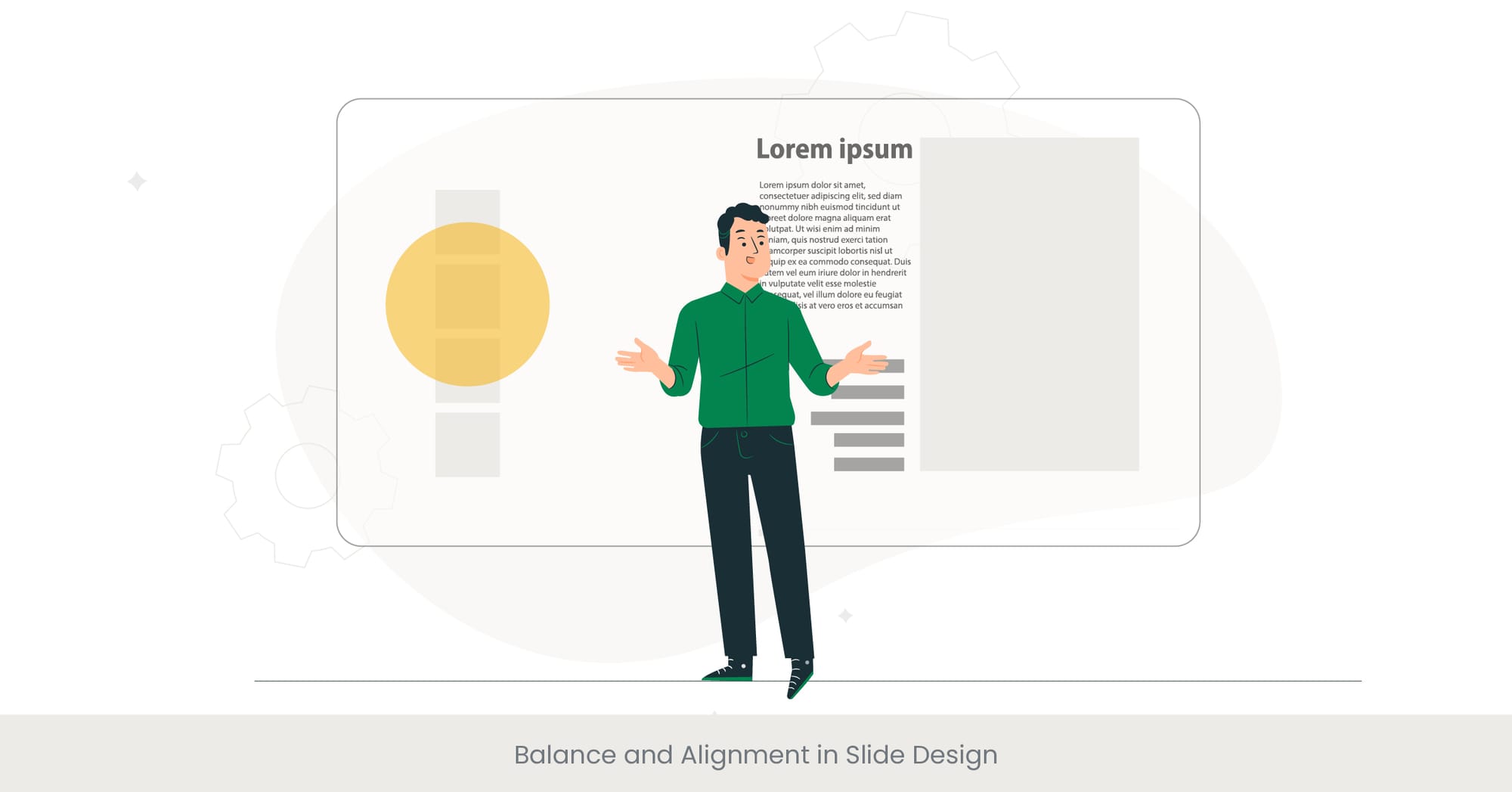
Creating Harmony in Presentation Slides
When designing slides for a product presentation, balance and alignment are fundamental principles that contribute to the overall visual impact and readability of your presentation. Balance refers to the distribution of visual weight within a slide. It can be symmetrical, where elements are mirrored on either side of an axis, or asymmetrical, which involves different elements that have equal visual weight. Alignment is the adjustment of elements in a way that lines them up along a common edge or center. Proper balance and alignment in slide design ensure that the presentation is not only aesthetically pleasing but also effectively communicates the intended message, ensuring a smooth product presentation flow design that keeps the audience engaged.
The Foundation of Professional Slide Design
Historically, principles of balance and alignment have been rooted in the broader field of graphic design and have been adapted for specific uses in slide presentations. The use of grids and guidelines, for example, is a common practice that aids designers in achieving a well-organized layout. These tools help ensure that all elements on a full slide deck are intentionally placed, creating a tidy and coherent arrangement that enhances the viewer's ability to process information, which is crucial when organising product information effectively. This background knowledge is crucial in understanding why balance and alignment are not just about aesthetics but are essential for clarity and precision in communication.
Real-World Applications and Current Trends

In today’s digital age, where presentations are an integral part of corporate and educational communications, the application of balance and alignment can be seen across various successful product presentations. For instance, Apple’s product launch presentations utilize a high degree of symmetry and alignment to focus the audience's attention on the product itself. This methodical arrangement facilitates a better connection with the audience, making the presentation memorable. Furthermore, with the rise of remote presentation tools like Google Slides, designers now emphasize dynamic balance and alignment that adapts to different screen sizes and formats, enhancing accessibility and engagement in product presentations.
Evidence-Based Design Approaches
Research in visual communication suggests that balanced and aligned slide designs are not only more appealing but also more effective in retaining the audience's attention. Studies indicate that viewers are likely to understand and remember information better when it is presented in a well-organized manner. For instance, a 2018 study found that presentations with strong alignment and balance led to a 20% better retention rate of presented information. This statistical backing highlights the importance of these design principles in creating successful product presentations and emphasizes why hiring professional product presentation services is crucial to enhance the overall delivery.
Color Psychology and Brand Identity

Influencing Perceptions with Colors
Colors play a pivotal role in product presentation design, not only by making the slides visually appealing but also by invoking specific psychological responses from the audience. Storytelling in product presentations can be amplified through the use of color, as different hues influence emotions and perceptions. For example, blue often instills a sense of trust, confidence, and reliability, while red can evoke feelings of energy and urgency. Integrating these colors into product presentations can align the viewer's emotional response with the brand's messaging and identity.
Looking to master the art of storytelling in presentations? Join our next webinar where we'll dive into strategies for making your product presentations more impactful and engaging.
The Role of Colors in Establishing Brand Identity
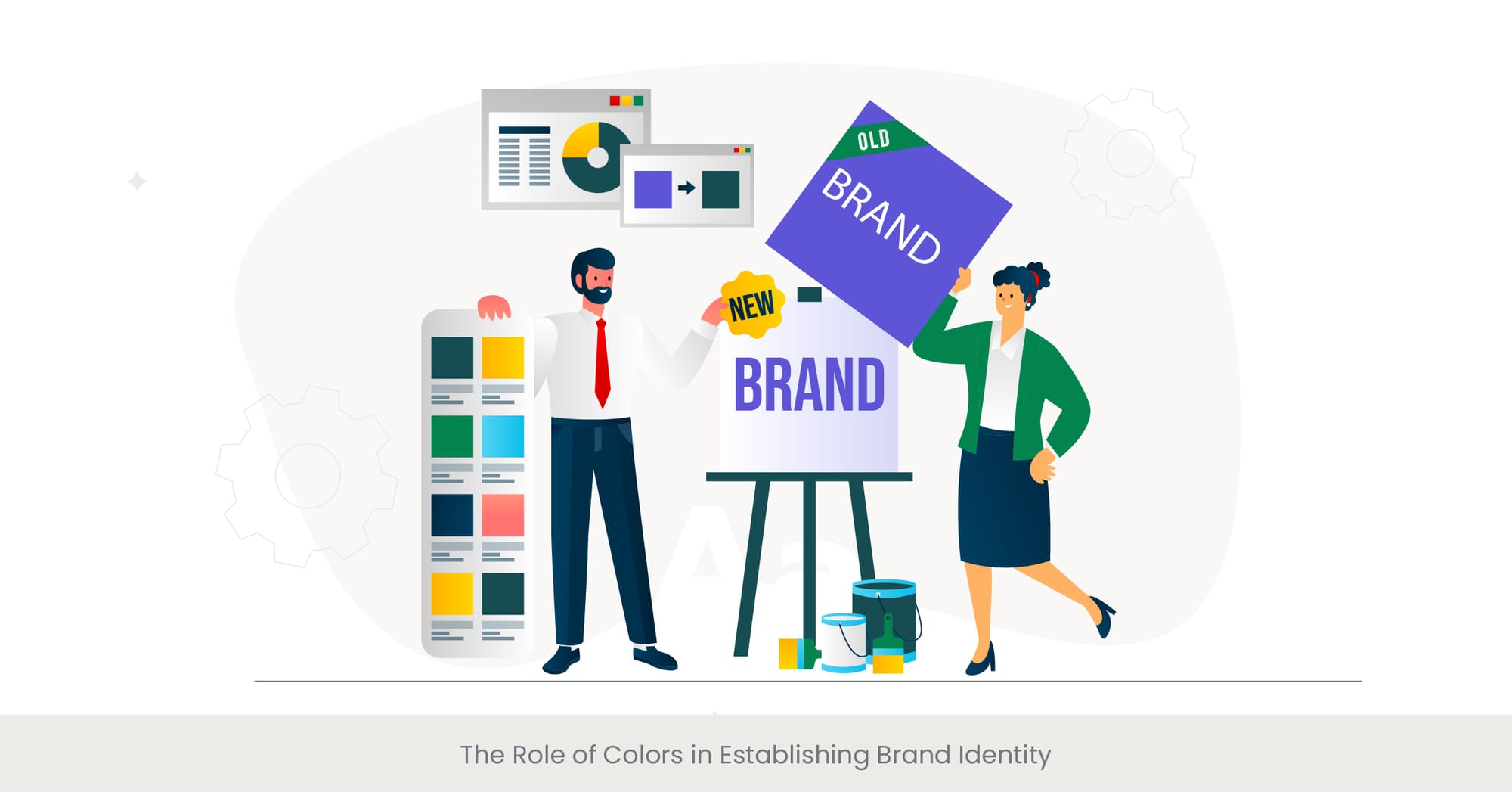
The consistent use of specific color palettes is a fundamental aspect of brand identity. These colors become synonymous with the brand, helping to enhance recognition and differentiation in the market. Historically, iconic brands like Coca-Cola with its red and white and Tiffany & Co. with its Tiffany blue have leveraged their distinctive colors to reinforce their brand identities in every aspect of their marketing, including product presentations. The strategic choice of colors can help companies convey their values and personality, creating a lasting impression on the audience.
Case Studies and Trends in Color Application
Looking at real-world examples of industrial design, companies like Spotify and Instagram utilize vibrant and dynamic color schemes in their product presentations to reflect their modern, innovative brands. These companies not only use color for aesthetic appeal but also strategically employ it to communicate and highlight key information and guide the audience’s attention through the presentation. Moreover, with the trend towards minimalism in design, there is a growing emphasis on using neutral backgrounds with pops of brand colors to draw attention to the most important points or features of the product.
Validating Color Choices Through Research
Research supports the significant impact of color on marketing and brand perception. For example, a survey by Colorcom found that up to 90% of snap judgments made about products can be based on color alone. Additionally, when brands use a color that aligns with the personality they want to portray, they see a 80% increase in brand recognition. These statistics underscore the importance of carefully choosing colors that align with the brand's identity and the message it intends to convey in product presentations.
Typography: Choosing the Right Fonts
The Impact of Typography on Presentation Clarity
Typography in product presentation design is crucial not just for aesthetics but for functionality and readability. The choice of fonts can dramatically affect how information is perceived and understood by the audience. Selecting the right font involves considering the font's legibility, readability, and emotional impact. For example, sans-serif fonts like Helvetica and Arial are often used in digital presentations for their clean and modern appearance, which improves readability on screens. On the other hand, serif fonts such as Times New Roman convey a sense of formality and respectability, which can be appropriate for more traditional or serious content in product presentations.
Historical Context and Evolution of Typography
The evolution of typography has been significantly influenced by technological advancements and cultural changes. Historically, typefaces were crafted to suit the printing technology of the time, which is why early printed works predominantly used serif fonts. With the advent of digital screens, designers have shifted towards sans-serif fonts due to their clarity and ease of reading at smaller sizes or lower resolutions. This historical perspective highlights the importance of choosing typefaces that are not only visually appealing but also suited to the medium and context of the product presentation flow design.
Examples of Effective Typography in Product Presentations
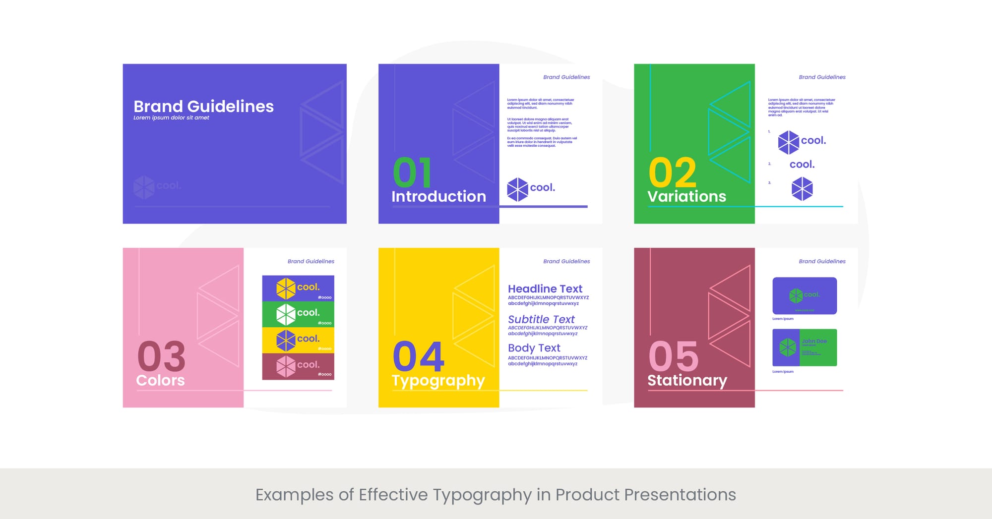
Real-world applications of effective typography are evident in successful product presentations by leading tech companies like Apple and Google. These companies meticulously choose fonts that align with their brand identity and enhance the user experience. For example, Apple’s use of its custom San Francisco font across its product presentations and devices creates a cohesive brand experience that is instantly recognizable. Similarly, Google’s use of its Roboto font is designed to offer high legibility across various devices and sizes, ensuring consistent communication.
Research-Backed Strategies for Font Selection
Research on typography emphasizes the importance of font choice in user engagement and information retention. Studies have shown that typefaces that are too complex can detract from the message, reducing comprehension and recall. For instance, a 2017 study found that presentations using simple, consistent font styles had a 30% higher retention rate among audiences compared to those using multiple or ornate fonts. This research underscores the need for strategic font selection, prioritizing clarity and brand consistency to maximize the effectiveness of product presentations.
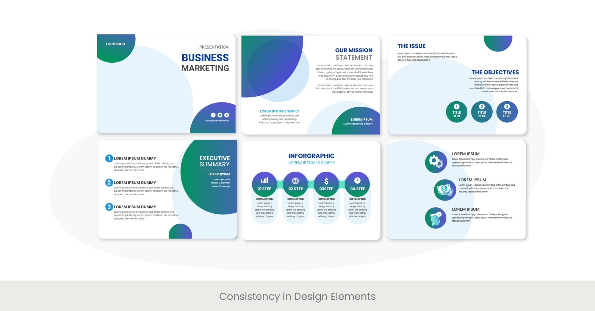
Consistency in Design Elements
Enhancing Brand Identity Through Design Consistency
Consistency in the design elements of a product presentation is vital for reinforcing brand identity and creating a memorable experience for the audience. Consistent use of colors, fonts, imagery, and layout throughout the presentation helps in building a coherent brand story that resonates with the audience. This cohesiveness ensures that the presentation not only looks professional but also feels connected, as each slide subtly reinforces the brand’s core message and values. This approach can significantly enhance the audience's trust and perception of the brand.
The Role of Standardization in Presentation Design
Historical development in graphic design shows a strong trend towards standardization, particularly with the advent of brand style guides in the mid-20th century. These guides often dictate specific colors, fonts, and other visual elements that are crucial for maintaining consistency across all forms of communication, including product presentations. The rationale is that standardized elements lead to a uniform brand experience, which is crucial in a crowded marketplace where distinctiveness and recognition are paramount.
Real-World Impact of Consistent Design Elements
Companies like Starbucks and IBM demonstrate the power of consistency in their presentation designs. Starbucks uses its distinctive green and white color scheme, along with its unique font style across all marketing materials, which reinforces its brand at every customer touchpoint. Similarly, IBM’s consistent use of blue and its proprietary IBM Plex font in presentations reflects its identity as a trustworthy and innovative technology leader. These examples show that consistency isn’t just about repetition; it's about making a brand instantly recognizable and reliable in the eyes of the audience.
Validating the Importance of Consistency with Research
Research supports the importance of consistent design elements in improving audience retention and engagement. A study by the University of Illinois found that presentations with consistent design elements across slides were 25% more effective in retaining audience attention compared to those with varied designs. This effect is attributed to the reduced cognitive load on the audience, as they do not need to reorient themselves with each new slide, allowing them to focus more on the content itself.
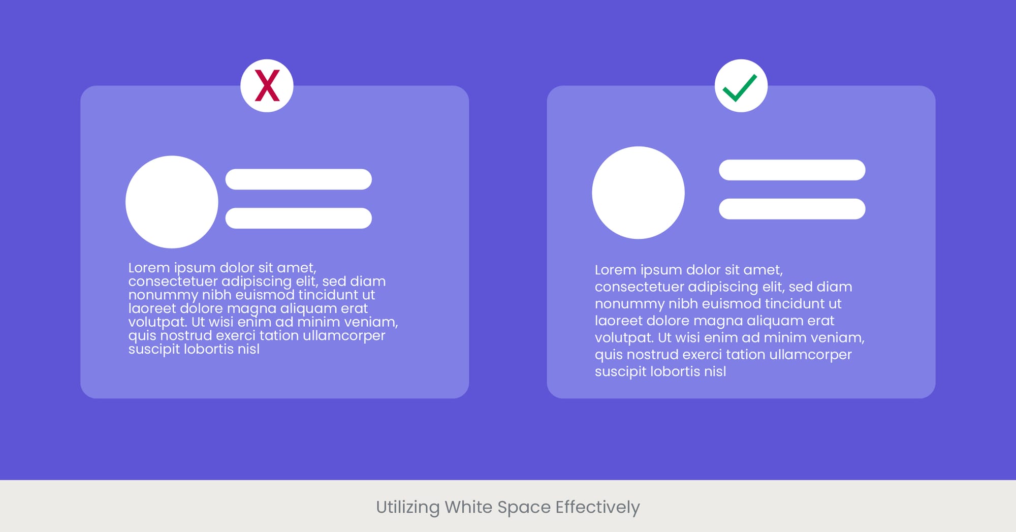
Utilizing White Space Effectively
The Strategic Role of White Space in Slide Design
White space, often referred to as negative space, is the portion of a slide left unoccupied by text or images. Its effective use is crucial in product presentation design, as it helps to create a layout that feels uncluttered and well-organized. Proper utilization of white space can significantly enhance the readability of slides by defining the grouping of information and improving the focus on key elements. This not only makes the presentation aesthetically pleasing but also facilitates easier comprehension and retention of the information presented, which is essential for organising product information effectively.
Historical Perspective on the Use of White Space
The concept of white space has been a fundamental element in art and design for centuries, emphasizing minimalism and focusing attention on what truly matters. In the context of modern design, the value proposition white space became prominently recognized with the rise of the Swiss Style in the 1950s, which focused on clean, simple layouts with ideas and concepts that are easy to understand. This design philosophy has carried into digital presentation design, where simplicity and clarity remain paramount.
Case Studies Demonstrating the Power of White Space
Leading companies such as Apple and Google effectively use white space in their product presentations to highlight new products and features. Apple, in particular, is known for its minimalist design approach, which includes ample white space to draw attention directly to its products, creating a focal point that ensures the product and its features are the center of the audience’s attention. This approach not only reinforces the product’s importance but also makes the presentation itself memorable and impactful.
Research-Backed Benefits of Using White Space
Research in the field of design and psychology supports the importance of white space. Studies indicate that layouts with ample white space increase comprehension by up to 20%, as they significantly lower cognitive overload, allowing the audience to focus on the content rather than sifting through clutter. Furthermore, white space contributes to the overall tone of the presentation, often suggesting sophistication and openness, which can positively affect the viewer's perception and emotional response to the presentation.
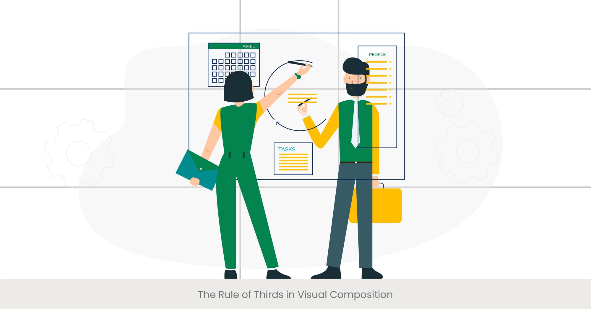
The Rule of Thirds in Visual Composition
Understanding the Rule of Thirds in Design
The Rule of Thirds is a compositional guideline used in various forms of visual arts such as photography, film, and design. It involves dividing the image into nine equal parts using two equally spaced horizontal lines and two equally spaced vertical lines. By placing the important elements of a composition along these lines or at their intersections, designers can create more engaging, balanced, and dynamic presentations. This technique is essential in product presentation flow design, helping draw the audience's attention to the most important parts of the slide and enhancing the visual communication of the presentation’s key points.
Historical Origins and Evolution of the Rule of Thirds
The Rule of Thirds originates from the theory of proportion known as the Golden Ratio. This has been a guiding principle in art and architecture for centuries, enabling artists to create aesthetically pleasing and natural compositions. In modern design, the rule has evolved and adapted for use in digital media, specifically in product presentation services. It’s used to organize content in a way that is not only visually appealing but also effective in conveying information in a manner that is easy to understand. Its application in product presentations underscores its relevance and importance in visual communication.
Practical Applications and Impactful Examples
In product presentations, applying the Rule of Thirds can dramatically increase the visual impact of the slides. Companies like Nikon and Canon use this rule in their product launch presentations to showcase cameras. The placement of the product at the intersections of the grid lines ensures it becomes the focal point of the presentation, making it more memorable and engaging for the audience. The strategic use of this rule is particularly effective when presenting key features of the product or differentiating it from competitors.
Empirical Evidence Supporting the Rule of Thirds
Studies on visual perception and aesthetics in presentations suggest that compositions adhering to the Rule of Thirds format are perceived as more balanced and interesting compared to centrally aligned compositions. A study by the University of Toronto found that viewers are more likely to engage with and remember visual content that employs this rule, as it mimics the natural way the human eye explores an image. This research underscores the practical benefits of using the Rule of Thirds format in product presentation design to optimize audience engagement and content retention.
Interactive Elements in Presentations

Enhancing Engagement with Interactive Elements
Interactive elements in product presentations are essential for fostering engagement and creating a participatory environment. These elements can range from clickable links, embedded videos, and real-time polls, to Q&A sessions. Incorporating interactivity into your product presentation flow design helps to transform a static presentation into a dynamic experience, encouraging audience participation and enhancing understanding. Interactivity retains attention by making the audience an active participant in the process.
The Evolution of Interactivity in Digital Presentations
As presentation technology has advanced, so has the capacity to incorporate interactive elements into digital presentations. Initially, presentations were largely linear and passive, limiting audience engagement. With the development of tools like PowerPoint, Google Slides, and other software, designers can now create more immersive and interactive experiences. This shift is even more evident in virtual and hybrid environments, where interactive elements are critical for maintaining audience attention and participation. These tools make product presentation services more versatile and engaging.
Case Studies Showcasing Successful Implementation
Real-world examples of successful interactive presentations are abundant. For instance, educational webinars often utilize polls and Q&A sessions to gauge understanding and encourage participation. In the corporate sector, companies like IBM use interactive dashboards and clickable infographics in their product presentations to provide deeper insights into data and foster a more engaging discussion. These interactive components allow audiences to explore information at their own pace, making the presentations more tailored to individual needs and more impactful.
Supporting Research on Interactive Presentations
Interactive presentations have been shown to significantly enhance communication effectiveness. A study by the Wharton School of Business found that interactive presentations are up to 50% more effective at maintaining audience attention and facilitating learning compared to traditional, non-interactive formats. This is due to the active involvement of the audience in the content, which helps with better retention and makes the experience more enjoyable. Implementing interactive elements can be a key component in product presentation services to optimize the presentation’s success.
Want proof of how impactful interactive elements can be in presentations? Take a look at our case studies to see how we've transformed presentations for leading companies across industries.
Animation and Transition Best Practices
Enhancing Presentations with Purposeful Animations
Animations and transitions, when used judiciously, can greatly enhance the dynamism and aesthetic appeal of product presentations. They serve not only to grab attention but also guide the audience through the content in a fluid and understandable manner. Best practices involve using subtle movements that are not overly elaborate or distracting. The goal is to emphasize critical points or smoothly transition between topics, ensuring that animations have a purpose and contribute to the overall communication of the presentation.
The Evolution of Animation in Presentation Software
Animation technology has advanced significantly with software like PowerPoint and Adobe After Effects. Initially, animations were rudimentary and often clunky. Today, modern software allows presenters to create smooth, integrated animations that align with their branding and messaging. These improvements in animation have made it easier to produce polished presentations that help product presentation services stand out in a competitive marketplace.
Illustrating Best Practices Through Real-World Examples
Companies like Google and Microsoft demonstrate excellent animation practices in their product presentations. Microsoft, for example, uses subtle transitions to highlight the seamless capabilities of its software, maintaining a sleek and professional look. Google utilizes animations to visually illustrate the interoperability of its ecosystem products, reinforcing its brand message. These companies understand how to use animation to highlight key features and enhance the storytelling aspect of their product presentations.
Research Insights on Effective Animations
Studies show that audiences are more likely to remember content that is introduced with effective animations. A study by MIT Media Lab revealed that effective animations help highlight key points and aid in the visualization of complex information. However, excessive use of animation can lead to cognitive overload. Therefore, it’s best to balance animation with the clarity of information to avoid distraction. Proper use of animations can elevate product presentation flow design and ensure the message is clear and engaging.
Dive deeper into mastering the art of presentation design with more valuable insights. Check out our blog for detailed tips and professional advice on creating visually stunning slides.
Want More Tips on Presentation Design?
Data Visualization for Clarity

The Importance of Clear Data Presentation
Data visualization is essential in product presentations when complex data needs to be communicated clearly and concisely. Using charts, graphs, and infographics enables the audience to quickly grasp important insights that might otherwise be difficult to understand through text alone. These visual tools can break down sales figures, market trends, or user demographics, making the information easier to digest. Clear data presentation ensures that audiences can make informed decisions based on the information presented.
Evolution and Techniques in Data Visualization
Over the years, data visualization has evolved from simple pie charts and bar graphs to dynamic, interactive diagrams that illustrate trends, correlations, and patterns. Tools like Tableau and Microsoft Power BI enable presenters to create sophisticated visual displays in real-time. These tools allow for a more engaging and tailored experience during product presentations, helping companies convey complex information effectively and interactively.
Effective Examples of Data Visualization in Action
Companies like IBM and Salesforce excel at using data visualization to present their products. IBM, for example, uses complex network graphs to demonstrate how their AI systems can analyze large datasets and identify trends. Salesforce uses interactive dashboards to show how their CRM system displays important sales and customer data. These examples illustrate how data visualization can turn raw data into a compelling story that resonates with the audience and enhances the product presentation flow design.
Research Supporting the Effectiveness of Visual Data
Research in cognitive psychology supports the use of visual data in presentations. Studies show that visual information can be processed 60,000 times faster than text, and people retain 65% of visual content compared to only 10% of written content after three days. These findings underline the importance of using data visualization in product presentations to ensure clarity, enhance audience understanding, and improve long-term retention of information.
If you're looking to create a presentation that truly stands out, consider working with presentation experts who can help you make your product message shine. Contact Us Now for personalized advice on elevating your presentations.
Ready to Transform Your Product Presentation? Let's Talk!
Designing for Accessibility
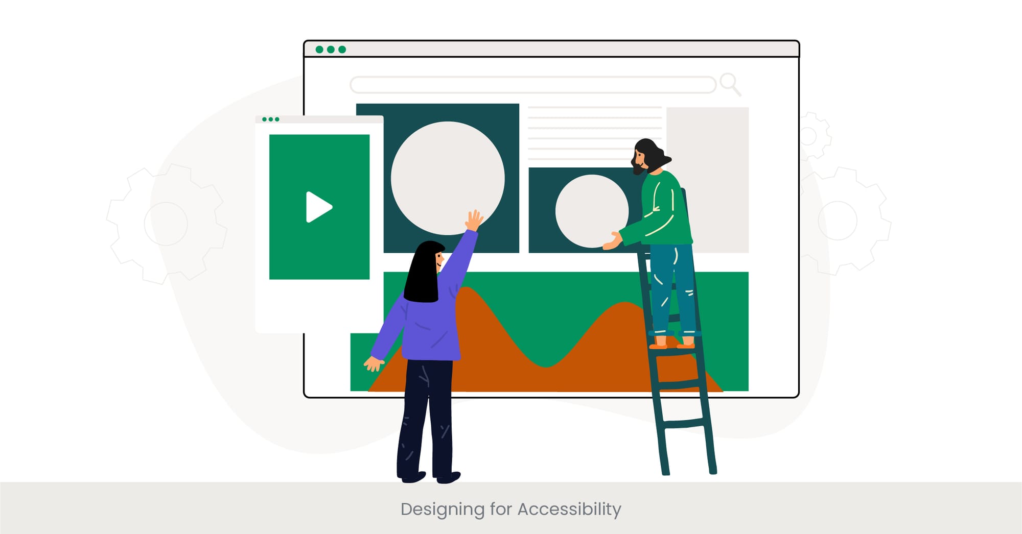
Prioritizing Accessibility in Product Presentations
Accessibility in product presentations is critical to ensure all audience members, regardless of disability, can fully engage with the content. This involves considering aspects such as color contrast, font size, and providing alternative text for images. Designing for accessibility ensures that all individuals, including those with visual, auditory, or cognitive impairments, can participate in and understand the presentation. Prioritizing accessibility reflects a commitment to inclusivity and ethical practice in business communications.
Historical Context and Importance of Accessible Design
The importance of accessible design has grown significantly, especially with the expansion of digital content and laws like the Americans with Disabilities Act (ADA). Accessibility began to gain momentum in the late 20th century as disability advocacy grew. Today, there are comprehensive guidelines for accessible digital content, ensuring that presentations, including product presentation services, are usable by people with a wide range of abilities.
Illustrating Accessibility with Real-World Examples
Companies like Microsoft and Apple lead the way in accessible design. Microsoft’s PowerPoint includes built-in accessibility checkers to help presenters ensure their slides meet accessibility standards. Apple’s product presentations often feature live closed captioning and descriptions for visual content, setting a high standard for accessibility in corporate communications. These companies exemplify how to design presentations that are accessible to all.
Research and Guidelines on Accessible Presentations
Guidelines from organizations like the Web Accessibility Initiative (WAI) offer best practices for making digital content accessible. These guidelines include recommendations for color contrast, text size, and navigation design. Research shows that following these guidelines improves the user experience for all individuals, not just those with disabilities. A study from the University of Cambridge found that accessible presentations were rated higher in terms of clarity and effectiveness by both disabled and non-disabled users.
Whether you need a pitch-perfect PowerPoint or a custom design for your product presentation, our team is here to help. Learn more about how we can bring your ideas to life.
Interactive Elements in Presentations
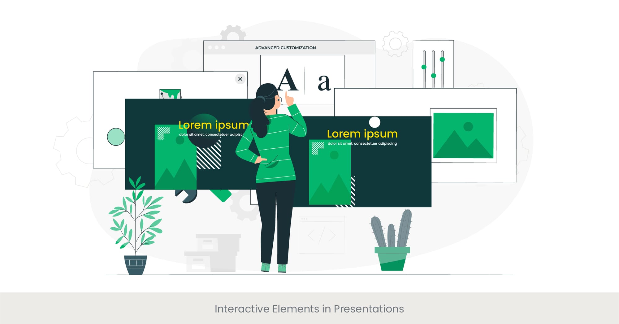
Enhancing Engagement with Interactive Elements
Interactive elements in product presentations are essential tools for engaging the audience and fostering a participatory environment. These elements can range from clickable links and embedded videos to real-time polls and Q&A sessions. By incorporating interactivity, presenters can transform a static presentation into a dynamic experience that encourages audience participation, enhances understanding, and retains attention by making the audience an active participant in the learning process.
The Evolution of Interactivity in Digital Presentations
The incorporation of interactive elements in presentations has evolved significantly with technological advancements. Initially, presentations were predominantly linear and passive, limiting audience engagement. However, with the development of more sophisticated presentation software and platforms, such as PowerPoint and Google Slides, designers now have the tools to create more immersive and interactive experiences. This shift has been further accelerated by the rise of virtual and hybrid meeting environments, where engagement tools are critical to maintaining audience attention and interaction.
Case Studies Showcasing Successful Implementation
Successful applications of interactive elements are evident in various industries. For example, educational webinars often utilize polls and Q&A sessions to gauge understanding and encourage participation. In the corporate sector, companies like IBM use interactive dashboards and clickable infographics in their presentations to provide deeper insights into data and foster a more engaging discussion. These interactive components allow audiences to explore information at their own pace, making the presentations more tailored to individual needs and significantly more impactful.
Supporting Research on Interactive Presentations
Research indicates that interactivity can significantly enhance communication effectiveness. A study conducted by the Wharton School of Business found that interactive presentations are up to 50% more effective in maintaining audience attention and facilitating learning compared to traditional, non-interactive formats. This effectiveness is attributed to the active involvement of the audience in the content, which not only helps in better retention of the information but also makes the presentation more enjoyable and engaging.
Get actionable tips on refining your product presentations right now. Read our free guide packed with strategies to enhance your visual storytelling and audience engagement.
Frequently Asked Questions

How do you present a product design?
Presenting a product design effectively involves clear and engaging visuals, concise and compelling messaging, and a strong narrative that connects the product's features to user needs and expectations. Utilize high-quality images or prototypes, data visualizations, and interactive elements to showcase the product’s functionality and benefits.
What should be included in a product design presentation?
A product design presentation should include an introduction to the product, details about its design process, key features and benefits, market analysis, competitor comparison, user feedback if available, and suggestions for future development plans. Visual aids like sketches, CAD drawings, and 3D models can enhance the presentation's effectiveness.
What should be included in a product presentation?
In a product presentation, include a clear outline of the product’s purpose, its target audience, unique selling points, pricing strategy, marketing plan and distribution plans, and key performance metrics. Use engaging storytelling and interactive video content to capture and maintain audience interest.
How do you present a product design portfolio?
A product design portfolio should be presented in a clean and organized manner, highlighting your best work through images, videos, and project descriptions. Focus on diversity of projects, the design process, problem-solving skills, and success and outcomes as product designer. Include testimonials or case studies to add credibility.
How to present a product in ppt?
Presenting a product in PowerPoint involves designing slides that are visually appealing and not overcrowded. Use high-quality images, consistent fonts, and colors reflective of the brand. Include charts, graphs, and videos to make complex information easier to digest. Interactive elements like hyperlinks or embedded documents can also be useful.
What should a product presentation include?
A product presentation should include an overview of the company, platform or product, its benefits, the problem it solves, market demand, competitive analysis, pricing, customer testimonials, and a call to action. Make sure each slide serves a clear purpose and contributes to the company and overall narrative.
What is the best way to present a product?
The best way to present a product is to clearly define in detail the business problem it solves, demonstrate its benefits, and show customers how it differs from competitors. Use storytelling to connect emotionally with the audience and interactive demos or live testimonials to provide proof of its effectiveness.
How do you start a presentation for selling a product?
Start a presentation for selling a product with introducing a compelling hook that grabs attention, such as a link, a surprising statistic, a link to a provocative question, or a relatable story. Quickly outline the problem your product solves and hint at the solution, setting the stage for the detailed presentation to follow.
%20(1).jpg)