
Advanced Graphic Design Techniques for Presentations
Introduction to Advanced Graphic Techniques
In today's competitive business environment, the ability to convey a message in a visually engaging manner is more important than ever. Advanced graphic design techniques play a crucial role in creating business presentations that not only capture attention but also facilitate comprehension and retention of information. This section delves into the sophisticated design strategies that elevate a presentation from standard to standout, focusing on how these techniques can be leveraged to make a business idea presentation not just seen, but remembered.
The Evolution and Impact of Graphic Design in Presentations
Historically, business presentations relied heavily on text and basic visuals to communicate concepts. However, as the digital landscape has evolved, so too have the expectations of audiences. Advanced graphic design techniques, such as the use of high-quality imagery, custom illustrations, and dynamic layouts, have set new standards. These methods help articulate complex ideas in a more digestible manner, enhancing the audience's ability to grasp and engage with the content, especially when explaining intricate business models or financial projections.
Real-World Application and Examples
Incorporating advanced graphic design into presentations has been a game-changer for numerous organizations. For instance, a presentation about a business plan that utilizes 3D elements and interactive design not only stands out but also significantly improves the stakeholders' understanding and retention of the material. Companies like Apple and Google have set benchmarks with their product launch presentations, using cutting-edge graphics and animations to highlight key points and market strategies effectively. These examples demonstrate the tangible benefits of adopting sophisticated design techniques in making a successful presentation.
Supporting Data and Resources
Research and case studies underscore the effectiveness of advanced graphic design in presentations. According to a study by the Nielsen Norman Group, presentations that employ a mix of high-quality graphics and minimal text increase audience engagement by up to 40%. Additionally, design-centric organizations have been shown to outperform their competitors by 219% over a 10-year period, as reported in the Design Management Institute's Design Value Index. These statistics reveal the significant impact that thoughtful design can have on the success of a business presentation.
Exploring 3D and Interactive Elements in Design
Innovating Presentation Design through 3D and Interactivity
The integration of 3D and interactive elements into presentation design represents a leap forward in how information is conveyed and experienced. This approach transforms static slides into dynamic, immersive experiences, allowing for a more impactful connection with the audience. By leveraging these elements, presenters can create a spatial understanding and deliver content in a way that is both engaging and memorable, particularly beneficial for detailed business plan presentations or complex financial projections.
The Evolution of 3D and Interactive Design
The journey from flat, two-dimensional designs to interactive, three-dimensional presentations marks a significant evolution in the field of graphic design. With advancements in software and technology, designers now have the tools to create presentations that extend beyond the screen, offering viewers a more tactile and engaging experience. This shift not only enhances the aesthetic appeal of the presentation but also aids in better comprehension of intricate concepts, such as a business model's operational and pricing structure, or target customers' market analysis.
Case Studies and Current Trends
Leading companies are increasingly incorporating 3D models and interactive elements into their presentations to highlight key elements of their business plans or to showcase product features in a more lifelike manner. For example, architectural firms use 3D renderings to present project proposals, allowing clients to virtually explore designs before any physical work begins. Similarly, tech companies employ interactive prototypes during pitches to demonstrate how a new app or software functions, providing a hands-on experience that static images or text alone cannot achieve.
Evidence of Effectiveness
The effectiveness of 3D and interactive elements in enhancing presentation impact is supported by numerous studies. For instance, research published in the Journal of Marketing Research indicates that interactive presentations can increase audience engagement levels by up to 70% compared to traditional slides. Further, a survey by Prezi found that 90% of business professionals believe that using interactive elements helps them stand out in their presentations, making their message more memorable. These findings highlight the growing importance of incorporating advanced design techniques to create a lasting impression on the audience.
Infusing Emotion and Storytelling Through Design
Leveraging Design to Tell a Story
Storytelling is an age-old technique that has been repurposed in the digital age to enhance business presentations, making them not just informative but emotionally resonant. Through strategic design, presenters can weave a narrative that connects with the audience on a personal level, turning abstract data and concepts into compelling stories. This section explores how design can be used to infuse emotion and storytelling into presentations, particularly when sharing a business idea presentation or illustrating the journey of creating a business plan.
The Role of Design in Emotional Engagement
Design plays a pivotal role in storytelling by setting the tone, creating the mood, and guiding the audience's emotional journey through the presentation. Color schemes, typography, and imagery work together to evoke specific feelings, be it excitement, urgency, or trust, thereby making the content more relatable. For instance, warm colors can stimulate a sense of optimism and creativity, crucial for presentations aimed at securing funding or buy-in for a new business venture.
Real-World Examples of Story-Driven Design
Companies like TED Talks and Pixar are renowned for their ability to craft stories that captivate and engage audiences. Their presentations often feature a blend of personal anecdotes, character-driven narratives, and visually rich designs that together create a memorable experience. By studying these examples, business professionals can learn how to effectively apply storytelling and design elements to their own presentations, whether it's to share a new marketing strategy, a business model, or financial projections.
Supporting Research and Insights
The power of storytelling in presentations is well-documented. A study from Stanford University found that stories are 22 times more memorable than facts alone. Additionally, incorporating emotional design elements can significantly increase audience retention and engagement rates. According to a report by the Nielsen Norman Group, presentations that effectively combine visuals and narratives can see a 50% increase in audience engagement. These statistics underscore the importance of integrating storytelling and emotion through design to create impactful and persuasive business presentations.
Strategic Use of Animations for Visual Impact
Animating Your Ideas for Greater Impact
In the realm of presentation design, animations serve as a powerful tool to enhance visual storytelling, guide audience attention, and emphasize key points. When used strategically, animations can transform a static presentation into a dynamic narrative, making complex information more understandable and engaging. This section explores the effective use of animations to create a visually impactful presentation about business plan, crucial for illustrating business plans, financial projections, and the journey of a business idea from conception to realization.
The Mechanics and Psychology Behind Effective Animations
Animations leverage the human brain's natural attraction to movement, capturing attention and improving retention. They can illustrate processes, show changes over time, and make abstract ideas concrete. However, the key to their effectiveness lies in their strategic application; overuse or irrelevant animations can distract or even annoy the audience. The best animations are those that enhance the storytelling aspect of the presentation, such as a graph that grows to demonstrate business growth or a model that animates to show the functionality of a product.
Showcasing Successful Animations in Business Presentations
Leading businesses often employ animations to highlight their business model's unique aspects or to breakdown financial projections in an easily digestible format. For instance, animated infographics can succinctly show financial projections based display market and competitor analysis, or target audience growth, making the data not only more visually appealing but also easier to understand. Companies like Dropbox and Airbnb have successfully used animations to explain their services and value propositions, significantly enhancing audience engagement and comprehension.
Research and Guidelines on Animation Use
Research supports the strategic use of animations in presentations. According to a study by the University of Minnesota, presentations that include relevant animations can increase audience understanding by up to 58%. Another guideline from the Harvard Business Review suggests that animations should be used to reinforce messages, not replace them, advising presenters to employ motion in moderation to highlight the most crucial parts of their presentation. These insights provide a framework for using animations effectively, ensuring they add value to the presentation and contribute to a more impactful delivery.
Consistent Theme and Style Across Presentation Elements
Creating Cohesion with Theme and Style
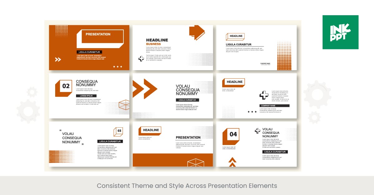
A consistent theme and style are the bedrock of any visually impactful presentation. They ensure that each slide contributes to a unified narrative, enhancing the overall professionalism and credibility of the presentation. This is especially critical when presenting a business plan or idea, where the coherence of the visual elements can significantly influence the audience's perception and understanding. This section delves into the importance of consistency in design and how it can be effectively achieved to support the narrative of your perfect business plan presentation or presentation.
The Importance of Visual Consistency
Visual consistency in presentations involves the harmonious use of colors, fonts, imagery, and layout across all slides. It serves to create a visual language that helps the audience connect the dots, making the content more accessible and engaging. Consistent design elements reinforce the presentation's message, aiding in brand recognition and recall, which is particularly beneficial for businesses aiming to showcase their model, their target customer, market, or marketing strategies in a memorable way.
Implementing a Consistent Design Strategy
To achieve visual consistency, presenters must start with a clear design template that reflects the presentation's tone and content. This includes selecting a color scheme that aligns with the brand or message, using the same font styles for headings and body text, and applying similar styling for graphics and illustrations. Additionally, the layout of each slide should follow a structured format to guide the audience through the presentation seamlessly. For instance, a business plan presentation might feature a recurring motif or color that symbolizes the company's vision, appearing subtly across all slides.
Evidence of Impact and Best Practices
Studies have shown that consistent visual presentation can significantly affect comprehension and retention. A report by the Journal of Applied Psychology found that presentations with consistent themes and styles led to better understanding and recall of the information presented. Best practices suggest using a limited color palette to avoid visual clutter and selecting fonts that are both readable and reflective of the presentation's tone. By meticulously planning the visual aspects of a presentation, presenters can ensure that their various business goals, plans and ideas are conveyed clearly and effectively.
Guidelines for Creating Engaging Slide Backgrounds
The Art of Slide Background Design
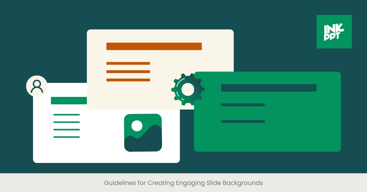
The background of a slide is not just a canvas on which content is placed; it is a critical component that can significantly influence the engagement and perception of your presentation. An engaging slide background complements the content, enhances readability, and sets the tone for the message being conveyed. This is particularly crucial in business presentations, where the goal is often to persuade, inform, or inspire. This section outlines essential guidelines for creating slide backgrounds that captivate and resonate with your audience, ensuring your business plan presentation is both impactful and memorable.
Understanding the Impact of Background Choices
The choice of slide background can make or break the visual appeal of your presentation. A well-chosen background can highlight key content, make text more readable, and contribute to the overall aesthetic coherence. Conversely, a poorly chosen background can distract, overwhelm, or even obscure important information. Factors such as color, texture, and imagery must be carefully considered to support the presentation's theme and objectives, whether it's to pitch a new business idea, outline a full marketing plan or strategy, or present financial projections.
Best Practices for Slide Background Design
Simplicity is Key: Opt for clean, uncluttered backgrounds that do not compete with the text or graphics. A minimalist approach can help ensure that your content stands out.
Consistency Across Slides: Maintain a consistent background style throughout your presentation to create a cohesive visual narrative. This consistency helps reinforce your brand and makes your presentation more professional.
Color and Contrast: Choose background colors that offer sufficient contrast with your text for easy readability. Soft, neutral colors can serve as excellent backgrounds without overshadowing the content.
Relevance to Content: The background should complement the theme of your slide. For instance, a slide discussing market analysis might feature a subtle, abstract design that evokes a sense of data or networks.
Incorporating Backgrounds Effectively in Business Presentations
Real-world examples demonstrate the effectiveness of well-designed slide backgrounds. Companies like Apple use backgrounds that complement their product imagery and key messages, enhancing the visual impact of their presentations. Research supports the use of appropriate backgrounds, with studies indicating that visual coherence in presentations can improve audience retention and engagement. By adhering to these guidelines, presenters can create slide backgrounds that enhance the visual appeal of their presentations, making their business plans and ideas more compelling and memorable.
Balancing Text and Visuals in Presentation Design
Achieving Harmony Between Text and Imagery
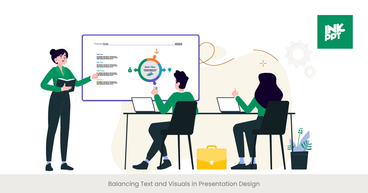
In the world of business presentations, striking the right balance between text and visuals is essential for delivering a message that is both engaging and informative. Too much text can overwhelm the audience, while too many visuals may dilute the message. This section explores strategies for achieving an optimal balance, ensuring that your presentation effectively communicates your business plan, financial projections, or marketing strategies without losing the audience's interest.
Understanding the Dynamics of Text and Visual Integration
The integration of text and visuals in a presentation should be guided by the principle of complementarity. Text provides the necessary details and explanations, while visuals help to illustrate and reinforce all these details and points. The key is to use visuals to break down complex information, such as data from market analysis or financial plans, making it more accessible and easier to understand. Meanwhile, text should be concise and to the point, offering the audience a clear takeaway without excessive reading.
Strategies for Effective Balance
Use Visuals to Simplify Complex Ideas: Infographics, charts, and diagrams can present complex data or concepts in a digestible format, reducing the need for lengthy textual explanations.
Prioritize Key Messages: Identify the core messages of your presentation and use text to highlight these points. Supplement with visuals that enhance or exemplify these key messages.
Adopt a Hierarchical Approach: Organize text and visuals in a hierarchical manner, with the most important information being the most prominent. This guides the audience's attention effectively through the presentation.
Interactive Elements: Incorporating interactive elements into title slide like clickable icons or embedded videos can provide additional information without cluttering the slide with text.
Examples and Best Practices
Real-world examples of successful presentations often show a masterful balance between text and visuals. For instance, TED Talks frequently use powerful imagery or videos to complement the speaker's narrative, creating a memorable experience for the audience. Studies have shown that presentations that effectively balance text and visuals can increase audience engagement and retention by up to 50%. This highlights the importance of thoughtful design in business presentations, where the goal is to convey a business idea or plan in a way that is both comprehensive and captivating.
Real-world Examples of Visually Impactful Presentations
Learning from the Best in Presentation Design
The most memorable business presentations often share a common trait: they make exceptional use of visual design to communicate their message. By examining real-world examples of visually impactful presentations, we can uncover the strategies and techniques that make them stand out. This section highlights several case studies that demonstrate how effective design can elevate a presentation, making the case for a business plan, marketing strategy, or financial projection more persuasive and engaging.
Case Studies of Excellence in Presentation Design
Apple Product Launches: Apple's presentations are renowned for their minimalist design, high-quality visuals, and clear messaging. By using vivid imagery and sleek animations, Apple effectively showcases its products' features and benefits, creating anticipation and excitement. The consistent use of a clean, branded theme helps reinforce Apple's identity, making each presentation a case study in brand storytelling.
TED Talks: TED speakers often use visually rich slides to complement their narratives, enhancing the emotional resonance of their stories. For example, in presentations about business ideas, technological factors, or innovations, speakers use powerful visuals and minimal text to support their spoken words, making complex topics accessible and engaging to a wide audience.
Google I/O Keynotes: Google utilizes interactive elements and live demos in its presentations to highlight the capabilities of its products and services. This approach not only demonstrates the practical application of their offerings but also keeps the audience engaged through a mix of visuals, text, and interactivity.
Impact of Visual Design on Audience Engagement
The success of these presentations underscores the importance of visual design in capturing and maintaining audience attention. Studies and surveys have consistently shown that presentations utilizing high-quality visuals and strategic design elements are more likely to engage audiences, increase retention of information, and persuade effectively. For instance, a survey by the Presentation Guild indicates that presentations deemed highly effective by audiences contain 25% more visual content than average presentations.
Incorporating Best Practices into Your Presentations
Drawing inspiration from these examples, businesses can adopt similar design strategies to enhance their own presentations. Whether it’s a presentation about a business plan or a pitch for a new product, incorporating high-quality visuals, maintaining a consistent theme, and balancing text with imagery are key strategies for success. By studying and applying the techniques used in these real-world examples, presenters can create visually impactful presentations that resonate with their audience and effectively convey their message.
Designing Memorable Presentation Quotes and Highlights
Making Key Points Unforgettable
In any business presentation, certain messages and quotes are meant to resonate more profoundly with the audience, serving as the takeaways that linger long after the presentation concludes. Designing these quotes and highlights with a strategic approach can significantly enhance their memorability and impact. This section delves into the art of making key points stand out through thoughtful design, ensuring they capture the essence of your business plan, idea, or strategy effectively.
Principles of Highlight Design
To design memorable quotes and highlights, it's essential to apply principles that elevate their visibility and resonance. Utilizing distinctive fonts, color contrasts, and spatial positioning can draw attention to these elements, distinguishing them from the rest of the content. Moreover, incorporating visual metaphors or icons related to the message can enhance understanding and retention, particularly effective in conveying complex business concepts or in financial statements and projections.
Strategies for Emphasis
Typography and Size: Choose fonts that embody the tone and importance of the quote or highlight. Larger sizes and bold or italic styles can signify significance, making the text stand out.
Color and Contrast: Utilizing colors that contrast with the background or employing a distinct color scheme for key points can make them instantly noticeable.
Visual Anchors: Pairing text with an iconic image or a subtle animation can anchor the quote in the viewer's memory, associating the message with a visual cue.
Inspiration from Successful Presentations
Looking at presentations that have effectively used design to highlight key messages offers valuable insights. For example, TED Talk presenters often utilize a single, impactful quote on a slide with minimalistic design to punctuate their narrative, ensuring that the message stands out. In business settings, companies like Tesla have masterfully used quotes and highlights to underscore their innovation and vision, using stark visuals and bold text to make their points memorable.
Research Supports Visual Highlights
Evidence suggests that well-designed quotes and highlights significantly enhance message retention. According to a study by the Educational Psychology Review, information presented in a visually distinct manner is more likely to be remembered than standard text. This underscores the importance of design in making key presentation points memorable, providing a compelling reason to employ these strategies in your business presentations.
Collaborative Design Approaches for Team Presentations
Harnessing the Power of Teamwork in Design
In the context of business presentations, collaboration among team members can lead to a more cohesive and impactful end product. Leveraging the diverse skills, perspectives, and expertise within a team allows for a richer design process, resulting in a presentation that effectively communicates the collective vision and objectives of the entire business plan, or project. This section explores collaborative design approaches that can enhance team presentations, ensuring that every element, from the business model to the marketing strategy, is presented with clarity and creativity.
Foundations of Effective Team Collaboration in Design
Successful collaborative design starts with clear communication and the establishment of common goals. Utilizing collaborative tools and platforms facilitates a seamless workflow, enabling team members to share ideas, feedback, and revisions in real time. Establishing roles based on each member's strengths ensures that tasks such as data analysis, graphic creation, and narrative development are handled efficiently, leading to a more polished and unified presentation.
Strategies for Collaborative Design Success
Shared Design Language: Developing a shared set of design standards and guidelines ensures consistency across the presentation, reinforcing the thematic unity and professional appearance.
Iterative Feedback Loops: Regular review and feedback sessions among team members encourage ongoing refinement and improvement of key personnel of the presentation, ensuring that each element aligns with the overall objectives.
Utilization of Collaborative Tools: Tools such as Google Slides or Microsoft PowerPoint Online allow team members to work on the presentation simultaneously, streamlining the design process and fostering a spirit of collaboration.
Real-World Examples of Successful Collaboration
Many of the most memorable business presentations are the result of collaborative efforts. For instance, the annual reports and product launch presentations of companies like Airbnb and Slack showcase the effectiveness of teamwork in creating presentations that are not only visually compelling but also deeply resonant with their target audience. These examples demonstrate how collaborative design can elevate a presentation, making complex information about financial projections, market analysis, or business strategies accessible and engaging.
The Impact of Collaboration on Design Quality
Research underscores the value of collaboration in the creative process. A study published in the Harvard Business Review found that teams that collaborate closely in the design phase produce more innovative and effective solutions than those working in silos. This collaborative approach not only enhances the creativity and quality of the presentation design but also fosters a sense of ownership and engagement among team members, contributing to a more dynamic and persuasive presentation.
FAQs: Enhancing Your Business Presentation Skills

Below are the answers to some frequently asked questions related to creating and delivering effective business presentations. These insights aim to cover various aspects, including design, content, and delivery strategies, ensuring a comprehensive understanding of how to craft visually impactful and persuasive presentations.
How do you present a business plan presentation?
To present a business plan effectively, start by outlining your main objectives and key points, ensuring clarity and coherence. Use visual aids like charts, graphs, and images to illustrate your points, making complex information more accessible. Practice your delivery to maintain engagement, and anticipate questions from your audience to prepare thorough responses.
How do you summarize a business plan presentation?
Summarize a business plan presentation by highlighting the core elements: the business idea, market analysis, marketing strategies, financial projections, and the management team. Focus on the unique value proposition and the expected outcomes, ensuring the summary create a business plan presentation template is concise yet comprehensive.
What should a business presentation include?
A business presentation should include an introduction to the business idea, an overview of the target customer segment and market, a detailed description of the company's success and business model, marketing and sales strategies, financial projections, and an executive summary. Visual elements should complement the text to enhance understanding and retention.
How do you write a business plan in PowerPoint?
Writing a business plan in PowerPoint involves creating slides that cover all critical aspects of your written business plan below, including the executive summary, business description, market analysis, organizational structure, product or service offerings, marketing and sales strategies, and financial planning. Use charts, graphs, and bullet points to present information clearly and concisely.
How to do a presentation of a business plan?
Presenting a business plan effectively involves clearly articulating your vision and strategy, demonstrating a deep understanding of the market, and showcasing how your business, marketing goals and financial plan will succeed. Use visual aids to support your points, engage with your audience by asking questions and inviting feedback, and practice your delivery to ensure confidence and professionalism.
What is the format for a business presentation?
The format for a business presentation typically includes an introduction, an overview of the business concept, detailed sections on market analysis, business model, operations plan, marketing and sales, customer segments, risk management plan and strategies, financial projections, and a conclusion. Each section should be supported by appropriate visuals and data to enhance clarity.
How do you present a presentation plan?
To present a presentation plan, start with a clear outline of the topics you'll cover. Use visual aids and storytelling to engage your audience, and practice your delivery to ensure it's smooth and confident. Be prepared to answer questions and provide additional details as needed.
What is business idea presentation?
A great business plan presentation or idea presentation is a pitch that outlines a new business concept, its value proposition, target market, competitive advantage, and how it plans to succeed. It typically includes financial projections and a marketing strategy to show potential investors and demonstrate the idea's viability and potential for success.
What is the best topic for presentation on business?
The best topic for a business presentation depends on your audience and objectives. Popular topics include innovative business ideas, market trends and analysis, strategies for growth, profit and loss statements, case studies of successful businesses, and insights on leadership and management.
How much do presentation designers charge?
The cost of hiring a presentation designer can vary widely depending on the designer's experience, the complexity of the project, funding requirements and the time frame. Rates can range from $50 to $150 per hour for freelance designers, while agencies may charge higher rates.
What does a presentation designer do?
A presentation designer specializes in creating visually appealing and effective presentations. They work to enhance the visual aspect of a presentation through layout, design, typography, imagery, and color schemes, ensuring that the message is communicated clearly and engagingly.
How do I get a PPT designer?
To find a PPT designer, you can search online freelancing platforms like Upwork, Fiverr, or Behance, where professionals showcase their portfolios. Alternatively, design agencies and networks can be linked resources that provide access to experienced designers specialized in presentation design.
What is a presentation design agency?
A presentation design agency specializes in various communication channels creating professional and impactful presentations for businesses and individuals. These agencies offer expertise in visual communication, helping clients convey their messages through compelling design and storytelling techniques.


%20(1).jpg)
%20(1).jpg)

