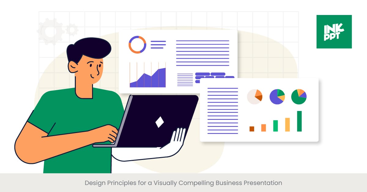
Design Principles for a Visually Compelling Business Presentation
Unleashing the Power of Visual Storytelling: Our Success Stories.

Feb 14, 2024
17 min read
%20(1).jpg)
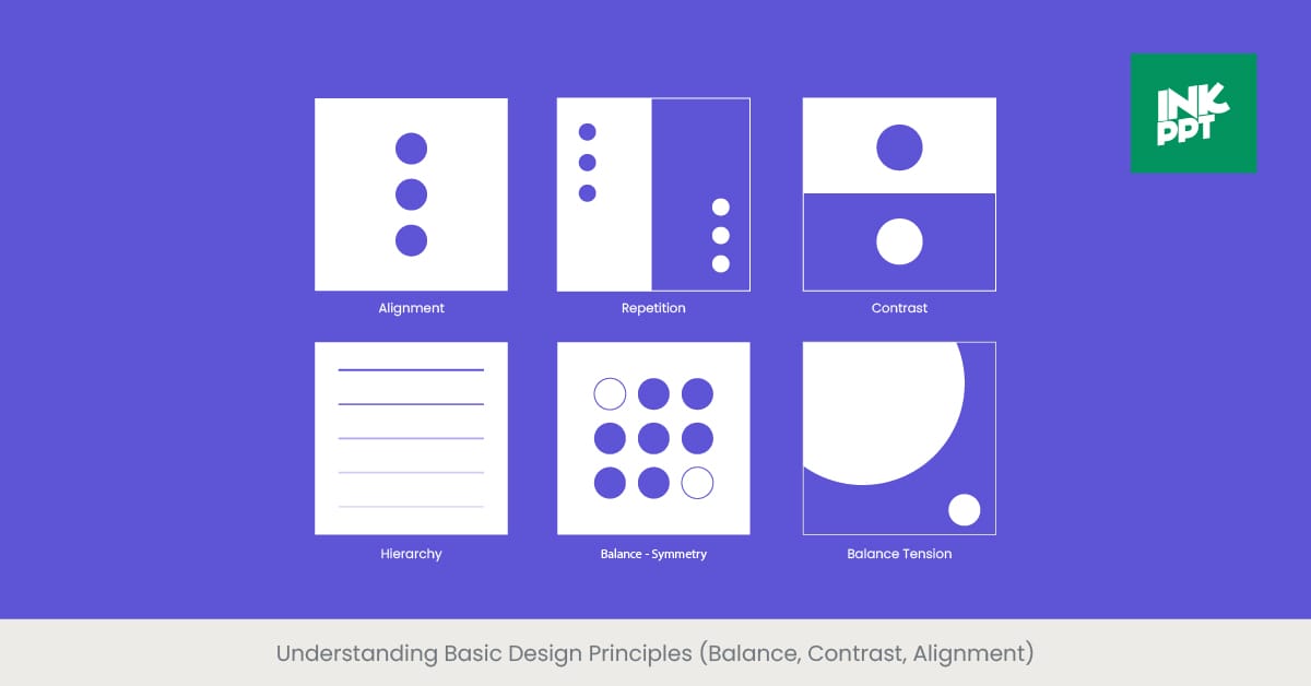
Understanding Basic Design Principles (Balance, Contrast, Alignment)
An Introduction to Core Design Elements
In crafting a visually compelling business presentation, the foundational design principles of balance, contrast, and alignment play pivotal roles. These elements are not merely aesthetic considerations; they are essential tools that guide the viewer's eye and facilitate the clear communication of ideas. Balance ensures that the slide's composition feels stable and aesthetically pleasing, preventing any single element from overpowering others. Contrast, on the other hand, draws attention to key points, helping important information stand out through differences in color, size, and type. Alignment brings order and cohesion, creating a seamless flow of content that enhances readability and professional appearance. This triad of design principles forms the backbone of effective presentation design, ensuring that your message is delivered with clarity and impact.
The Importance of Design Fundamentals
Understanding the background and significance of these design principles is crucial for anyone involved in creating business presentations. The concept of balance dates back to ancient art and architecture, embodying the idea of symmetry and harmony. Contrast has been a fundamental aspect of visual communication, utilized to highlight differences and prioritize information. Alignment stems from the need for a logical structure, ensuring that elements relate to each other in a meaningful way. These principles have evolved into key guidelines for graphic design, particularly in the context of presentation design, where the goal is to communicate complex information quickly and effectively.
Real-World Applications and Examples
In the realm of business presentations, these design principles manifest in various ways. A well-balanced, slide deck might use symmetrical or asymmetrical layouts to distribute visual weight evenly. High contrast is often achieved through the use of bold colors against a neutral background or by varying text sizes for hierarchical importance. Effective alignment might mean aligning text left or using grid structures to organize content. Companies like Apple and Google exemplify these principles in their presentations, using clean lines, stark contrasts, and balanced layouts to convey their messages succinctly and elegantly.
Validating with External Sources
Research and studies underscore the effectiveness of these design principles. For instance, a study published in the Journal of Visual Communication found that presentations utilizing high contrast between text and background enhance comprehension and retention. Similarly, the Design Management Institute highlights case studies where strategic use of balance and alignment significantly improved audience engagement and message clarity. These findings validate the critical role of balance, contrast, and alignment in creating successful business presentations, emphasizing the need for thoughtful design in professional communication.
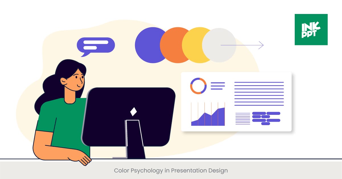
Color Psychology in Presentation Design
The Power of Color in Communication
Color psychology is a crucial aspect of presentation design that can significantly affect the viewer's perception, emotions, and understanding of the material presented. Different colors can evoke different feelings and associations, making it essential to choose your palette wisely to support the message of your business presentation. For instance, blue is often associated with trust and calmness, making it an excellent choice for corporate presentations, while green can represent growth and stability, suitable for presentations on business development or sustainability.
Exploring the Meaning Behind Colors
The study of color psychology delves into how colors influence human behavior and decision-making processes. Historically, colors have been used to convey messages and evoke responses in various cultures and contexts. In marketing and branding, colors are strategically selected to elicit specific customer reactions. For example, red can evoke a sense of urgency, while yellow can inspire optimism. Understanding these psychological effects is paramount in presentation design, as it allows the designer to manipulate viewer emotions subtly, enhancing the overall impact of the presentation.
Leveraging Color for Impactful Presentations
Real-world examples of effective color use in business presentations abound. A notable case is the use of a monochromatic color scheme by a renowned technology company to promote focus on their innovative product. Similarly, a leading food and beverage company utilized warm colors in their presentation to evoke feelings of warmth and comfort, aligning with their brand image. These examples demonstrate how color can be a powerful tool in reinforcing the message and engaging the audience.
Supporting Evidence from Research
The influence of color on perception and behavior is well-documented in scientific literature. A study in the Journal of Marketing Research indicates that appropriate color use can increase brand recognition by up to 80%, highlighting the importance of color in business communication. Furthermore, research published in Color Research & Application found that people make up their minds within 90 seconds of their initial interaction with people or products, and about 62%-90% of the assessment is based on colors alone. These statistics underscore the critical role of color psychology in business presentation examples and design, emphasizing its potential to make or break the effectiveness of your business presentation.
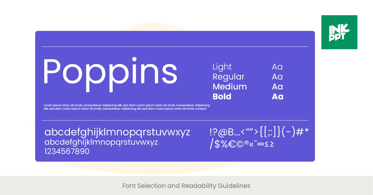
Font Selection and Readability Guidelines
The Significance of Typography in Presentations
Typography is an essential element of presentation design that significantly influences readability and audience engagement. The choice of font and text formatting can convey tone, establish hierarchy, and guide the audience's attention to the most crucial parts of your presentation. Selecting the right font involves more than just aesthetic preference; it requires a careful consideration of readability, context, and the emotional impact of the typeface. A well-chosen font enhances the clarity of your message and ensures that your presentation is accessible to all audience members.
Understanding Font Types and Their Uses
Fonts can be broadly categorized into serif, sans-serif, script, and decorative types, each with its own implications for readability and presentation style. Serif fonts, characterized by small lines attached to the end of letters, are traditionally used in print and considered more formal. Sans-serif fonts, without these lines, offer a cleaner look that is often easier to read on digital screens, making them a popular choice for business presentations. Script and decorative fonts, while attractive, can be challenging to read and are best used sparingly, such as for titles or emphasis. The context and medium of your presentation will largely dictate the most appropriate font choice.
Real-World Applications and Success Stories
Companies renowned for their compelling presentations, such as Apple and TED Talks, often employ a minimalist approach to typography, favoring clean, sans-serif fonts that are easy to read from a distance. This simplicity ensures that the audience's focus remains on the content rather than being distracted by overly decorative fonts. Additionally, the use of consistent font styles and sizes across slides contributes to giving presentations both a cohesive and professional look, significantly enhancing the presentation's overall effectiveness.
Empirical Evidence on Typography and Readability
Research underscores the importance of font selection in presentation design. A study published in the International Journal of Human-Computer Studies found that sans-serif fonts, such as Arial and Helvetica, significantly improve reading speed and comprehension on digital screens compared to serif fonts. Moreover, guidelines from the American Psychological Association recommend using highly readable fonts at a size of at least 18pt for presentations, ensuring that all audience members, including those with visual impairments, can easily follow along. These findings highlight the critical role of font selection in enhancing the accessibility and effectiveness of business presentations.
Incorporating Brand Elements in Presentation Design
Branding in Business Presentations
Incorporating brand elements into presentation design is not just about aesthetics; it's a strategic approach to building brand recognition and cohesion across all company communications. Effective use of brand elements—such as logos, color schemes, and typography—ensures that every slide reflects and reinforces the company's identity. This consistency helps to establish a strong, memorable brand presence in the minds of the audience, whether they are potential investors, clients, or employees. By integrating brand elements into your presentation, you're not only sharing information but also telling a compelling story about your business.
The Role of Brand Identity in Presentations
Brand identity is the visual and emotional representation of a company, encompassing everything from color palettes and typography to messaging and values. When presentations align with brand identity, they communicate a consistent message that resonates with the audience and fosters trust. For example, a technology startup might use sleek, modern fonts and a vibrant color scheme to convey innovation and energy, while a law firm might opt for more conservative colors and traditional fonts to project stability and professionalism. Understanding and leveraging your brand identity in presentation design can significantly enhance the impact of your message.
Successful Brand Integration Examples
Several leading companies excel in integrating brand elements into their business presentations. For instance, a global beverage company consistently uses its iconic red and white color scheme, along with distinctive typography, across all marketing presentations to reinforce brand recognition. Another example is a tech giant known for its minimalist design aesthetic, using simple layouts, a consistent color palette, and its logo strategically placed on every slide. These practices ensure that the brand is visually present throughout the presentation, enhancing brand recall and engagement.
Research and Guidelines on Brand Consistency
Studies emphasize the importance of brand consistency in enhancing consumer perception and loyalty. According to research published in the Journal of Marketing, consistent brand presentation across all platforms can increase revenue by up to 23%. The Design Management Institute also highlights that consistent brand usage in presentations and other communication materials plays a crucial role in building a strong brand identity. These insights confirm the idea that incorporating brand elements into presentation design is a vital strategy for businesses aiming to establish a cohesive and strong brand presence in the market.
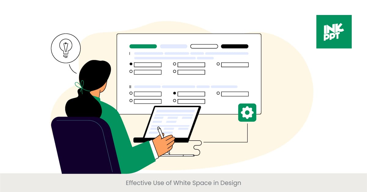
Effective Use of White Space in Design
Embracing the Power of White Space
White space, often referred to as negative space, is the unmarked portion of a slide or design element that is left empty. Far from being mere background, effective use of white space is a critical design principle that enhances readability, focuses attention, and creates a hierarchy of information in business presentations. It allows key points to stand out and provides a visual rest for the audience, making the content more digestible. White space is not just about aesthetics; it's about creating a user-friendly experience that guides the viewer through the presentation with ease.
The Importance of White Space in Visual Communication
The strategic use of white space can dramatically impact the effectiveness of a presentation. It helps in organizing content, separating distinct elements, and drawing attention to the most critical information. White space also plays a crucial role in design aesthetics, contributing to a clean, uncluttered look that is more appealing to the audience. By balancing text, images, and white space, designers can create slides that are not only visually engaging but also easy to follow and understand.
Real-World Applications and Benefits
Top brands and designers often leverage white space to enhance the impact of their presentations. For instance, a well-known technology company might use ample white space around product images to draw focus and signify importance, while a fashion brand may use white space to create a sense of luxury and exclusivity in killer presentation. These applications show that white space is not about what is missing but about creating an effective framework for the content that matters, allowing the audience to focus on the key messages without feeling overwhelmed.
Supporting Research on the Efficacy of White Space
Research underscores the importance of white space in improving comprehension and retention of information presented. A study in the Journal of Cognitive Psychology found that presentations with ample white space around text and titles were significantly better understood and remembered by viewers. Moreover, guidelines from the Nielsen Norman Group, a leading user experience research firm, recommend using white space to increase content legibility and viewer engagement. These findings validate the strategic use of white space as a powerful tool in presentation design, enhancing both the aesthetic appeal and the effectiveness of the communication.
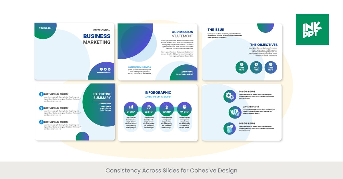
Consistency Across Slides for Cohesive Design
The Foundation of Cohesive Presentation Design
Consistency in presentation design is the thread that ties every slide together into a coherent narrative, reinforcing the message and brand identity throughout the presentation. It involves the uniform use of colors, fonts, imagery, and layout structures across all slides. This uniformity ensures that the presentation feels like a unified whole rather than a disjointed collection of slides. Consistency aids in reinforcing the business message, enhancing brand recall, and keeping the audience's attention focused on the content rather than being distracted by varying design elements.
The Role of Design Standards in Consistency
Establishing design standards is crucial for achieving consistency in business presentations. These standards should outline specific guidelines for the use of brand elements, typography, color schemes, and layout preferences. For example, defining a set palette of colors for all presentations ensures that each slide contributes to a unified brand image. Similarly, using a consistent font type and size hierarchy across slides aids in readability and helps maintain a professional appearance. By adhering to these standards, companies can create presentations that are not only visually appealing but also immediately recognizable as part of their brand.
Illustrating Consistency with Successful Examples
Several leading companies exemplify the power of consistency in their presentation designs. A prominent tech company, for example, uses a consistent layout and design template for all its product launch presentations, creating a signature look that viewers instantly recognize. Another example is a multinational corporation that employs a fixed color scheme and typography in its annual reports and investor presentations, reinforcing its corporate identity. These examples demonstrate how consistency in design can enhance brand strength and audience engagement.
Evidence Supporting the Importance of Consistency
Research highlights the benefits of consistency in presentation design. A study published in the International Journal of Business Communication found that consistent use of visual elements in best business presentations and communications significantly improves audience comprehension and retention of information. Furthermore, guidelines from professional design associations, such as the Graphic Artists Guild, emphasize the importance of consistency in building a strong, coherent brand identity across all marketing materials, including presentations. This body of evidence underscores the critical role that consistency plays in effective presentation design, further validating its importance in creating successful business presentations.
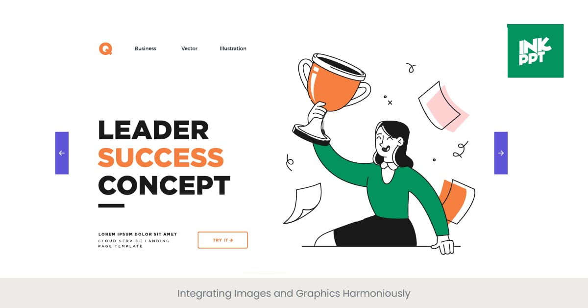
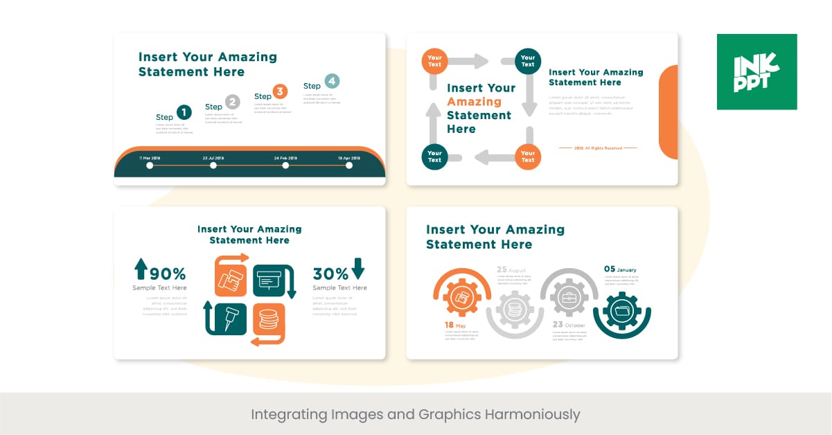
Integrating Images and Graphics Harmoniously
Enhancing Presentations with Visuals
In the realm of business presentations, the harmonious integration of images and graphics plays a pivotal role in conveying complex information succinctly and engagingly. Visual elements like charts, infographics, and photographs can break up text-heavy slides, making data more digestible and helping to maintain the audience's attention. When used strategically, these visuals can amplify your message, making it more memorable and impactful.
The Art of Selecting Appropriate Visuals
Choosing the right images and graphics is about more than just filling space. Each visual should serve a specific purpose, whether it's illustrating a point, showcasing important details or data, or evoking an emotional response relevant to the presentation's content. The best presentations use visuals that are not only high-quality and professional but also directly aligned with the topic at the point at hand, ensuring that every element on the slide contributes to the presentation software overall narrative.
Real-World Success Stories
Successful integration of visuals can be seen in the presentations of leading brands and corporations, which often use custom graphics and professional photos that reflect their brand identity and message. For example, sales pitch for a tech company might use sleek, futuristic imagery to underscore its innovation, while a nonprofit might use compelling photographs to highlight the human impact of its work. These examples show how effectively chosen visuals can enhance the storytelling aspect of a presentation.
Supporting Research on Visual Communication
Research in visual communication underscores the effectiveness of integrating images and graphics in presentations. Studies have shown that people remember 65% of information when it's paired with a relevant image, compared to 10% when presented with text alone. This statistic highlights the importance of carefully selecting and integrating visuals into your presentation to maximize audience engagement and message retention.
Choosing the Right Slide Layouts for Different Content
Tailoring Layouts to Enhance Message Delivery
The effectiveness of a business presentation significantly depends on selecting the appropriate slide layout for different types of content. Whether presenting complex data, introducing a new business model, or sharing the company's vision, the right layout can enhance comprehension and engagement. Customizing slide layouts according to the content not only aids in conveying the message more effectively but also keeps the audience focused and interested.
The Strategy Behind Layout Selection
Choosing the right layout involves understanding the nature of the content and the goal of the presentation. For data-driven slides, a layout that accommodates charts and graphs is essential. When sharing narratives or stories, a layout that allows for imagery and minimal text can be more impactful. For discussions on business models or plans, structured layouts that can visually depict processes or hierarchies are beneficial. This strategic selection ensures that the presentation is not only visually appealing but also aligned with the presentation's objectives.
Examples of Effective Layout Use
Leading companies often utilize a variety of various slide deck layouts to cater to diverse content needs effectively. For instance, a tech giant might use a grid layout to showcase product features side by side, while a consulting firm might prefer a flowchart layout to explain process improvements. These examples illustrate how adapting the slide layout to fit the content can significantly enhance the clarity and effectiveness of the presentation.
Research Insights on Visual Layouts
Studies in the field of visual communication and educational psychology suggest that the spatial organization of information on slides can greatly affect learner engagement and content retention. For example, a layout that logically aligns with the viewer's natural reading direction (left to right, top to bottom) can facilitate better comprehension. Furthermore, research indicates that presentations featuring a mix of visual and textual information, appropriately spaced and aligned, result in higher retention rates compared to text-heavy slides.
Utilizing Icons and Symbols for Visual Representation
The Impact of Icons and Symbols in Presentations
Icons and symbols offer a powerful means to convey complex information succinctly and intuitively in business presentations. These visual elements can replace or complement text, making slides more engaging and easier to digest. The right icons and symbols can communicate ideas at a glance, transcending language barriers and enhancing the presentation's global accessibility. Their use is pivotal in creating presentations that are not only visually appealing but also universally understandable.
Choosing the Right Visual Representations
The effectiveness of icons and symbols hinges on their relevance and clarity. Selecting icons that are widely recognized ensures that your message is immediately clear to the audience. Consistency in style and color of these visuals is crucial for maintaining a cohesive look and feel throughout the presentation. This careful selection and integration of icons and symbols can significantly streamline information delivery, making complex data more approachable.
Success Stories of Icon Integration
Successful applications of icons and symbols are evident in the presentations of leading global brands, which often employ custom-designed icons created to represent core services or values uniquely. For example, a multinational corporation may use a series of bespoke symbols to illustrate more detail its sustainability efforts across different regions, making the information more relatable and memorable. Such strategic use of visual representations not only reinforces the brand identity but also elevates the overall impact of the presentation.
Research Supporting Visual Symbols’ Efficacy
The cognitive benefits of using icons and symbols in learning and communication are well-documented. Research suggests that people process visuals 60,000 times faster than text, and incorporating visual aids like icons can significantly enhance message retention. A study published in the Journal of Educational Psychology found that presentations incorporating relevant icons helped audiences retain information more effectively than text-only slides. These findings underscore the importance of utilizing icons and symbols in business presentations to maximize engagement and comprehension.
Designing for Accessibility and Inclusivity
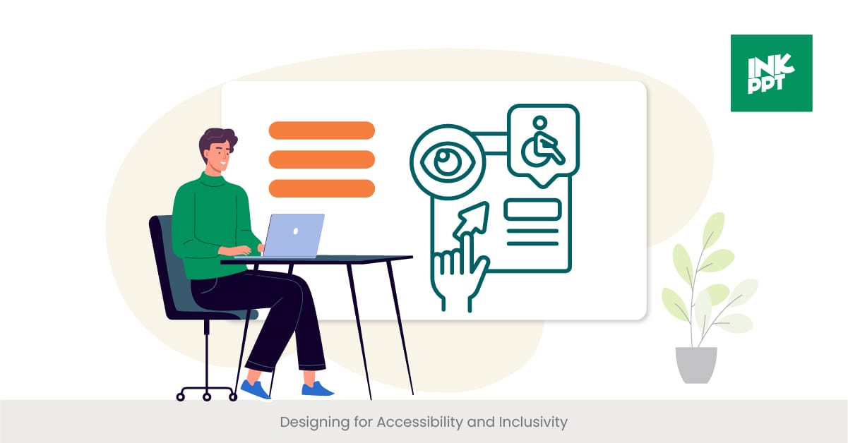
Prioritizing Universal Design in Presentations
Designing business presentations with accessibility and inclusivity in mind is crucial for reaching and engaging all audience members, regardless of their abilities or backgrounds. This approach ensures that everyone has an equal opportunity to benefit from the information being presented. Incorporating principles of universal design—such as clear visuals, readable fonts, and alternative text for images—makes presentations more accessible to individuals with disabilities, including those with visual or hearing impairments.
The Essentials of Accessible Design
Accessible presentation design involves several key practices: using high-contrast color schemes for readability, providing subtitles or transcripts for audio and video content, and ensuring that all visual materials are comprehensible without sound. Additionally, using simple, clear language and providing summaries or outlines can help individuals with cognitive disabilities follow along more easily. These practices not only make presentations more inclusive but also enhance the overall clarity and effectiveness of the communication.
Spotlight on Inclusive Presentation Successes
Organizations leading the charge in accessible and inclusive presentation design often see increased engagement and positive feedback from diverse audiences. For instance, a major technology conference introduced real-time captioning and sign language interpretation for its presentations, significantly improving the experience for attendees with hearing impairments. Another example is a global life well company that redesigned its training materials to include accessible PDFs and presentation slides, which led to better learning outcomes and created greater employee satisfaction across the board.
Supporting Data on Accessibility in Communication
Research highlights the importance of inclusive design in communication. A study from the Journal of Accessibility and Design for All found that presentations designed with accessibility in mind were rated higher in clarity, engagement, and overall effectiveness by a diverse group of participants. Furthermore, guidelines from organizations like the World Wide Web Consortium (W3C) provide comprehensive strategies for creating accessible digital content, underscoring the global movement towards more inclusive information sharing.
FAQs on Business Presentations
What should a business presentation include?
A business presentation should include a clear introduction, an overview of the business model or business plan, a discussion of market trends, details on the target market or audience, and potential investors if applicable. Including compelling stories and key takeaways slides can make the presentation more engaging.
What is the 10 20 30 rule?
The 10 20 30 rule, popularized by Guy Kawasaki, suggests that a good presentation alone should have 10 slides, last no more than 20 minutes, and use a minimum font size of 30 points. This rule emphasizes the importance of simplicity, clarity, and readability in presentations.
What are the three general types of business presentations?
The three general types great presentations include informational presentations, aimed at informing the audience about specific data, ideas or processes; persuasive presentations, designed to convince the audience of a particular, desired action, viewpoint or action; and decision-making presentations, which are intended to facilitate a decision by providing relevant information and analyses.
How do I start my own awesome business presentation?
Start by clearly defining the purpose of your presentation and understanding your audience. Begin your speech with an engaging introduction that outlines what the audience can expect to learn. Utilizing a compelling life story or presenting an interesting statistic can grab the audience's attention from the very beginning.
How do you write an awesome business presentation?
Writing a business presentation involves researching your topic thoroughly, organizing your content into a logical structure, and including key points that support your main points and explain your message. Make sure to incorporate visuals like charts, graphs, and images to complement your narrative and keep the audience engaged.
What is the best topic for presentation on business?
The best topic varies depending on your goals and target audience. Popular topics include emerging market trends, innovations in your industry, case studies of successful business strategies, and analyses of current challenges and opportunities.
What should I look for in a business presentation?
Look for clarity, conciseness, and relevance of the content to the business deck the audience's interests and needs. Effective presentations also include well-designed slides with a balance of text, visuals, and white space, and deliver a clear call to action or takeaway for the team and the audience.
What is an example of introduction in a business presentation?
An effective introduction or great presentation could start with a surprising fact, a relevant quote, or a brief story that relates to the presentation's topic. It should set the stage, prepare you for what's to come and establish why the talk or topic is important to the audience.
What is a presentation of business?
A presentation of business typically involves a team sharing information about a company's products, services, business model, market position, or strategic plans with an audience, which could be potential clients, investors, clients, or the team of employees.
How can I start a business presentation?
Begin your talk with a strong opening that captures the audience's interest, such as a question, a bold statement, or a compelling fact. Follow this with a brief overview of the project and what you will cover, setting clear expectations for the presentation.
%20(1).jpg)