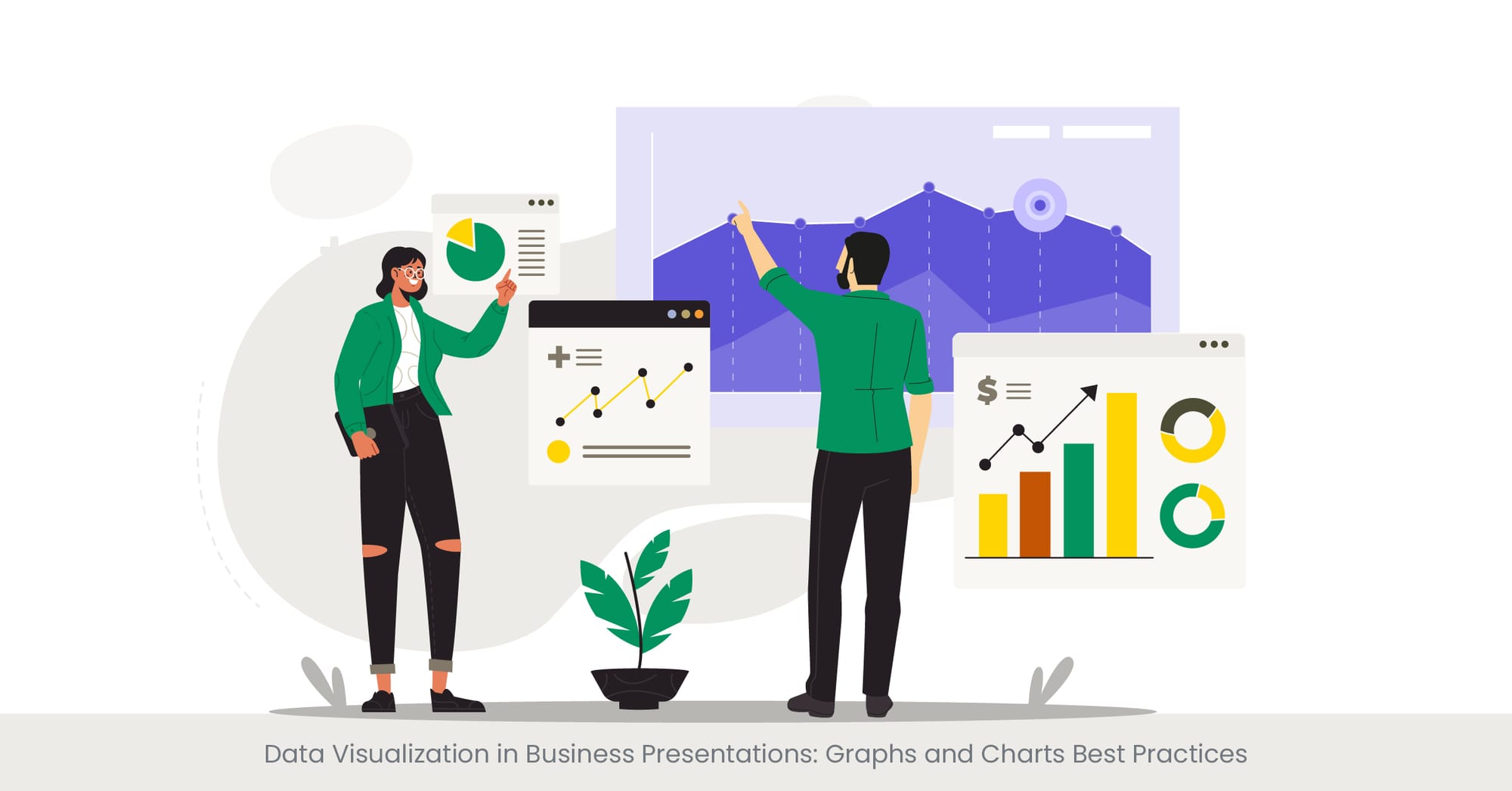
Data Visualization in Business Presentations: Graphs and Charts Best Practices
Unleashing the Power of Visual Storytelling: Our Success Stories.

Feb 15, 2024
17 min read
%20(1).jpg)
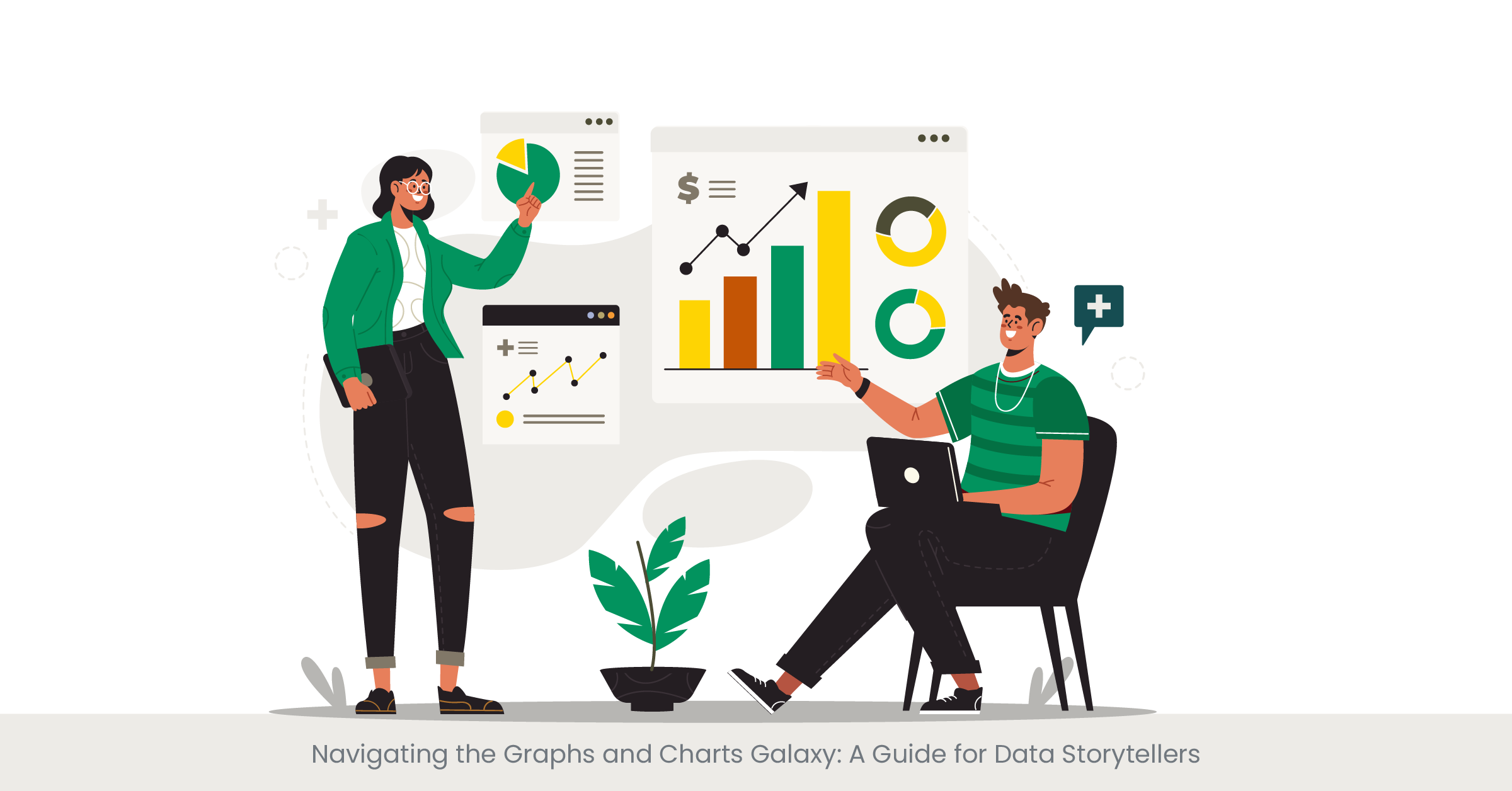
Navigating the Graphs and Charts Galaxy: A Guide for Data Storytellers
Introduction to Graphs and Charts Selection
When it comes to data visualization in business presentations, the choice of graphs and charts is pivotal. These visual aids are the storytellers of numerical tales, translating complex datasets into comprehensible narratives. The art lies in matching the story you wish to tell with the appropriate visual vehicle. Whether it’s a bar graph illustrating quarterly sales or a line chart tracking website traffic trends, the right selection can illuminate insights and guide decision-making processes. A well-chosen chart or graph not only enhances the business case presentation but also reinforces the message with clarity and impact.
Historically, visual representations of data have been instrumental in facilitating understanding. From Florence Nightingale's Coxcomb plots to John Snow's cholera outbreak maps, the ability to see patterns and relationships in data has shaped decision-making in business and beyond. Today, with the surge in big data and analytics, the role of presentation design services has grown exponentially. They specialize in harnessing the power of PowerPoint presentation design and other tools to distill and display data. The choice of graph or chart hinges on the nature of the data – categorical, time-series, comparative, or relational – and the story it is intended to convey.
Real-world Application and Current Trends
In the realm of real-world application, companies often turn to presentation design agencies to help them craft a compelling business case slide. For instance, a product launch with right presentation design agency might leverage a combination of pie charts and histograms to depict market segmentation and consumer preferences. Meanwhile, presentation design companies are increasingly adopting interactive dashboards, allowing for a dynamic and engaging data experience. These tools not only display static figures but also enable viewers to interact with the data, drilling down into specifics and exploring different scenarios on the fly.
Credibility in data representation is paramount, and referencing high-quality external sources is key to achieving this. For a presentation redesign for example, the use of business case templates with proven effectiveness can be backed by statistics from reputable agencies. According to a recent survey by a leading PowerPoint design agency, presentations that utilized tailored, data-specific graphs saw a 30% increase in audience engagement. Furthermore, a study in the Journal of Business Communication found that incorporating clear and relevant graphs in sales presentations increased the persuasiveness of the argument by 43%.
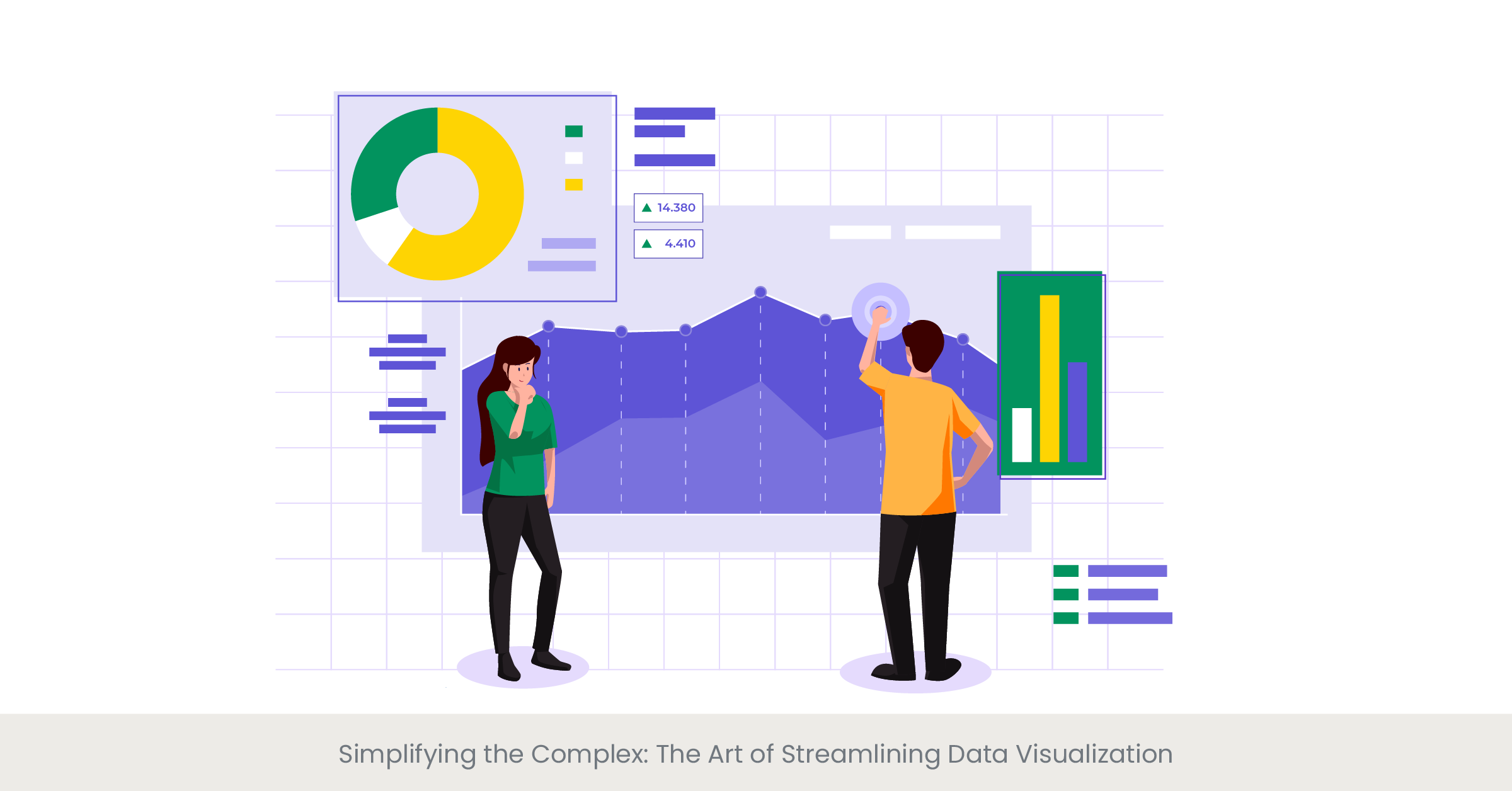
Simplifying the Complex: The Art of Streamlining Data Visualization
Introduction to Simplifying Complex Data
Data, by its nature, can be intricate and overwhelming, especially when large volumes are involved. This is where the second rule of data visualization in business presentations comes into play: simplification. The goal is to strip down complexity without losing the essence of the information. Simplifying complex data visualization involves choosing the right powerpoint presentation design services that can distill vast amounts of data into easily digestible visuals. By doing so, presentation design agencies ensure that the audience can quickly grasp the underlying patterns and messages without getting lost in a sea of numbers.
Delving into Simplification Techniques
The process of simplification is not about dumbing down data; it's about smart consolidation and prioritization. Techniques vary from employing data aggregation—whereby data is categorized into larger groups for a broader view—to highlighting significant data points to draw attention to critical trends or outliers. Google slides and other presentation software offer tools that can enhance simplicity, such as clean lines and comparative scales. These techniques by skilled presentation designers help to avoid cognitive overload and make the data more approachable and memorable.
Real-world examples abound where complex data visualization has been successfully simplified. Presentation design companies often showcase before-and-after scenarios to demonstrate their skill in transforming convoluted spreadsheets into intuitive charts. For instance, a recent corporate presentation by a tech giant exhibited a remarkable use of a minimalist interactive data dashboard that allowed the audience to explore various market scenarios with ease. Additionally, many presentation design agencies have created visual case studies that display their expertise in simplifying complex projects, making a strong case for their presentation services here.
Statistics show that presentations with simplified visuals have a higher retention rate. A survey by a top presentation design company revealed that their clients reported a 50% better understanding of data when it was presented in a simplified manner. The Harvard Business Review also emphasizes the effectiveness of simple visual aids, citing that investors and executives often prefer straightforward graphs over complex ones because they can quickly comprehend and act on the information. Thus, the importance of simplification in data visualization cannot be overstated, as evidenced by the expertise and recommendations of industry leaders.
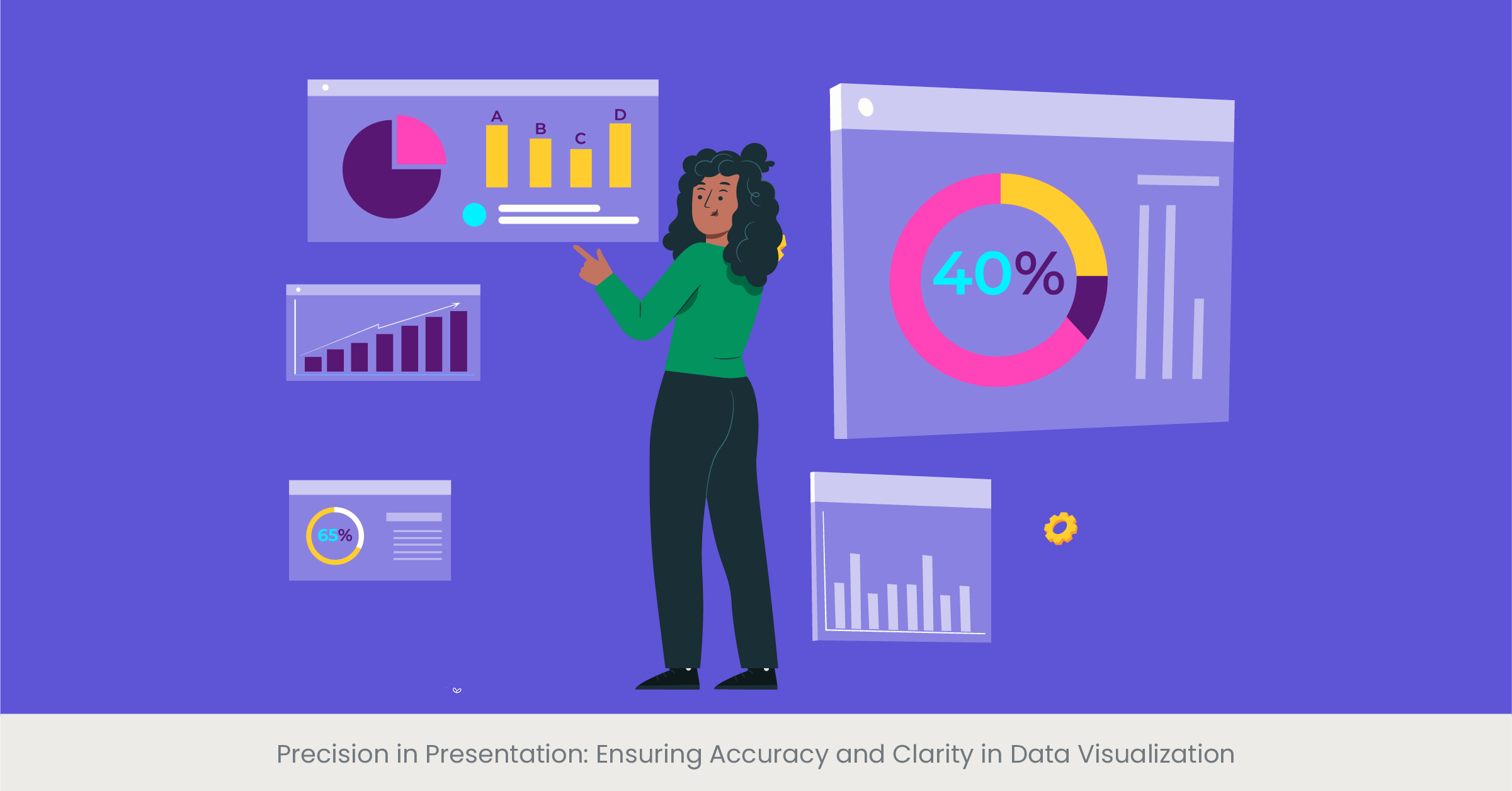
Precision in Presentation: Ensuring Accuracy and Clarity in Data Visualization
Introduction to Accuracy and Clarity in Data
The integrity of a business case presentation hinges on the accuracy and clarity of its data visualization. This concept is a cornerstone in communicating information effectively, as even the most visually appealing business case presentation template can be rendered useless if the data it conveys is not accurate and clear. The challenge for presentation design services is to maintain the delicate balance between aesthetic appeal and the precise portrayal of data. It is a balance that requires a deep understanding of data nuances and a keen eye for design.
Background on the Importance of Accurate Data Representation
The history of data visualization is littered with examples where inaccuracies in data representation have led to misinformed decisions with significant consequences. Thus, presentation designers place a high emphasis on data integrity. Accuracy involves double-checking data sources, using appropriate scales, and avoiding misleading graph elements such as truncated axes or inappropriate intervals. Clarity is about making the data accessible, using the right type of graph to match the message, and avoiding clutter that can obscure the data's meaning.
Illustrating with Real-World Examples
Consider a PowerPoint presentation for a major product launch presentation. Here, precise market data visualization could be the difference between securing stakeholder buy-in or not. A presentation design agency might use clear, accurate bar charts to depict market share, while a sales presentation may require precise line graphs to forecast sales trends. Google Slides and other tools now offer advanced features that help ensure accuracy, such as live data integration, which can update charts in real-time to reflect the most current data.
The best presentation design companies not only focus on the aesthetics of graphs but also on the verifiability of the data presented. They often cite and link to data from credible sources, such as industry reports or academic studies, which adds a layer of trust to the presentation. For instance, a business case analysis might be supported by data from financial institutions or market research firms, complete with citations. According to a survey by a leading business school, presentations that referenced authoritative data sources were rated as more than persuasive presentations by 65% of executives surveyed.
Unveiling Success Stories: Real-world Examples of Effective Data Visualization
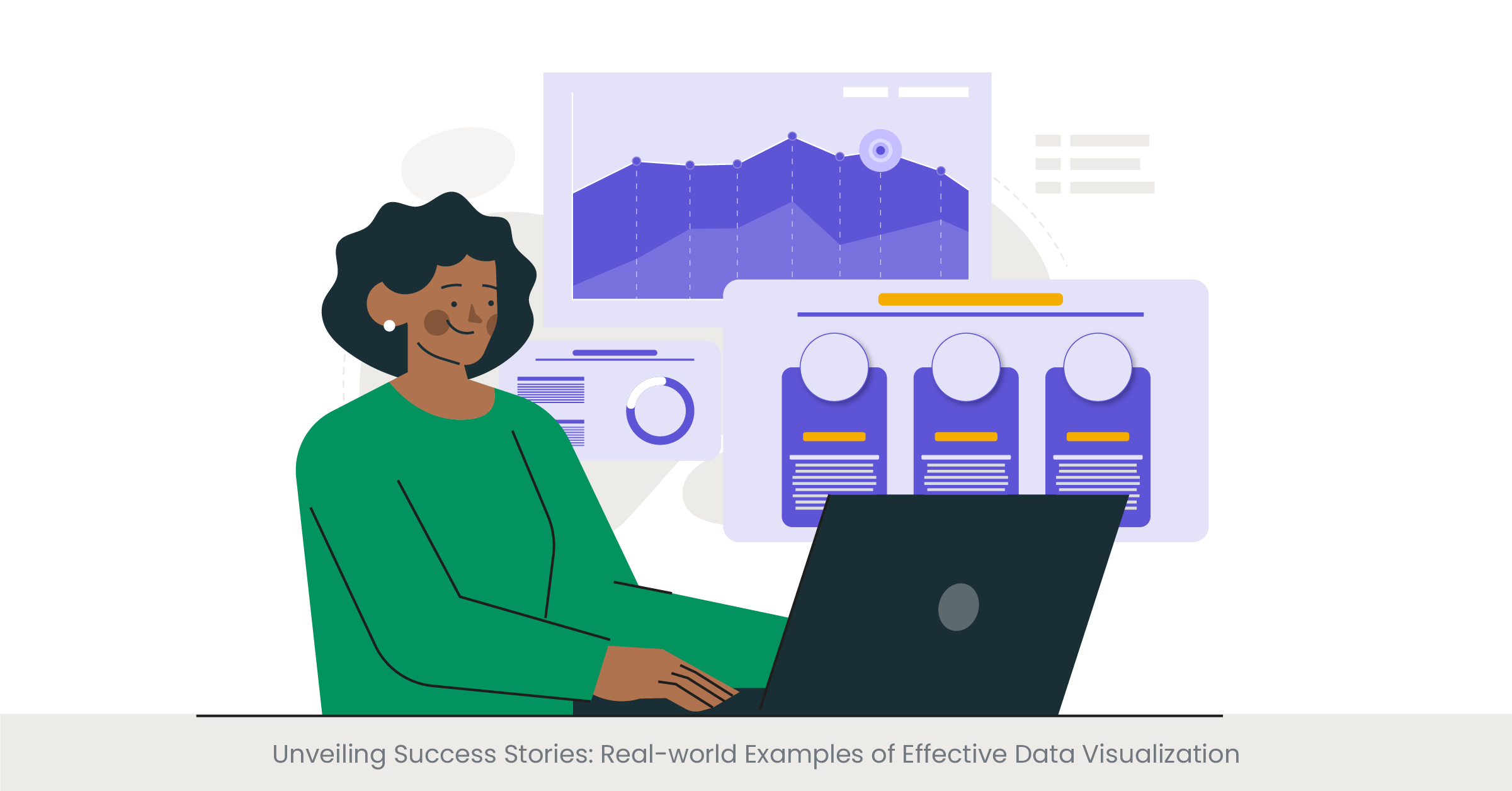
Introduction to Effective Data Visualization
Effective data visualization acts as a bridge between complex data sets and decision-making processes. It is a potent tool in a business case presentation, with the power to influence and inform. But what makes a data visualization effective? The answer lies in its ability to tell a story that is both compelling and understandable. It’s not just about presenting data; it’s about crafting a narrative that resonates with the audience. Presentation design services strive to achieve this by focusing on design elements that highlight the key messages within the data.
Background on Data Visualization Success
The success stories of data visualization are as varied as the fields that use them. For example, the use of infographics in business case slides has transformed dry statistics into engaging stories. Historical examples, like the work of Edward Tufte, who emphasized the importance of displaying data with integrity and simplicity, continue to influence modern presentation design. Moreover, both powerpoint presentations and presentation design services have evolved to incorporate storytelling elements, making data not just informative but also memorable.
Real-world Examples of Visualization
Among the notable instances of effective data visualization are the interactive dashboards used by major consulting firms. These dashboards have revolutionized the way data is presented, allowing users to interact with the information dynamically. For example, a business case analysis presented through an interactive dashboard can help the audience visualize the impact of different business scenarios. Another example is the annual reports of leading tech companies, which often employ a mix of charts, graphs, and animations to present financial data, user statistics, and performance metrics.
The real-world effectiveness of data visualization is often supported by research and expert opinion. A study published in the 'International Journal of Business Communication' found that incorporating well-designed charts and graphs could increase comprehension by up to 70%. Presentation design agencies often highlight these findings to validate their approaches. Additionally, companies like Google have published white papers on the effectiveness of visualization in Google Slides, demonstrating how visual storytelling aids information retention and decision-making.
The Art of Data Storytelling: Leveraging Infographics
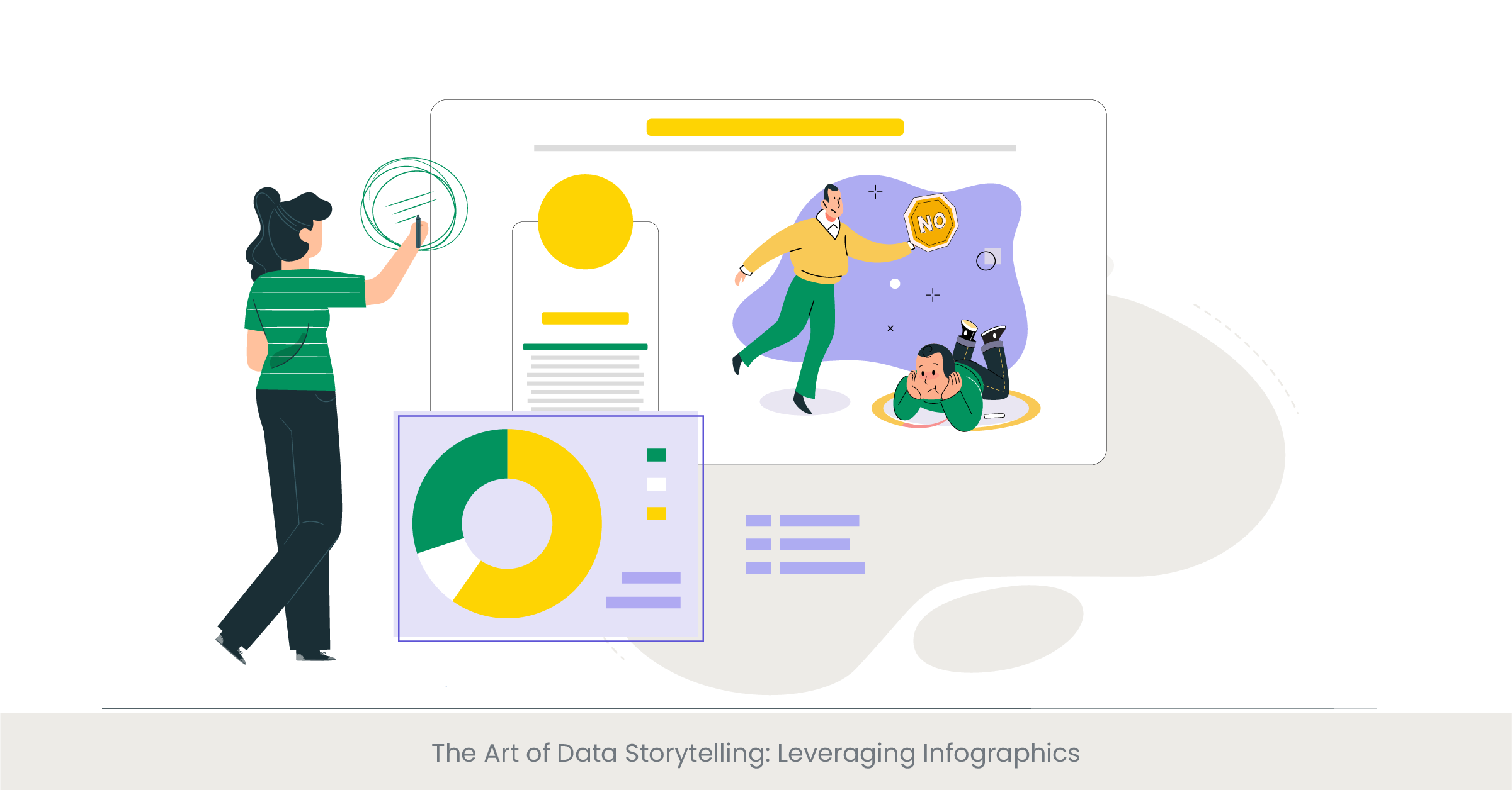
Introduction to Data Storytelling Through Infographics
Infographics have revolutionized the way we understand and interact with data in a business case presentation. They blend visual appeal with information-rich content to create a compelling narrative. The essence of data storytelling lies in its ability to make complex information easily digestible, and infographics are the perfect vessel for this. Presentation design services use infographics to transform rows of data into a visual story that engages and informs the audience, making them a staple in the arsenal of best presentation design company.
Exploring the Evolution of Infographics
Infographics are not a modern invention; they have been used for centuries, from ancient cave paintings to the elaborate diagrams of the Renaissance. In the context of business, they have taken center stage as a means to convey business cases, market analyses, and statistical data. The evolution of presentation design tools, including PowerPoint presentation design services and Google Slides, has given rise to innovative infographic formats that combine images, charts, and text to depict information more dynamically and interactively.
Real-world Applications of Infographics
Business presentations, especially those related to marketing presentations and sales presentations, have benefited greatly from the use of infographics. For example, an infographic detailing customer demographics and purchasing behaviors can provide a clear picture of market segments in a business presentation. Presentation design agencies often showcase their expertise by creating infographics that distill complex data, such as financial reports or consumer surveys, into concise visuals that highlight key trends and insights.
Infographics must be rooted in reliable data to maintain credibility. Top presentation design companies ensure that the data they visualize comes from authoritative sources, often referencing industry reports, academic research, or proprietary data. For instance, a business case slide that includes an infographic might cite data from a well-known market research firm to back up the market trends it presents. The use of verifiable sources not only strengthens the message but also enhances the reputation of the business or individual presenting the data.
Enhancing Engagement: Animations and Transitions in Data Visualization
Introduction to Dynamic Visualizations in Presentations
In the landscape of business presentations, animations, and transitions are not mere embellishments; they serve as critical tools for enhancing the understanding and retention of data. When used judiciously, these dynamic elements can guide the audience through a narrative, revealing insights step-by-step and keeping them engaged. The judicious use of animations in PowerPoint presentation design services, for instance, can turn a static business case slide into an interactive storytelling experience.
The Role of Animations in Simplifying Information
Animations can break down complex information into manageable sequences, making it easier for the audience to follow and absorb. By progressively disclosing information, animations help to maintain focus and can effectively highlight changes over time or the relationship between data points. Presentation design agencies understand the cognitive load of their audience and use transitions to direct attention, reduce overwhelm, and facilitate the digestion of complex data.
Real-world Examples of Effective Use of Animations
Consider the impact of a well-animated product launch presentation. It can reveal market trends, product features, and user statistics in a manner that builds anticipation and keeps the audience engaged. Real-world examples include sales presentations that use motion to track the journey of a product from conception to market leader. Presentation designers may use animated charts to depict the growth trajectory, with each phase of growth revealed through a transition, creating a more memorable presentation and persuasive narrative.
While animations can add a layer of sophistication to presentations, their accuracy and relevance should be grounded in solid data. Top presentation design service companies often quote statistics on the effectiveness of animated visuals. For instance, research has shown that animated visuals in a PowerPoint presentation can increase audience engagement by up to 40%. Presentation design services ensure that the animated elements are not only visually appealing but also represent the data faithfully, often referencing and displaying source data on-screen during the presentation for transparency and trustworthiness.
Interactive Insights: The Power of Data Dashboards in Presentations
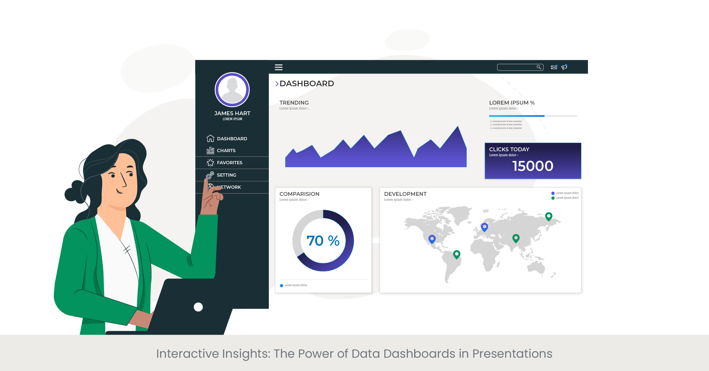
Introduction to Interactive Data Dashboards
Data dashboards are at the forefront of modern business presentations, offering a dynamic and interactive way to display complex data. They serve as a control panel, providing a comprehensive view of metrics and key performance indicators (KPIs) at a glance. In a business case presentation, an interactive dashboard can empower the audience to engage directly with the data, fostering a deeper understanding and a more personalized experience.
The Evolution and Importance of Dashboards
Historically, data was presented in static tables and charts, which could be difficult to interpret and act upon. The advent of interactive dashboards has changed the game, allowing users to filter, drill down, and manipulate data in real time. This evolution has been driven by advances in presentation design services and software, with PowerPoint presentation design services now integrating dashboard functionality into their offerings. Dashboards have become an essential tool for project managers and business analysts to convey complex data succinctly and effectively.
Dashboards in Action: Case Studies
Real-world examples of dashboard implementation include multinational corporations that use them for tracking sales and operations across different regions. Presentation design agencies have crafted bespoke dashboards for these companies, which are used in executive summaries and monthly reports. These dashboards often include interactive elements like sliders and dropdown menus, allowing viewers to select different data segments and receive immediate, visual feedback.
The inclusion of interactive dashboards is supported by research indicating their effectiveness. For instance, a study from a presentation design company found that presentations featuring interactive dashboards saw a 50% increase in audience participation. Furthermore, industry experts from presentation design agencies have noted that interactive dashboards can lead to more informed decision-making, as they allow users to explore and interrogate the data themselves, leading to a more engaging and insightful presentation.
Future-Proofing Presentations: Trends in Data Visualization for Business
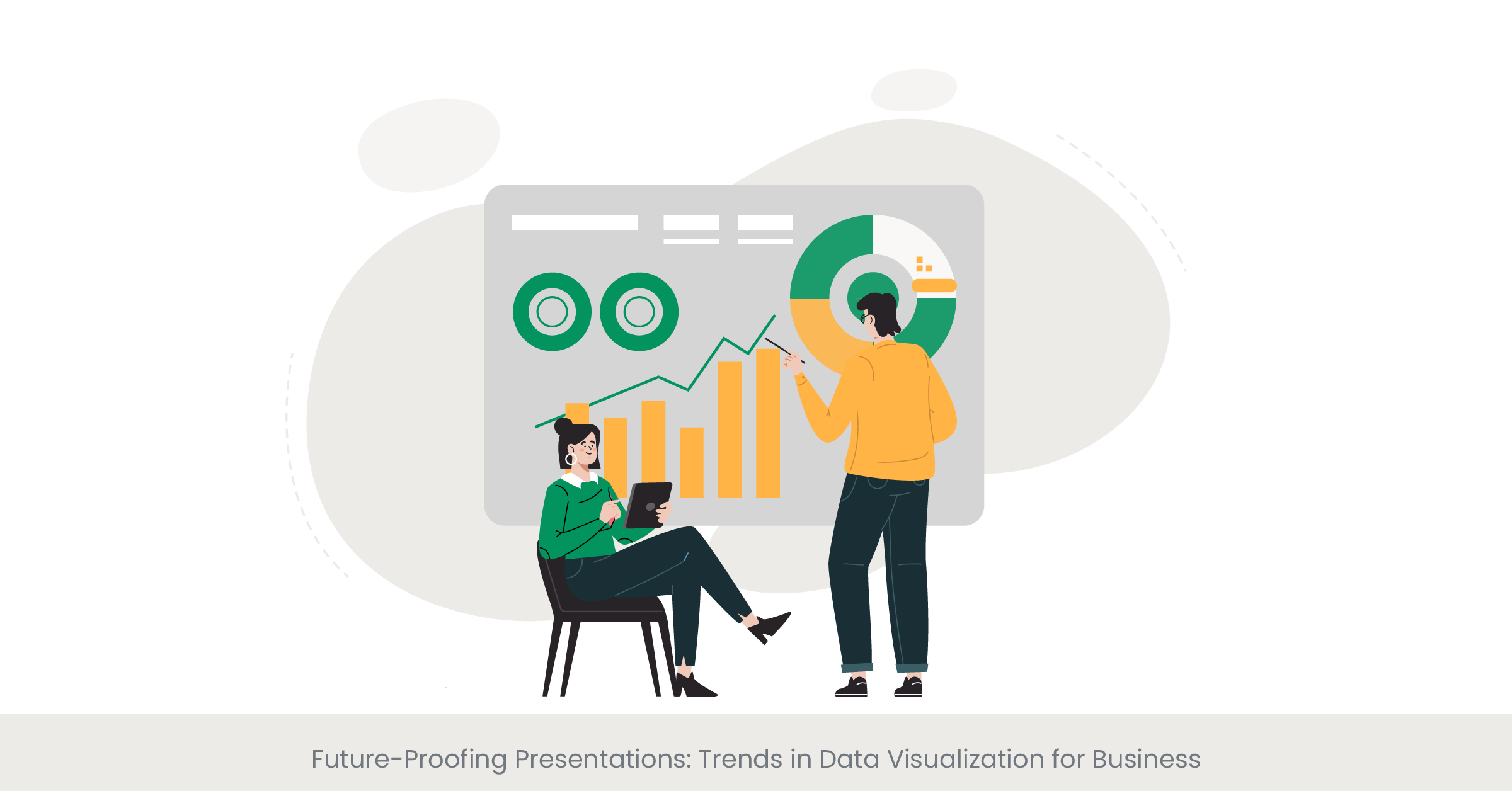
Introduction to Data Visualization Trends
As the business landscape evolves, so do the trends in data visualization. Keeping abreast of these trends is crucial for any business case presentation, as it reflects a company's ability to adapt and innovate. From AI-powered analytics to real-time data feeds, the latest trends in data visualization are shaping the way businesses present and interpret data. Presentation design services that stay ahead of these trends not only offer cutting-edge solutions but also provide their clients with a competitive edge.
Understanding the Impact of New Visualization Techniques
Emerging technologies are continuously influencing the techniques used in presentation design. For instance, augmented reality (AR) and virtual reality (VR) are beginning to find their way into powerpoint presentation design services, offering immersive ways to explore data. Big data and machine learning are also impacting the field, with algorithms now capable of identifying patterns and insights that might be missed by the human eye, and presenting them in novel and compelling ways.
Case Studies: Innovation in Data Visualization
Innovative companies are already harnessing these new trends to powerful effect. A business case slide that uses AR can allow stakeholders to visualize product placement in a real-world setting, while VR can create an immersive environment for exploring complex datasets. Presentation design agencies are also leveraging these technologies to offer more impactful and engaging presentation experiences. For example, a financial firm used an interactive, real-time data visualization to illustrate market fluctuations during a high-stakes investment meeting, enabling investors to make more informed decisions on the spot.
The future of data visualization is a hot topic among industry experts and thought leaders. Research papers and tech conferences often highlight the potential for AI and interactive elements to transform business presentations. A recent article in a tech journal by a leading presentation design company projected that the use of dynamic and interactive data visualization will increase by 70% in the next five years. This suggests a future where data visualization not only informs but also interacts with the audience in real-time, making presentations more engaging and informative.
Mastering the Numbers: Strategies for Presenting Statistical Data
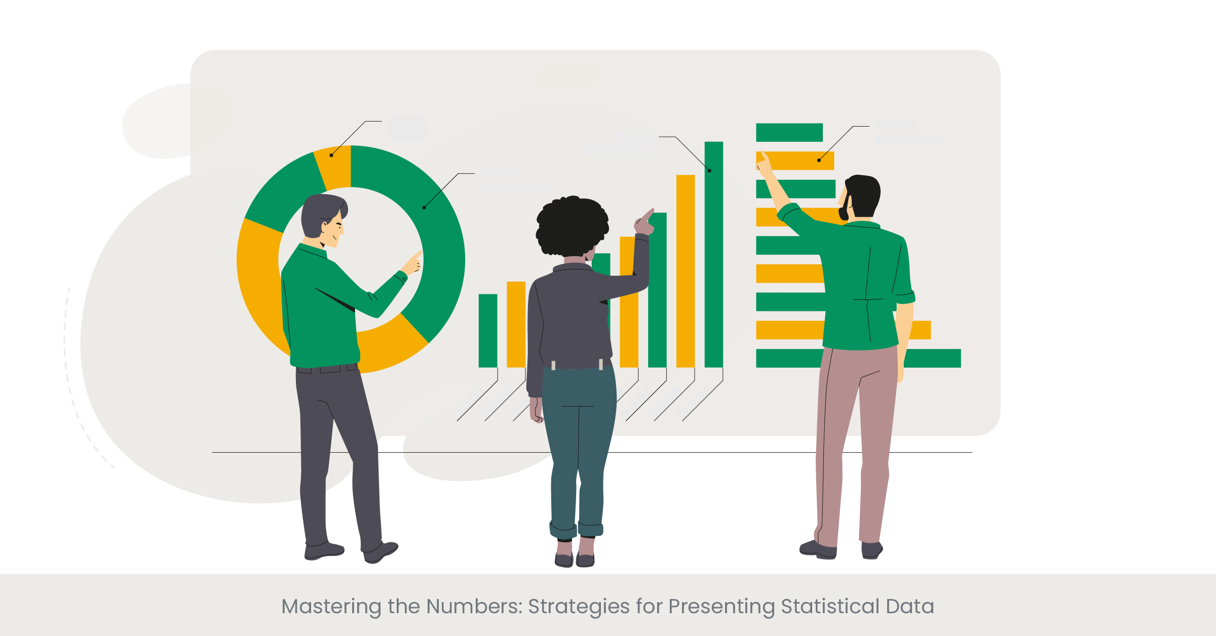
Introduction to Statistical Data Presentation Strategies
Presenting statistical data effectively is a cornerstone of a persuasive business case for best presentation design agency. The challenge is to present statistics in a way that is accurate, accessible, and engaging. This requires a blend of clear communication, appropriate visualization, and a narrative that connects the data to the audience's needs and interests. Successful presentation design services understand that the right strategies can transform raw numbers into powerful insights.
Deep Dive into Effective Data Strategy
The key to presenting statistics effectively lies in understanding the audience and the context. For a product launch presentation, this might involve focusing on consumer statistics and market potential. Presentation design agencies have developed a range of strategies to handle such data, such as segmenting information, using relative comparisons, and emphasizing change over time. These techniques help to contextualize data, making it more meaningful and impactful for the audience.
Real-World Examples of Statistical Presentation
Real-world examples of statistical data presentation abound in annual business reports and market analysis presentations. For instance, sales presentations often use comparative bar graphs to show performance against competitors, while business case analyses might employ scatter plots to identify correlation between variables. In these cases, presentation designers aim to highlight the most important statistics to support the narrative of the presentation.
Credibility in statistical presentation is reinforced by sourcing data from reputable institutions. Presentation design companies often cite market research firms, government databases, and academic studies to back up the data they present. For example, a business case slide might include statistics from an industry report, adding authority to the presentation. According to a study by a leading university, presentations that include cited statistics are considered more trustworthy by 80% of business executives.
The Persuasive Power of Data: Visualization for Impact
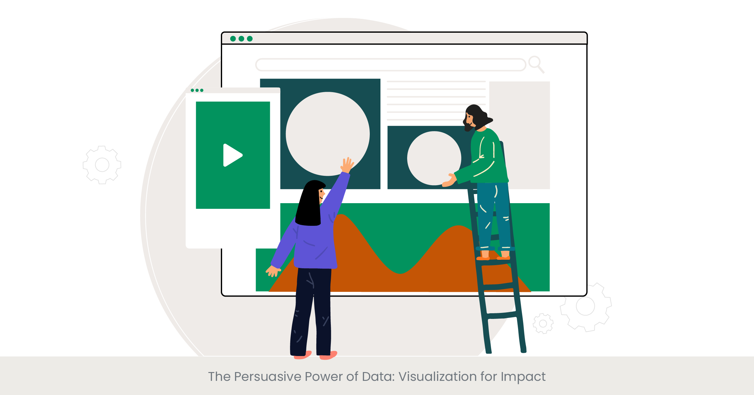
Introduction to Persuasive Data Visualization
In the world of business presentations, data visualization is not just about displaying information; it's about persuasion. It's about using data effectively to influence and drive decision-making. A business case presentation, for instance, needs to do more than just inform—it must convince. To achieve this, presentation design services must leverage data visualization techniques that not only present data but also tell a compelling story, creating an emotional connection with the audience and emphasizing the key takeaways.
Background on the Art of Persuasion through Data
The art of persuasion in data visualization is rooted in an understanding of human psychology and the principles of design. It involves the strategic use of colors, shapes, and layouts to emphasize important data points and guide the audience's perception. For instance, a PowerPoint presentation design that wants to underscore growth will use ascending bar charts with bold, upward-pointing arrows. Presentation designers are adept at using visual hierarchies to direct attention to key factors and employ contrast to create focal points for persuasive storytelling.
Case Studies of Impactful Data Visualization
Looking at case studies, we find numerous instances where data visualization has been used to great persuasive effect. Sales presentations, for instance, often use infographics to highlight customer satisfaction rates or to compare feature benefits. A presentation design company might produce a business case slide that uses a combination of pie charts and pictograms to represent market share and demographic segments, making the data more relatable and impactful.
The persuasive power of visualizations is often backed by data and research from credible sources. Presentation design agencies typically reference statistical evidence to support the choices made in data representation. For instance, a study might show that presentations with data visualizations are 43% more persuasive than those without. Furthermore, experts from presentation design services can cite cases where their visual strategies have directly contributed to successful business outcomes, such as increased investment or improved stakeholder buy-in.
FAQs
What should be included in a business case presentation?
A business case presentation should include an executive summary, problem statement, proposed solution, benefits and drawbacks, cost-benefit analysis, risk assessment, and implementation plan. Visual aids like graphs and charts should be used to support the data presented.
What are the 4 key elements that a business case should contain?
The four key elements include the executive summary, business idea, analysis of the problem or opportunity, discussion of possible solutions, and a recommendation with justification.
How do you present a business use case?
Present a business use case by starting with a clear problem statement, a simple business case template followed by the proposed solution, the benefits, and how it aligns with business objectives. Use data visualization to make your case compelling.
How do you present an effective business case?
An effective business case is presented by clearly defining the problem, showcasing the benefits of your solution, providing a detailed analysis and evidence, and concluding final presentation with a strong call to action. Incorporate visual data representation for clarity and impact.
What is a business case slide?
A business case slide is a part of a presentation deck that succinctly presents the rationale for a project or initiative, highlighting the benefits, costs, and impact on the organization. It uses graphs, charts, and bullet points for easy comprehension.
How do you structure a business case presentation?
Structure a business case presentation by including an introduction, background information, presentation of the business case, analysis of alternatives, recommended solution, implementation plan, and conclusion. Use charts and graphs to visualize data.
What should a business case include?
A business case should include an introduction, problem statement, analysis of options, technical details, recommended solution, implementation plan, financial analysis, risk assessment, and conclusion. Visual aids can enhance understanding and retention.
How do you write a case study slide?
Write a case study slide by summarizing the background, challenge, solution, and results. Use visuals like graphs, charts, and images to illustrate key points and outcomes effectively.
How much does it cost to design a PowerPoint presentation?
The cost to design a PowerPoint presentation can vary widely, from $100 to over $1,000, depending on complexity, length, and the expertise of the designer or agency involved.
How do I get a PowerPoint designer?
PowerPoint Designer is a feature within Microsoft PowerPoint that offers design ideas for slides. To use it, simply start creating a slide, and the Designer panel will offer suggestions. Ensure you have an active internet connection and a valid Microsoft 365 subscription.
How much does the presentation design cost per page?
Presentation design costs per page can range from $10 to $50 or more, based on the the design style, complexity, amount of content, and the designer's expertise.
How much does Slide Genius cost?
Slide Genius offers custom quotes based on the specific needs of a project. Pricing can vary based on the complexity of the presentation, the number of slides, and additional services required.
How do you start a product launch presentation?
Start a product launch presentation with a compelling story or statistic that highlights the need or opportunity for the product. Follow with an overview of the product, its features, benefits, and market potential, using engaging visuals to captivate the audience.
How do you introduce a product in a presentation?
Introduce a product by clearly defining the problem it solves, its unique value proposition, key features, and benefits. Use visuals and data to support your points and make the presentation partner introduction memorable.
How do you introduce a new product launch?
Introduce a new product launch by setting the stage with market insights, the inspiration behind the product, its differentiation points, and expected impact. Engage the audience with dynamic visuals and compelling data.
What are the five steps to launching a product?
The five steps to launching a product include market research, product development, creating a marketing plan, preparing the launch, and executing the launch strategy. Incorporating visual data presentations can enhance each step.
How much do presentation designers charge?
Presentation designers charge based on the project scope, with rates ranging from $50 to $200 per hour. Fixed project rates are also common, varying based on complexity and requirements.
What is a presentation design agency?
A presentation design agency specializes in creating visually appealing and effective presentation slides keynote presentations. They offer services like custom design, storytelling, and data visualization to enhance the impact of presentations.
Are presentation designers in demand?
Yes, presentation designers are in high demand, especially in fields requiring complex data visualization, persuasive storytelling, and professional branding in presentations.
Which company is best for presentation design?
The best company for presentation design depends on specific needs, but firms like Slide Genius, Presentation Design Co., and Buffalo 7 are highly regarded for their expertise and creativity in creating impactful corporate presentations.
%20(1).jpg)