
Principles of Effective Poster Design
Introduction to Effective Poster Design
The art of crafting an effective poster presentation transcends mere aesthetics; it's a strategic amalgamation of design principles aimed at maximizing engagement and comprehension. At the core, effective poster design is about communication – conveying your research, ideas, or information in the most accessible and impactful way possible. This necessitates a blend of creativity, clarity, and conciseness, ensuring that your poster stands out in a conference, meeting, or any event setting. It's not just about catching the eye but holding the viewer's attention long enough to impart the intended message.
Foundational Elements of Poster Design
The journey to a compelling poster presentation begins with a solid understanding of design fundamentals. This includes the hierarchy of information, color theory, typography, and layout. A well-designed poster guides the viewer through the content in a logical order, using color and contrast to highlight key points or data. Typography plays a crucial role as well; the right font can enhance readability and draw attention to the essential elements of your presentation. The overall layout should balance white space with informational content, preventing the poster from feeling overcrowded or cluttered. These elements are the building blocks of a presentation that not only informs but engages.
Real-world Applications and Trends
Incorporating current trends and real-world examples can transform a standard poster into a standout presentation. For instance, infographics and data visualization techniques have become increasingly popular in poster design, allowing complex data to be presented in a more digestible and visually appealing manner. QR codes are another innovative addition, offering a direct link to further reading, videos, photos or datasets. The evolution of digital and e-posters has also opened new avenues for interactive and multimedia elements, enhancing the viewer's engagement and the poster's overall impact.
Validating Design Choices Through External Sources
The effectiveness of your poster design can be significantly bolstered by grounding your choices in established research and design principles. Studies in visual communication and graphic design provide insights into how people perceive and process information. For example, research published in Journal of Visual Communication highlights the importance of color contrast in attracting attention and aiding memory retention. Another study in Design Studies emphasizes the role of visual hierarchy in guiding viewers through content systematically. By incorporating these insights, your poster can achieve a balance between aesthetic appeal and functional design, ensuring that your presentation makes a lasting impression.
This section has introduced the foundational principles of effective poster design, emphasizing the importance of strategic planning and execution. As we move to the next topic, we'll explore how these principles can be tailored to fit various types of events, further enhancing the impact of your poster presentations.
When preparing panel discussion slide presentations, clarity and conciseness are key. These presentations must support the flow of conversation without overwhelming the audience. Include brief, impactful slides that highlight the key points being discussed, making it easier for attendees to follow the discussion. Position the slides as visual anchors to complement the panel's insights.
Tailoring Posters for Different Event Types
Adapting Design Strategies for Varied Audiences
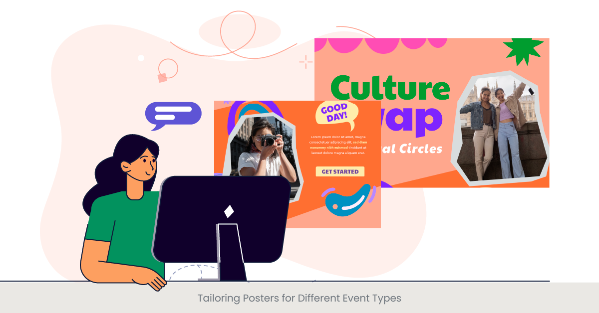
Designing a poster presentation requires a nuanced understanding of the event and its audience. Whether it’s a scientific conference, an industry trade show, or an academic symposium, each setting demands a tailored approach to ensure your poster resonates with attendees. The key lies in customizing the design and content to suit the specific interests, knowledge level, and expectations of your audience. For instance, a research poster for a scientific conference might prioritize detailed data visualizations and technical terms, while a poster for a community health fair would focus on clear, accessible language and impactful visuals.
Understanding the Context: Background and Considerations
The context in which your poster will be presented significantly influences its design. A deep dive into the event’s theme, the typical audience demographics, and the common practices within the field can provide valuable insights. Historical trends in the event’s poster sessions can offer clues about what works and what doesn’t, guiding you towards more effective design choices. For example, posters at academic conferences often follow specific formatting guidelines, while those at creative industry events may allow for more experimental designs. Understanding these nuances is crucial for creating a poster that not only stands out but is also appropriate for the context.
Corporate event presentations often aim to communicate critical business strategies, product launches, or company achievements. Use a professional, clean design with minimal text and powerful visuals to engage your corporate audience. Tailor the tone and content to reflect the company’s brand values while ensuring the presentation conveys key messages clearly.
Examples of Tailored Poster Designs
Real-world examples underscore the importance of context in poster design. At a recent international climate change symposium, a poster utilized augmented reality to provide an interactive experience, allowing attendees to visualize the effects of global warming through their smartphones. Meanwhile, a tech conference poster presentation employed dynamic QR codes that updated throughout the event to provide the latest research findings and software demos. These examples highlight how innovative approaches, when aligned with the event's focus and audience's expectations, can significantly enhance engagement and information retention.
Leveraging Insights from External Sources
Research underscores the effectiveness of audience-tailored communication strategies in poster design. A study in the Journal of Marketing Communications found that personalized visual and textual content significantly increases viewer engagement and message recall. Another research piece, focusing on educational events, demonstrated that posters incorporating interactive elements were 30% more likely to be remembered by attendees. These findings validate the approach of customizing posters to fit the event type and audience, ensuring that your presentation not only captures attention but also leaves a lasting impact.
By understanding the unique demands of different event types and tailoring your poster design accordingly, you can maximize the effectiveness of your presentation. This approach ensures that your poster not only attracts the right audience but also communicates your message in the most impactful way possible.
Incorporating Data and Research Findings

Enhancing Poster Presentations with Data
The integration of data and research findings is a pivotal aspect of crafting an impactful poster presentation for conference show. This process involves more than just listing statistics or outcomes; it's about presenting your data in a manner that is both comprehensible and compelling to your audience. Effective data incorporation can transform a poster from a mere visual display to a powerful narrative tool that highlights the significance and implications of your research or project. This involves selecting the most relevant data points, employing clear and accessible visualizations, and contextualizing these findings within the broader scope of your topic.
The Backbone of Effective Research Communication
Data serves as the backbone of your poster, providing the empirical evidence that supports your arguments or conclusions. A solid understanding of the types of data relevant to your field and how they can be visually represented is crucial. This might include quantitative data showcased through charts and graphs or qualitative insights illustrated with quotes or infographics. Historical background on how data visualization has evolved in your field can also inform your approach, allowing you to adhere to best practices while pushing the envelope with innovative formats.
Real-World Examples of Data-Driven Posters
The impact of well-incorporated data in poster presentations is evident in various successful case studies. For instance, a research poster in the field of public health effectively used color-coded maps to highlight areas with high disease prevalence, making complex geographical data immediately understandable. Another example is a finance conference poster that utilized interactive bar graphs to demonstrate market trends over time, allowing viewers to engage directly with the data. These examples illustrate how creative data visualization can elevate the overall effectiveness of your presentation.
Supporting Your Choices with Research
The importance of thoughtfully integrating data into poster presentations is underscored by research. Studies have shown that visual data representation not only aids in better comprehension but also significantly increases the retention of information. According to a publication in the Journal of Educational Psychology, viewers are 65% more likely to remember data presented through visuals than through text alone. Another study highlighted in the International Journal of Science Education found that posters incorporating interactive data elements facilitated a deeper understanding of the subject matter among viewers. These findings emphasize the critical role of data in enhancing the communicative power of poster presentations.
Incorporating data and research findings into your poster presentation is not just about showcasing your work; it's about crafting a narrative that engages, informs, and persuades. By thoughtfully selecting and visualizing your data, you can ensure that your poster not only captures attention but also conveys your message with clarity and impact.
Tools and Techniques for Creating Posters

Exploring the Toolbox for Poster Design
The creation of a compelling poster presentation hinges on leveraging the right tools and techniques. With the plethora of design software and online platforms available today, selecting the most suitable ones can significantly impact the effectiveness of your poster. This journey begins with an understanding of the specific features and capabilities of various design tools, from advanced graphic design software to user-friendly online templates. The goal is to find a balance between functionality and ease of use, ensuring that your poster not only looks professional but also communicates your message effectively.
The Evolution of Design Tools
The landscape of poster design has evolved dramatically with advancements in digital technology. Historically, poster creation involved manual processes, such as hand-drawing illustrations and physically assembling layouts. Today, digital tools offer a range of functionalities, including vector graphics for crisp designs, color management systems for accurate color reproduction, and dynamic elements like QR codes and interactive links. Familiarizing yourself with the history and progression of these tools can provide valuable insights into how best to utilize them for your poster.
Case Studies: Effective Use of Design Tools
Real-world examples illustrate the transformative power of utilizing the right tools and techniques in poster design. For instance, a research team utilized Adobe Illustrator to create high-resolution images and intricate data visualizations for their environmental study poster, achieving a level of detail and clarity that significantly enhanced viewer engagement. Another example is a marketing team that used Canva, an online design platform, to quickly assemble a visually appealing poster for a product launch event, demonstrating the efficiency and accessibility of web-based tools for professional-looking designs.
For product unveiling presentations, the goal is to generate excitement and highlight key features. Focus on high-quality visuals, demonstrations, and clear messaging that builds anticipation. Incorporate storytelling elements that tie into the brand’s narrative. Use animations or interactive elements to give the audience a memorable experience.
Validating Choices Through External Research
The strategic selection of design tools is supported by research on visual communication and graphic design. Studies highlight the importance of using high-quality images and visualizations to increase comprehension and retention rates among viewers. For example, research published in the Visual Communication Quarterly suggests that posters featuring high-resolution images and clear, legible fonts are 30% more likely to attract and retain audience attention than those without. Another study in the Journal of Graphic Design found that posters designed with professional software were perceived as more credible and authoritative. These insights underscore the significance of choosing the right tools and techniques to maximize the impact of your poster presentation.
Leveraging modern tools and techniques is essential for creating effective and engaging poster presentations. By understanding and utilizing the vast array of design resources available, you can ensure that your poster not only captures the essence of your message but also stands out in any event setting.
Engaging Your Audience with Visual Elements

The Power of Visual Storytelling in Posters
Visual elements are the heartbeat of an impactful poster presentation, capable of transforming complex information into an engaging visual story. The strategic use of color, imagery, and design not only captures attention but also facilitates understanding and retention of the presented information. This section delves into the art of selecting and integrating visual elements that resonate with your audience, creating a memorable and effective poster. The goal is to employ visuals that complement and enhance your message, making your poster not just seen but felt by the viewers.
A Deep Dive into Visual Components
The choice of visual components in a poster can significantly influence its effectiveness. This includes the use of high-resolution images, infographics, charts, and color schemes that align with the poster's theme and message. Understanding the psychology of color and how it affects perception can help in choosing a palette that evokes the desired response. Similarly, selecting images that are relevant and evocative can make your poster more compelling. The layout plays a crucial role as well, with a clear and organized arrangement of visual elements ensuring that the poster is not only aesthetically pleasing but also easy to navigate.
Interactive event presentations engage the audience through participation. Incorporate real-time polls, Q&A sessions, and interactive visuals that allow attendees to engage directly with the content. This format can be especially effective for workshops or live demos. Keep the content dynamic to maintain energy and audience involvement throughout the session.
Illustrating Success with Visual Elements
Real-world success stories highlight the impact of well-executed visual elements in poster presentations. For instance, a research poster on ocean conservation used a striking underwater photograph as its background, instantly drawing viewers in and setting the stage for the message about marine biodiversity. Another example is a health conference poster that employed simple yet powerful infographics to depict statistical data on patient outcomes, making the information accessible at a glance. These examples demonstrate how effective visuals can be in conveying complex data and narratives in an engaging manner.
Research-Backed Strategies for Visual Engagement
The importance of visual engagement is backed by research in visual communication and design. Studies have shown that visuals increase the likelihood of information being remembered by up to 55%, compared to text alone. Research in the field of educational technology suggests that posters incorporating interactive visual elements, such as QR codes or augmented reality, can enhance engagement and learning outcomes. These findings support the notion that integrating well-chosen visual elements into your poster can significantly enhance its appeal and effectiveness.
By harnessing the power of visual elements, you can create a full print or poster presentation that not only stands out but also communicates your message in a dynamic and memorable way. This approach ensures that your audience is not just informed but also inspired by what they see.
Best Practices for Presenting Posters at Events
Mastering the Art of Poster Presentation
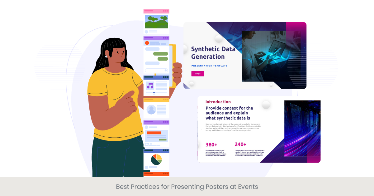
Presenting a poster at an event is an art that goes beyond design and content creation. It involves effective communication, engagement strategies, and logistical planning to ensure your message resonates with the audience. This section outlines the best practices for presenting your poster, from preparing your pitch to interacting with event attendees. The goal is to equip you with the tools and techniques needed to make a lasting impact, turning your poster presentation into a memorable and enriching experience for both you and your audience.
Preparation and Presentation Techniques
Preparation is key to a successful poster presentation. This includes familiarizing yourself with the layout of the event space, understanding the flow of traffic, and anticipating the types of questions you may receive. Crafting a concise and compelling elevator pitch that summarizes your main points can be invaluable in engaging passersby. Additionally, practicing your presentation in front of peers or mentors can help refine your delivery and ensure you are ready to communicate your research or project effectively and confidently.
Engagement Strategies for Audience Interaction
Engaging your audience is crucial for a memorable poster presentation. Strategies such as posing open-ended questions, providing interactive elements like touchscreens or QR codes, and incorporating real-world examples can foster interaction and stimulate discussion. Being approachable, maintaining eye contact, and showing enthusiasm for your topic are also key factors in drawing attendees to your poster and keeping them engaged.
Navigating Logistical Challenges
Logistical planning cannot be overlooked when presenting a poster. This involves ensuring your poster is displayed properly, with all necessary materials and equipment ready and accessible. Considerations such as the positioning of your poster, lighting, and potential obstacles to visibility and access are important to address beforehand. Additionally, preparing handouts or digital access codes for further information can enhance the audience's experience and facilitate follow-up after the event.
Leveraging Insights from Successful Presentations
Learning from successful poster presentations can provide valuable insights into best practices. Observing how experienced presenters engage with their audience, handle questions, and utilize their space effectively can offer inspiration and guidance. Furthermore, feedback from attendees and peers can highlight strengths and areas for improvement, informing future presentations and enhancing your skills as a communicator.
By adhering to these best practices for presenting posters at events, you can maximize the impact of your presentation and ensure a positive and productive experience for both you and your audience. The key lies in thorough preparation, active engagement, and effective logistical planning, all of the three questions which contribute to the success of your poster presentation.
Innovative Approaches to Poster Presentation
Embracing Innovation in Poster Design
The landscape of poster presentations is continually evolving, with new technologies and creative approaches pushing the boundaries of traditional formats. Embracing innovation in poster design not only helps in standing out in a crowded event but also in more effectively communicating complex information. This section explores cutting-edge techniques and technologies that are transforming poster presentations, from digital and interactive posters to the use of augmented reality and beyond. The aim is to inspire you to think outside the traditional poster frame, leveraging innovation to make your research or message resonate with a modern audience.
Digital and Interactive Posters: A New Frontier
The advent of digital and interactive posters has opened up a realm of possibilities for presenters. These formats allow for dynamic content, such as videos, animated graphs, and live data feeds, making the poster more engaging and informative. Interactive elements, such as touchscreens and QR codes, invite viewers to dive deeper into the content, fostering a two-way communication channel. Such technologies not only enhance the viewer's experience but also provide presenters with unique ways to showcase their work.
Augmented Reality: Bringing Posters to Life
Augmented reality (AR) is another innovative tool that is redefining poster presentations. By overlaying digital information onto the physical poster, AR can bring data to life, create immersive experiences, and make complex concepts easier to understand. Viewers can use their smartphones or tablets to interact with the poster, exploring 3D models, animations, and additional layers of information. This approach not only captivates the audience but also allows for a more detailed exploration of the subject matter.
Case Studies: Pioneering Poster Presentations
Illustrating the potential of innovative approaches, several case studies highlight how creativity and technology can elevate a poster presentation. For instance, a climate change research poster utilized AR to simulate the effects of sea-level rise on coastal cities, providing a visceral understanding of the data. Another example is a medical research poster that incorporated interactive data visualizations, enabling viewers to explore patient outcomes across different demographics. These examples demonstrate the power of innovative approaches in making poster presentations more engaging, informative, and impactful.
Supporting Innovation with Research
The push towards innovative poster presentations is supported by research on learning and engagement. Studies have shown that interactive and multimedia elements can significantly increase engagement levels and information retention among viewers. For example, research published in the Journal of Educational Multimedia and Hypermedia found that participants who interacted with multimedia posters demonstrated a deeper understanding of the content compared to those who viewed traditional posters. This evidence underscores the value of integrating innovative approaches into poster design, not just for the sake of novelty but for enhancing the overall effectiveness of the presentation.
Innovative approaches to poster presentation offer a compelling way to engage and educate audiences in a digitally connected world. By incorporating digital, interactive, and augmented reality elements, you can transform your poster into an interactive storytelling tool that captivates, informs, and inspires.
Navigating Logistical Aspects of Poster Displays
Strategic Planning for Poster Display Success
The logistical aspects of displaying a poster at an event can significantly influence its visibility and engagement levels. Effective navigation of these logistical challenges requires strategic planning, attention to detail, and sometimes, a bit of creativity. This section focuses on the practical considerations for setting up your poster display, from selecting the right location to ensuring your poster remains accessible and engaging throughout the event. Understanding and addressing these logistical elements is crucial for maximizing the impact of your presentation.
Choosing the Optimal Location and Setup
The location of your poster within the event space can dramatically affect its exposure to attendees. High-traffic areas near entrances, corridors leading to keynote sessions, or spaces adjacent to refreshment stands can offer increased visibility. However, these locations may also come with distractions or space limitations. Consider the flow of the event, the layout of the space, and the nature of your poster when selecting a location. Additionally, the physical setup of your poster—whether it's mounted on a board, displayed on a digital screen, or integrated into an interactive kiosk—should align with both the content of your presentation and the logistics of the space.
Overcoming Space and Visibility Challenges
Space constraints and visibility issues are common logistical challenges at crowded events. To overcome these, effective use of vertical space, clear signage, and strategic lighting can make your poster stand out. Employing tall, eye-catching display stands or banners can help attract attention from afar, while spotlights or LED frames can highlight key elements of your poster in dimly lit venues. Additionally, consider the accessibility of your poster for all attendees, including those with disabilities, by ensuring a clutter-free area around your display and providing alternative formats if necessary.
Leveraging Technology for Seamless Displays
Technology plays a pivotal role in navigating the logistical aspects of poster displays. Digital posters, for instance, can alleviate some physical constraints by allowing for dynamic content changes and interactive features without the need for additional physical space. Online platforms and mobile apps can also complement your physical poster by providing attendees with virtual access to your presentation, supplementary materials, and contact information. This dual approach can enhance the reach and impact of your printed poster beyond the confines of the event venue.
Learning from Real-World Logistics Solutions
Examining real-world examples can offer valuable insights into effective logistical planning for poster displays. For instance, at a recent scientific conference, a research team used a combination of QR codes and augmented reality to extend their poster's presence, enabling conference attendees to engage with additional content on their mobile devices. Another example involves a trade show participant who utilized a modular display system, allowing for quick setup and adjustments based on the day's foot traffic patterns. These case studies highlight innovative and practical solutions to common logistical challenges, emphasizing the importance of flexibility and forward-thinking in poster presentation logistics.
Navigating the logistical aspects of poster displays is a critical component of a successful presentation. By carefully planning your display's location, setup, and complementary technologies, you can ensure that your poster not only reaches its intended audience but also provides a memorable and engaging experience.
Evaluating the Impact of Your Poster Presentation
The Importance of Impact Assessment
Evaluating the impact of your poster presentation is crucial for understanding its effectiveness in communicating your message, engaging your audience, and achieving your objectives. This process involves gathering feedback, analyzing engagement metrics, and reflecting on the presentation's outcomes. By assessing the impact, you can identify strengths, uncover areas for improvement, and gather insights for future presentations. This section explores methods and strategies for evaluating the success of your poster presentation, ensuring that each experience contributes to your growth and development as a presenter.
Gathering and Analyzing Feedback
Feedback from attendees is invaluable for assessing the impact of your poster presentation. This can be collected through direct conversations, feedback forms, or digital platforms that allow for anonymous comments. Pay attention to both positive feedback and constructive criticism, as both can provide insights into your presentation's strengths and areas for improvement. Additionally, if your poster is part of a competition or review process, the judges' or reviewers' comments can offer a professional perspective on your work's effectiveness and impact.
Measuring Engagement Through Metrics
In the case of digital or interactive posters, engagement metrics can offer concrete data on your presentation's impact. This might include the number of scans for QR codes, interactions with digital elements, downloads of supplementary materials, or visits to associated online content. Analyzing these metrics can help you understand what captured the audience's interest, how they engaged with your content, and the overall reach of your presentation.
Reflecting on Personal and Professional Growth
Beyond external feedback and metrics, personal reflection on your experience is a key part of evaluating your poster presentation's impact. Consider your goals for the presentation, whether they were met, and what you learned through the process. Reflect on your communication skills, design choices, and engagement strategies, and think about how these can be adapted or improved for future presentations. This self-assessment is an important step in your ongoing development as a researcher and presenter.
Learning from Case Studies and Industry Standards
Examining case studies of impactful poster presentations and staying informed about industry standards can also aid in your evaluation process. Looking at examples of successful posters in your field can provide benchmarks for engagement, design, and content clarity. Furthermore, industry standards for evaluation, such as peer recognition, publication opportunities, or follow-up invitations, can serve as indicators of success and impact. By comparing your presentation to these benchmarks and standards, you can gain a broader perspective on its effectiveness and areas for enhancement.
Evaluating the impact of your poster presentation is a multifaceted process that combines external feedback, engagement metrics, personal reflection, and industry benchmarks. This comprehensive approach ensures not only the continuous improvement of your presentation skills but also the maximization of your own research project's visibility and influence.
Case Studies: Memorable Poster Presentations
Highlighting Excellence in Poster Design and Delivery
Examining case studies of memorable poster presentations offers invaluable lessons on the elements that contribute to their success. These examples not only inspire but also provide practical insights into innovative design, effective communication, and audience engagement strategies. This section delves into a selection of notable poster presentations, dissecting their approaches to uncover the secrets behind their impact and memorability. Through these case studies, we aim to illustrate the diverse ways in which researchers and presenters can leave a lasting impression on their audiences.
Innovative Design: A Case Study in Environmental Research
One memorable poster presentation focused on climate change impacts utilized a combination of high-resolution satellite imagery and interactive digital elements to convey its message powerfully. The poster featured a touchscreen interface that allowed viewers to explore changes in global temperatures over time. This innovative approach not only engaged the audience but also made complex data accessible and understandable. The poster's success lay in its ability to visually share intricate research findings in an interactive and compelling manner, demonstrating the power of combining traditional research with modern technology.
Effective Communication in Public Health
Another case study involves a public health poster presentation that stood out for its clear and concise communication of a community health initiative. The poster used simple language, bold colors, and clear infographics to outline the program's objectives, methods, and outcomes. By distilling complex information into key points and visually engaging elements, the presenter effectively conveyed the initiative's significance and impact, making it accessible to a broad audience. This case underscores the importance of clarity and visual appeal in communicating health-related information.
Engaging the Audience: A Technology Conference Highlight
At a recent technology conference, a poster presentation on cybersecurity innovations captured attendees' attention through an augmented reality (AR) component. Viewers used their smartphones to scan the poster, revealing dynamic content such as live hacking demonstrations and interactive data visualizations. This approach not only provided a deeper understanding of the subject but also created a memorable experience through active participation. The first poster session's success demonstrated how emerging technologies could be leveraged to enhance engagement and learning in academic and professional settings.
Reflecting on Impact: Educational Research Presentation
A poster presentation on educational strategies for enhancing STEM learning in underrepresented communities made a lasting impact through its compelling narrative and evidence-based recommendations. The presenter used a combination of personal stories, student testimonials, and quantitative data to highlight the program's effectiveness. This narrative approach, supported by tangible outcomes, resonated with educators and policymakers, leading to discussions on broader implementation. The case illustrates how combining personal narratives with research findings can powerfully advocate for change.
These case studies of memorable poster presentations showcase the diverse strategies and approaches that can lead to success. From innovative design and technology integration to clear communication and narrative storytelling, these examples provide a roadmap for creating impactful and engaging poster presentations.
Frequently Asked Questions (FAQs) about Poster Presentations
How to do a poster presentation in a conference?
Begin by understanding the conference theme and audience. Design your poster to communicate your research clearly and visually. Practice a concise oral presentation that highlights your main findings and be prepared to answer questions from attendees.
How long should a poster presentation be at a conference?
A poster presentation should ideally be a brief overview lasting about 5 to 10 minutes. This allows time for questions and engagement with multiple visitors.
What makes a good poster presentation?
A good poster presentation effectively communicates the research question, methodology, results, and conclusions in a clear, concise, and visually appealing manner. It engages the audience and sparks discussions.
What is a poster presentation example?
An example could be a poster detailing all the details and findings of a study on renewable energy sources, featuring charts of data analysis, images of explored technologies, and bullet points summarizing key outcomes.
How to make a poster presentation for a research paper?
Summarize your research paper into key points, including your hypothesis, methodology, results, and conclusions. Use visual aids like charts, tables and images to support your summary and design the poster to be engaging and readable.
What is a poster presentation in research?
It is a method of presenting research findings visually on a large poster, which allows for informal discussion with attendees at conferences or academic meetings.
How to design a poster presentation so your research stands out?
Use high-contrast colors, clear and large text, and high-quality images or graphs. Ensure your main point of findings are easy to identify and understand at a glance.
How do you lay out a research poster?
Divide your talk or poster into sections, such as title, abstract, introduction, methods, results, and conclusions. Use columns or blocks to organize the content logically and visually.
How do you make a poster presentation for a research paper?
Similar to question 5, focus on distilling your research paper and conclusion into a visually engaging poster that highlights the most critical aspects of your work.
What is the purpose of a poster presentation?
The purpose is to visually communicate research findings, the research posters facilitate networking with other researchers, and engage in discussions that can provide feedback and new insights.
What is the difference between a paper presentation and a poster presentation in research?
A paper presentation is a formal, timed presentation in front of an audience, often followed by a Q&A session, while a poster presentation is a more informal and interactive format allowing for one-on-one discussions.
How do you structure a research poster?
Follow a logical flow that introduces the research question, outlines the methodology, presents the results, and concludes with the implications of the findings.
What is an e-poster presentation?
An e-poster or electronic poster image uses digital means to present research information, often displayed on screens or monitors, allowing for interactive elements like animations or links.
What is a digital poster presentation?
Similar to an e-poster, a digital poster uses electronic formats to display research findings, potentially incorporating interactive features for viewer engagement.
What is the format for an e-poster?
The format can vary but typically includes a single-page PDF or an interactive HTML page designed to be viewed on a digital screen, with considerations for readability and engagement.
What makes a good e-poster?
A good e-poster is visually appealing, with clear, concise content and interactive elements that enhance understanding and engagement with the research.
How do you present an e-poster?
Present an e-poster by guiding viewers through the content, highlighting key findings, and using interactive features to engage and explain your research further.
What is the difference between a poster and an e-poster?
The main difference lies in the printing format; traditional posters are printed materials, while e-posters are digital, allowing for interactive and multimedia content.
What are the requirements for an e-poster?
Requirements may include specific dimensions, file formats, and interactive elements, depending on the conference or event guidelines.
How do I make a poster presentation?
Identify the key messages of your research, choose a visually engaging layout and design, and use software tools to create a poster that effectively communicates your findings.



%20(1).jpg)
%20(1).jpg)


