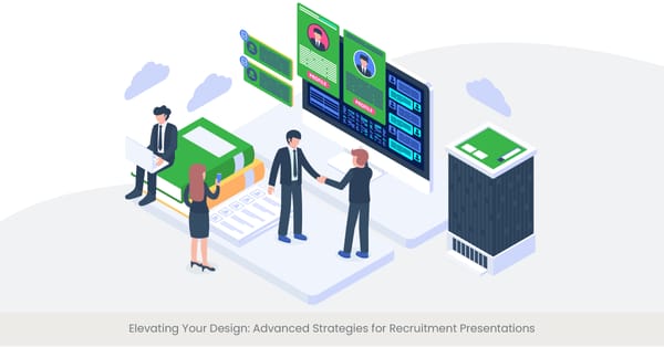
The Basics of Layout and Composition
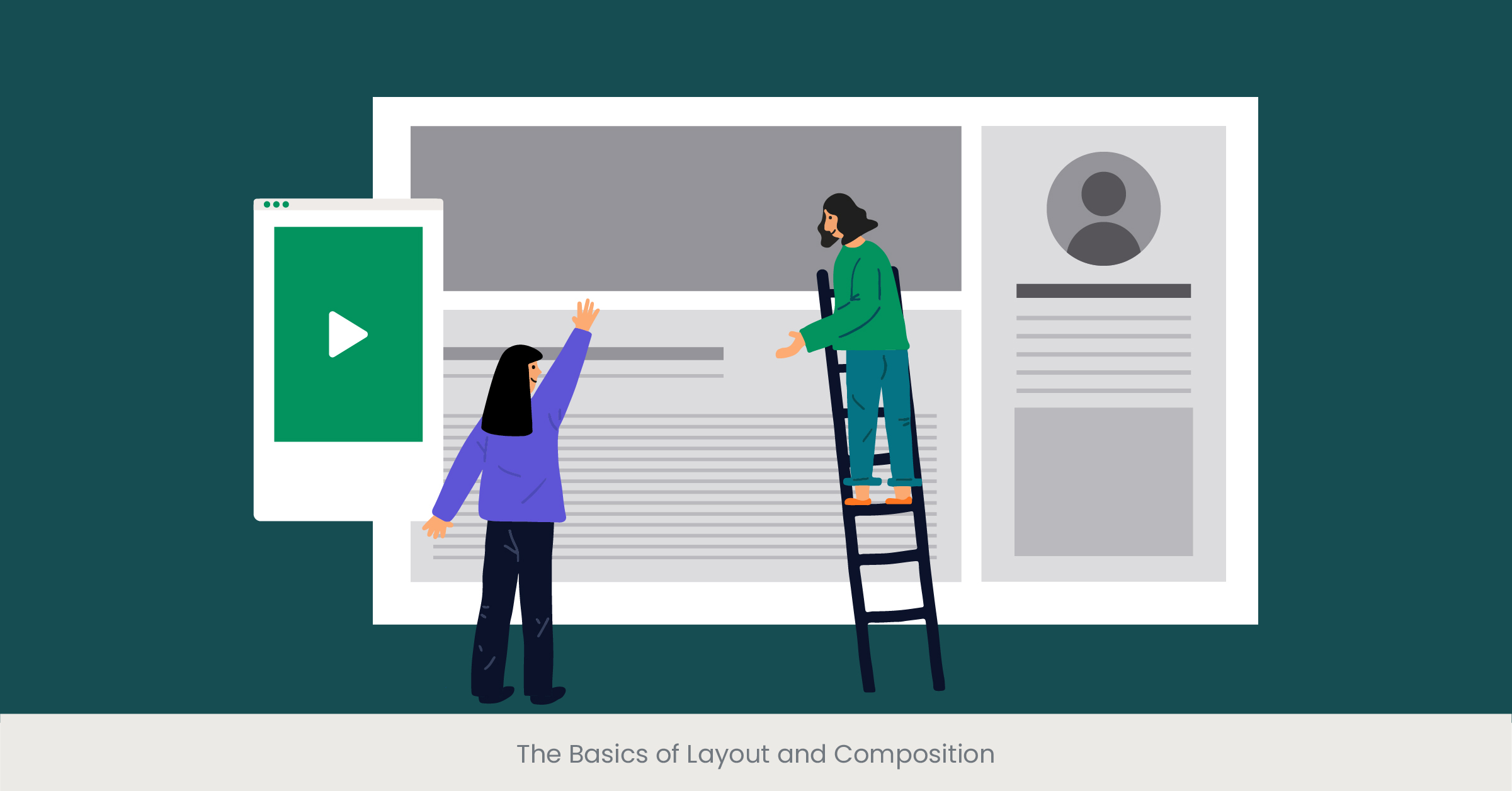
Introduction to Layout and Composition
The foundation of any compelling recruitment presentation begins with a solid grasp of layout and composition. This concept serves as the backbone of visual design, orchestrating the arrangement of text, images, and other elements in a harmonious balance that guides the viewer's eye across the slide. For recruitment companies aiming to captivate potential candidates, understanding these principles is crucial. It's about making that first impression count, ensuring that the message is not just seen but felt.
Explore how INK PPT helps recruitment companies create compelling presentations
Deep Dive: The Significance of Structure
At its core, layout and page composition are about creating order and hierarchy. They dictate the flow of information, emphasizing the most critical points while maintaining aesthetic appeal. Historical precedents, from the Gutenberg Diagram to the Z-pattern layout, illustrate how spatial arrangement influences readability and engagement. In the context of a recruitment presentation, the right layout can mean the difference between a candidate feeling invited to learn more or overwhelmed by cluttered information.
Real-World Application: Recruitment Infographics
Consider the recruitment infographic: it transforms the hiring process into an engaging narrative. A well-composed slide layout breaks down complex data about company perks or the recruitment process, making it digestible at a glance. Google slides, with their flexibility and array of design options, serve as an excellent platform for experimenting with these principles. By strategically placing elements, designers can highlight the journey to becoming one of the best candidates or showcase what makes their company the top choice for top talent.
Validating with Evidence
Research and case studies underscore the effectiveness of thoughtful design. A study from the Nielsen Norman Group highlights how users pay more attention to information-carrying images that are relevant to the task at hand. When recruitment presentations incorporate infographics or icons that resonate with the potential employees' aspirations or values, they not only inform but also inspire. Websites like SlideShare offer numerous examples of how varied industries leverage these principles to attract the right candidates, providing a wealth of inspiration and benchmarking opportunities for recruitment companies.
Enhancing Readability with Typography
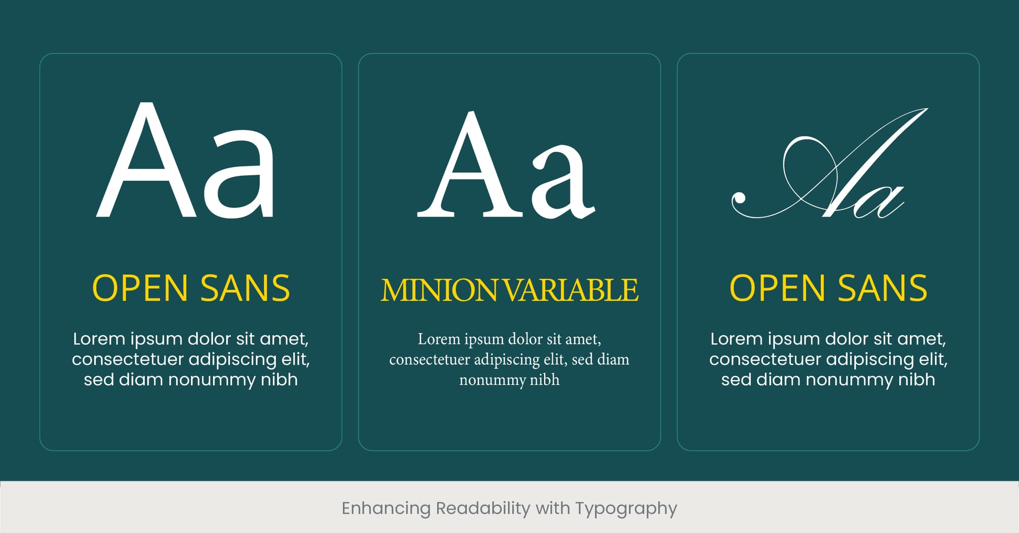
Introduction to Typography in Presentations
Typography, the art and technique of arranging type, is pivotal in determining a presentation's readability and audience engagement. It's not merely about choosing fonts but understanding how typeface choices, size, color, and spacing can significantly impact the delivery of your message. For recruitment presentations, where conveying information about the recruitment process, company culture, and job roles clearly and effectively is key, mastering typography is essential. It ensures that your presentation not only captures but also holds the attention of your potential employees and top talent.
The Impact of Typeface Selection and Structure
Typography can evoke emotion, set a tone, and establish credibility. Historical perspectives on typography reveal its evolution from utilitarian communication to a form of visual expression. In the realm of recruitment presentations, the choice of typeface should align with the company's brand identity. Serif fonts might convey tradition and reliability, suitable for established companies, while sans-serif fonts project modernity and approachability, often favored by startups. The structure of your typography, including hierarchy and alignment, guides viewers through your presentation, emphasizing key points like the benefits of joining your team or the stories of best candidates who have thrived within the company.
Typography in Action: Case Studies and Trends
Real-world examples abound where typography has been the linchpin of successful recruitment campaigns. For instance, innovative recruitment infographics utilize typography not just to inform but to engage, turning dry statistics about the hiring process or social recruiting into compelling narratives. Recruitment company presentation PPTs often highlight their unique approach through typographic creativity, distinguishing themselves in a competitive market. The latest trends also show a move towards inclusivity, with typefaces designed for better readability by a wider range of people, reflecting a commitment to accessibility and diversity.
Read about successful recruitment campaigns powered by INK PPT’s design
Research-Backed Benefits of Thoughtful Typography
Evidence from various studies, including those by the Software Usability Research Laboratory (SURL), highlights how typography affects comprehension and user experience. Presentations that skillfully employ typography can see a marked improvement in the audience's ability to recall information and feel engaged. For recruitment presentations, this means that well-chosen fonts and thoughtful typographic design can significantly boost your company's appeal to the best candidates around. Resources like Google Slides offer a plethora of fonts and layout options, enabling recruiters to experiment and find the perfect typographic expression for their message.
Using Color to Evoke Emotions and Actions
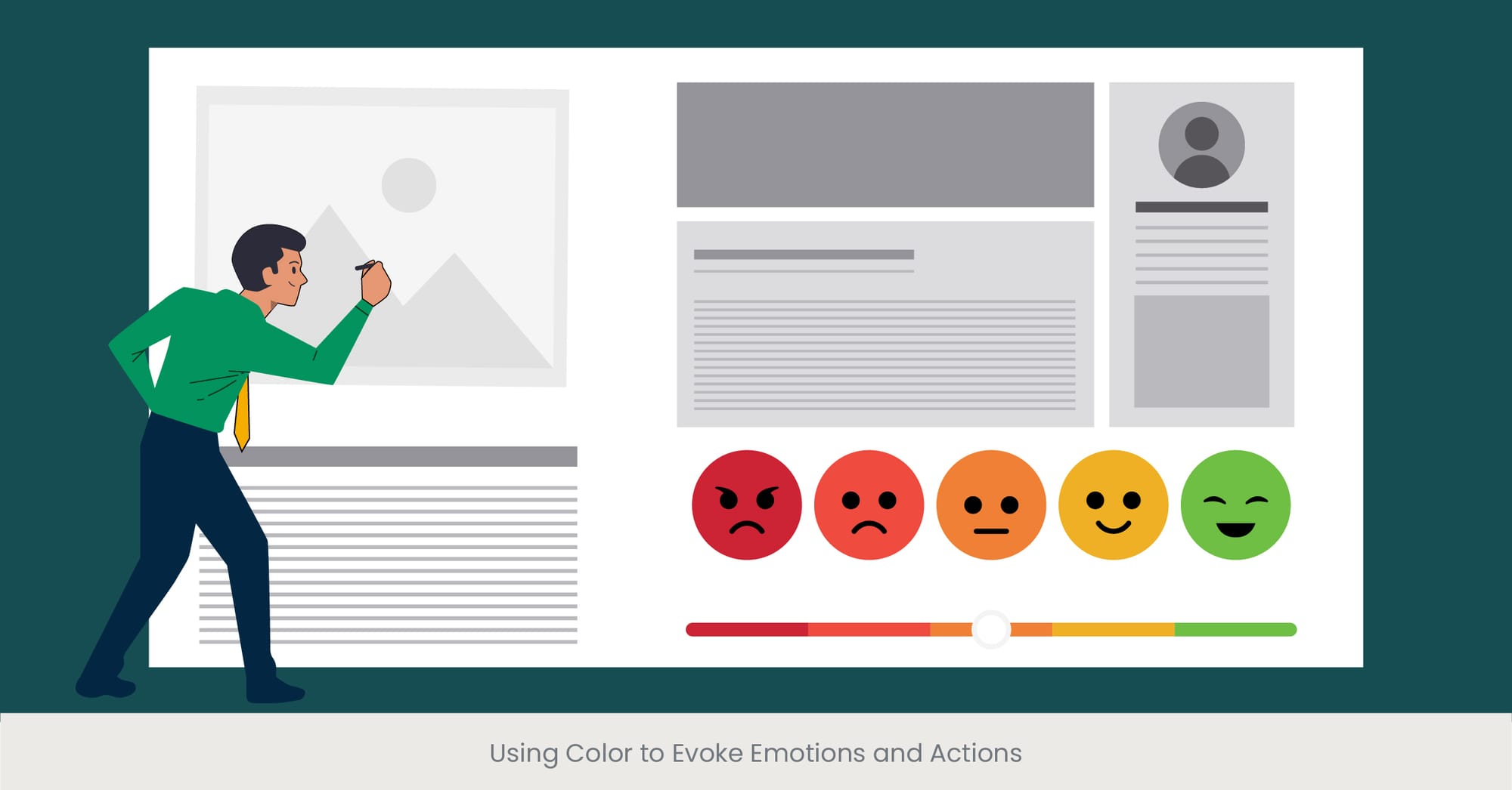
The Emotional Power of Color in Design
Color is a potent tool in the arsenal of visual communication, wielding the power to evoke emotions, influence decisions, and even drive actions. In the context of recruitment presentations, the strategic use of color can turn a standard presentation into an unforgettable experience. It goes beyond aesthetics, tapping into the subconscious to make the audience feel inspired, excited, or calm. Understanding color theory and psychology is key to harnessing this power, ensuring that the colors chosen align with the message you wish to convey about your company and the opportunities it offers.
Discover how color psychology can transform your recruitment presentations
Understanding Color Theory
The principles of color theory provide a foundation for making informed decisions about color schemes in recruitment presentations. This involves the study of color wheel relationships, including complementary, analogous, and triadic schemes, and how these can be used to achieve harmony and contrast. Historical insights into color perception show how different cultures interpret colors, adding a layer of complexity when targeting a diverse talent pool. For example, green can symbolize growth and vitality, making it an excellent choice for companies looking to attract candidates who value personal and professional development.
Real-World Examples: Color in Recruitment
Successful recruitment campaigns often leverage color psychology to stand out. For instance, a recruitment infographic might use a vibrant orange to call to action, encouraging potential candidates to apply, while a soothing blue background in a recruitment company presentation ppt can create a sense of trust and reliability. Google Slides templates designed for recruitment presentations frequently feature color palettes optimized for engagement and emotional impact, showcasing how color can be used to highlight key information like company perks, tips on the recruitment process, or testimonials from the best talent.
See how we’ve helped clients stand out with impactful color schemes
The Science of Color and Its Impact
Research underscores the significant impact color has on engagement and retention. Studies have found that color can increase readers' attention spans and recall by up to 82%, a critical factor when presenting complex information about job roles or the recruitment process. This is further validated by recruitment presentation templates that use color strategically to draw the eye to important details, making them more memorable. Companies that employ these strategies not only showcase and represent their brand's personality but also demonstrate an understanding of how to effectively communicate with their target audience.
The Importance of Imagery and Icons

Visual Storytelling in Recruitment
Imagery and icons play a crucial role in enhancing the appeal and clarity of recruitment presentations. Beyond mere decoration, these visual elements tell a story, conveying messages quickly and effectively to potential candidates. They can illustrate the company culture, highlight the diversity of the workforce, or symbolize the benefits and opportunities available. In the fast-paced world of recruitment, where capturing and retaining the attention of top talent is essential, imagery and icons serve as powerful tools to make complex information accessible and engaging.
The Role of Visuals in Communication
Visuals have always been at the heart of communication, breaking down barriers and transcending language. The use of imagery in recruitment presentations can evoke emotions, set a tone, and create a lasting impression. Icons, with their ability to condense information into simple, recognizable symbols, guide viewers through the presentation, highlighting key points such as the stages of the recruitment process or the core values of the company. When used thoughtfully, these elements can transform a standard presentation into a compelling narrative about the company and its mission.
Recruitment process presentations
A well-structured recruitment process presentation can streamline communication with candidates by visually outlining each step. Design clarity ensures potential hires understand the application stages, interview procedures, and onboarding expectations. Using accessible design principles ensures that these presentations are inclusive and effective for all candidates.
Leveraging Imagery and Icons: Case Studies
Several recruitment companies have set themselves apart by innovatively using imagery and icons in their presentations. For example, a recruitment infographic that uses dynamic icons to depict the hiring process can make the information more relatable and memorable. Similarly, photographs that showcase real employees and work environments help to humanize the company, making it more attractive to potential employees. Google Slides and other presentation platforms offer a wide range of options for incorporating these visual elements, enabling companies to create custom presentations that resonate with their target audience.
Workforce development presentations
Incorporating storytelling in workforce development presentations can enhance engagement by highlighting real employee success stories. Using consistent branding and clear visuals ensures the message resonates. Design elements like infographics help to showcase growth opportunities and future career paths effectively, creating a compelling narrative for potential candidates.
Supporting Research and Trends
The effectiveness of imagery and icons in communication is well-documented. According to the Picture Superiority Effect, people remember information better when it's presented visually rather than as text alone. This principle is particularly relevant in recruitment, where companies must convey a lot of information succinctly. Studies have shown that presentations incorporating relevant images and icons can significantly enhance audience engagement and retention. Additionally, the trend towards more visual and interactive content in recruitment reflects a broader shift in how companies connect with potential candidates, emphasizing the importance of visual literacy in today's job market.
Simplifying Complex Information with Infographics
Unlocking the Power of Infographics in Recruitment
Infographics have revolutionized the way we present and interpret complex data, transforming dense statistics, metrics and processes into visually appealing, easily digestible content. In the context of recruitment, infographics serve as an invaluable tool for communicating the intricacies of the hiring process, company structure, and the benefits of joining the organization. They not only simplify information but also make it more engaging, helping to capture the interest of potential candidates and convey the company's values and culture in a memorable way.
The Essence of Effective Infographics
Effective infographics distill complex information into clear, concise visual representations, utilizing a combination of icons, charts, and minimal text. The key to their effectiveness lies in their ability to tell a story, guiding the viewer through a narrative that makes the data relatable and the message stick. This storytelling approach is especially beneficial in the recruitment process, where conveying the company's ethos, the recruitment process, and the job roles' nuances can be challenging. By breaking down these components into visually stimulating elements, infographics facilitate a deeper understanding and connection.
Infographics in Action: Enhancing Recruitment Strategies
The strategic use of infographics in recruitment presentations has led to innovative approaches to attracting top talent. For instance, a recruitment infographic can map out the journey from application to hire, highlighting key milestones such as interviews, assessments, and onboarding. This not only helps candidates understand what to expect but also demonstrates the company's commitment to transparency and support. Similarly, infographics showcasing company perks, team structures, or career progression paths can significantly influence a candidate's decision to apply, providing a clear, attractive overview of what the company offers.
Recruitment marketing presentations:
Creating impactful recruitment marketing presentations involves integrating your company’s unique culture and values into the design. Consistent use of color schemes, typography, and imagery is essential. Highlighting employee testimonials and using data-driven insights will appeal to top talent, aligning your brand's story with candidates’ aspirations.
Explore how INK PPT can simplify your recruitment strategies with infographics.
Evidence of Impact and Trends
Research supports the effectiveness of visual aids like infographics in enhancing comprehension and retention. According to the Wharton School of Business, presentations using visual aids were found to be 67% more effective in persuading audiences than those without. In recruitment, where the goal is to persuade top talent to join your organization, this is particularly pertinent. The growing trend towards more visual and interactive features in recruitment materials reflects a broader recognition of the need to communicate complex information in an accessible and engaging manner.
The Role of White Space in Design

Embracing the Silence: White Space in Visual Communication
White space, often referred to as negative space, plays a pivotal role in design, particularly in the realms of recruitment presentations. Far from being mere emptiness, white space is a powerful design element that organizes content, enhances readability, and directs viewers' attention to the most crucial elements of the presentation. In the context of recruitment, where the goal is to communicate effectively with potential candidates, the strategic use of white space can make the difference between a cluttered, overwhelming presentation and one that is clear, engaging, and persuasive.
The Science Behind White Space
The principle of white space hinges on the cognitive benefits of simplicity and focus. By surrounding text, images, and icons with ample space, designers can reduce cognitive load, making information easier to process and remember. This is crucial in recruitment presentations, where conveying the essence of the company, the recruitment process, and the available positions clearly and succinctly is vital. White space also contributes to the overall aesthetic of the presentation, promoting a sense of elegance and professionalism that reflects positively on the company’s brand.
White Space at Work: Case Studies in Recruitment
Several leading companies have leveraged white space effectively in their recruitment materials. For example, a recruitment presentation template that uses white space to separate sections on company culture, job descriptions, and application processes helps ensure that each part is given its due attention. This approach not only makes the presentation more visually appealing but also aids in information retention, a key factor when candidates are likely considering multiple opportunities and companies.
Supporting Research and Best Practices
Research underscores the importance of white space in design, with studies indicating that layouts incorporating white space are perceived as more trustworthy and appealing. In a field where first impressions are crucial, such as recruitment, the ability to convey trust and quality through design is invaluable. Best practices suggest that white space should not be an afterthought but a fundamental consideration from the outset of the design process, ensuring that the presentation communicates both visually and textually.
Achieving Consistency Across All Recruitment Materials
The Cornerstone of Brand Identity: Consistency in Design
Consistency in the design of recruitment materials is not just about repetition or uniformity; it’s about creating a cohesive brand identity that resonates across all platforms and mediums. This cohesiveness ensures that whether a potential candidate encounters a recruitment presentation, infographic, or job advertisement, they receive a unified message about the company’s culture, values, and the opportunities available. Achieving this level of consistency is crucial for building trust and recognition on social recruiting,, making it easier for candidates to identify and connect with your brand.
Foundations of Consistent Design
The journey towards consistent design begins with the establishment of brand guidelines, which include specific color palettes, typography, imagery styles, and the use of logos and icons. These guidelines serve as a roadmap for creating recruitment materials that reflect the company's identity accurately and uniformly. For recruitment presentations, this means applying the same design principles, whether it’s for a slide deck about the company’s hiring process or an infographic highlighting the benefits of joining the team. This uniformity not only strengthens the brand’s visual identity but also enhances the clarity and effectiveness of its communications.
Real-World Impact: Brand Recognition and Trust
Companies that excel in maintaining consistency across their recruitment materials reap significant benefits in terms of brand recognition and trust. For instance, a recruitment company presentation ppt that mirrors the style and tone of its recruitment infographics and templates reinforces the company's image and message, making a lasting impression on potential candidates. This consistency across various touchpoints helps build a strong, recognizable brand that candidates are more likely to trust and engage with.
Empirical Evidence and Industry Standards
Research highlights the importance of consistency in branding, with studies showing that consistent brand presentation across all platforms can increase revenue by up to 23%. In the realm of recruitment, this consistency translates into a more compelling employer brand, attracting higher-quality candidates and enhancing the company’s reputation in the job market. Industry standards further underscore the value of consistency, with successful companies often cited as benchmarks for how to effectively integrate design principles across all materials to create a seamless and impactful recruit and candidate experience.
Accessibility Considerations in Design

Prioritizing Inclusivity Through Design
In the realm of recruitment presentations and materials, incorporating accessibility considerations is not just about compliance; it's a demonstration of a company's commitment to inclusivity and equality. Designing for accessibility ensures that all potential candidates, regardless of their abilities, can access, understand, and engage with your content. This approach not only broadens your talent pool but also reinforces your company's values, showcasing a culture that values diversity and inclusion.
Key Elements of Accessible Design
Accessible design in recruitment materials involves several critical elements, from color contrast and typography to the use of alt text for images and ensuring compatibility with screen readers. The goal is to create presentations and infographics that are easily navigable and understandable for everyone, including those with visual, auditory, motor, or cognitive disabilities. For example, ensuring that text is legible against its background and using clear, simple language can significantly improve comprehension and accessibility. Additionally, incorporating captions or transcripts for video content is essential for those who are deaf or hard of hearing.
Talent management presentation design
Effective talent management presentation design should focus on creating a visual flow that mirrors the employee lifecycle, from recruitment to retention. Consistent design across slides enhances understanding and fosters connection, illustrating how your organization supports employee growth, development, and career progression.
Impactful Accessibility Practices in Recruitment
Implementing accessible design practices in recruitment materials can have a profound impact. It not only enhances the candidate experience for individuals with disabilities but also reflects positively on the company's brand, signaling an environment that is welcoming and accommodating to all. Companies that prioritize accessibility in their recruitment presentations, from Google Slides to downloadable PDFs, often see a wider and more diverse range of applicants, enriching their talent pool with individuals who bring varied perspectives and experiences.
Validating the Importance of Accessibility
Research underscores the significance of accessibility in design, with studies indicating that accessible websites and materials can increase the user base by up to 20%. In the context of recruitment, accessible design not only complies with legal standards but also aligns with ethical business practices, contributing to a positive company image and competitive advantage. Moreover, feedback from candidates and employees who benefit from accessible design can provide invaluable insights, helping companies to continually improve their materials, services and approach to inclusivity.
Feedback Loops: Testing and Iterating Designs

Embracing Continuous Improvement in Design
The creation of engaging recruitment materials is not a one-time task but an ongoing process of refinement and improvement. Implementing feedback loops into the design process allows companies to gather insights and reactions from their target audience, ensuring that their presentations not only look appealing but also effectively communicate the intended message. This approach, rooted in the principles of design thinking, fosters a culture of innovation and responsiveness, crucial for staying relevant in the competitive landscape of talent acquisition.
The Mechanism of Feedback Loops
Feedback loops involve collecting data and responses on the usability, accessibility, and impact of recruitment materials from potential candidates, hiring managers, and other stakeholders. This can be achieved through surveys, focus groups, usability tests, and analytics tools that measure engagement levels with online materials. The insights gained are then used to make iterative changes, enhancing the clarity, effectiveness, and appeal of presentations, infographics, and other recruitment aids. By continually refining these materials based on real-world feedback, companies can create more targeted and resonant recruitment campaigns.
Real-Life Applications and Success Stories
Numerous companies have successfully integrated feedback loops into their design processes, leading to significant improvements in their recruitment materials. For example, a recruitment company may find that certain colors or layouts in their presentation ppt are not resonating with the intended audience. By adjusting these elements based on candidate feedback, they can increase engagement and application rates. Similarly, iterative testing might reveal that incorporating more inclusive imagery or clearer calls-to-action in recruitment infographics can enhance the overall effectiveness of the materials.
Evidence of Efficacy
Research in the field of marketing and communication consistently highlights the value of feedback loops. Studies show that materials designed with user feedback are significantly more effective in achieving their communication goals. In recruitment, where the aim is to attract and engage the best talent, the ability to adapt and refine materials based on direct feedback is invaluable. Moreover, this iterative process aligns with modern expectations of brand interaction, where companies are seen as responsive and adaptable to their audience's needs.
HR recruitment presentations
Clear and engaging HR recruitment presentations are essential for communicating job roles, expectations, and company culture. Consistency in design, combined with accessible elements, ensures that the message reaches diverse candidates effectively. Using a mix of infographics, visual storytelling, and data helps drive interest and engagement.
Want to attract top talent with a consistent and powerful employer brand? Let’s start with a strategy that ensures consistency across all your recruitment touchpoints.
The Power of Storytelling Through Design

Unleashing Emotion and Connection
Storytelling through design transcends the mere presentation of facts, graphs and figures; it evokes emotion, builds connections, and humanizes the recruitment process. In the competitive arena of attracting top talent, leveraging the power of storytelling in recruitment presentations can set a company apart, transforming passive viewers into engaged candidates. It's about crafting a narrative that resonates with the audience's aspirations, challenges, and values, making the opportunity not just seen but felt.
Principles of Storytelling in Design
Effective storytelling in design integrates visual elements with narrative flow, guiding the audience through a journey that aligns with their own career aspirations and personal growth. This involves the strategic use of imagery, color, typography, and layout to create a cohesive and compelling narrative. For instance, using consistent themes, graphics and motifs throughout the recruitment presentation can reinforce the company's culture and values, while personalized stories of current employees' growth and success within the company can illustrate potential career paths and opportunities.
Transformative Examples in Recruitment
Innovative companies have harnessed storytelling to significantly enhance their recruitment strategies. A recruitment infographic might chart the company’s evolution, emphasizing its growth and the opportunities it presents. Recruitment presentations that share testimonials or success stories of current employees can vividly depict the potential for career development and the supportive community within the organization. These narratives not only inform but also inspire, painting a vivid picture of what it means to be part of the team.
Validating Storytelling's Impact
Research in psychology and marketing underscores the power of storytelling to engage and persuade. Stories are remembered up to 22 times more than facts alone, according to Jerome Bruner, a renowned psychologist. In recruitment, where differentiation and emotional connection right candidates are key, the strategic use of storytelling can attract more engaged and committed candidates. Further, stories that highlight diversity, inclusion, and growth opportunities can appeal to a wider range of potential employees, aligning with broader organizational goals of diversity and innovation.
FAQs on Leveraging Design Principles for Engaging Recruitment Presentations
How do you write a recruitment presentation?
To craft and present a compelling recruitment presentation, start by defining your objectives and understanding your audience. Incorporate design principles such as layout, typography, and color to ensure clarity and engagement. Use storytelling to connect on an emotional level, presenting the company culture and opportunities through narratives that resonate with potential candidates. Finally, include clear calls to action, guiding viewers on the next steps.
What is the best template for a presentation?
The best template for a presentation is one that aligns with your company's brand identity and the message you wish to convey. It should offer flexibility in design elements such as color schemes, fonts, and layout options, allowing for customization to suit your content. Look for templates that are professional, easy to navigate, and include a variety of slide types to accommodate different types of information.
What makes a good presentation template?
A good presentation template features a clean, accessible design that enhances readability and viewer engagement. It should be consistent in style, with a coherent color scheme and typography, and offer various slide layouts to suit different content types. Additionally, a good template is adaptable, enabling customization to fit your site with specific branding and messaging needs.
How do you write a presentation template?
Writing a presentation template involves creating a structure that can be adapted for various purposes. Start with a basic outline that includes an introduction, key content sections, and a conclusion. Incorporate placeholders for essential elements such as headings, text blocks, images, and charts. Ensure the template guides users on how to use color, fonts, and spacing for consistency and impact.


%20(1).jpg)
%20(1).jpg)
