
Contact Us
Let’s Partner for Your Next Big Presentation
Consult with our Business Advisor
.webp)
Thank you! Your submission has been received!
Oops! Something went wrong while submitting the form.


Most investors decide how they feel about your startup in the first three minutes. That is all the time you get. So if you are trying to figure out how to make a pitch deck that actually holds attention, the answer is not more slides or fancier design. It is clarity.
This is where many founders go wrong. They treat the deck like a company brochure, trying to stuff in every feature, future plan, and statistic they have. The result is a presentation packed with information but missing a clear point. A strong deck takes the opposite approach. Each slide makes one point, the numbers build credibility, and the story keeps moving.
In this guide, you will get the exact slide structure that works, practical pitch presentation tips for the day of the meeting, and proven strategies for winning pitches. You will also see perfect pitch deck examples from companies like Airbnb, Uber, and Dropbox, along with the specific reason each one worked.
A pitch deck is a brief presentation that communicates a business idea, product, or growth opportunity to potential investors, partners, or stakeholders. It brings together essential information such as the problem, solution, market opportunity, business model, competitive landscape, traction, team, and financial projections in a clear and compelling format.
A perfect pitch deck does more than share information. It helps investors quickly understand the business, evaluate its potential, and see why the opportunity is worth their attention. The right structure and visual storytelling can make complex data easier to understand while building credibility and keeping the audience engaged.
For startups seeking funding, a strong pitch deck can also shape the first impression of the company. It gives founders an opportunity to present their vision with clarity, demonstrate market potential, and create a strong case for investment. This is why professional pitch deck design services focus not only on visual appeal but also on storytelling, information hierarchy, and investor expectations.
The slide order is fairly clear. Investors have seen plenty of pitch decks, so they expect the key information to follow a logical flow. Use that to your advantage.
Add your logo, company name, and one clear sentence explaining what you do.
The one-line pitch is often the hardest part. Keep it simple and specific. “We help small clinics book patients online” is clearer than “AI-powered patient acquisition ecosystem.” If someone cannot repeat your line after hearing it once, simplify it. Add your contact details at the bottom in small text.
Explain the problem clearly. Who faces it, how often does it happen, and what does it cost them?
Use a real customer example if possible. One short story can be more effective than several points about market problems. Focus on one main problem so investors know exactly what you are solving.
Show how your product or service solves the problem. Make the connection to the previous slide obvious.
Avoid listing every feature and focus on the outcome. Show how the customer's experience improves after using your solution. A screenshot with a few lines of context may be enough.
Show investors how big the opportunity can become. Keep the numbers simple:
Show how you arrived at the numbers and include your sources. Unrealistic market figures can quickly damage your credibility.
Show your product in action.
Use screenshots, a simple flow, or a short video. Seeing the product makes the idea easier to understand. If the product is still being developed, show the prototype and be clear about its current stage.
Explain how your business makes money in one simple line.
Then include the key numbers, such as pricing, cost to serve a customer, and margins. If you have multiple revenue streams, make it clear which one drives most of the business.
This is one of the most important slides for investors. Show your growth with a simple chart. Use revenue, users, contracts, retention, or whichever metric best shows progress. Focus on real numbers.
If you are pre-revenue, show the proof you do have. This could include waitlist signups, pilot results, customer interest, or letters of intent.
Avoid saying that you have no competition. Investors know that every business has alternatives.
Show the companies, products, or other solutions customers use today, including doing nothing. Then explain what makes your approach different and why that advantage matters. A simple comparison table can make this easy to understand.
Explain how you plan to reach customers and what it costs to acquire them.
Name your main channels and share what you have already tested. Show what worked and what did not. Real results are more convincing than a list of future marketing plans.
Add photos, names, roles, and a short line explaining why each person is suited to the role.
Focus on relevant experience rather than full biographies. If you have strong advisors or early backers, you can mention them briefly at the bottom.
Three years of projections is usually enough. Show revenue, major costs, headcount, and cash burn.
Keep the numbers easy to follow. Your assumptions should be realistic and easy to explain. Be prepared to show what is driving your expected growth.
End by clearly stating how much you are raising and what you plan to use it for.
Break the amount into a few key areas, such as hiring, product development, and marketing. Then explain what the funding will help you achieve before the next round. Make the ask clear. Investors should never have to guess what you are asking for.
A perfect pitch deck design is not about making slides look attractive. It is about making your business easy to understand, building credibility, and helping investors grasp the opportunity quickly.
Every slide should have one specific purpose. Your market slide should explain the opportunity, while your traction slide should demonstrate growth. If a slide is trying to communicate multiple ideas, break it into smaller, more focused slides.
Avoid generic headings such as “Market,” “Traction,” or “Business Model.” Use headlines that communicate the key takeaway, such as “Revenue grew 4x in nine months.” A strong headline helps investors understand the message before they study the details.
Utilize the 10/20/30 rule as a useful starting point, not a strict formula. The ideal number of slides depends on the purpose, audience, and stage of your business. The important thing is that every slide adds value and moves the investment story forward.
Avoid filling slides with lengthy paragraphs. Use short statements, key numbers, and concise supporting points. The presentation should complement what you say, not compete with it. Detailed information can always move to the appendix.
Give your content enough room to breathe. Generous spacing makes slides easier to scan and directs attention toward the most important information. If content only fits by reducing the font size, consider removing or restructuring it instead.
Limit your deck to one or two complementary typefaces and use them consistently. Maintain a clear difference between headlines, subheads, and body copy. Most importantly, make sure text remains readable on both large screens and smaller devices.
Use your brand colors strategically rather than filling every slide with color. A primary color, an accent color, and neutral shades are often enough. Use the accent color to highlight important numbers, insights, or actions.
Do not make investors work through large tables of numbers. Use charts, graphs, and visual comparisons to make important data easier to understand. Choose the right format for the information and remove unnecessary gridlines, labels, and visual clutter.
Real product visuals are often more convincing than generic illustrations. Use sharp screenshots, product mockups, or demonstrations to show what you have built. Highlight the feature or experience that matters most rather than displaying the entire interface.
Keep headlines, margins, spacing, logos, icons, colors, and layouts consistent throughout the deck. A predictable visual structure allows investors to focus on your story instead of figuring out how each slide works.
A pitch deck may be presented in a boardroom, shared over email, or reviewed independently on a laptop or phone. Make sure the design works across all these formats. Check the final PDF for readability, font consistency, image quality, and file size before sharing it.
Your core deck should tell a focused story, while the appendix can answer deeper questions. Include supporting information such as unit economics, churn, competitive analysis, financial details, hiring plans, or additional market data for investors who want to dig deeper.
From the first slide to the final ask, INK PPT helps you build a deck that tells your story clearly and presents your business with confidence.
A strong pitch deck gets attention, but a well-planned pitch builds conviction. The best pitches combine a compelling story with preparation, audience understanding, and confident delivery. Let’s understand in detail:
Even a well-designed perfect pitch deck can lose its impact when it falls into common mistakes investors see repeatedly. Here are some of the errors that can weaken your story and cost you valuable investor interest:
Famous decks show you what good structure looks like. Real client work shows you how it actually gets built.
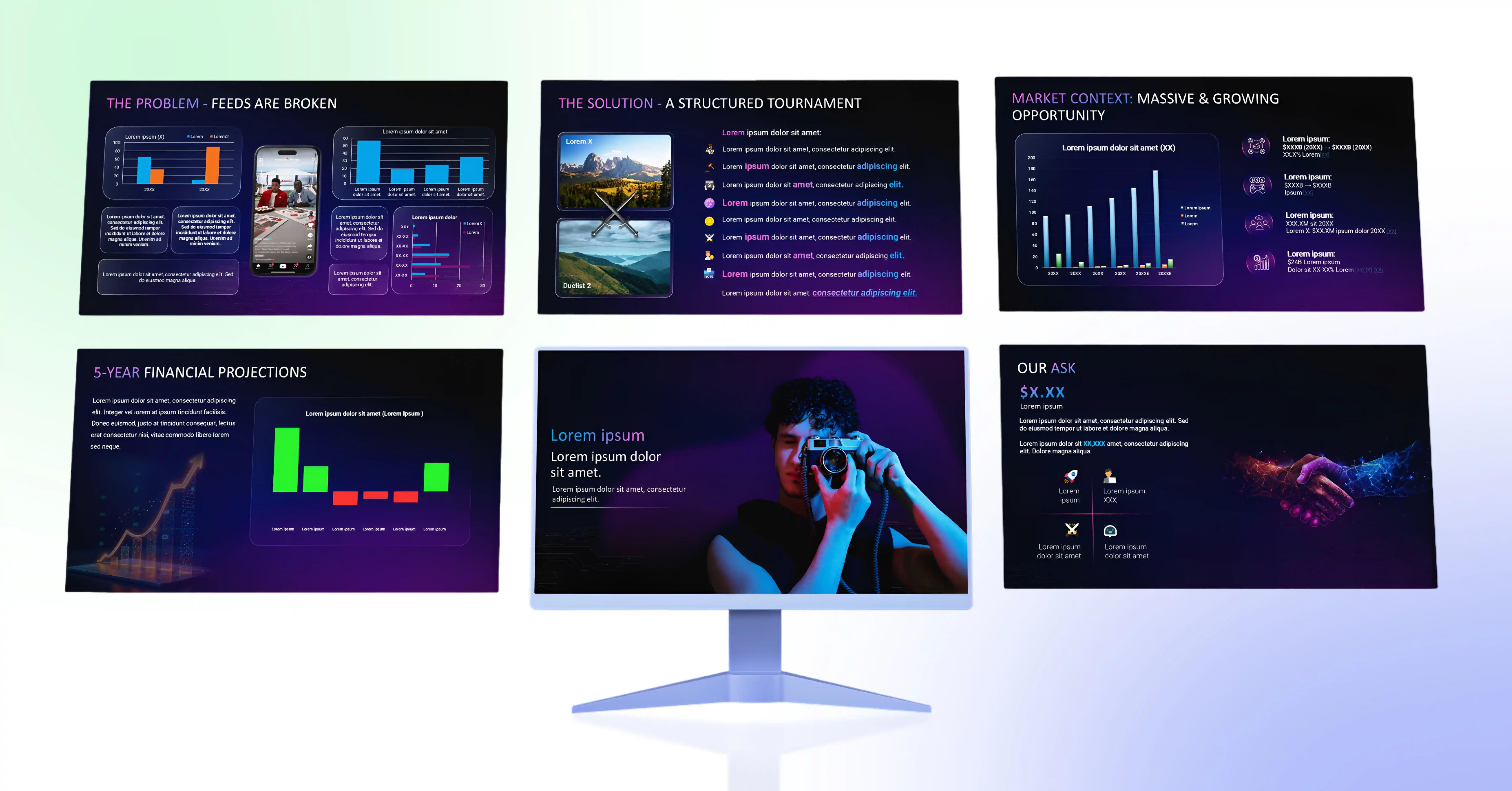
A perfect pitch deck is not just about excellent slides. It is a simple and clear story about your business that helps investors understand your idea, trust your numbers, and see your future growth. To make a strong pitch deck, focus on clear structure, simple storytelling, real data, and clean design. Good visuals help explain complex ideas and make your message easy to remember.
If you want to make your pitch deck more effective, INK PPT can help. As a presentation design agency, INK PPT creates pitch decks that combine clear storytelling with strong design. Whether it is your first investor meeting or a big funding round, an efficient deck can help you share your idea better, build trust, and get more interest from investors.
As a passionate explorer, I see crafting the perfect story as embarking on a refreshing Himalayan journey. Every narrative is an adventure, a voyage of imagination, meticulously molded into captivating presentations. I'm here to guide you, ensuring your story becomes an unforgettable odyssey, with each creation as a vibrant landscape ready to captivate eager audiences.

About the Author




Consult with our Business Advisor


